Table of Contents
Key Takeaways
-
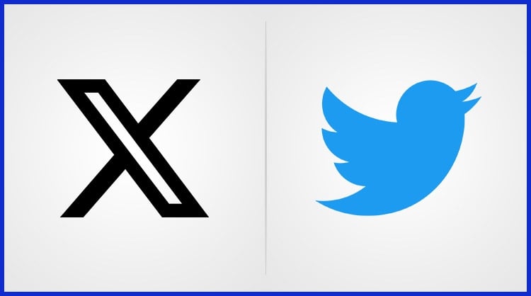
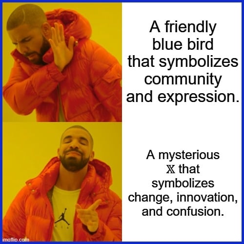
The transformation from the iconic Twitter bird to the dynamic X logo symbolizes a daring move towards innovation and an aspiration to be a flexible “everything app” catering to the changing demands of users across the globe.
-
Quick rollout of new logo because the brand must adapt in a rapid digital environment, stay relevant, and enhance user experience.
-
The sleek X logo is easy to remember, making the brand more memorable and accessible to new and existing users worldwide.
-
Transitioning to the X logo signifies a bold step forward for future growth and reflects the company’s evolving mission, reinforcing trust and connection.
-
Some reactions to the new logo are bittersweet nostalgia for the blue bird. Experts emphasize the strategic advantages of the rebrand for market positioning.
-
Bold moves like Twitter’s rebrand to X, though controversial, often catalyze innovation and establish the platform for sustained growth when combined with transparent messaging and a customer-centric ethos.
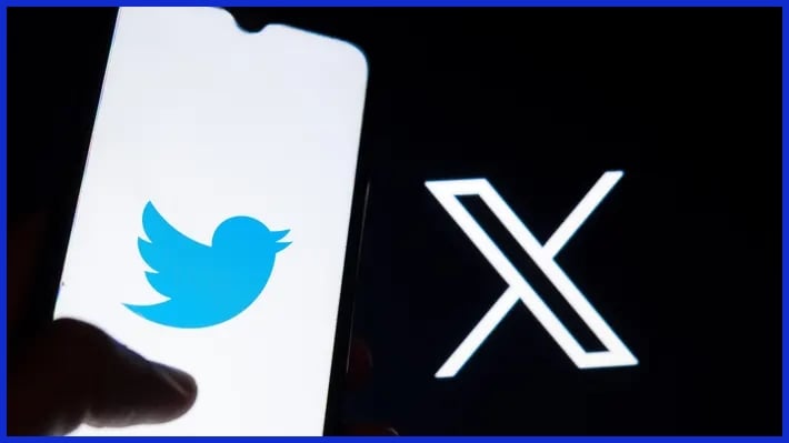
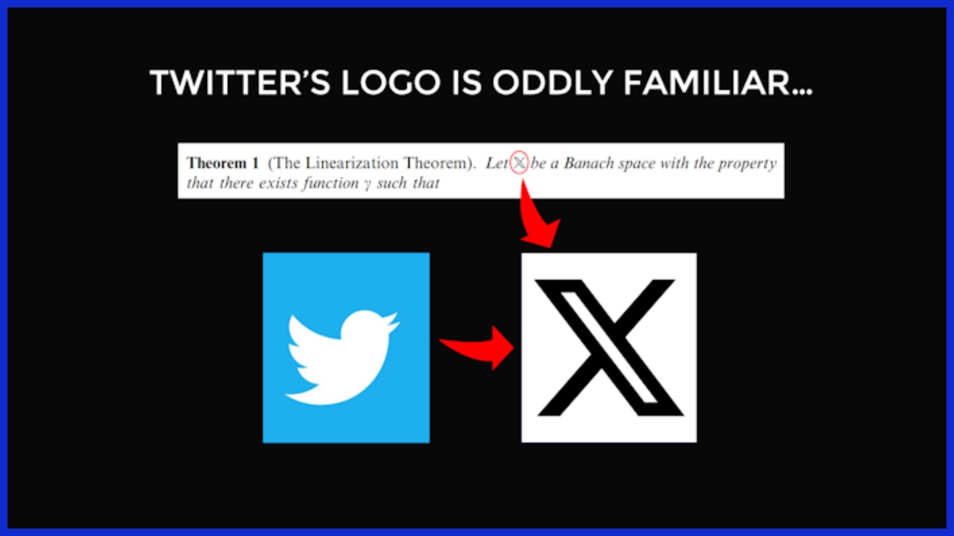
Twitter’s new X logo represents a significant change for the social media giant, replacing the iconic blue bird with a striking lone “X”.
The update went global and got people chatting online, with a bunch of users posting ambivalent remarks.
For brands and design teams, this change is more than a logo swap. It is a genuine testament to how quickly digital branding shifts and sculpts online identity.
Why the Twitter X Logo?
The move from the iconic Twitter bird to the new logo X means more than just a facelift. It’s an obvious attempt by Twitter’s leadership to redefine the platform’s purpose and direction. It’s a transition that’s occurring in the midst of a rapidly evolving social media landscape, with user preferences shifting right alongside.
For small businesses and digital agencies observing from afar, it’s a live tutorial in how brands reinvent themselves to remain relevant.
1. Vision
The X rebrand carries a bold vision: to turn Twitter into a true “everything app.” Elon Musk has stated he wanted to make X.com a one-stop shop for digital life, and acquiring Twitter accelerated that plan.
The new logo, a simple X, looks ahead, striving to demonstrate that Twitter isn’t just about tweets anymore, but an expanding space for everything digital, including news, payments, shopping, and beyond. This vision may lead users to spend more time on the platform and view it as more than just a social network.
If they pull it off, no one would want to leave and that’s every brand’s dream.
2. Speed
Twitter’s logo change occurred at a dizzying pace. Musk wanted a quick choice. He crowdsourced a logo design, liked one, and within a weekend, the iconic blue bird was out from headquarters.

Some will say it was rushed, yet it demonstrates how speed can keep a brand a step ahead. This sort of rapid pace is dangerous, yet it keeps the platform innovative and top of mind with the media. Rapid pivots can rattle users, but they indicate a firm’s readiness to evolve with the times, which maintains its cool.
3. Simplicity
A simple logo plays well everywhere. The new X is simply a Unicode character, no fuss, no clutter. Minimalist logos pop in a cluttered world, and they’re quick to identify on any device.
Simple shapes stick in our brains, so people will recall them longer. To agencies and brands, this is a reminder that you don’t require something flashy to leave your imprint. Something like Graphically.io can assist with this, creating clean, efficient styles that serve just about as well for small shops as they do for global platforms.
4. Identity
The X means Twitter’s identity is getting a reboot. The mark is malleable, not anchored to a single significance. It suits Musk’s broader objective to expand Twitter’s utility beyond posting updates. For brands adapting to this change, knowing the best time to post on Twitter
can help them reach a wider and more engaged audience.
When a brand’s look evolves with its mission, it fosters confidence in both faithful users and new arrivals. With time, a powerful, defined identity brings people back because they know what to expect.
Deconstructing the X Design
Twitter’s new X logo indicates a change in identity, grounded in contemporary design principles and fueled by evolving usage patterns and brand intent. To get a grasp on this rebrand, it’s useful to deconstruct the elements, style, and unicode symbol that form the X.
The Source
The X mark pulls inspiration from a few places. Geometric minimalism lies at its heart. Clear lines, limited forms, and a restrained color palette are reflective of the broader trend in tech branding to simplicity and straightforwardness.
Tech influences from basic interface icons to code symbols are obvious. Elon’s vision chipped the lead, insisting on a logo that insinuates enigma and potentiality, a visual Rorschach. He’s famous for eschewing logos that tell, opting instead for signs that incite, inviting the viewer to guess what’s coming next.
This X also nods to the platform’s history. Twitter’s bird logo once stood for openness and connection, while X looks forward, signaling a new phase. The pivot takes a cue from the past and future alike, mixing Twitter’s social origins with Musk’s forward-looking aspirations.
The Style
Design decisions here are keen. The X employs a stark, bold typeface that makes it pop at any scale, from mobile screens to billboards. Its lines are bold, but not brash, straddling the boundary between assertiveness and understatement.
The palette is near-monochrome—black, white, and a range of grays—mirroring recent tendencies in international tech design. This minimalist style appears contemporary and transcribes well across platforms, be it a social profile icon or a print ad.
The look fits with worldwide trends for visually minimalist, scalable logos that print well anywhere. With just two or three geometrical shapes and stable proportions, the X eschews complexity.
The Symbolism
The X symbol represents change, not just the brand. In branding, the letter X signifies a place of reinvention. For Twitter, it marks a departure from its traditional image, allowing room for innovation and new features. This new logo change is pivotal for the platform’s evolution.
The letter X is universal—transcending cultures and languages—and insinuates a sense of innovation. It’s a blank slate, enabling anyone to project their own significance upon it. This wide appeal is essential for an international social media platform.
Yet, the rollout sparked mixed feelings: only 22% of people liked the change, while 31% disliked it. Powerful responses, however, make marks indelible, particularly when they upset the anticipated.
Because pattern-based visuals can increase recognition by 37%, the official X logo’s geometric underpinning could help it spread in the long term. For companies considering rebrands, this demonstrates the strength and peril of daring, minimal design.
Public and Expert Reactions
The new X logo ignited passionate discussion across the globe. Public and expert reactions are pouring in after Elon Musk retired the iconic blue bird. This was about more than a facelift. It represented a stark departure from Twitter’s former identity as a real-time news destination, transforming the texture of the platform immediately.
|
Perspective |
Key Opinions |
|---|---|
|
Users |
Miss the familiar blue bird; found brand switch abrupt; fear loss of community feel; mixed on “X”’s look |
|
Experts |
Say rebrand is risky; note confusion from inconsistent rollout; highlight lost brand equity; debate long-term gains |
User Sentiment
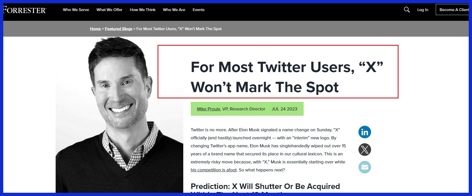
Polls and popular tags indicated passion for the new branding. In a multinational poll of 11,000, 31% hated the rebrand, while only 22% liked it. A Forrester study found that 43% thought renaming Twitter to the X symbol was a blunder. Twitter erupted with memes and jokes, along with a bit of nostalgia for the old logo.
For weeks, users had been seeing both the old and new branding on the site, which felt uncomfortable and seemed like a sloppy rebrand. The sudden rebranding raised concerns about the actual font and design choices.
-
Common themes in user feedback:
-
Nostalgia for the blue bird icon and “Twitter” name.
-
Just confused, seeing two logos simultaneously.
-
Concerns over brand stewardship.
-
Excited to see what features the future holds tied to “X.”
-
Ambivalence about the appearance and sensation of the new logo.
-
Public and expert reactions indicate that when users feel excluded or lost, they might drift away from the social media platform. Passionate responses demonstrate that individuals continue to be concerned over the site. If the brand listens, it can pivot and regain trust.
Graphically.io, for example, aids brands in handling such changes seamlessly and avoids jarring rollouts. As sentiment changes, participation may increase or decrease. A few users might like the new look, while others wait for actual changes.
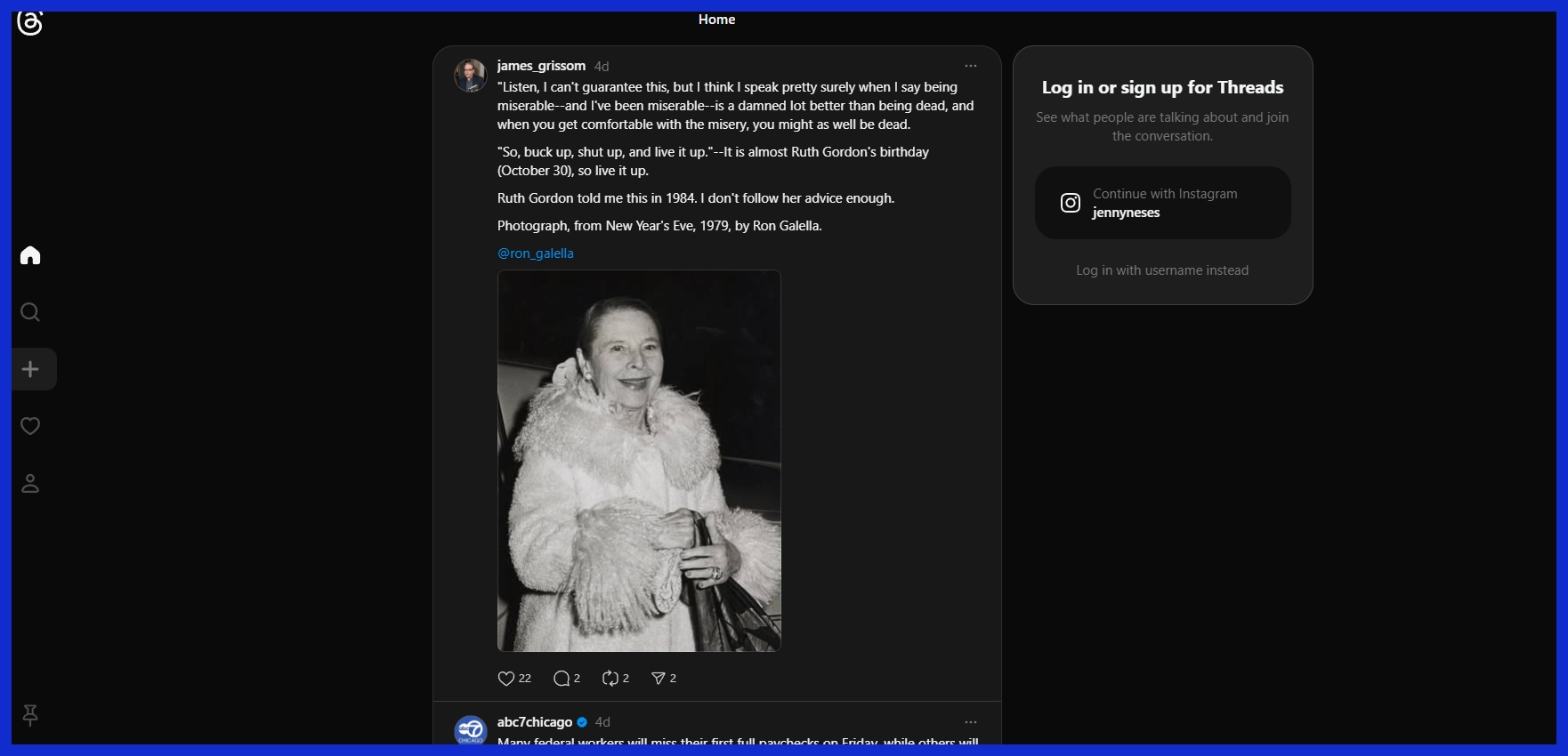
The logo, by itself, turns into an emblem of whether the platform hears, an opening act for long-term loyalty or churn. Also during this time of heated debate over whether people liked the new changes of Twitter, Meta uses that advantage and launched “Threads,” which is connected to your Instagram platform.
Brand Analysis
The brand’s position before the logo change was clear: Twitter stood for real-time updates and global conversation. Following the transition, “X” indicated a shift to a larger technological ambition. The table below sums up the shift:
|
Aspect |
Before (“Twitter”) |
After (“X”) |
|---|---|---|
|
Brand Identity |
Social media, news, conversation |
Tech platform, innovation, unknown |
|
Visual Symbol |
Blue bird |
Stylized “X” |
|
Brand Equity |
High, widely recognized |
Risked billions, faced uncertainty |
|
User Perception |
Familiar, trusted |
Split, cautious, curious |
So competitively, X now shines in a crowded space, but risks confusion. Some view the move as courageous, others as foolhardy. The new identity intends to fit Musk’s goal of an “everything app,” but the implementation, including clumsy logo swaps and squandered brand equity, damaged the shift. By early 2024, over 1,700 advertisers and 90 of the top 100 ad spenders had returned, signaling a rebound.
Conclusion
Difference pops. Twitter’s new X logo really stirred up conversation, from quaint Parisian boutiques to Manhattan tech sardine cans. Replacing the blue bird with a bold X disrupts more than the brand; it disrupts users’ emotional connection to it. Some cheer, some shake their heads, but it makes an impact. You want to hear an honest opinion? brands that dare to do something bold are often the ones that set new ideas in motion. Imagine what a little logo edge means in the conversation at the next coffee break or team meeting.
Want your brand to pop, too? Graphically.io lets you reinvent your image, not just in a snap of the fingers, but with heart and craftsmanship. So let’s make your next move.
Frequently Asked Questions
What is the new Twitter X logo?
Twitter’s new X logo replaces the iconic blue bird with a minimalist, aggressive design, marking a significant change in the social media platform’s brand identity.
Why did Twitter change its logo to X?
Twitter changed its logo to the official X logo as part of a sudden rebranding. This aims to indicate a new direction and vision for the social media platform under its present leadership.
How has the public responded to the X logo?
Responses to the X logo are polarizing, as many appreciate the bold shift in brand identity design, while others nostalgically yearn for the old Twitter logo.
Who designed the Twitter X logo?
The X logo emerged during Elon Musk’s tenure, reflecting his vision for the social media platform’s evolution and the new brand identity design.
What does the X in the new logo represent?
The X symbol is a representation of Twitter’s new era, reflecting a sudden rebranding as the platform evolves beyond microblogging into wider digital services.
Has the Twitter app icon also changed to the X logo?
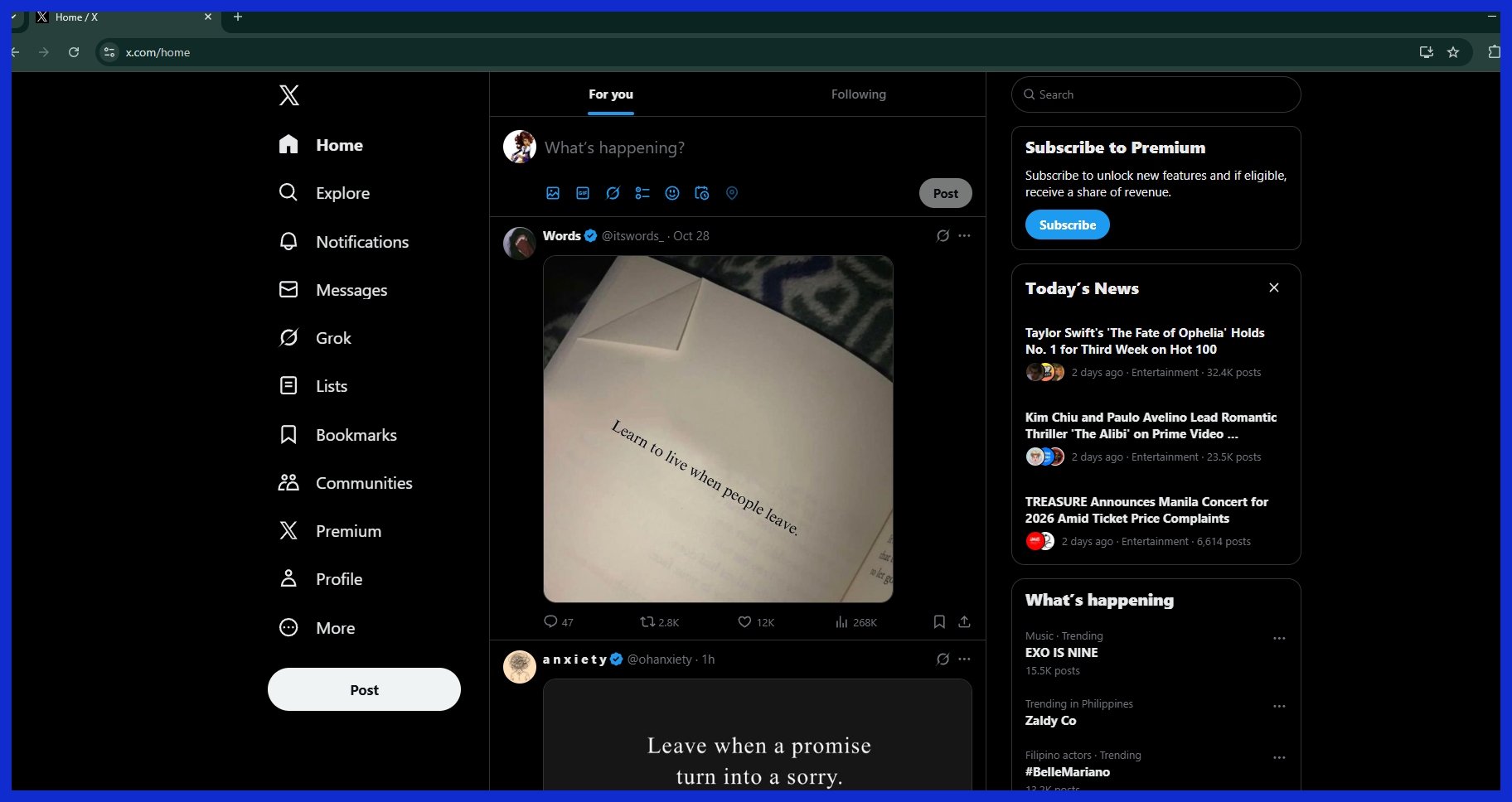
Yep, the Twitter app icon has undergone a redesign; that blue bird has been replaced with the new X logo across much of the digital real estate and user interface.
Will the Twitter name also change to X?
Speculation is swirling about the social media platform Twitter being renamed to the official X logo. For the time being, it’s still widely known as Twitter.