Table of Contents
- Key Takeaways
- Beyond the Logo
- Crafting Your Corporate Identity
- The Psychology of Perception
- Maintaining Visual Harmony
- Measuring Identity Impact
- Conclusion
- Frequently Asked Questions
- What is corporate identity in graphic design?
- Why does corporate identity go beyond just a logo?
- How does corporate identity influence customer perception?
- What are the key elements of a strong corporate identity?
- How can companies maintain visual harmony in their branding?
- How is the impact of a corporate identity measured?
- What trends are shaping the future of corporate identity design?
Key Takeaways
-
Corporate identity is so much more than a logo. It’s every element that influences the way people experience your brand.
-
Your foundation for a compelling and enduring corporate identity begins with a well-defined brand strategy, grounded in your core values and consistent with your objectives.
-
Be consistent. Use the same style, color palette, and voice at every touchpoint, and you’ll make your audience trust and recognize you.
-
Storytelling and consistent brand voice make your message accessible and forge enduring emotional connections with customers.
-
Periodically audit and refresh your brand guidelines to keep your identity current within shifting markets and trends.
-
Tracking its impact via feedback and analytics lets you adjust strategies and brand success.
Corporate identity graphic design determines how a business appears and resonates to the rest of the world. Clean logos, coordinated colors, and crisp fonts convey your narrative in an instant. Small business owners and agencies use these to build trust and stand apart.
Good design unites teams and helps win clients in cluttered marketplaces. In this post, discover what makes for great corporate identity design and why it matters for growth and brand trust.
Beyond the Logo

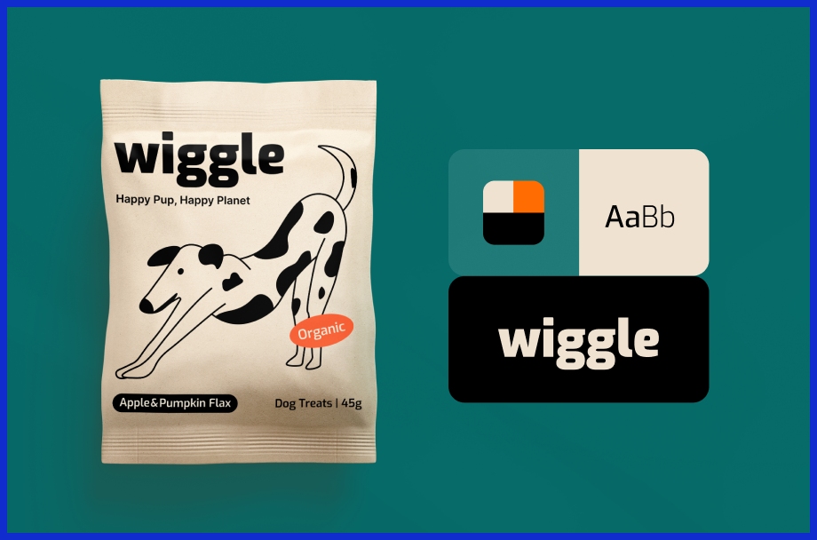
Corporate identity is more than a logo. It’s about all the things that influence how people perceive and experience a brand. A logo is just the beginning. It’s more than the logo, the color, type, shapes, photos, and the use of words. All parts collaborate, narrating a tale that people notice and believe in.
When a company really gets this right, it makes it easier for customers to recall them, even in a world cluttered with messages and advertising everywhere. Brand assets are what create a consistent brand experience wherever you encounter the company. Picture those same colors and fonts on a business card, a website or social media page.
This is what makes the brand feel grounded, not fragmented. You see a particular red or pristine font and you immediately know what soda bottle it is. That’s no coincidence. It’s completely mapped out with a visual identity system. At Graphically.io, we assist brands in aligning all these elements so they consistently appear and resonate the same way, whether an individual encounters an online ad or physically handles a product.
Brand personality counts as much as the appearances. It’s the sensation that remains after each time they see a post, go into a store, or receive an email. A personality will make you heard, even if there are thousands of other voices out there screaming for attention.
For instance, while certain brands win people over by being playful and fun, others win trust by sounding smart and steady. The proper look and feel goes a long way toward establishing these tones. A great identity uses the little things to represent not just what a brand sells, but what it is about.
Below is a quick look at what goes into good logo design and why it is more than just a mark:
|
Feature |
Pros |
Cons |
Data/Facts |
|---|---|---|---|
|
Simplicity |
Easy to remember, works everywhere |
Might look plain |
Simple logos are 13x more likely to be seen |
|
Versatility |
Fits on any size or screen |
Hard to design well |
80% of brands value multi-use design |
|
Uniqueness |
Stands out, hard to copy |
Risk of being too odd |
Unique marks boost recall by up to 60% |
|
Storytelling |
Connects on an emotional level |
Needs deeper thought and planning |
79% say stories sway buying choices |
|
Timelessness |
Stays fresh for years |
Can take longer to get right |
Timeless logos avoid costly rebrands |
Brands can’t just have a cool logo anymore. They’re spotting brands everywhere from social apps to new tech like VR and AR. A brand’s voice, look, and vibe all have to be consistent as well.
The goal is to generate a confidence-inspiring, solid-with-a-streak-of-fun sensation that builds trust, ignites emotion, and drives return visits. At Graphically.io, we collaborate with clients to construct all these brand elements, not just a logo, to assist them in differentiating themselves in a crowded world.
Crafting Your Corporate Identity
Your corporate identity reflects who your company is, what it stands for, and how it wants to be perceived. More than a logo or a color scheme, each experience, each design, and each word paints a picture in people’s heads. A lot of entrepreneurs discover that a defined corporate identity reinforces their credibility with customers and establishes trust.
For digital agencies and tech consultants, a well-made identity keeps teams aligned and helps attract the right customers.
1. Strategic Foundation
Begin by scribbling down your brand’s core values. These are the values that inform decisions and influence your company’s behavior. If you make these values prominent, all your branding decisions will seem natural.
Second, determine your target market. Are you targeting startups, local businesses, or international technology companies? When you know your audience, you can tailor every aspect of branding—from your logo to your emails—to them.
Marrying your company’s culture with its identity is crucial. If your team breathes the brand, customers resonate with that. Apply insights, think customer feedback and market research, to see if your branding resonates. If it doesn’t, adjust until it does.
Many brands conduct a brand audit to understand how people perceive them and what needs to shift.
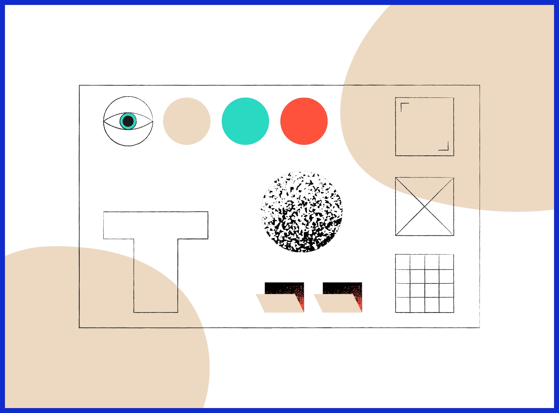
2. Visual Language
The visual component of your brand is what usually catches people’s attention initially. Your logo, for instance, becomes your business’s face. It needs to be clear, identifiable, and represent your business.

Don’t stop with a logo. Construct an entire visual system with fonts, colors, and design elements. Use only three to four primary colors and select one or two fonts from the primary categories: serif for classic, sans serif for contemporary, script for elegance, and display fonts for punch.
Maintain your style consistently online. If your site, your social media, and your print materials all match, they’ll remember you. At Graphically.io, I often assist clients in constructing these systems so that everything—from business cards to billboards—appears and feels like it’s from the same company.
3. Verbal Expression
How your brand reads is as important as how it appears. Determine whether your voice needs to be more formal, amicable, or even a little bit irreverent. Compose communications that reinforce your brand promise and mission.
A great story makes your brand memorable. Post about your path, your triumphs, and your tribulations—these make you more relatable. Be certain your language and voice are consistent on your site, emails, and social posts.
4. Systematized Guidelines
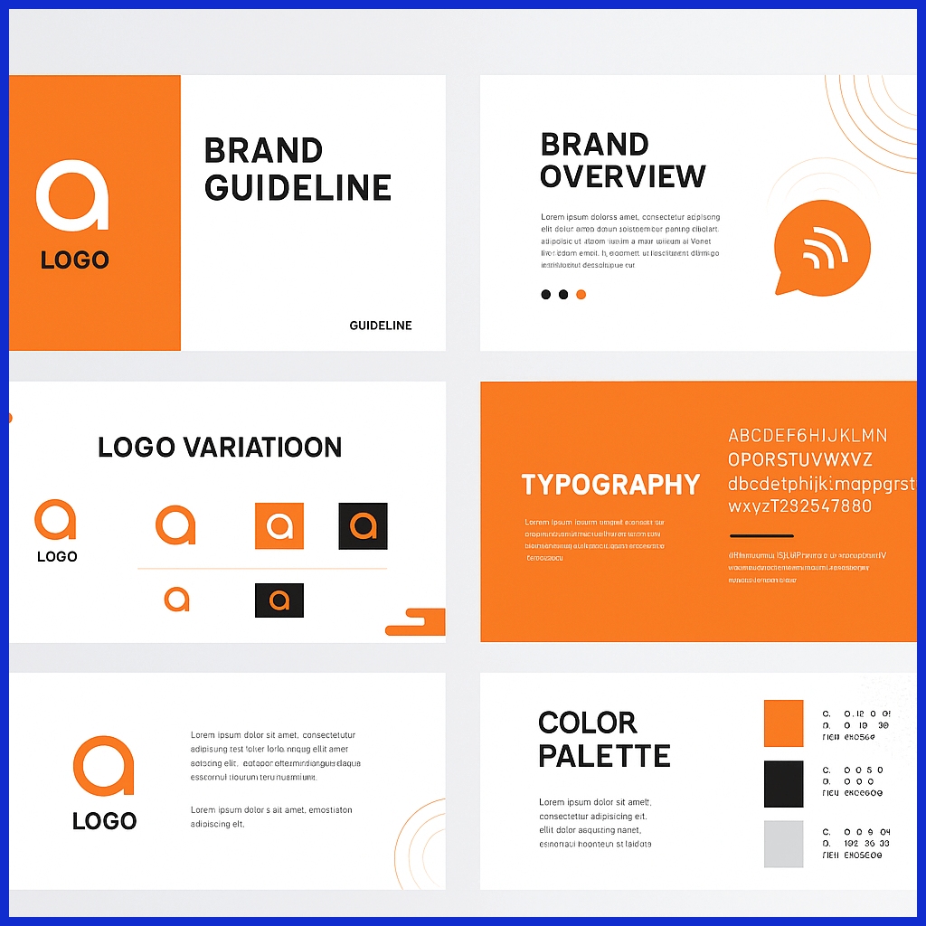
Define explicit guidelines for your brand. This entails documenting usage of the logo, color choices, fonts, and more. Create a guide that anyone in your company can consult.
Organize all your assets in one place, such as a brand portal, so your team and partners are always using the correct files. Update these rules frequently to stay aligned with trends or when your business changes.
5. Sensory Experience
Branding isn’t just what we see or read. It’s not just what we see, but what we hear and feel. Think about using smells, textures, or sounds in your brand – like when you get a call from your bank or the aroma in a hotel lobby.
These specifics make you memorable. For digital agencies, even the tactile impression of your site or the soundtrack in a video ad influences how clients perceive your brand. The more senses you touch, the more lasting connections you make.
The Psychology of Perception
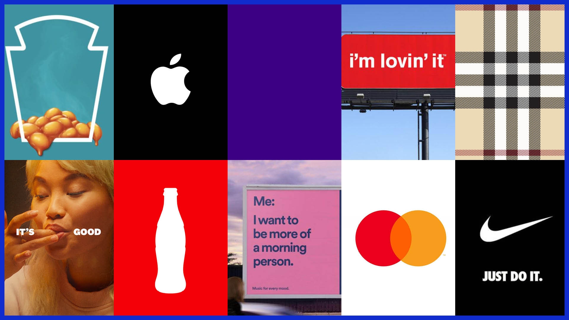
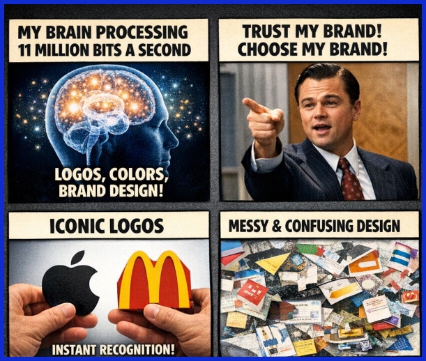
Corporate identity graphic design influences how consumers perceive a brand. Our brains can work fast, about 11 million bits a second, and they rely on shortcuts to interpret what we see. That’s why an effective logo or a particular color or style can linger in someone’s mind long after they see it.
For small business owners and agencies, it’s not merely about appearing nice. The right brand identity design makes people trust your brand, remember your brand, and even prefer your brand.
Visual branding penetrates deep into our psychology as consumers. When we have a logo composed of basic forms, the brain attempts to find the contours initially. This makes it easier for them to recognize the brand even in a crowded environment.
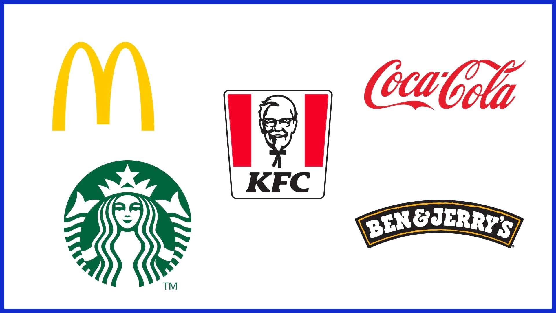
Consider the silhouette of a bitten apple or a striking golden arches “M.” According to the Gestalt Principle of Proximity, if things are close together, such as a logo and a slogan, people perceive them as connected. Altering the spacing between logo elements can change what people perceive they belong to.
That’s why the design of every visual has an impact, from business cards to entire websites. Colors evoke emotion and even alter purchasing decisions. Red can express vitality or prompt a call to action, while blue tends to convey a sense of steadiness and tranquility.
These emotions aren’t arbitrary. Color psychology functions as it does because our brains respond to color signals from early childhood. For an international company, it pays to find out what colors signify in each culture.
Big brands have understood this for years. For small teams, it’s just as crucial. Partnering with a service like Graphically.io can help keep it all on track, ensuring that each new graphic is consistent with what preceded it.
Gestalt psychology refers to “emergence”—perceiving whole forms from myriad parts. When you gaze at a new logo, your mind completes shapes and makes snap assumptions. The cleaner and clearer the design, the quicker the mind can accomplish this.
If brand identity is cluttered or confused, it’s forgettable and untrustworthy.
|
Branding Element |
Consumer Impact Example |
Psychological Principle |
|---|---|---|
|
Color |
Blue calms, red excites, green reassures |
Color Psychology |
|
Shape/Outline |
Recognizable logos aid quick recall |
Simplicity, Emergence |
|
Proximity |
Grouped icons feel linked |
Gestalt Principle of Proximity |
|
Consistency |
Same look across platforms builds trust |
Halo Effect, Trust |
|
Spacing |
Tight groups feel related; spread out, less so |
Spatial Relationships |
Maintaining Visual Harmony
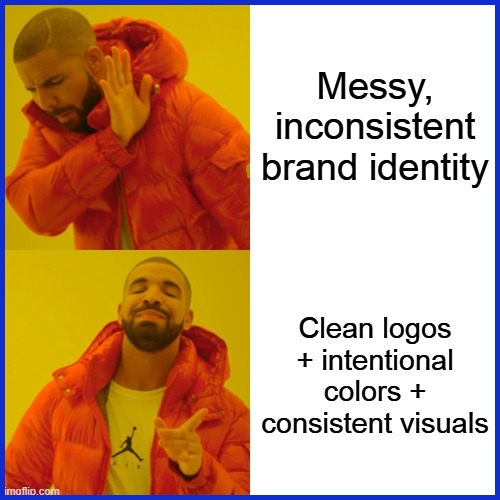
About keeping it visually harmonious, a cohesive brand identity is essential. It prevents brand assets from communicating mixed messages, aids individuals in identifying your brand quickly, and makes all interaction points seem related. When your logo, brand colors, type, and images all run together, you create a look that is memorable and trustworthy.
Stylish consistency, one lighting style, one illustration stroke weight, one main shape, tells a crisp, welcoming brand story. It’s not just about aesthetics. Research demonstrates that brands that have a consistent visual aesthetic are three and a half times more likely to be noticed and almost eighty percent more likely to be remembered than those with a haphazard appearance.
Sticking with a limited color palette makes a real difference in your brand identity design. Choose two or three primary colors and a couple of accent colors that harmonize. This keeps things tidy and prevents layouts from appearing cluttered. The same holds true for fonts. Keeping just two or three typefaces across all your branding materials helps people identify your brand, whether it’s on a website, a business card, or a social post.
Measuring Identity Impact
Measuring identity impact isn’t only visual. It’s about the identity impact of your brand — how your brand aligns with your business objectives and the way people experience your brand each time they encounter it. A bad identity is more than a logo. It’s your colors, fonts, tone and every touchpoint that tells them it’s you if they visit your website, an ad or a social post.
For small business owners and agencies, understanding whether your brand identity is working can help you spend intelligently and grow more quickly. Begin with crystal-clear measures to verify that your identity is on target. These should relate back to your objectives, such as increased sales, improved brand recall or increased loyalty.

One quick win here is to make sure your brand is displayed consistently everywhere—on your site, your emails, your socials. A coherent brand can boost your revenue by 10 to 20 percent and some studies say even by 23 percent. That’s huge for companies attempting to squeeze the most out of every dollar. Not sure where to begin? At Graphically.io, we always recommend creating a basic checklist with your essentials, such as logo positioning, color scheme and voice. This allows you to catch flung particles before they stab your identity.
Surveys and feedback are nuggets of gold for real world perspective! Here’s a trick — ask your customers what they think when they see your brand. Does it feel trustworthy? Do they recall you? One such survey asks you to display your logo with others and then asks which they remember first. Because 60% of people identify brands by their look, a visual identity is essential.

Don’t simply run a survey once and drop it. Make seeking feedback a habit. Customer tastes shift, and what works for one group may not resonate with another. Account for things such as age, culture, and buying behavior. For digital agencies, running a quick poll post campaign or leveraging online review tools can provide you with an obvious pulse on your brand’s vitality.
Digital analytics provide another lens into what’s working. Look at stuff like search volume for your brand, click-through rates on your posts, or online chatter. Monitor these metrics to determine whether your work is effective. If you observe brand searches or mentions increasing, your identity is gaining attention. If not, maybe it’s time to adjust your imagery or your copy.
Tools like Google Analytics or social listening apps can illustrate the numbers for you in the moment.

Checklist for measuring corporate identity effectiveness:
-
Is your branding consistent across all channels and materials?
-
Do customers recall your brand easily?
-
Are you seeing steady or growing brand mentions online?
-
Does feedback show trust and positive perception?
-
Are sales or inquiries increasing after branding changes?
-
Do your visuals appeal to your core customer groups?
Conclusion
Powerful brands don’t just arrive. They sprout from bold signals, brilliant decisions and a little bravery. See the forms, the hues, the verbiage that impresses itself upon memory—these establish credibility. A slick appearance can energize a little shop or accelerate a large team. Just try to keep up with the real thing. Remember that coffee shop with the striking bright blue cup or tech firm that stays visually tight on every screen. These decisions ignite honest conversation and cultivate deep roots. Prepared to leave your imprint? Try Graphically.io. Simple. Fast. Smart. Design. Give your brand room to breathe and flourish—the right way.
Frequently Asked Questions
What is corporate identity in graphic design?
Corporate identity graphic design involves effective logos, brand colors, and imagery that create a cohesive brand identity.
Why does corporate identity go beyond just a logo?
Corporate identity encompasses more than just a logo; it includes colors, typefaces, and design styles that combine to create a cohesive brand identity and memorable brand image.
How does corporate identity influence customer perception?
A powerful corporate identity establishes confidence and legitimacy. It defines how others perceive your business and can give your business a more professional and trustworthy appearance.
What are the key elements of a strong corporate identity?
These should feature a distinctive logo, cohesive brand identity elements, a uniform color scheme, legible fonts, and comprehensive brand guidelines. These assist in making your brand visible everywhere.
How can companies maintain visual harmony in their branding?
Businesses maintain a cohesive brand identity by using style guides, ensuring consistent branding through the same colors, fonts, and styles across all marketing collateral for a unified appearance.
How is the impact of a corporate identity measured?
Businesses track identity effectiveness by measuring brand awareness and customer reviews, while analytics assess how connected the brand identity is with potential customers.
What trends are shaping the future of corporate identity design?
Digital-first branding and minimalism are key trends in effective brand identity design.