Famous snack logos pop with bright colors, playful typography, and clean-cut shapes that immediately attract attention. Snack brands leverage these logos to foster trust and assist consumers in recognizing their products quickly in crowded retail environments.
Certain logos, whether for chips or chocolate bars, incorporate fun imagery or an approachable mascot. In the next piece, discover how these snack logos influence decision-making and why they linger in your memory.
The Psychology of Cravings
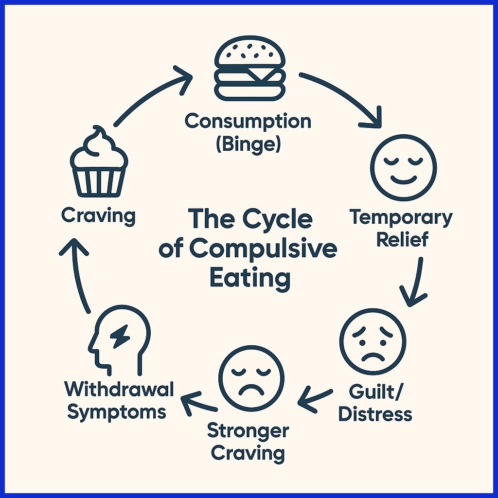
Snack logos don’t just help brands stand out. They serve a primal, psychological purpose, too, tapping into deep cravings and emotions. We eat with our eyes first. Research demonstrates that consumers form impressions about a brand in 90 seconds, with the majority of those impressions based on visual cues.
When snack brands nail their logos, they don’t just catch the eye. They ignite hunger, faith and even a little nostalgia. Colors, shapes, font choices, and mascots all play a role.
1. Color
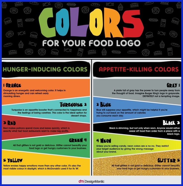
Red attracts and has people salivating. It’s why you find it in so many snack brands, from chips to soda. Yellow promotes cheer and warmth. Green indicates freshness, which is why you’ll typically see it on healthy snacks.
Studies associate hues such as red and yellow with appetite stimulation and accelerated decision-making. These colors can even encourage individuals to complete tasks with greater speed simply by observing them. Reliable colors establish trust.
If packaging or ads shift colors too frequently, customers can become disoriented or suspicious of the brand. Eye-popping colors use snacky conjuring tricks to help snacks leap out from cluttered shelves, so people can easily find their yum-yums.
2. Shape
Easy logo shapes like circles and ovals communicate comfort and a feeling of community. Keen, edgy geometric forms may symbolize either tasty spices or risk-taking. Brands that rely on specific shapes, consider the Pringles oval and the three-pointed Doritos triangle for instance, stay with people.
Certain shapes get tied to specific snacks: triangles for chips and circles for cookies. Geometric shapes can make a brand seem stable and reliable. Snack brands do well with logo shapes that are memorable and catch the eye at a glance.
For agencies or consultants, a smart curve in a logo can be the difference between unloading and a lost opportunity.
3. Font
Typography can communicate whether a snack is playful, adventurous, or reliable. Playful, hand-written fonts resonate with kids and families. Bold, blocky typefaces communicate trust and durability, which aids new items.
Readable fonts build trust. If they can’t read the name, they won’t remember it. Graphically.io double checks font selections to ensure they align with the brand’s narrative.
4. Mascot
It’s mascots that bring logos to life. A buddy character, a tiger or bear, for example, brings a brand closer, particularly to kids and families. They can tell tales, offer advice, or feature in commercials.
Mascots like the grinning Cheetos cheetah or the Kool-Aid Man become pop culture fixtures over time. They make consumers feel connected to the brand.
5. Nostalgia
Old-school logos or retro designs can bring back those childhood snack and good times memories. A lot of brands employ this effect, such as reviving a retro logo, to woo older consumers or instigate nostalgia.
By using nostalgic designs, they’re making people crave those snacks not only for their flavor, but for how comforting and memorable they are. This easy hack drives loyalty and sales, even in difficult or emotional moments.
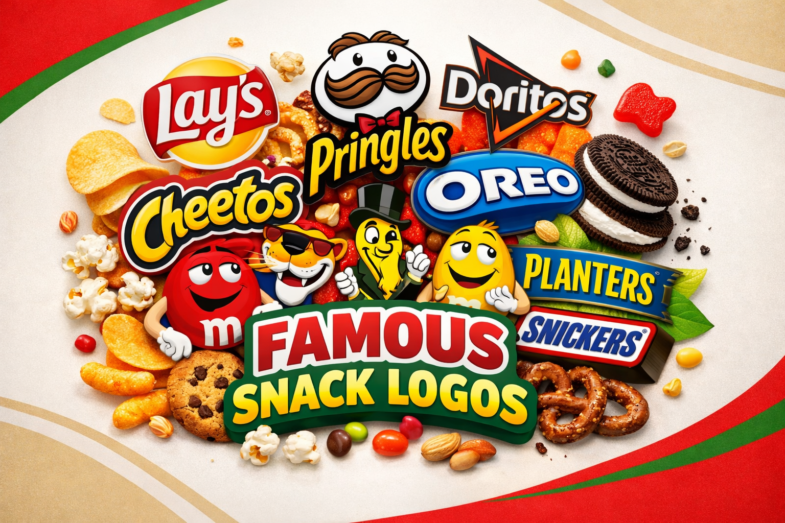
Top 20 Famous Snack Logos
To understand why some snacks, like chocolate candy bars and savory snacks, dominate the global market, we have to look at the visual identity that greets us in the aisle, including famous candy logos. Here is a breakdown of 20 legendary snack logos and what makes them work.
1. Lay’s
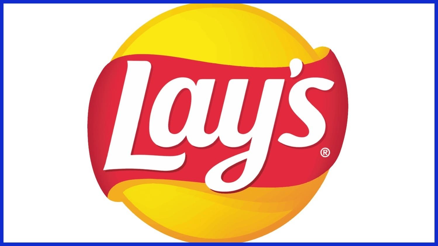
The logo features a bright yellow sun-like circle with a red banner draped across it. This combination is a classic appetite stimulant; the yellow promotes a sense of cheer and ‘sunny’ snacking, while the red draws the eye and triggers hunger, reminiscent of familiar candy logos that evoke warmth and welcome.
2. Pringles
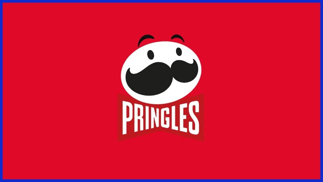
Centering on the “Mr. P” mascot with his iconic mustache and bowtie, this logo personifies the brand. The oval shape of the character’s head mimics the unique shape of the chip inside. It works by creating a friendly, recognizable face that stands out on tall, cylindrical cans.
3. Oreo
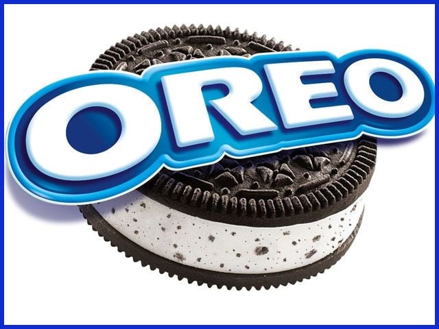
This logo features a bold, white sans-serif wordmark set against a deep blue background, embodying the essence of trust and reliability. This design mirrors the clean, circular shape of the cookie, making it a favorite among American snacks, much like popular candy logos such as Snickers and Oreo.
4. Doritos
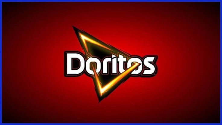
A sharp, fiery triangle pierces through the center of the ‘o’ in the wordmark. This edgy, geometric design symbolizes the crunch and the bold intensity of the flavor, effectively representing the adventurous personality of popular snacks like tortilla chips and chocolate candy.
5. Cheetos
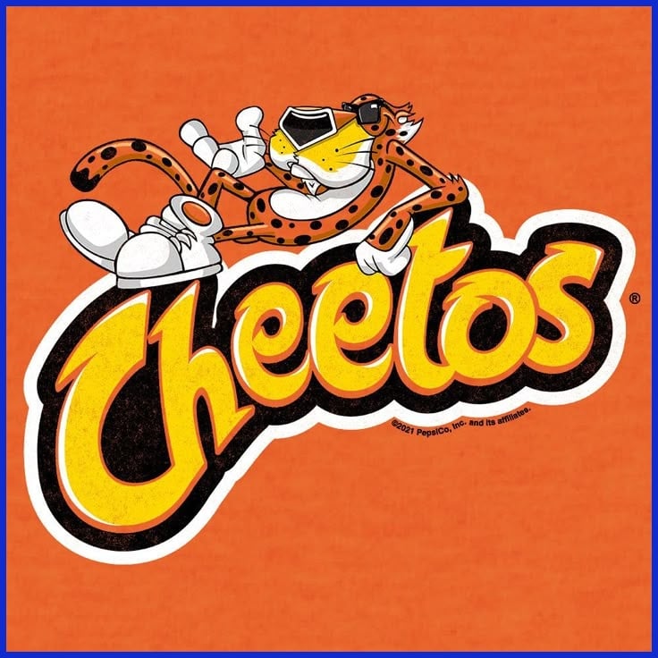
The logo, often paired with Chester Cheetah, a cool mascot with sunglasses, embodies the essence of the snack industry. This stylized, energetic font suggests a ‘dangerously cheesy’ experience, making it a favorite among younger audiences who enjoy savory snacks and popular candy.
6. Kit Kat
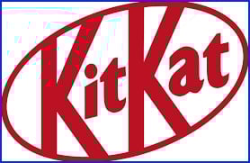
The red oval “stamp” with a slanted, thick white font resembles a seal of quality, much like familiar candy logos. The high-contrast red and white palette generates a sense of urgency and excitement, effectively highlighting the “break” ritual associated with favorite treats like chocolate candy bars.
7. Snickers
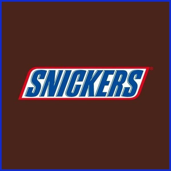
Using a thick, blue block typeface inside a white rectangle with a thin red border, this candy logo looks ‘heavy.’ It works because the bold, masculine font choice communicates that the chocolate candy bar is substantial and filling, perfectly aligning with their ‘Satisfies’ branding.
8. M&M’s
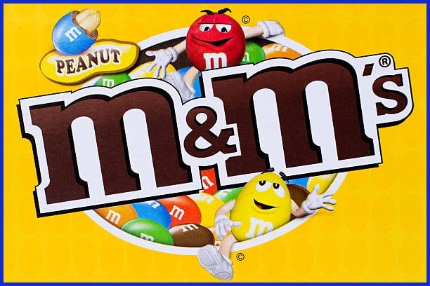
The logo features soft, rounded, lowercase “m”s that feel approachable and friendly, reminiscent of favorite candy logos. By using lowercase letters instead of capitals, the brand feels less like a corporation and more like a delightful treat, anchored in its chocolate roots.
9. Reese’s
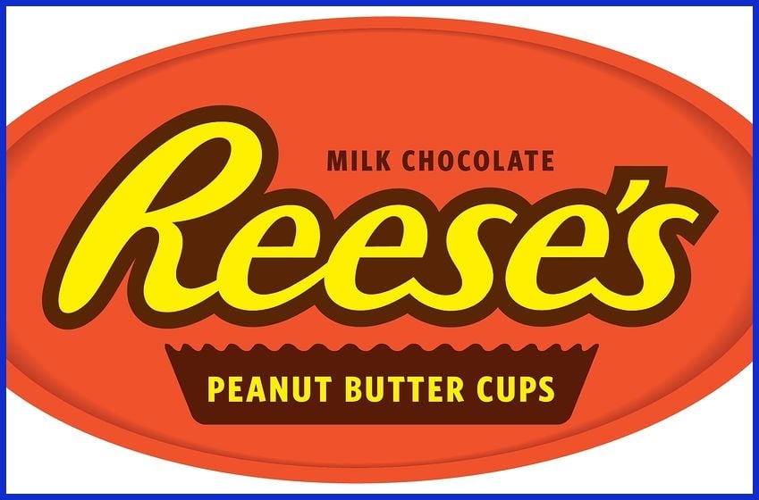
With its distinct yellow-orange font and thick brown border on a bright orange background, this candy logo is impossible to miss. It works through ‘flavor signaling’—the orange and brown immediately tell the consumer to expect the unique taste of peanut butter and chocolate before they even read the name.
10. Hershey’s
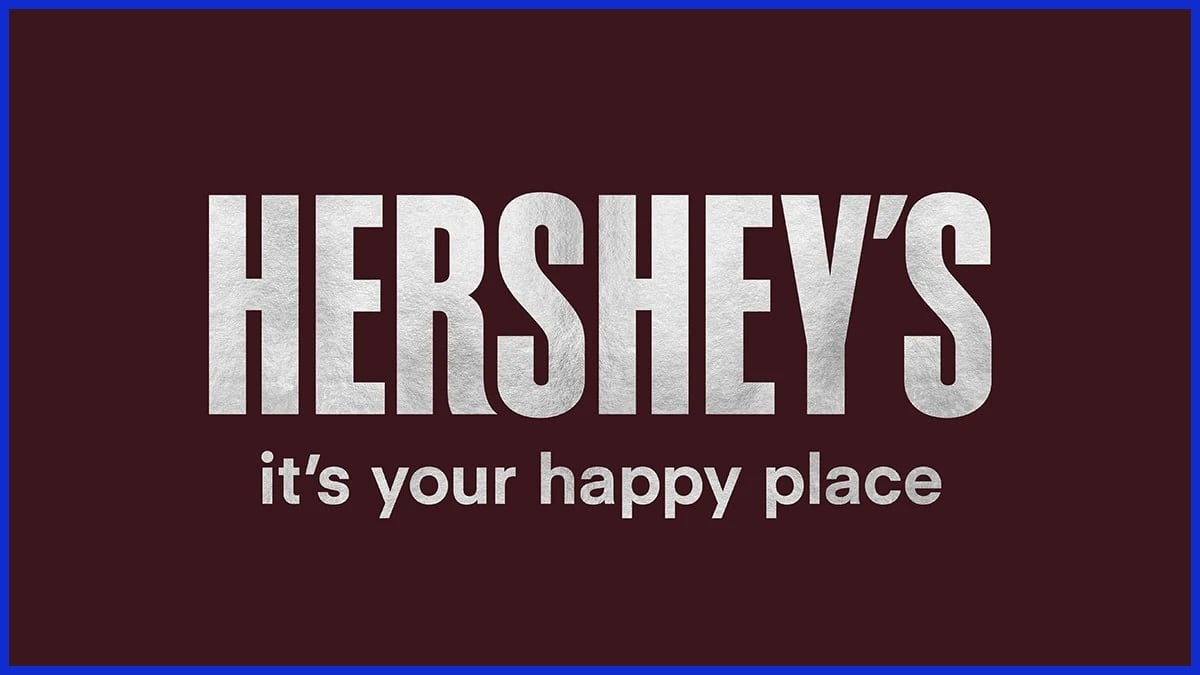
A rigid, silver-white block font sits on a dark chocolate-brown background, reminiscent of famous candy logos. It looks like an industrial stamp or a classic sign, leaning into heritage; it feels like an authentic, 100-year-old American original that you can trust.
11. Goldfish
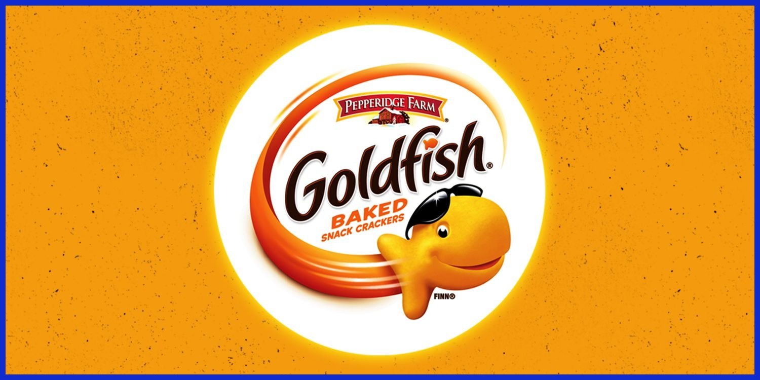
The “snack that smiles back” features a grinning orange fish wearing sunglasses, embodying the essence of popular snacks. This playful design adds a “cool” factor to a wholesome baked snack, making it highly engaging for kids and resonating with parents in the snack industry.
12. Ritz
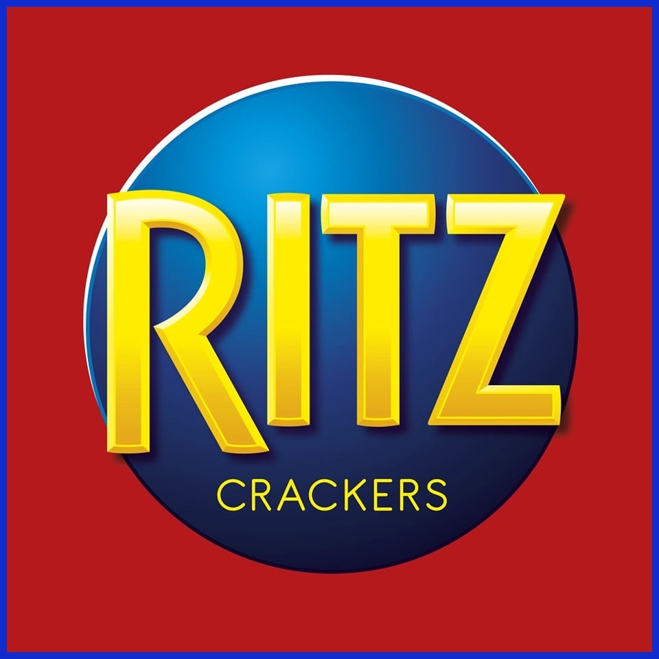
This logo places a yellow wordmark inside a blue circle, usually set against a red box. It uses a “power palette” of primary colors that feel premium yet classic. It works because it suggests a high-quality, stable product that has been a pantry staple for decades.
13. Skittles
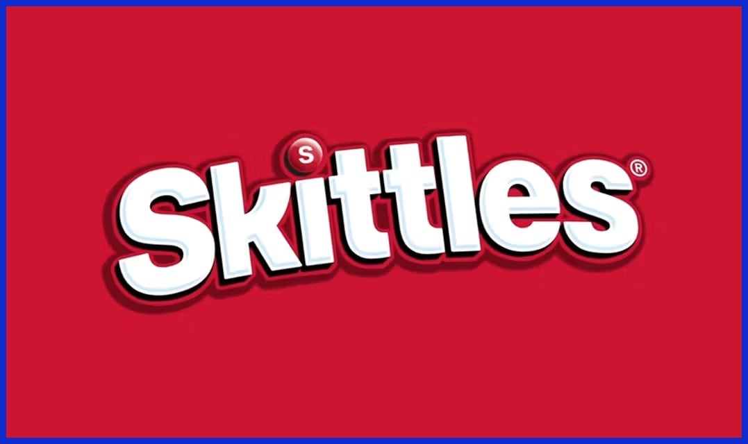
A vibrant rainbow arc sits above a white, bubbly script, reminiscent of popular candy logos. This design is a literal representation of their “Taste the Rainbow” slogan, promising a multi-flavored experience that embodies the essence of unique candy.
14. Toblerone
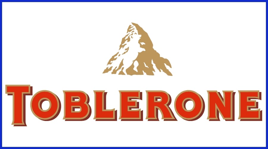
A gold serif font is paired with a mountain peak (the Matterhorn) that contains a hidden bear silhouette, creating a unique candy logo. This design rewards the observant consumer with a ‘hidden secret,’ building a clever connection with the brand.
15. Ferrero Rocher
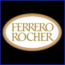
The logo, resembling a high-end sticker, features an elegant, gold-bordered oval design that embodies the essence of luxury and prestige. This classy candy logo elevates the chocolate from a simple snack to a ‘giftable’ premium experience.
16. Pocky
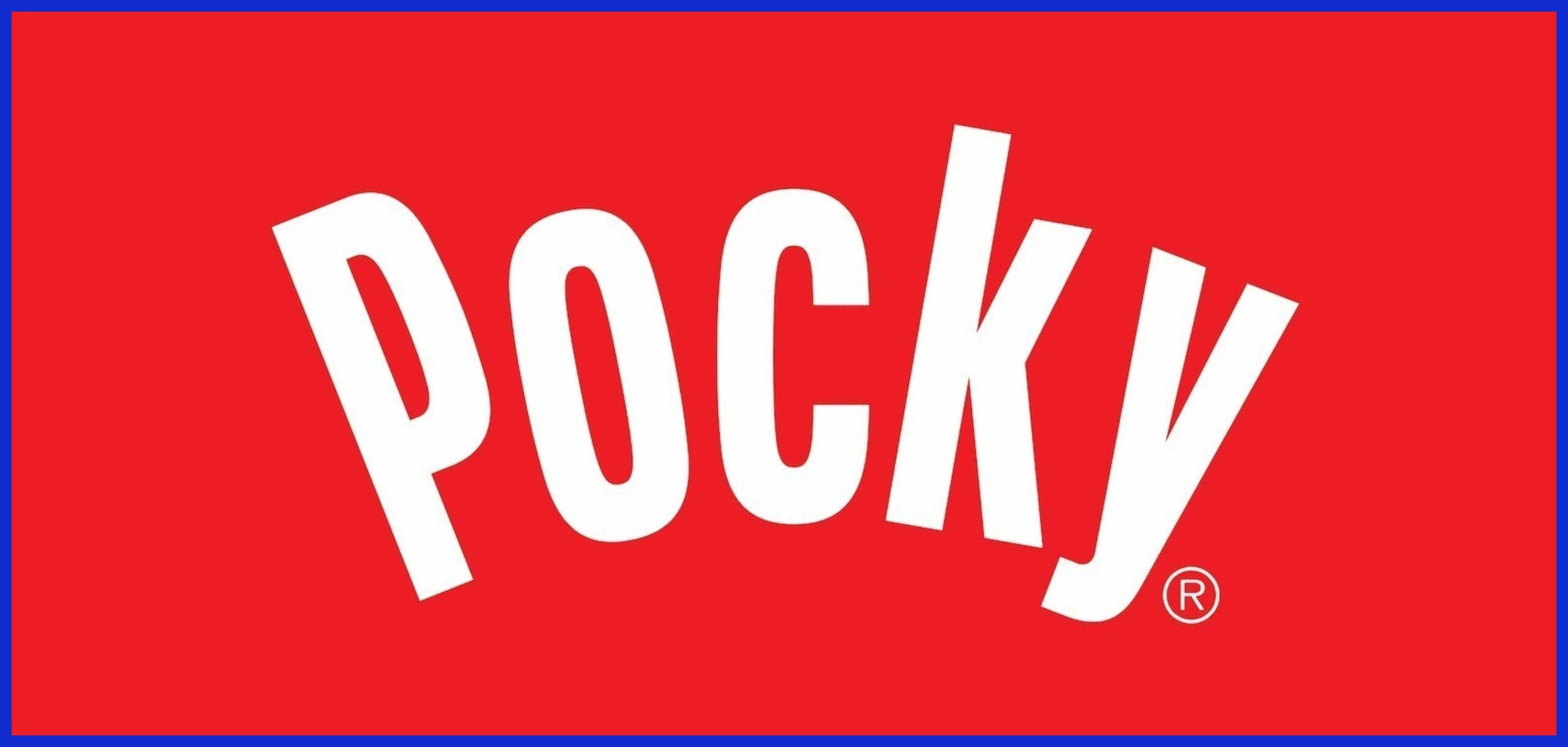
This minimalist logo features a red, modern font with a small red dot reminiscent of the Japanese flag. It works through simplicity; the clean lines reflect a modern snacking experience while subtly nodding to its unique candy origins.
17. Kinder
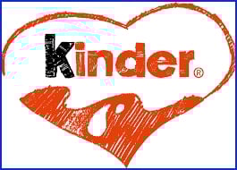
The logo, featuring a mix of black and red font along with a graphic of a ‘drop of milk,’ cleverly incorporates visual cues to reassure parents. This milk imagery not only suggests nutrition and calcium but also balances the perception of chocolate candy as a ‘sweet treat’ with a healthier twist.
18. Cheez-It
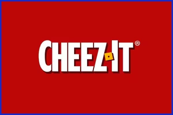
The logo is a square, red-orange box that mimics the actual shape of the cheese cracker. This consistency between the logo and the product shape works by reinforcing brand recognition—when you see a red square, you think of a familiar candy logo like Cheez-It.
19. Haribo
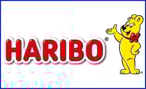
The bubbly red font, often paired with the joyful “Goldbear” mascot, resembles familiar candy logos. The rounded, “fat” letters evoke the soft, chewy essence of gummy candy, appealing to the sweetness and nostalgia of the kid in all of us.
20. Takis
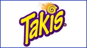
A purple swirl with a “fire” graphic on the “i” signifies intense heat. The use of purple is unique in the snack industry, which helps it stand out as a “niche” or “challenge” snack. This innovative design attracts Gen Z consumers looking for familiar candy logos and unique flavors.
A Logo’s Evolution
A snack logo, such as the famous candy logos we recognize today, is not just an image; it’s an icon that links nostalgia, flavor, and faith. Over the decades, these logos have evolved to stay in step with trends, technology, and consumer preferences.
-
Know when a refresh is needed by studying trends and consumer needs.
-
Hear what people say, discover what resonates and what is outdated.
-
Use clean shapes and fewer colors for instant recognition.
-
Ensure the logo is attractive on screen and in print.
-
Keep some core features to protect the brand’s identity.
-
Try out new designs on device screens, packaging, and social profiles.
-
Refine details often, rather than big overhauls.
Responsive logos transform for every platform. Imagine a full logo on a website yet only the icon for a phone app. Animation can breathe life into a logo, so it moves, shifts, or plays with a tap. About a logo’s evolution. So imagine Google’s G or the Pringles face winking in a GIF.
The Unseen Impact
Popular treat logos accomplish more than attention. They operate in unseen ways to influence what we purchase, recall, and believe. These tiny chunks of design exist to push us toward selecting a bag from the aisle, to lure us back again and again, and to create a relationship beyond flavor.
The checklist below details the subtle ways logos influence our choices:
-
Create instant recognition through colors, shapes, and symbols
-
Try subliminal or witty white space to create intrigue.
-
Establish faith by being present everywhere, on every package and ad.
-
Connect with personal or cultural totems to bond at a more profound level.
-
Narrate or allude to principles that transform every munch into significance.
Shelf Presence
A logo’s influence begins at the shelf, especially for popular candy brands. A daring design makes a snack leap from a sea of competitors, luring the eye with color and form before we even see the label. When shoppers stroll down a crowded aisle, their eye catches on a bright red or cool blue, perhaps reminiscent of familiar candy logos or the unique flavors of chocolate candy.
Brand Memory
Logos make us remember snacks days after the bag is gone. A logo with an obvious, straightforward icon lodges in memory and assists customers to remember it when they’re back at the counter. Think Pringles face or Oreo wordmark – simple to remember, simple to see again.
Repetition counts as well. The more frequently we see a logo, the more it sears into memory. Secret messages or witty icons make a logo into a mini mystery, providing us with a reason to look twice and recall it more easily.
Emotional Connection
Great logos do more than remind—they make us feel. If a logo utilizes shapes or colors that evoke the essence of favorite snacks or popular candy, it induces affinity. Snack logos, like those of famous candy logos, tend to tap into a personal or shared iconography, such as the mischievous tiger on Frosted Flakes or the warm, homemade aesthetic of Pepperidge Farm.
Conclusion
Famous logos for snacks don’t just perch on a bag or box. Consider the iconic red of Lay’s or those crisp Oreo lines. They ignite desires, illuminate nostalgia and keep brands front of mind. A logo grows with its fans, shifts with trends and pops on a crowded shelf. Check out how Pringles modified the mustache or how KitKat stays red, fresh but uncomplicated. A snappy logo means a snack can transcend borders from Tokyo to Paris and capture hearts. To energize your identity, cool design and clever hacks assist. Amazing logos begin with killer concepts and keen observers. Need assistance? Consult Graphically with . Watch your snack brand pop and last forever.
Frequently Asked Questions
What makes a snack logo memorable?
An iconic snack logo, like those of popular candy brands, employs striking colors, uncomplicated geometric forms, and distinctive typefaces to assist individuals in identifying and recalling the brand quickly.
How do snack logos influence cravings?
Famous snack logos, like those of chocolate candies and popular candy brands, use color psychology and delicious-looking pictures to stimulate hunger and cravings.
Why do snack logos change over time?
Snack logos, like those of popular candy brands, change to keep up with the times and attract new consumers.
How do global snack brands adapt their logos for local markets?
Worldwide brands regularly tweak colors, icons, or text, including famous candy logos, to align with local cultures, helping them relate better to their local consumers.
What is the impact of a snack logo beyond appearance?
A candy logo creates faith and repeat business. It is an iconic sign of the brand’s reputation and excellence, affecting how people perceive their favorite treats.
Can a snack logo affect purchasing decisions?
That’s right, a tasty logo, like those of popular candy brands, can catch the eye and make someone choose your product over a competitor. Branding has a lot to do with purchase decisions.
What trends are shaping the future of snack logos?
Minimalism, green designs, and digital flexibility are trending in the snack industry, focusing on clean, simple candy logos that translate well to digital spaces.