Cloud Dancer and White are both popular paint colors often compared for their clean looks and subtle tones.
Cloud Dancer, a creamy off-white, exudes warmth while White provides a clean, neutral foundation. Many small business owners and digital agencies consider these colors for a new brand or office refresh.
Folks are interested in what shade suits their needs. The following sections detail the defining characteristics, advantages, and applications of each color.
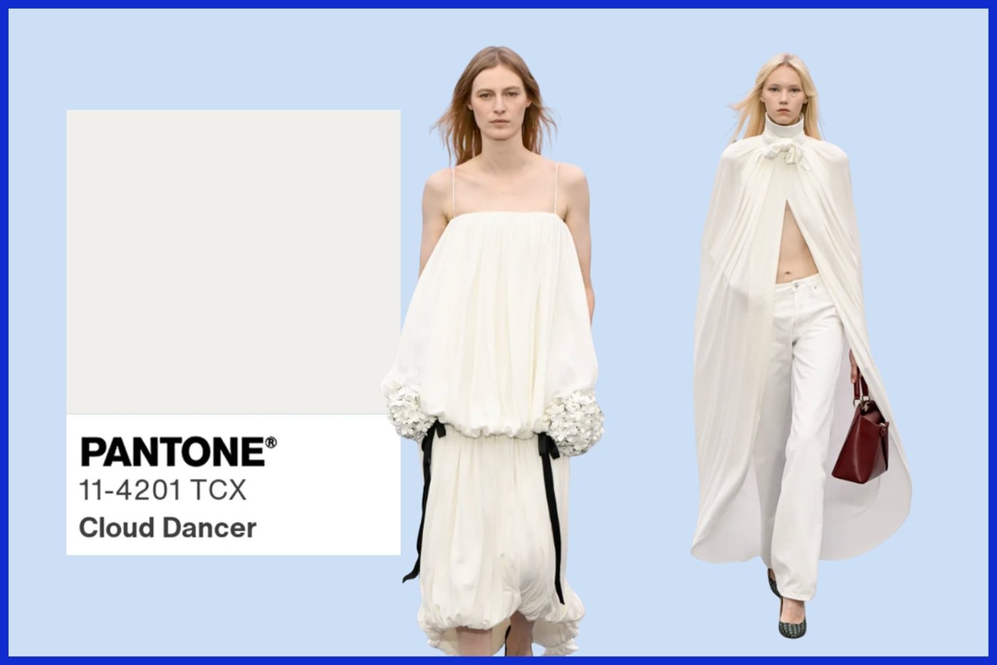
What is Cloud Dancer?

Cloud Dancer is the soft, warm but subtle white that just can’t quit. It’s not as bright as crisp white and provides a softer, more sophisticated feel. People comment on Cloud Dancer’s soothing, ethereal quality and how it adds an understated elegance to a space or outfit.
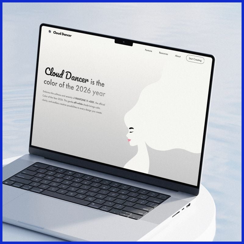
While bright white can sometimes feel harsh and cold, Cloud Dancer is warm and forgiving and pairs effortlessly with others. Its popularity surge, including becoming the Pantone Color of the Year for 2026, mirrors a broader turn to gentler aesthetics.
1. The Undertone
Cloud Dancer has a nice cool tone to it, as opposed to lots of whites that tend to be yellow or creamy. It is this coolness that gives it a versatile edge in the home, the office, or on your outfit. That doesn’t fight with other colors; it just gets along and helps bring peace to a palette.
Undertones set the tone of a room or an ensemble. Cloud Dancer’s cool base makes a room feel calm and airy and adds a contemporary punch to apparel. Designers tend to combine it with taupe, navy or gentle pastels, confident of its grounding properties.
Lighting transforms the way we perceive Cloud Dancer. By natural illumination, it exhibits its tender side. Under bulbs, it can almost look crisp or snowy. Selecting the appropriate undertone guarantees that your design has that perfect warmth and isn’t too cool or too beige.
2. The Texture
Cloud Dancer is blissfully soft and smooth, like silk or high-thread-count cotton. I love this texture because it’s super comfy and makes it a breeze to use in comfort-oriented environments like living rooms or luxury garments. In wool or linen, it looks even more inviting.
In fashion, texture brings out the best in Cloud Dancer. Whether on a floaty dress or a plush sweater, it appears elegant and never boring. The right fabric takes a solid shade and morphs it into a fashion statement.
Selecting the right fabric is crucial. Stiff materials make Cloud Dancer look cold. Plush textures render it warm. Even subtle nuances such as a matte or gloss finish alter the warmth of the color.
Texture transforms the appearance and it transforms the mood. Cloud Dancer in soft feels inviting and in sleek feels crisp and pure.
3. The Origin
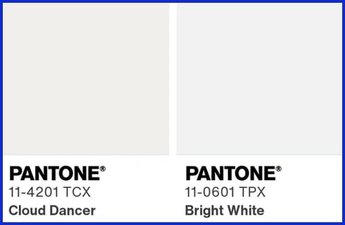
White is not that easy a color; there’s an entire spectrum. Cloud Dancer falls somewhere between the bright, clinical whites and the deep creams.
It’s less harsh and more forgiving than Bright White. It’s more effective in places where comfort counts, like living rooms or snug offices. Other whites could potentially appear too cold or too yellow in those patches.
The right white shade can make or break a design. Cloud Dancer’s mix of warm and cool tones allows it to play a number of roles from backgrounds to statement.
Knowing where Cloud Dancer falls on the white spectrum allows designers and brands such as Graphically.io to choose if it’s the ideal color for logos, websites, or branded interiors.
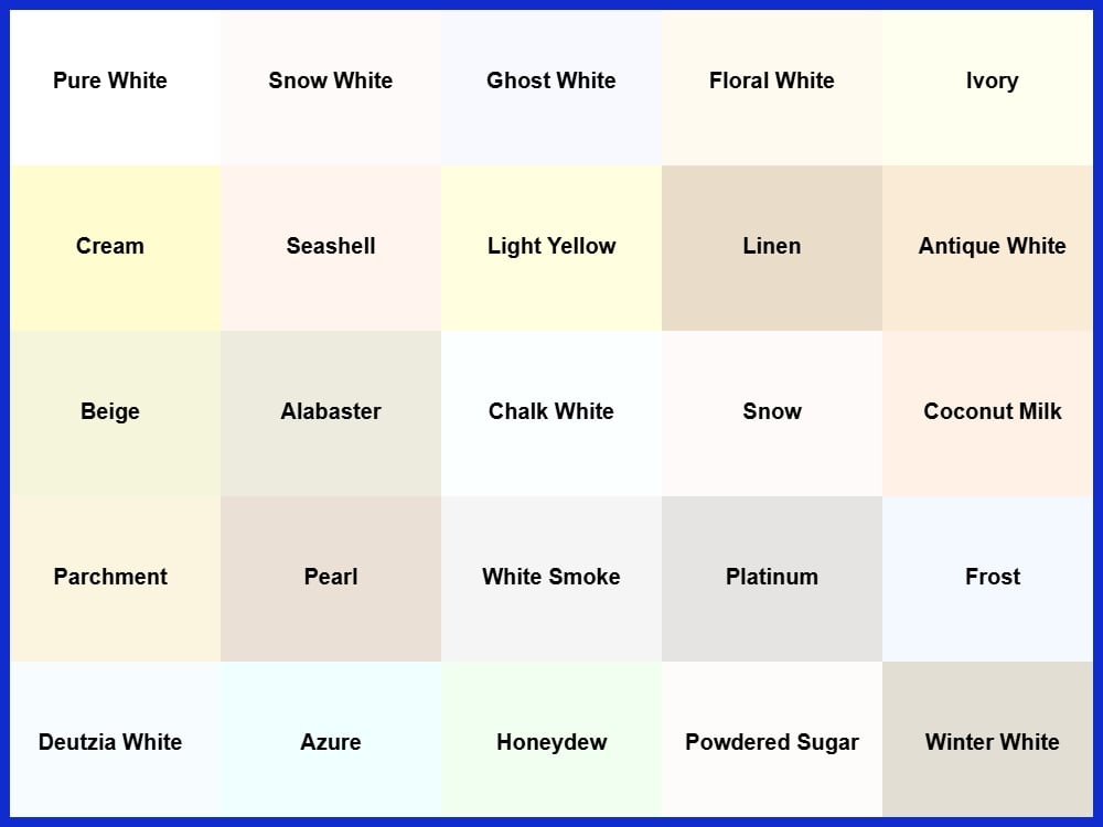
The White Spectrum
White is not merely a colorless void. It is a spectrum that influences our perception of a room, outfit, or design. Across cultures, white may signify peace, unity, or even mourning. The different shades of the white spectrum glow with their own personality.
Options such as bright white, warm white, ivory, and off-white provide designers and business owners with a range of choices for mood, contrast, and warmth. Choosing the perfect white is not only a matter of aesthetics. It transforms a space or differentiates a brand. Even a blank canvas can be bold, and the finest white can be just the cutting edge your project requires.
Bright White
Bright white is the most pristine, sterile shade on the spectrum. It is crisp and bold and provides great contrast wherever it is applied. It is the color you find in contemporary design, gallery spaces, and minimal websites.
It bounces a ton of light, so it makes spaces look larger and crisper. We select brilliant white when we need a room or business to seem new and uncluttered. In style, a head-to-bright-white ensemble can be very impactful, though a few consider it a challenge to wear.
Ditto for interiors—brilliant white walls in a shop or office make bold decor or branding pop. In contrast to Cloud Dancer, which is softer and more muted, bright white jumps out and grabs you.
Warm White
Warm white leans cozy, with a touch of yellow or beige that welcomes a space, making it a versatile styling potential for various occasions. It plays wonderfully with wood, stone, and other earthbound materials, creating a calm elegance in any room. If you’re having a small gathering or just want your living room to feel cozy, warm white is the clever choice.
It’s less clinical than bright white, so it doesn’t feel frigid. By contrast, Cloud Dancer pairs beautifully with warm white, offering a light breezy touch that seems more airy than warm. For brands that want to feel approachable but not mushy, warm white is the sweet spot.
Warm white is a hit with restaurants, boutique hotels, and anyone trying to find that sweet spot between chic and cozy, embodying the idea of quiet luxury in their design choices.
Ivory
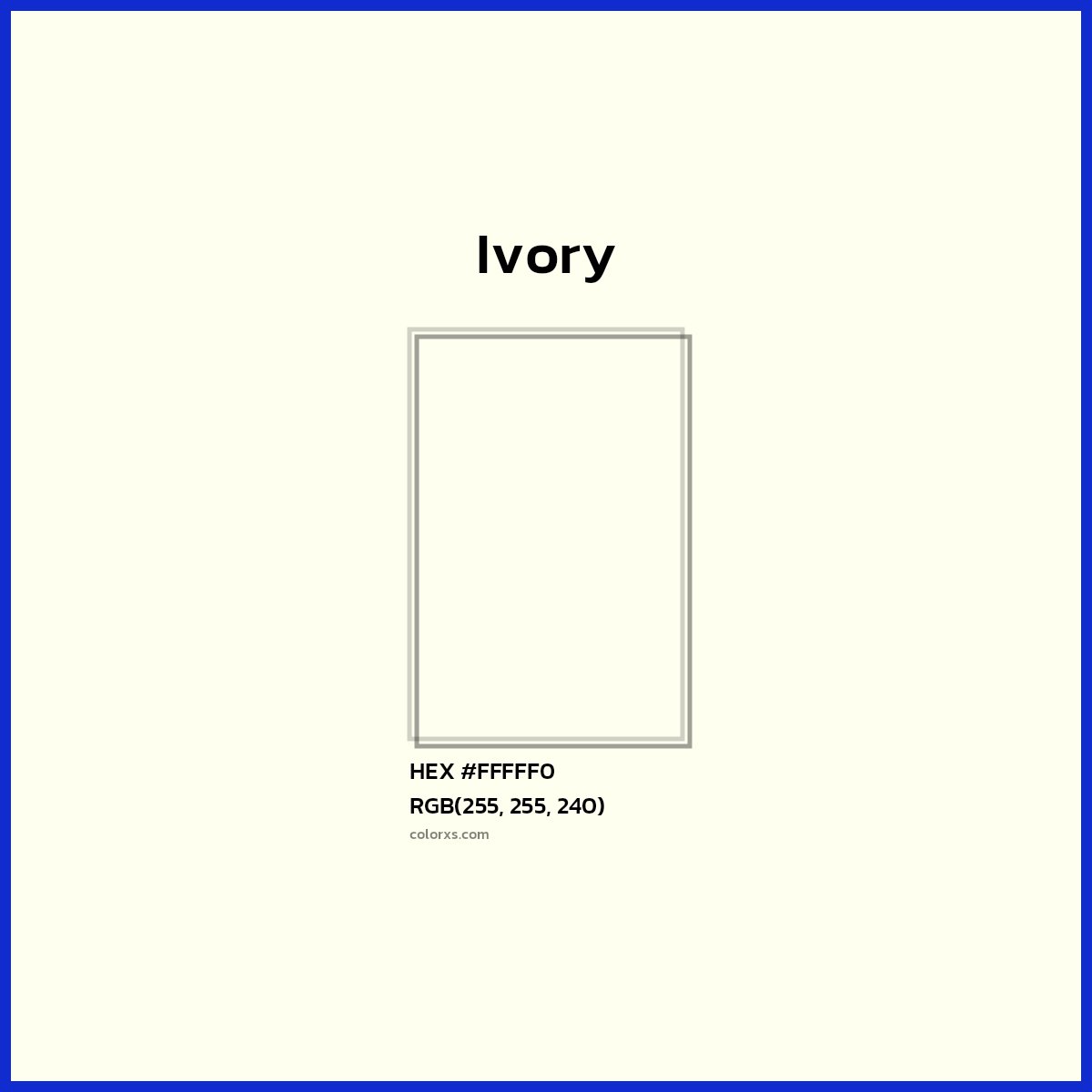
Ivory is known for its creamy, soft tone. It’s fancy without being flashy, which is why it’s a popular choice for weddings and other formal events. Designers tend to mix ivory with pastels or muted colors to maintain a chic and laid-back vibe.
This tint is not as radiant as Cloud Dancer, making it more timeless with a small bit of a retro mood. Cloud Dancer is fresh; ivory is timeless. Ivory works for brands or occasions that want to enhance the classiness without overdoing it.
Off-White
Off-white is the default for versatility, particularly when it comes to styling outfits. Nestled between white and beige, it serves as a perfect backdrop for striking pops of color, allowing for calm elegance in any space. This neutral shade works wonders in an office, making art pop while softening the vibe.
When you’re feeling low-key chic, Cloud Dancer pairs beautifully with other colors, adding a whimsical touch. Off-white is an excellent choice for small businesses aiming for a versatile styling potential that won’t overshadow their brand identity.
At Graphically.io, we routinely suggest off-white to customers seeking a harmonious appearance that embodies modernity and refinement, ensuring success in their design choices.
Visual Differences in White Shades
The subtlest shift in white can transform the way a space or design feels. Understanding these distinctions enables you to select the appropriate mood for a project.
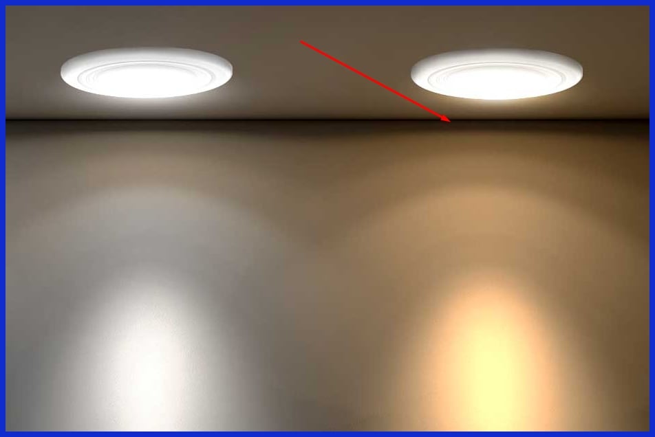
Think about how a bright white boat hull keeps a boat cool inside, or warm white cafe lighting invites a languid simmer. The right tone of white can make a small room feel bigger or a big room feel soft and cozy.

Designers leverage these nuanced distinctions to make decisions in branding, interiors, and product packaging. At Graphically.io, assisting clients in locating the ideal white is project quality control.
The Visual Difference

Cloud Dancer, a soft slightly warm white, makes itself known by its soft manner of reflecting light. Numerous whites can be crisp or chilly. Cloud Dancer mellows that brilliance, providing rooms with a breezy, inviting atmosphere. Bright White has a crisp, cool undertone that frequently reads as assertive.
Cloud Dancer sets up a tranquil, airy mood. This is what makes it a favorite for those looking to escape the clinical feel that stark whites can sometimes convey. Light reflection is the secret of its allure and for anyone designing a room, outfit, or brand palette, understanding how these subtle shifts operate can transform it all.
Light Reflection

Cloud Dancer’s unusual light reflection makes it a perfect partner to almost any color or texture, showcasing its versatile styling potential. Because of its warmth, this shade’s soft glow means it doesn’t overpower, creating a perfect backdrop for deep blues, gentle greys, or even rich jewel tones both in interiors and fashion. A navy sofa or emerald dress pops without competing, embodying the essence of calm elegance.
In fashion, combine Cloud Dancer with light tan or soft blush for a casual, contemporary appearance that is ideal for the stylish individual who prefers chic to sweat. This strategic color pairing can elevate a basic outfit into something fresh and memorable, reflecting the modernity of today’s trends.
Paired with textured throws, woven baskets or matte-finish ceramics, Cloud Dancer’s airy light bounces gently, adding dimension without looking cluttered. Color stories count. Picking shades that either resonate or contrast with Cloud Dancer helps craft a visual narrative that reads balanced and deliberate.
Graphically.io can assist you in planning palettes that encapsulate this effect, making every project feel unified and polished, ensuring success in your design endeavors.
Color Pairing
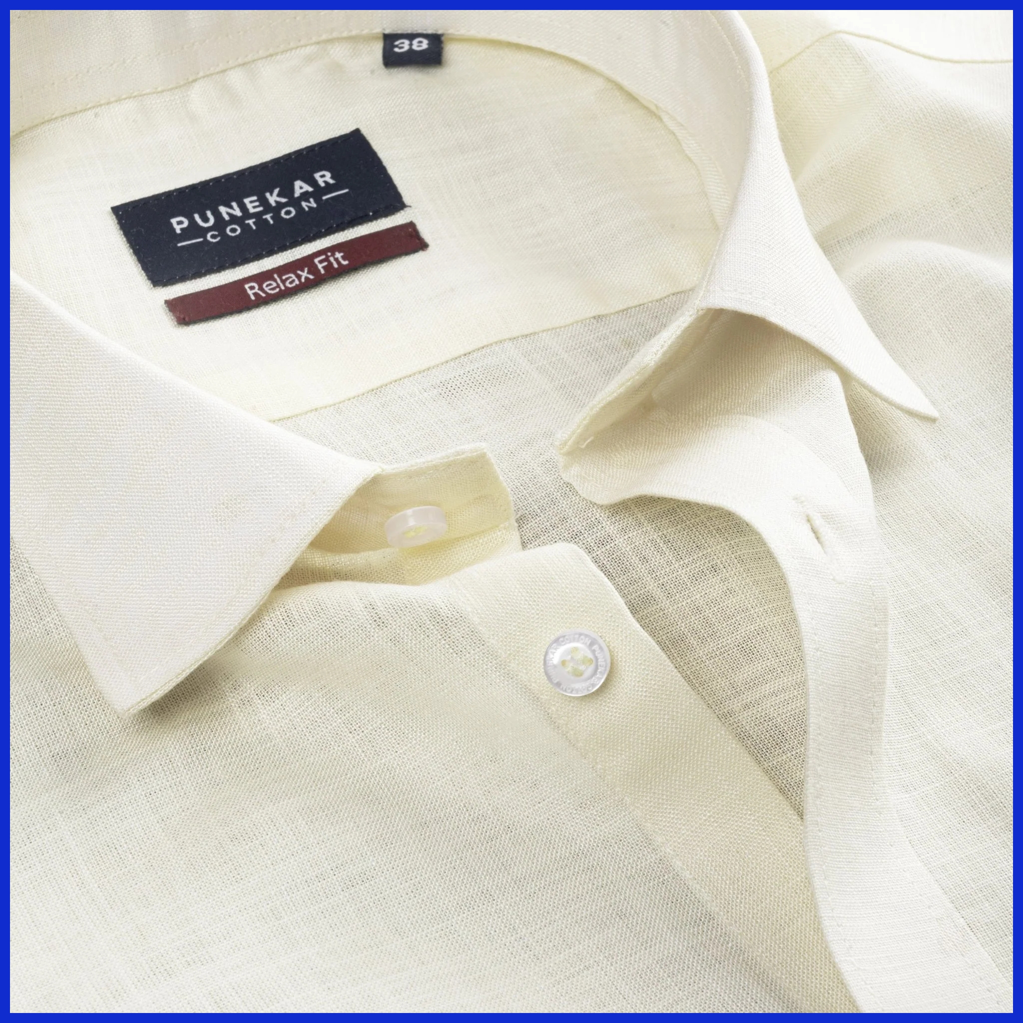
Cloud Dancer’s soft finish wicks differently on materials. On silk, it glistens, flaunting its heat. On linen, it appears casual and airy. In décor, a Cloud Dancer wall juxtaposed with oak wood or brushed metals feels modern yet grounded.
Fabric is important. Cloud Dancer teamed with velvet or heavy knits can weigh its impact down, whereas cotton or lightweight wool makes things fresh. Texture can make or break the look. The rough textures surrounding Cloud Dancer provide contrast and prevent the space or outfit from becoming flat.
In interiors, it’s lovely layered with textured area rugs and natural stone to bring out its ethereal side. For agencies, this means constantly balancing substance to maximize every drop from this tone.
When to Choose Cloud Dancer
Cloud Dancer is a soft, off-white that humbly gets noticed for its calm elegance. It’s less harsh than pure white and more welcoming than ivory, making it perfect for versatile styling potential. Brands seeking to communicate reliability, friendliness, and a contemporary edge frequently select Cloud Dancer for its warm but professional vibe. This shade suggests trustworthiness without being sterile, resonating with individuals who cherish tranquility and focus, especially in their outfits and design choices.
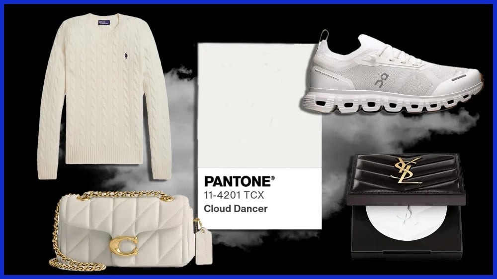
For Branding
Cloud Dancer lends brands a soft contemporary chic, embodying calm elegance and versatility. This particular shade is particularly effective for design, wellness, and tech companies that want to appear clean without being ostentatious. From boutique agencies to lifestyle brands, some of the world’s most engaging brands incorporate Cloud Dancer in their palettes to demonstrate transparency and modernity.
For instance, a digital marketing agency can utilize Cloud Dancer backgrounds on their website to make content pop and increase readability. It’s a versatile styling potential for companies that want to remain accessible. Cloud Dancer doesn’t compete with logos or graphics, allowing your brand’s message and visuals to take center stage.
Equally at home in digital and printed settings, this color is perfect for everything from business cards to social media templates. Graphically.io typically directs clients to Cloud Dancer when they prefer first-rate design that remains modern and classic.
For Interiors
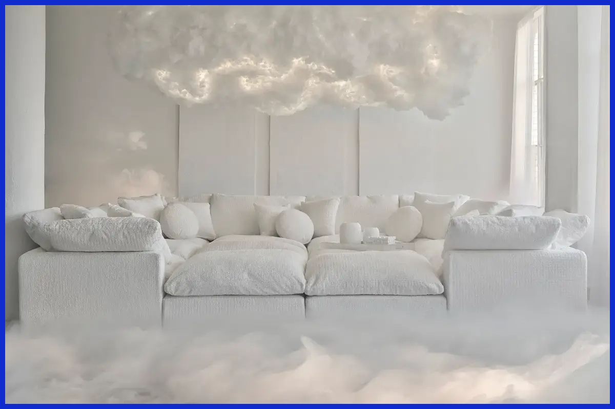
Cloud Dancer brings light and air to any room. Its soft hue lends interiors a sense of spaciousness and tranquility, which is why it’s a salon favorite for open plan offices or wellness spaces. This color looks great with wood, metal, and stone, working into minimalist, Scandinavian, or modern farmhouse decor.
If you’re seeking a serene and ethereal abode, Cloud Dancer can be used on walls, ceilings, and even large furniture pieces. Accentuate Cloud Dancer with pastels or soft neutrals to emphasize its warmth. For a warm reading corner or tranquil bedroom, layer in natural fibers and light woods.
If you want to accentuate art or statement pieces, Cloud Dancer’s soft background lets it all pop without feeling cluttered.
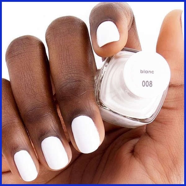
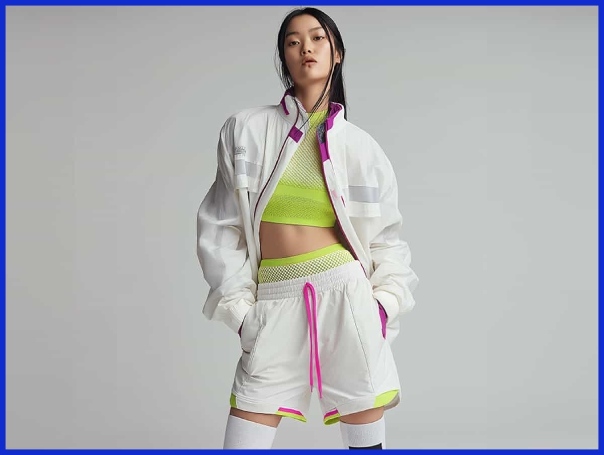
For Fashion
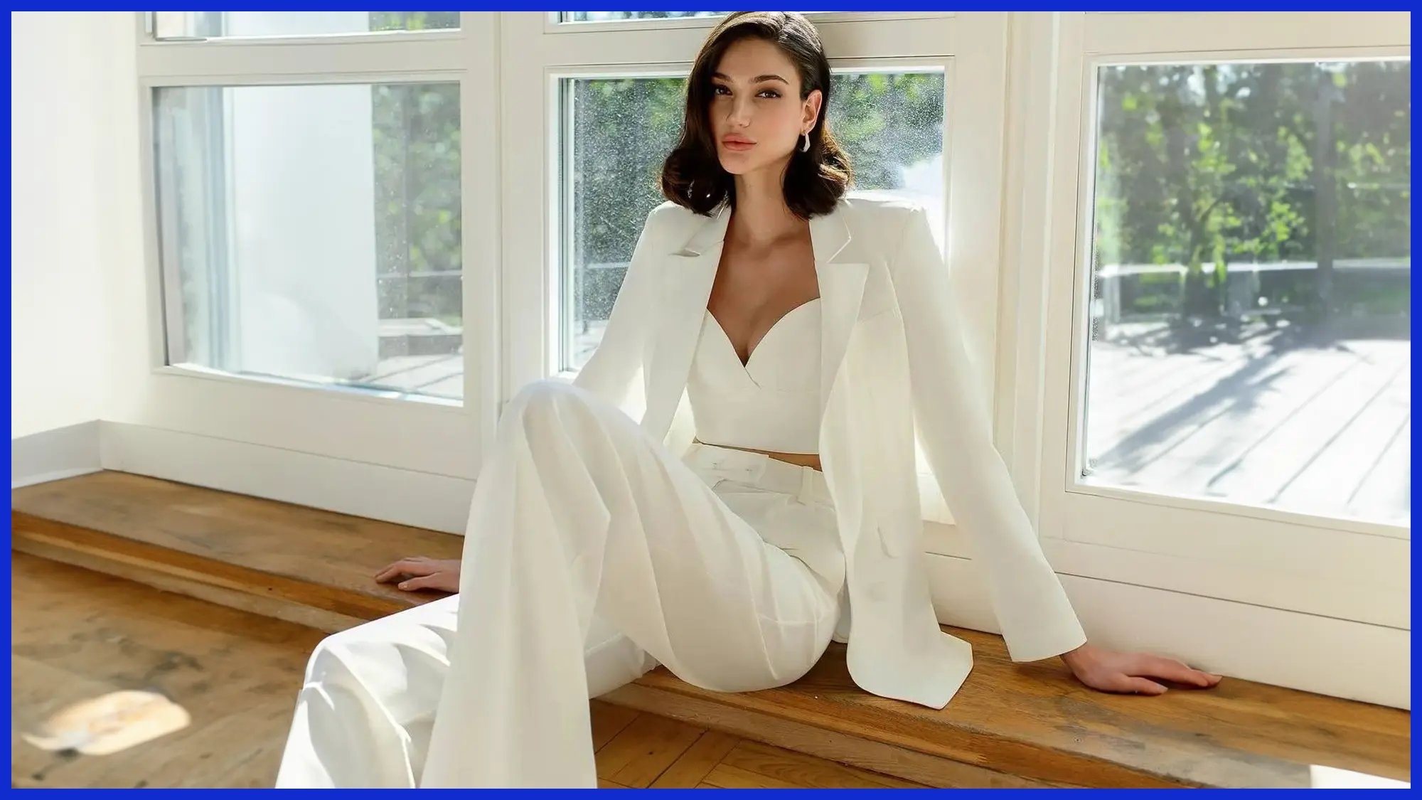
Cloud Dancer is wardrobe-friendly, working for both casual and formal attire. It’s a clever choice for those who seek sophistication without the clinical nature of crisp white. Spring workwear includes a Cloud Dancer blouse with taupe trousers, refined but never harsh.
On weekends, team a Cloud Dancer top with pastel skirts or soft jeans. It’s such a great color for layering. Slip a Cloud Dancer sweater under a dark blazer to soften the vibe, or let it serve as a canvas for bright scarves and bold jewels.
It’s an excellent alternative to traditional white or dressy ivory, blending in perfectly for daytime functions or more casual affairs.
For Evolving Color Perspectives
Design’s always evolving. Cloud Dancer is a sign of the trend toward lighter, more welcoming colors. It proves that white can be personal and warm, not just clean or clinical. It’s helpful for designers to understand how Cloud Dancer translates in various light because it can appear creamy at times and nearly pure white at others.
Experiment with Cloud Dancer in print, on the web and in product design. You might find that it gives your work a new spin. Don’t be afraid to have some fun with it spanning projects. After all, the most stunning results can often be found in subtle shifts of shade or combination.
Conclusion
Cloud Dancer lends a soft, fresh look that stands out from stark white. It retains warmth without yellowing. White keeps it crisp and clean, ideal for areas that require a neat trim. A bunch of brands use Cloud Dancer for peace and calm moods in their ads and web pages. White works well for loud, simple backgrounds. Both colors fit nicely in clever desi schemes. Choosing between the two is really just a matter of the type of vibe you’re going for. Try both in little spots and then decide. Need a hand choosing palettes or launching some new brand colors? Graphically.io, sharp eyecare, and a team ready to help. Extend your hand and experience what a pro touch can bring to your next project.
Frequently Asked Questions
What is Cloud Dancer?
Cloud Dancer is an off-white with a warm, soft tone. It has a soft, inviting essence and is frequently incorporated into modern and minimalist designs.
How does Cloud Dancer differ from pure white?
Cloud Dancer, with its gentle warmth and creamy tone, offers a versatile styling potential, making it a popular choice in modern outfits compared to pure white.
Why choose Cloud Dancer over standard white?
Opt for Cloud Dancer if you’re seeking a calm elegance and muted, cozy vibe. This versatile shade tones down harshness, warms things up, and pairs well with many outfits without dominating.
Is Cloud Dancer suitable for all lighting conditions?
Cloud Dancer, a versatile styling potential, plays nice with both natural and artificial light, offering calm elegance in sunny rooms.
What psychological effect does Cloud Dancer have?
Cloud Dancer, a versatile styling potential, encourages calm elegance and coziness. Its gentle warmth brings relief into a room, making it feel more welcoming than bright whites.
Where is pure white a better choice than Cloud Dancer?
Pure white, a versatile styling potential, is best reserved for areas that warrant maximum luminosity and a crisp, contemporary aesthetic, like kitchens, studios, or bathrooms.
Can Cloud Dancer and white be used together?
Yep, Cloud Dancer paired with pure white offers a calm elegance and depth, while using this Pantone color on your walls with bright whites or accents creates a versatile styling potential.