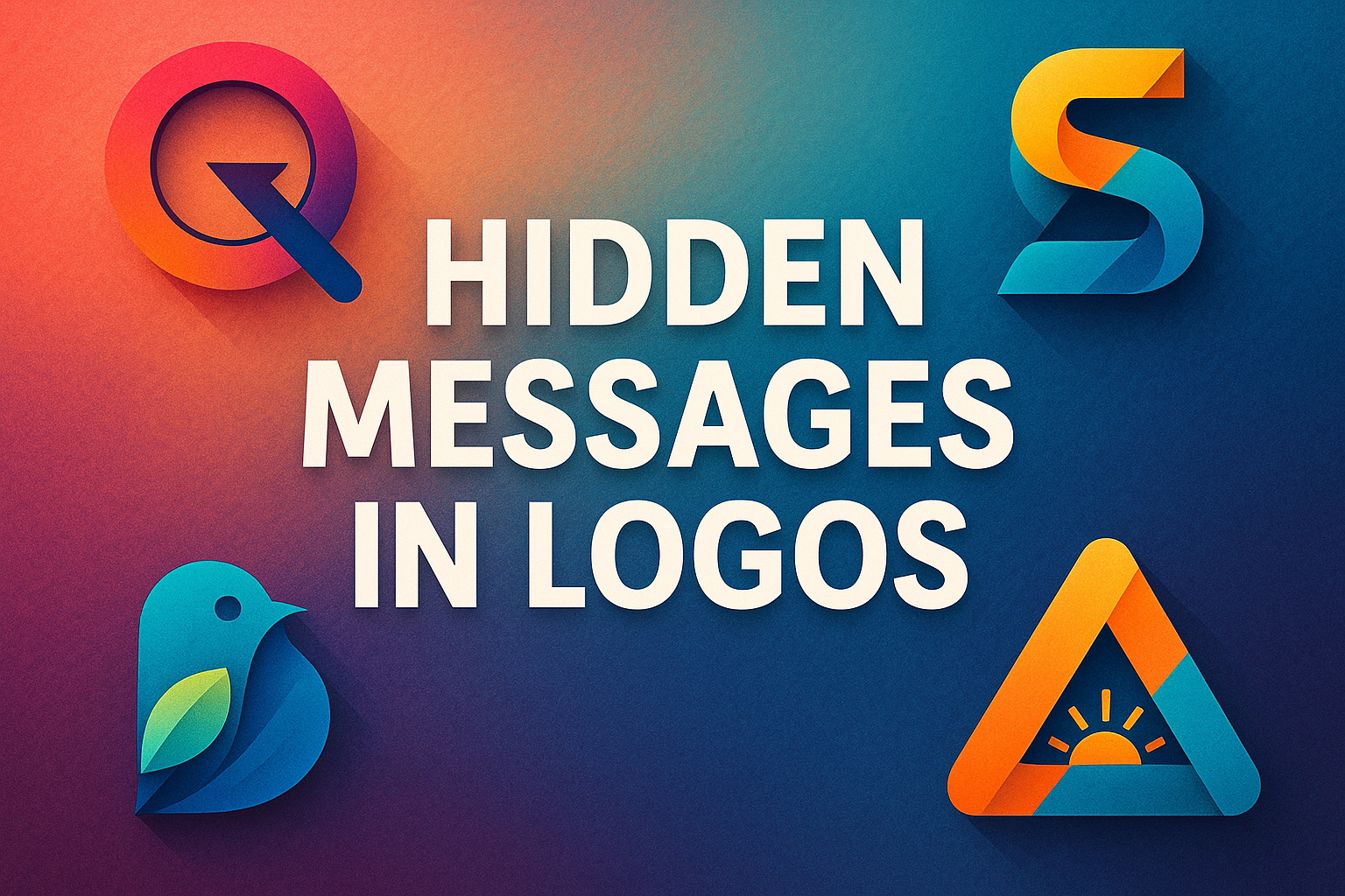
Every day, we see countless logos, but many hide “Easter eggs” right in front of us. These are subtle shapes, letters, or symbols embedded in the design that convey extra meaning without being obvious. For example, many famous logos carry a secret twist – an arrow, a smile, a hidden number – that reflects the brand’s identity or story. Research even shows that these surprises can create intrigue and a deeper connection with an audience. In other words, stumbling on a hidden element makes the logo (and brand) stick in our minds.
To see how this works, let’s look at 32 famous logos and what clever detail each one hides:
32 Logos with Hidden Messages
1. Beats by Dre
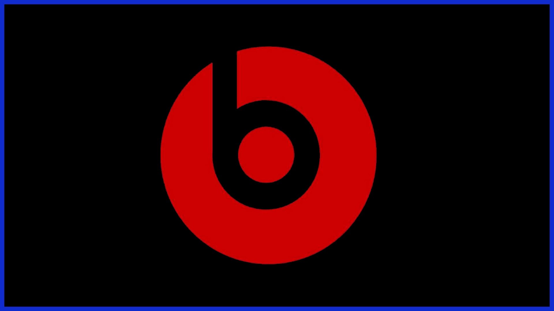
The lowercase “b” inside the circle is more than a letter. It’s drawn to look like a pair of headphones on a head, giving the logo a personal, user-centric feel.
2. Amazon
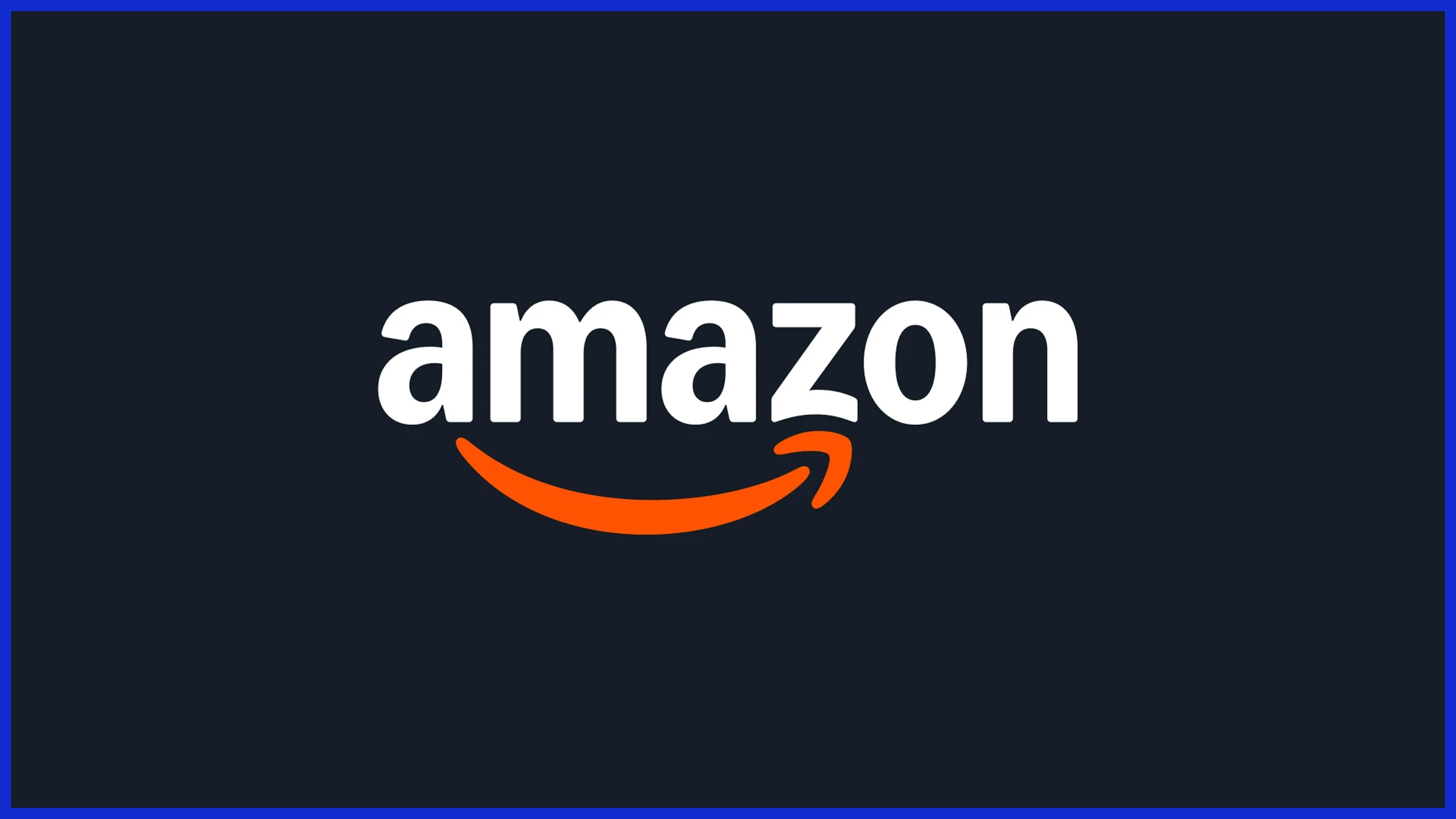
The swooping arrow goes from “a” to “z,” illustrating that Amazon sells everything from A–Z. As a bonus, the arrow doubles as a smile, suggesting customer happiness.
3. Baskin-Robbins
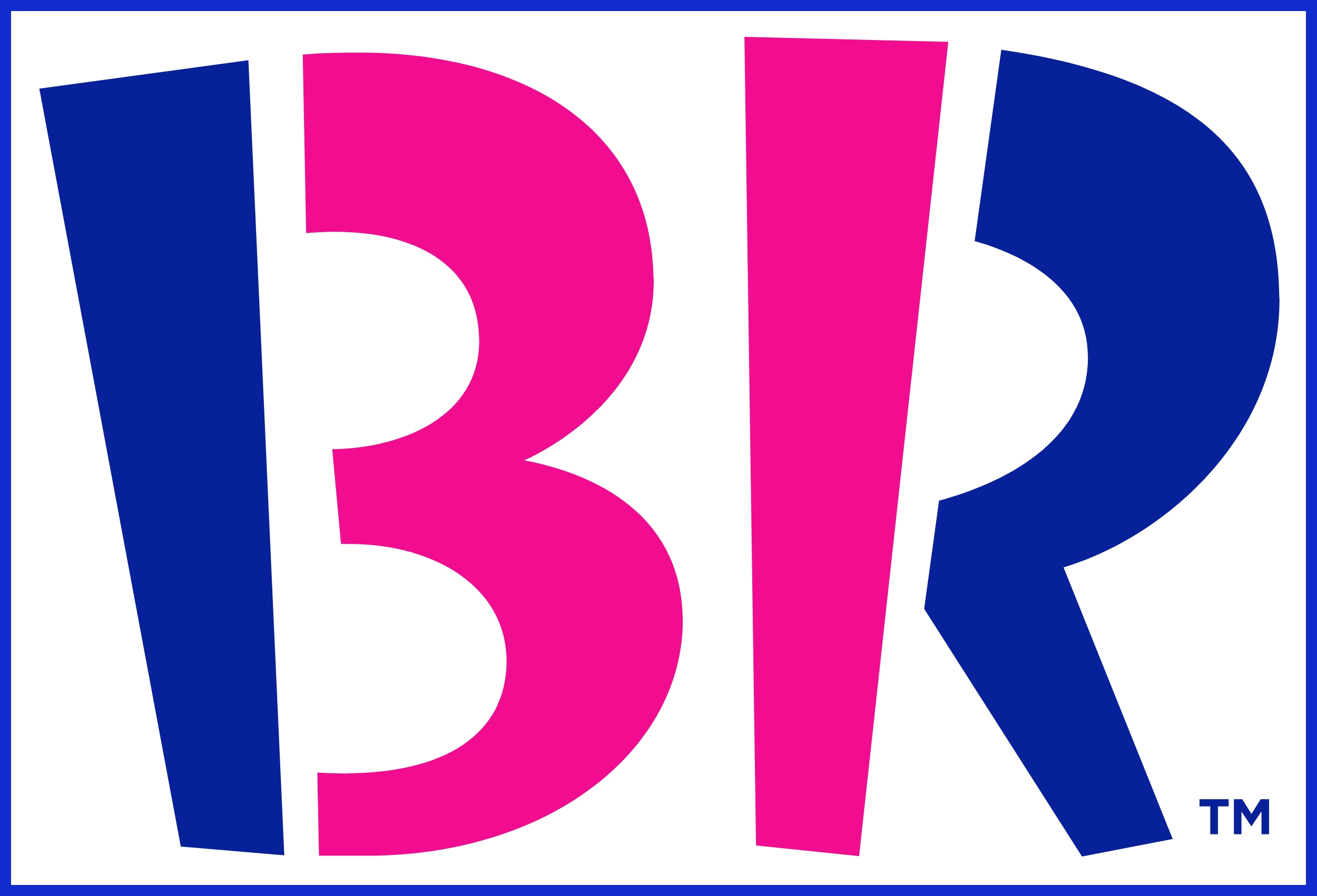
The ice cream chain’s pink “BR” actually contains the number “31” (its original flavor count). The diagonal parts of the B and R form a “31” to emphasize variety.
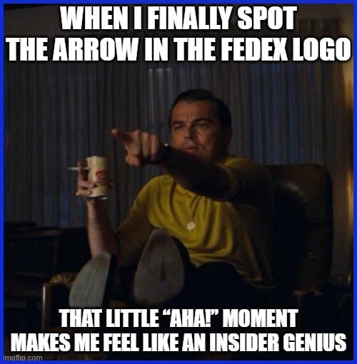
4. FedEx
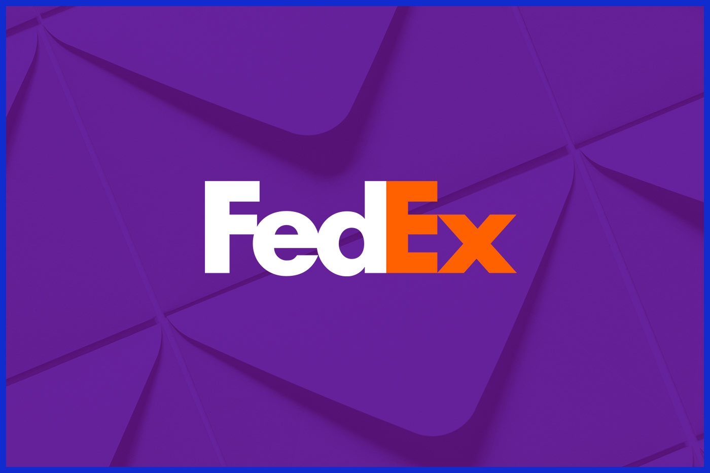
Between the letters E and x is a hidden right-pointing arrow, formed by the negative space. This arrow symbolizes speed and forward motion – exactly what a delivery company promises.
5. Tostitos
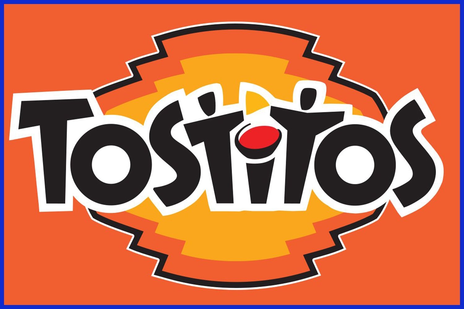
In the word “Tostitos,” the two middle “t” letters and the dot above the “i” create an image: two people sitting at a chip-and-salsa table. It visually reinforces that Tostitos is about sharing snacks.
6. Carrefour
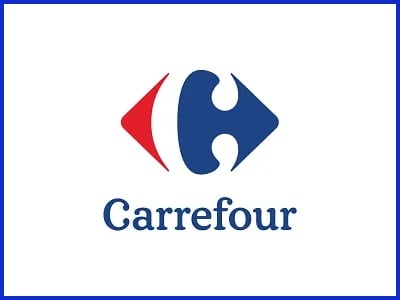
This French retailer’s logo uses negative space cleverly. The red and blue shapes create a white “C” in between (for Carrefour). It’s a simple nod to the brand’s name hidden in the icon.
7. Unilever
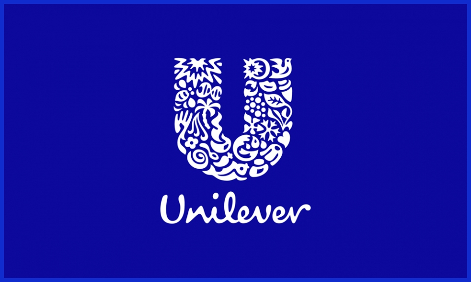
The giant “U” in Unilever’s logo is actually composed of many small icons (a heart, a spoon, a leaf, etc.) representing its diverse products. This mosaic shows at a glance the brand’s variety.
8. Toblerone
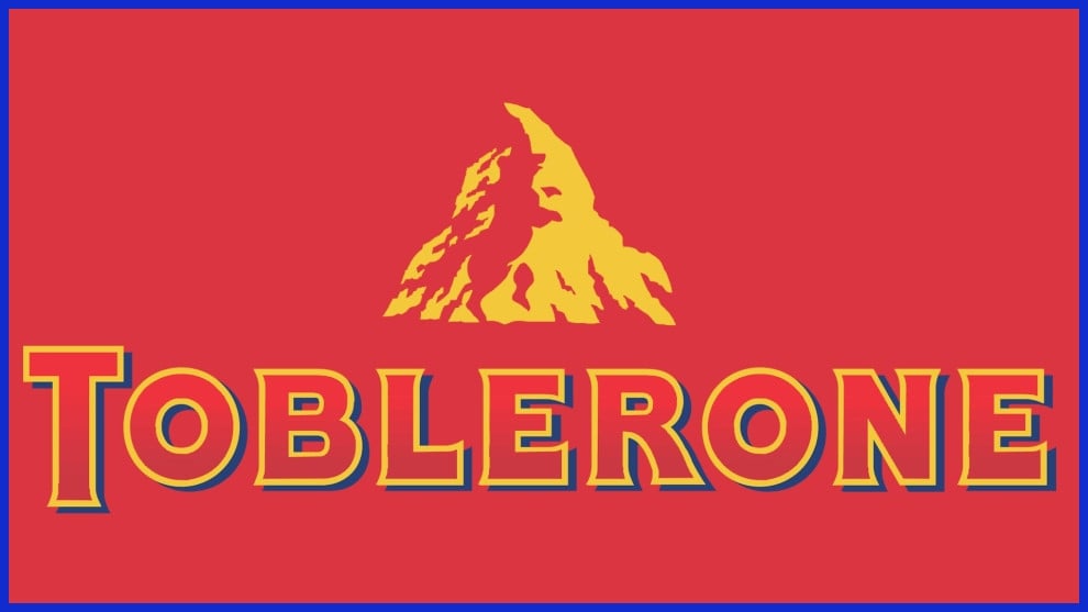
The triangular Toblerone logo outlines a Swiss mountain (the Matterhorn), but look closely: a bear is hidden in the mountain’s silhouette. The bear alludes to Bern (the “City of Bears” in Switzerland) and the honey flavor of the chocolate.
9. Audi
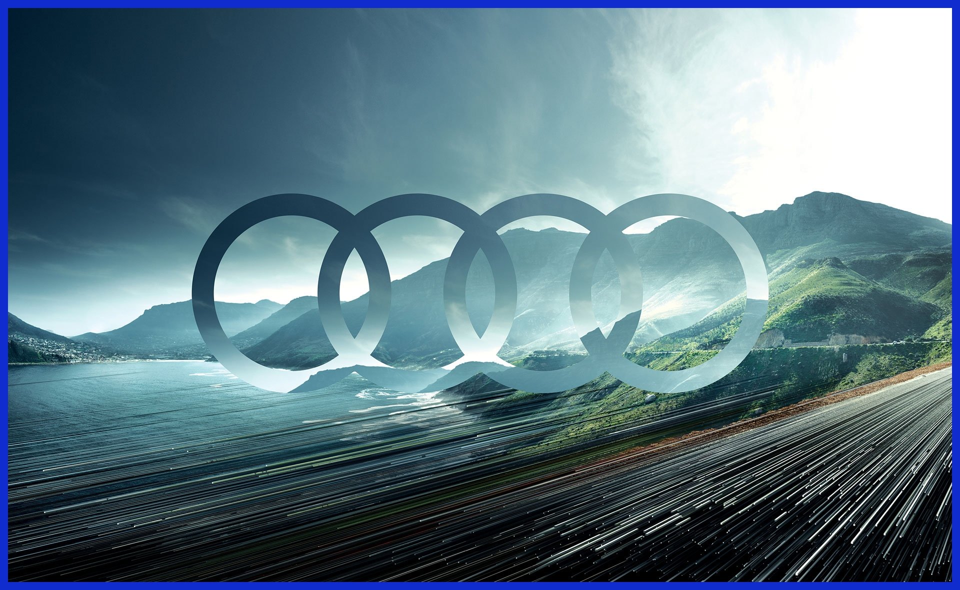
Audi’s four interlocking rings symbolize the four car makers (Audi, DKW, Horch, Wanderer) that merged in 1932. The rings literally show their union.
10. Nike
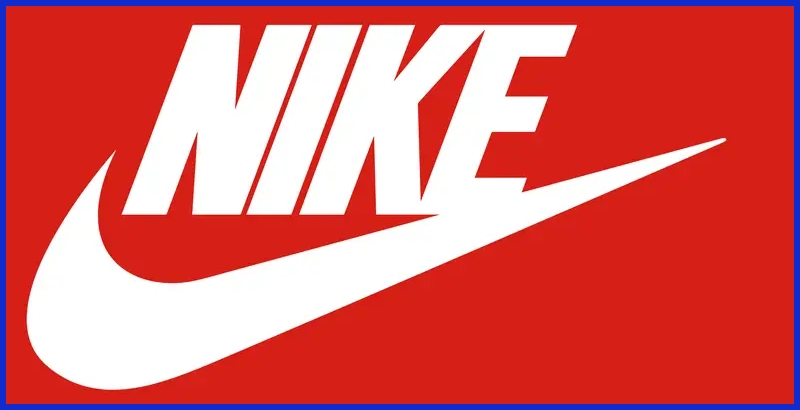
The famous swoosh isn’t random: it’s based on the wing of Nike, the Greek goddess of victory. It implies motion, speed, and the spirit of triumph.
11. Adidas
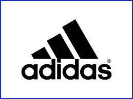
The three diagonal stripes over the word “Adidas” are arranged to form a peak or mountain. This mountain represents the challenges athletes must overcome – a perfect metaphor for a sports brand.
12. BMW
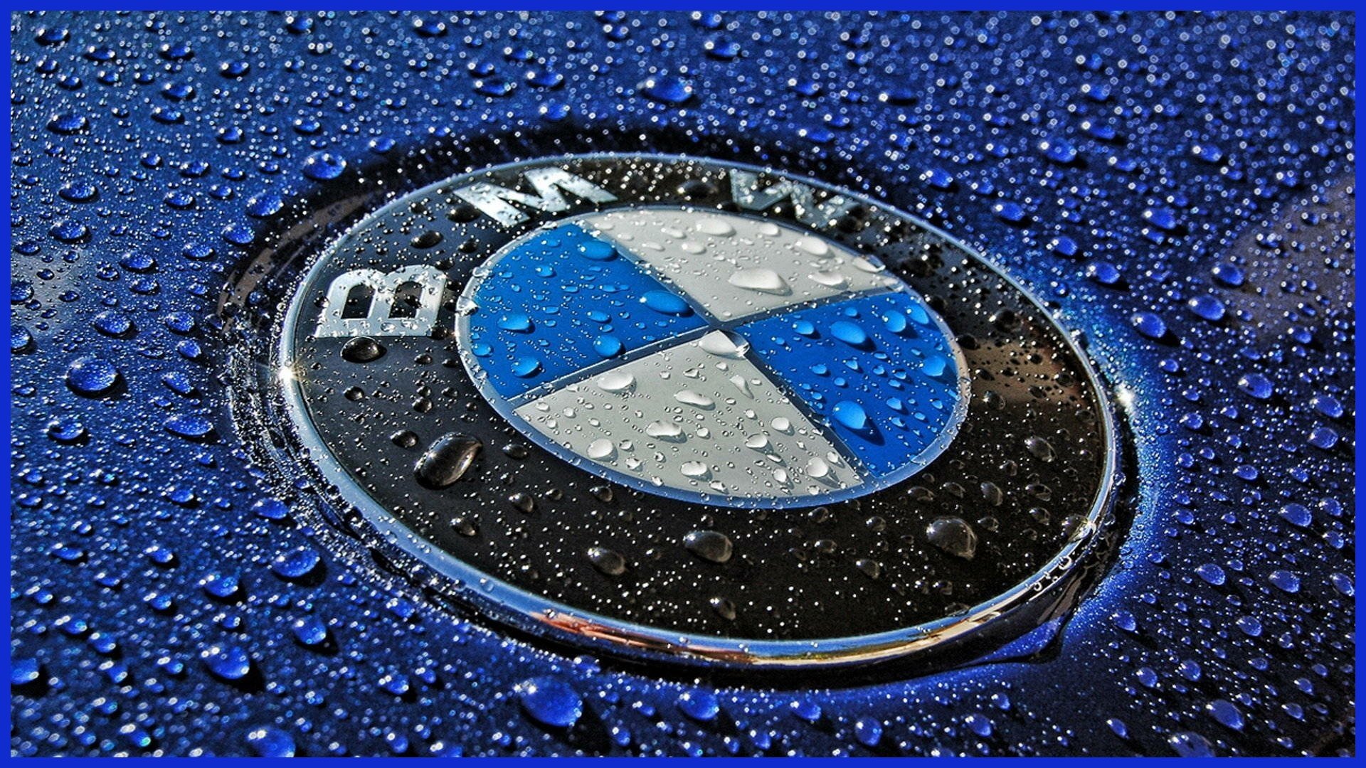
BMW’s blue-and-white quartered circle comes from Bavaria’s flag (the company’s home). Although often thought to be a spinning propeller (from its airplane-engine history), it actually just echoes Bavarian colors.
13. LG
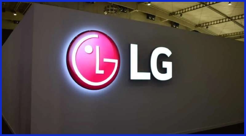
The letters “L” and “G” in the LG circle are more than just initials. Together they form a smiling human face (the “L” is the nose and the “G” is the outline of the face). It humanizes the brand and makes it feel friendly.
14. Cisco
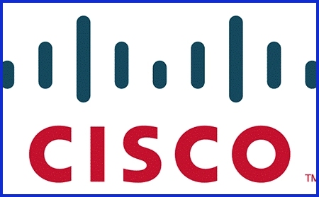
The vertical bars above the letters in the Cisco logo represent the Golden Gate Bridge. Since Cisco was founded in San Francisco, this honors the company’s roots.
15. Pinterest
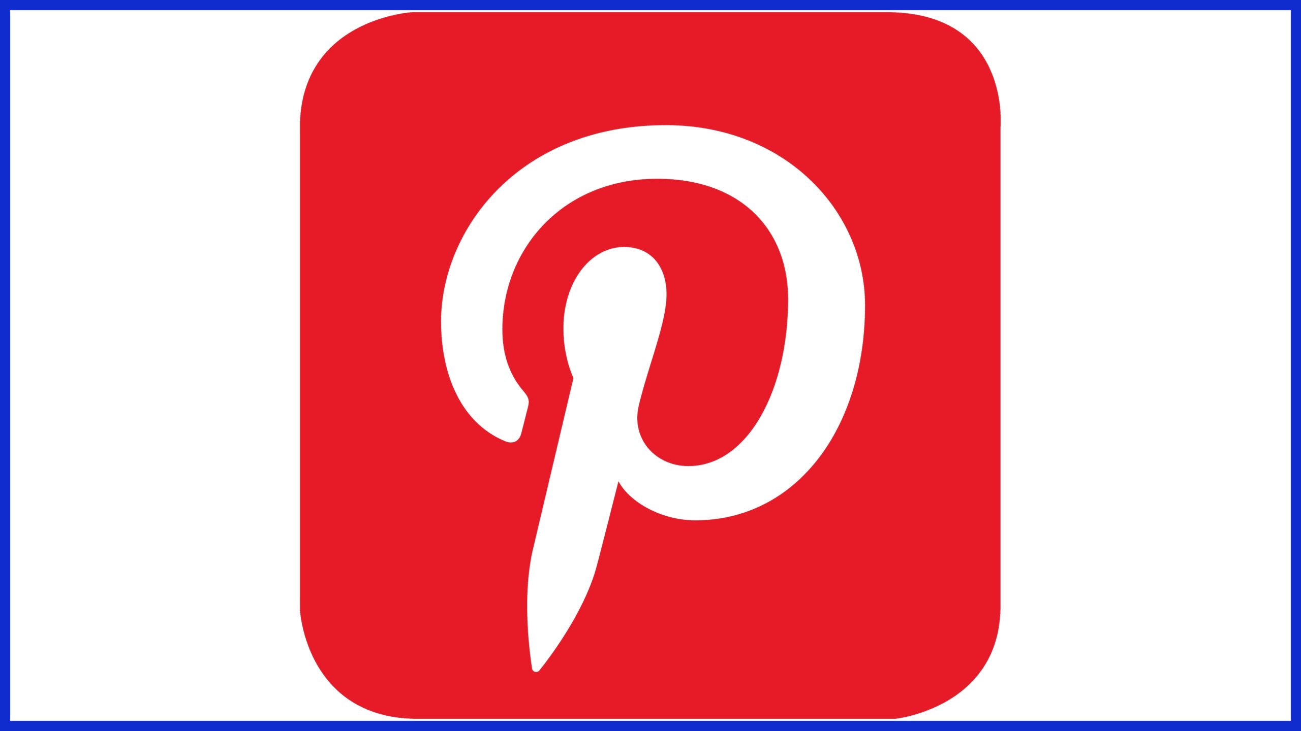
The “P” in Pinterest’s logo doubles as a pushpin. This visual pun reinforces the idea of “pinning” content onto a digital board.
16. Gillette
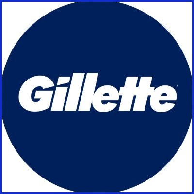
The famous razor brand’s name has a hidden razor-edge detail: the “G” and the dot on the “i” have tiny cuts, evoking the blade of a razor. It’s a subtle way to tie the logo to its product.
17. GameCube
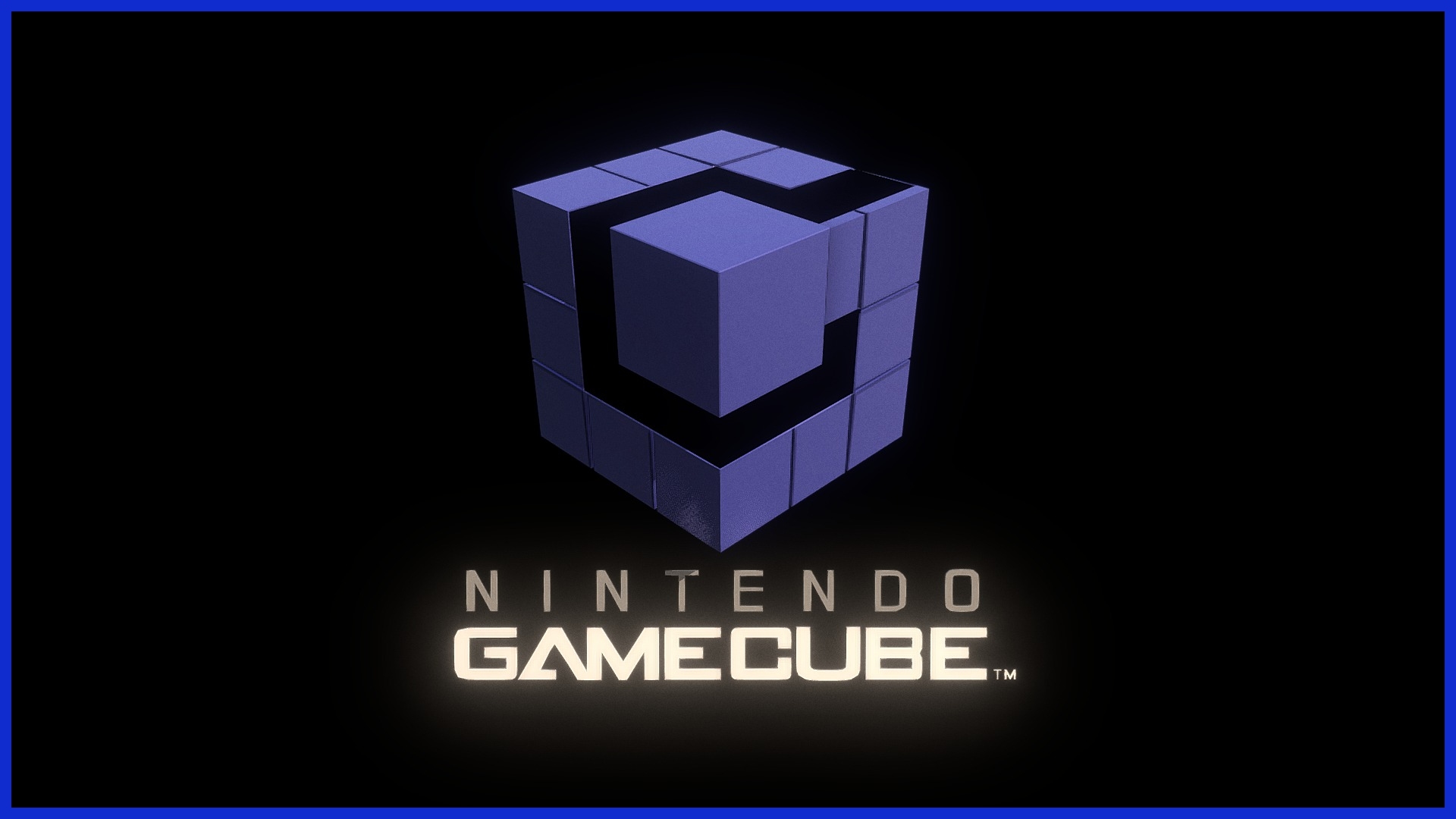
Nintendo’s GameCube logo looks like a simple cube, but clever geometry turns it into a 3D “G” and a “C” (for GameCube). The shape reveals both letters at once.
18. NBC
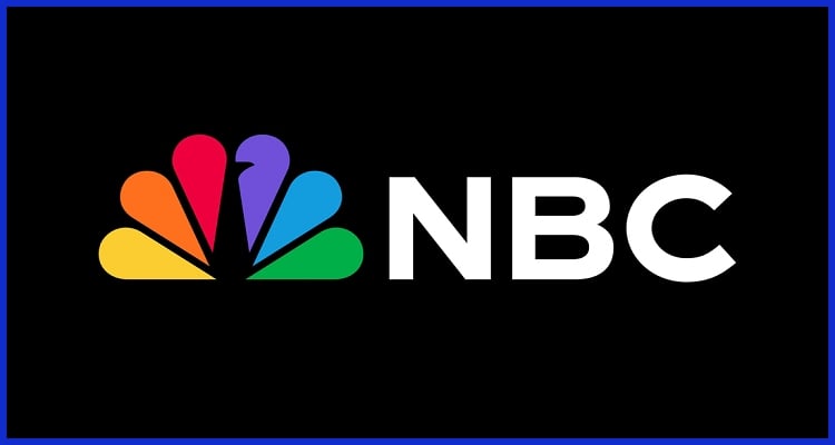
The peacock is obvious, but note its details: each of the six colored feathers represents one of NBC’s divisions. Originally chosen to promote color TV (“proud as a peacock”), the logo ties the imagery to the network’s pride in its programming.
19. Toyota
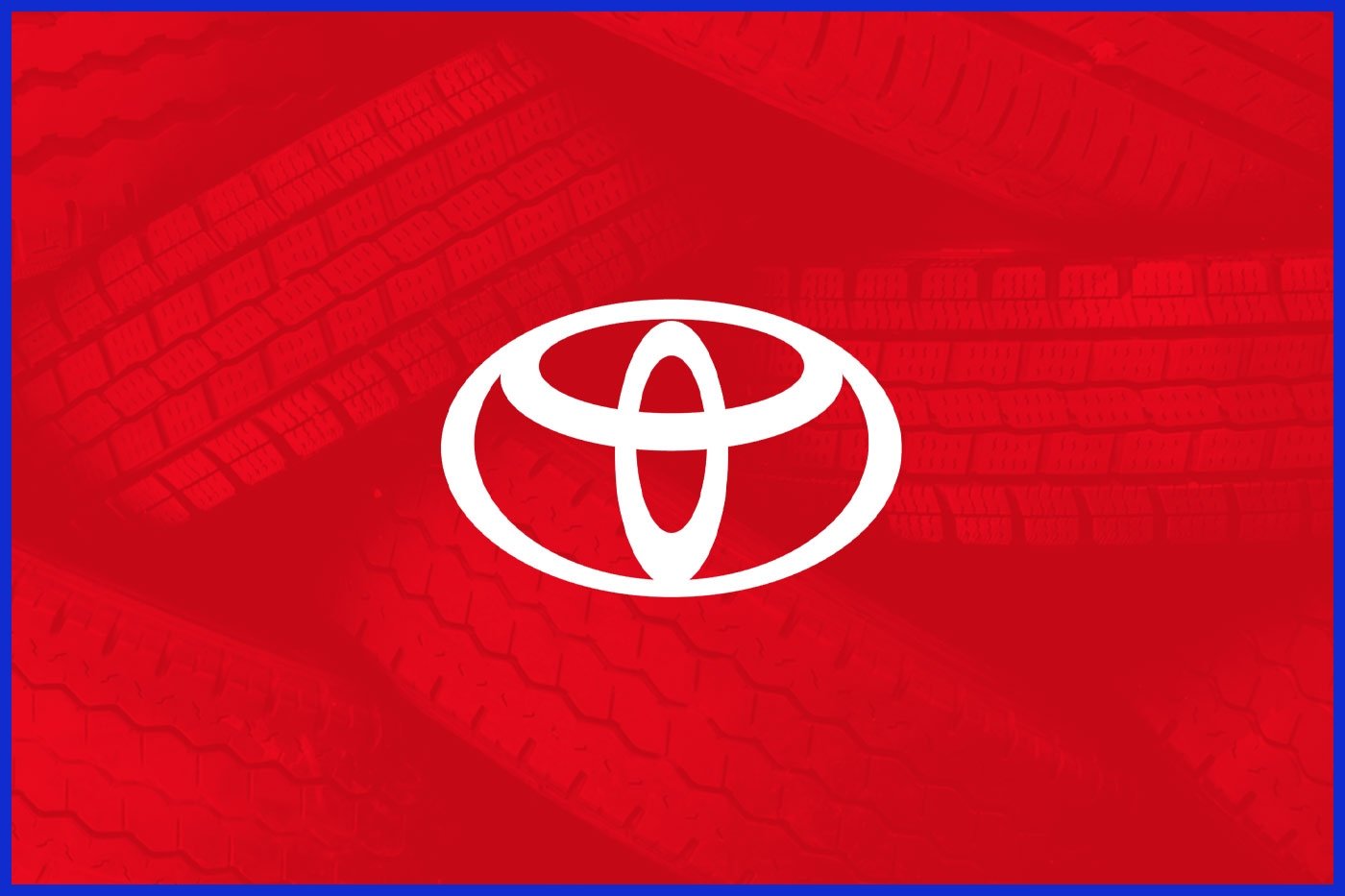
Toyota’s modern logo uses three overlapping ovals. Together, they symbolize the hearts of the customers and the company coming together, and the space around them suggests advancement. (It visually represents trust and forward-looking growth.)
20. Sun Microsystems
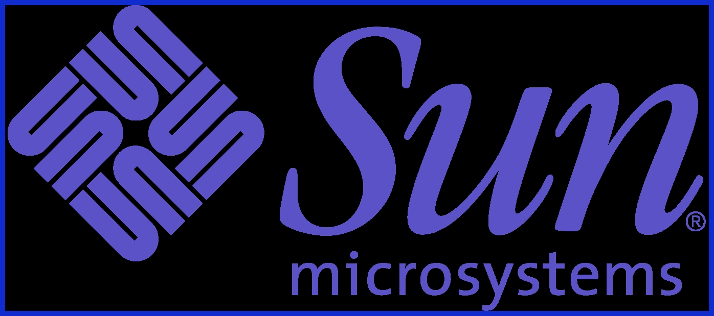
The old Sun Microsystems logo is a clever ambigram. It’s made of letters “S”, “U”, “N” repeating in a diamond pattern. If you look at the diamond, you can read “sun” from all sides.
21. Apple
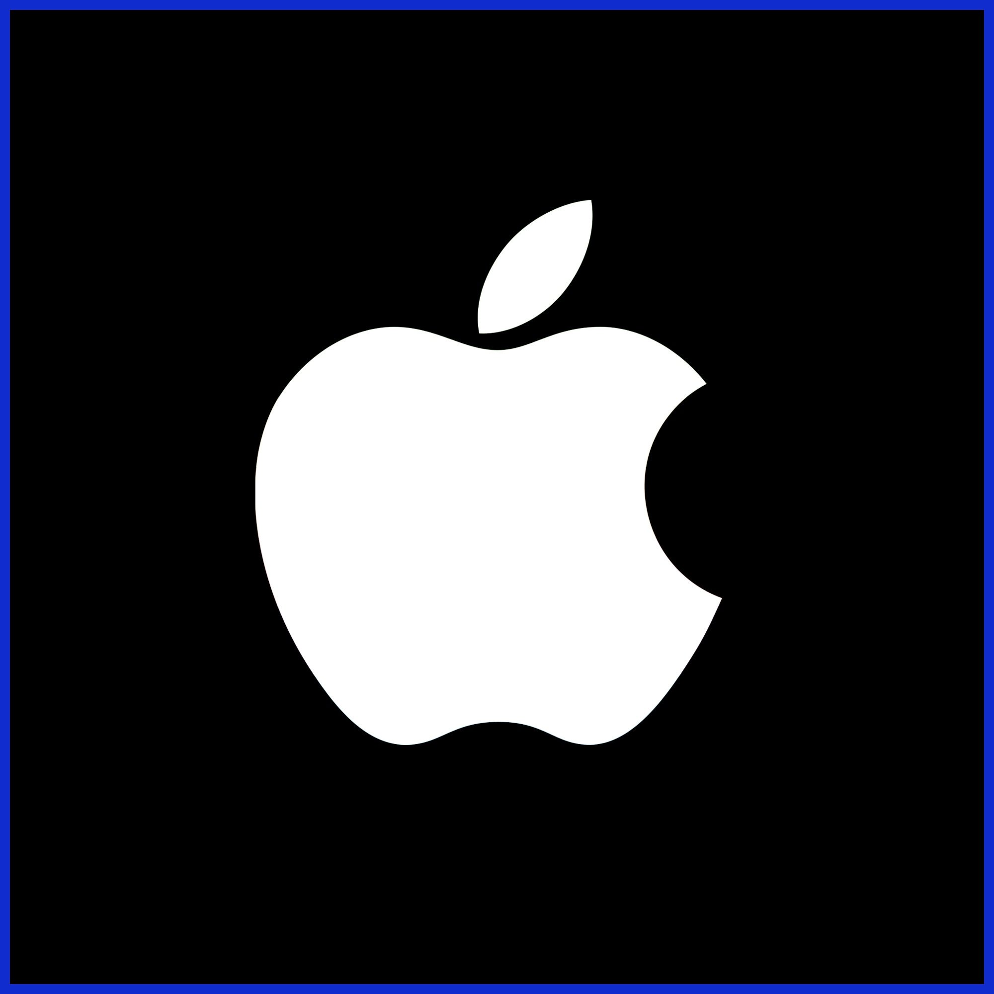
One of the world’s most famous logos, the bitten apple is said to reference the Biblical fruit of knowledge (the Tree of Knowledge). The simple apple shape with a bite taken out suggests knowledge and creativity.
22. Google
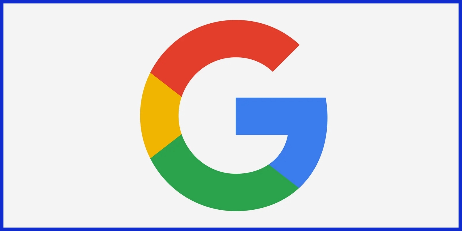
Google’s logo deliberately breaks the rules of color: it uses a secondary color (green) on the “l” amidst primary colors. This choice (splashing green in the word) is a statement of fun and nonconformity: “we don’t follow the rules.”
23. Levi’s
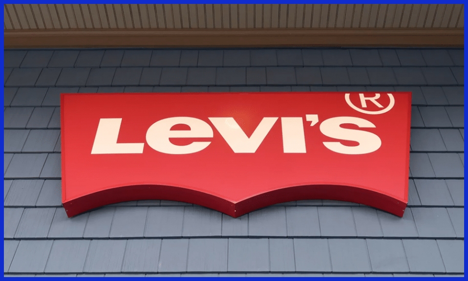
The red Levi’s “batwing” logo has two little cut-outs at the top. Those indentations actually mirror the shape of a pair of jeans pockets. It’s a hidden nod to their product.
24. Chick-fil-A
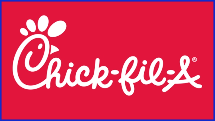
Chick-fil-A’s “C” in its name is drawn to look like a smiling chicken with a comb. The crest on the “C” completes the profile of a chicken’s head, directly linking to the restaurant’s chicken focus.
25. Goodwill
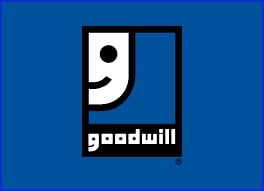
The Goodwill charity logo looks like a smiling face, but it’s more than that: the face is actually a lowercase “g.” This double meaning (a friendly smile and the initial “g”) reinforces the brand’s positive mission.
26. Hershey’s Kisses
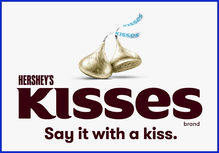
In the word “KISSES,” the gap between the letters “K” and “I” forms the silhouette of a Hershey’s Kiss candy. It’s a subtle shape that chocolate fans will recognize once they see it.
27. Continental
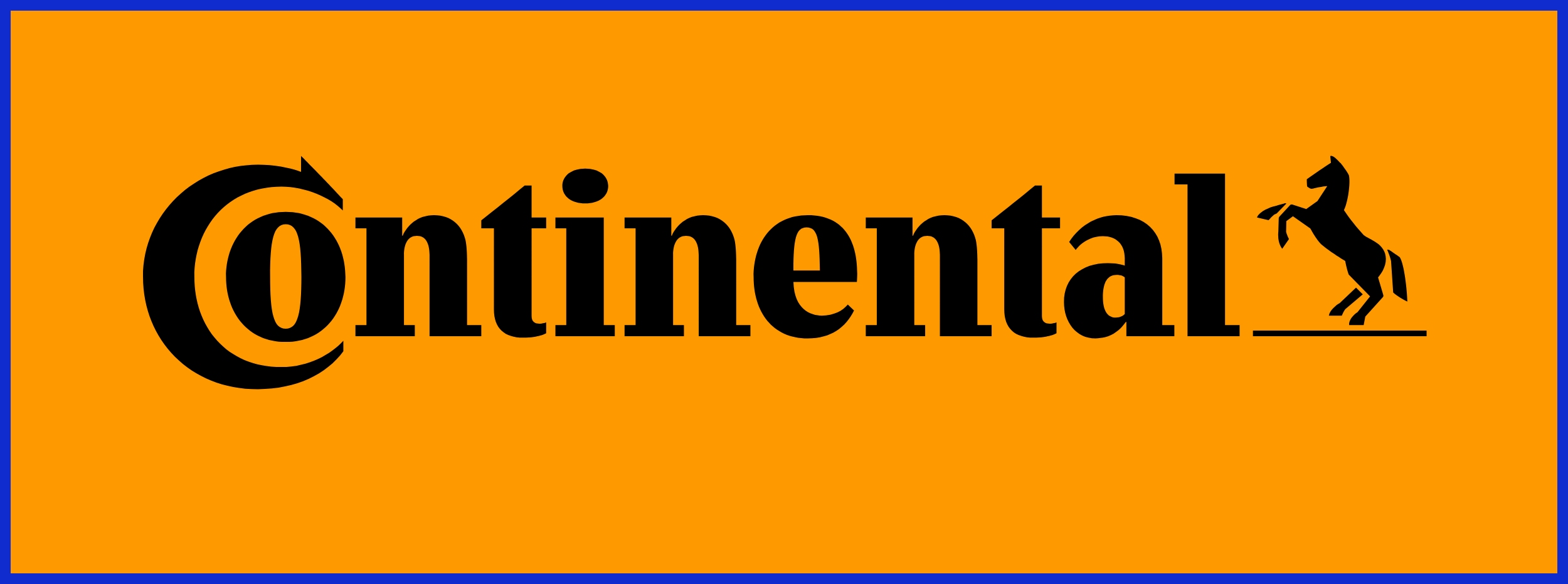
In Continental Tire’s logo, the letters “C” and “o” are placed so that they form a tire shape together. The “C” wraps around like a tire tread, hinting at the company’s products.
28. IBM
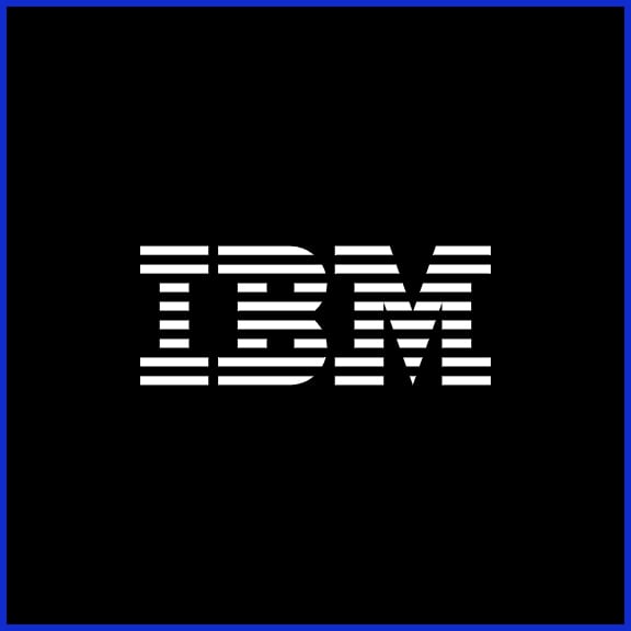
The famous IBM lettering is striped, and the negative spaces under the stripes create little “=” signs. This was meant to symbolize equality and technological progress.
29. Wendy’s
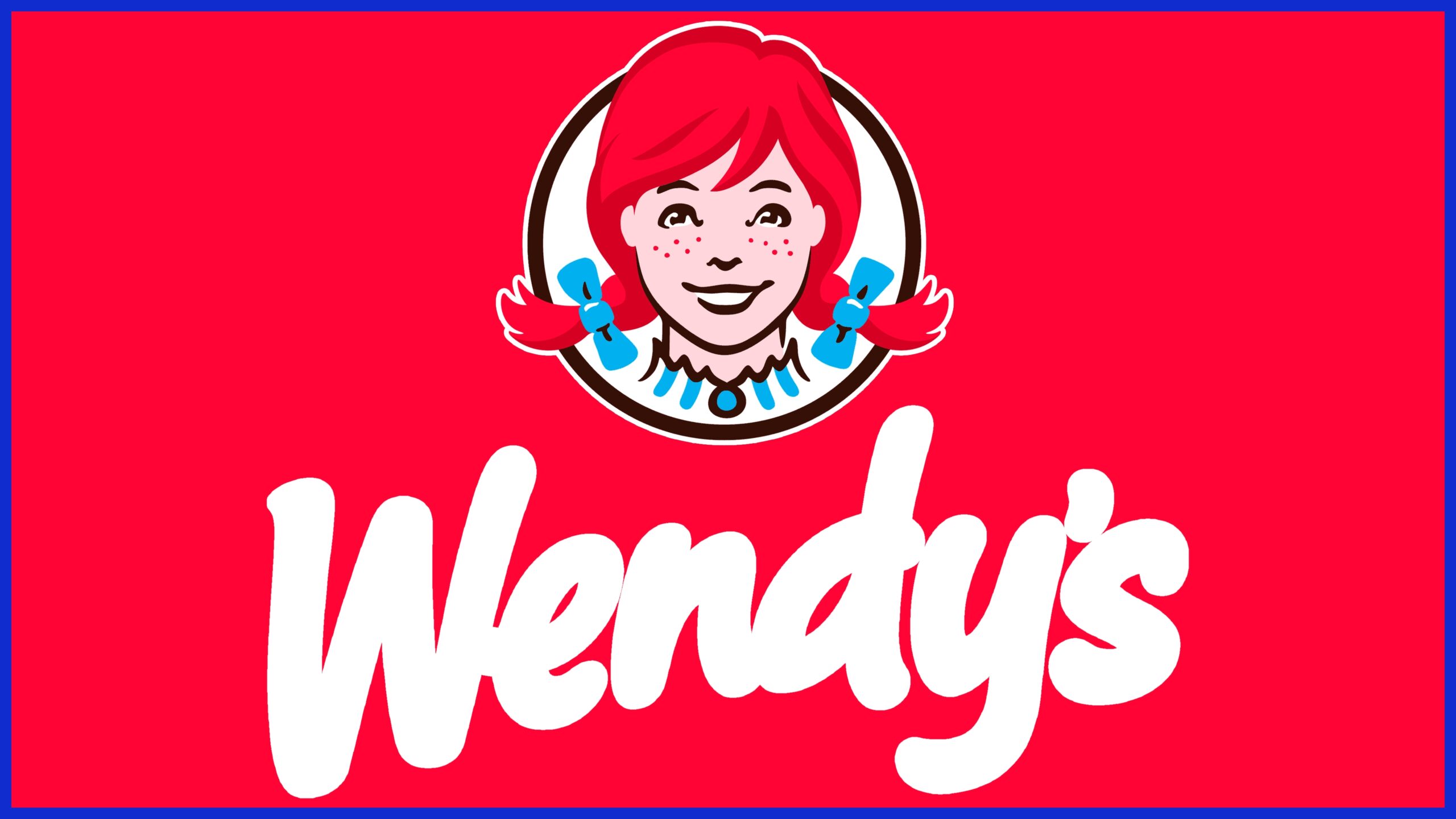
Look closely at Wendy’s red-haired girl: the letters on her collar spell “mom.” It’s a hidden message meant to evoke the feel of home-cooked meals.
30. Milwaukee Brewers
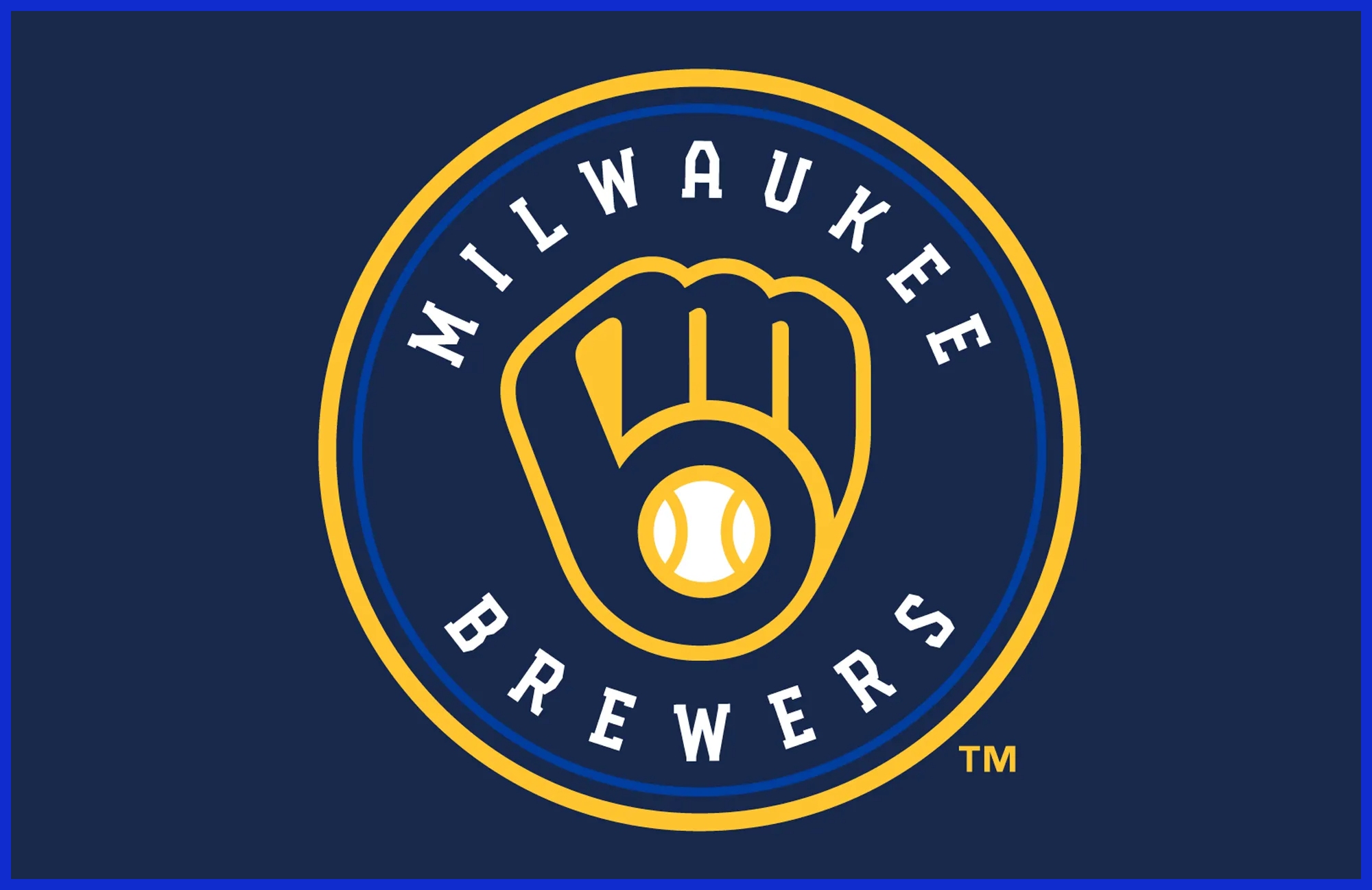
The old Brewers baseball logo (the glove) hides letters: the shape of the mitt forms a lowercase “m” and “b” – the team’s initials.
31. Atlanta Falcons
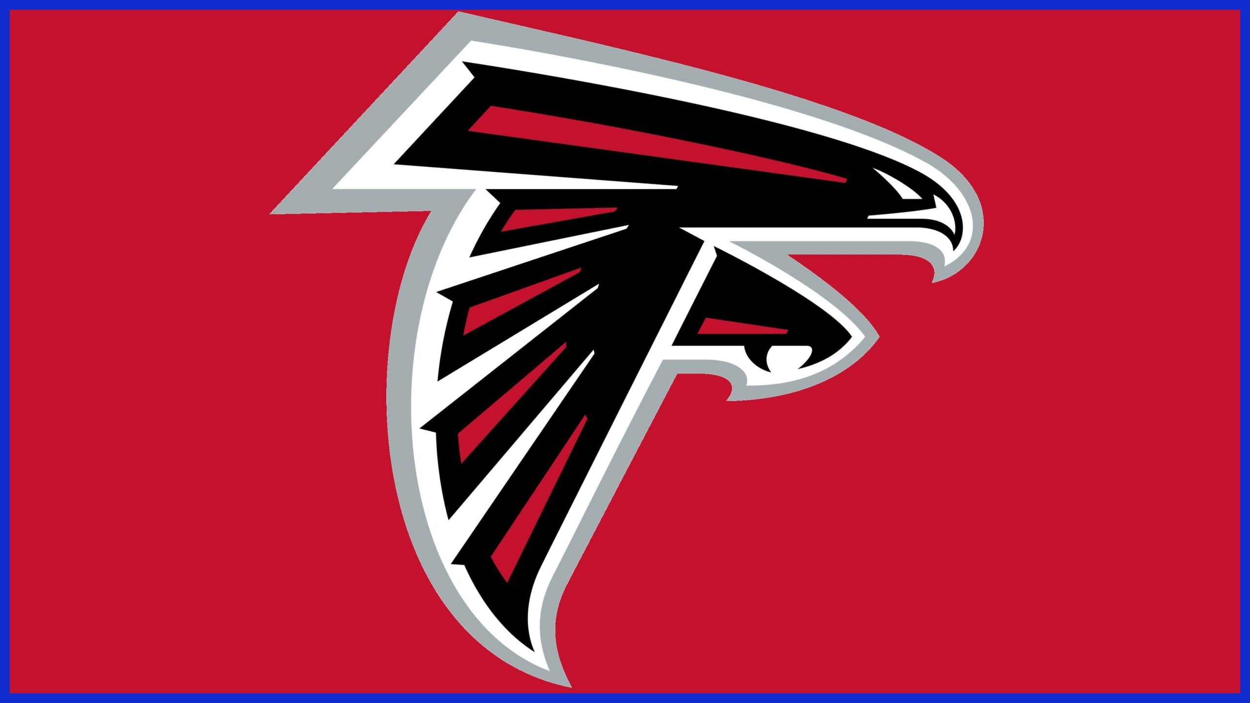
The Atlanta Falcons logo is a falcon, but notice the negative space: the bird is angled into the shape of the letter “F,” for Falcons.
32. Hyundai
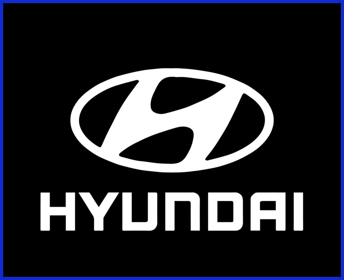
Hyundai’s tilted “H” logo is actually two people shaking hands. Look closely and you see the vertical stroke of the H plus a leaning partner – a clever way to symbolize trust and partnership.
Each of these logos uses a bit of design magic – via shapes, colors, or negative space – to deliver an extra “second message.” Decoding these small details can be fun, and it helps the logo stick in people’s minds.
The Psychology Behind Secrets
Hidden messages in logos do more than look cool—they tap into human psychology and enhance brand recognition. Research shows that secrets spark curiosity and pull people in, making a strong logo even more impactful. A clever design detail can even change how we see a brand, transforming it into a powerful symbol of identity.
When someone spots a hidden element, they experience that little thrill of discovery, akin to solving a puzzle. This moment not only makes the brand more memorable but also creates a stronger emotional bond with the audience, reinforcing the brand’s visual identity.
Secrets can be powerful. In everyday life, they might protect us, give us strength, or, on the flip side, cause isolation. But in branding, the right kind of secret does the opposite. Instead of pushing people away, it draws them closer.
That’s why many companies, like Graphically.io, use hidden messages in logos to help businesses stand out and create a unique way to engage their audience. A logo with a hidden meaning gives people a reason to look again—and to remember.
The “Aha!” Moment
You know that Eureka! feeling when you finally spot the hidden arrow in the FedEx logo or the “1” in Formula One? That’s the “aha!” moment. It feels like a tiny reward for paying attention.
Psychologists say this moment boosts positive feelings and makes people more likely to return to the brand. It’s a way to build loyalty without saying a word.
The Insider Feeling
Hidden messages also make customers feel like part of an exclusive club:
-
It’s like an inside joke – only those who notice get the extra meaning.
-
It deepens connection – Pinterest’s “P” doubles as a pushpin, making users feel clever for spotting it.
-
It builds loyalty – that insider vibe strengthens trust and creates long-term relationships.
When a logo makes people feel “in on the secret,” it transforms from a simple design into a shared experience.
The Memory Hook
Invisible notes act as memory cues. A smart twist makes a logo more memorable and more shareable. That makes brands memorable.
|
Logo |
Hidden Message |
Memory Hook |
|---|---|---|
|
Baskin Robbins |
“31” in pink (flavors) |
The number stands for variety |
|
FedEx |
Arrow in negative space |
Symbolizes speed and direction |
|
Amazon |
Arrow from A to Z |
Shows a wide product range, a smile |
|
Toblerone |
Bear in the mountain |
Nods to the brand’s Swiss roots |
Baskin-Robbins logo is a standout. The pink ‘31’ in the logo directs you to those original 31 flavors — indelible, for anyone who catches a glance. Brands should consider these hooks when collaborating with design teams such as Graphically.io.
A clever logo is not just design — it’s mnemonic.
How Designers Create Them
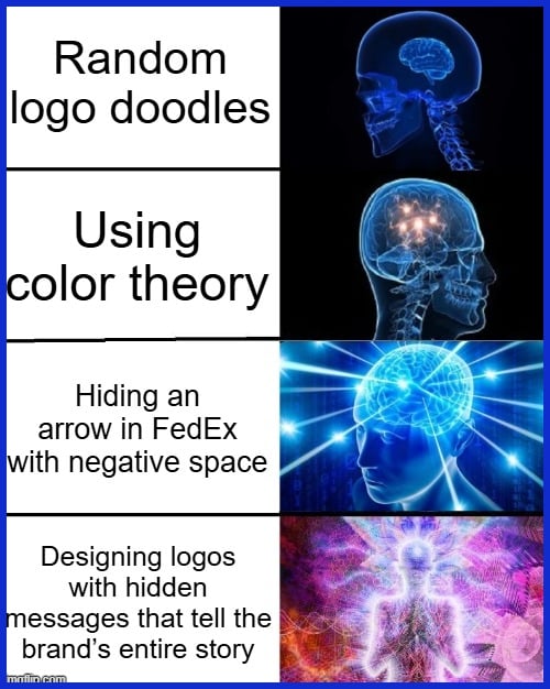
Hidden messages in logos aren’t accidental. These ingenious touches emerge from a thoughtful process that fuses imagination, brand requirements, and savvy design decisions. Designers employ a combination of time-tested and innovative techniques—such as negative space, color theory, and cultural references—to infuse additional meaning.
At Graphically.io, we observe how even little brands leverage these strategies to create logos that are catchy and intelligent.
-
Understand the Brand: Before putting pencil to paper, designers need a clear sense of the brand’s values, audience, and story. This stage aids in identifying motifs, icons, or concepts that may turn into clandestine ingredients.
-
Brainstorm and Ideate: The best logos start with lots of ideas—some wild, some simple. During this phase, designers sketch, doodle, and discuss ideas with colleagues or brand planners. They examine global moments, symbolic imagery, even insider humor—to discover significance that suits the brand.
-
Choose Techniques: Designers pick from a toolkit of methods. Negative space is a fave. Take, for instance, the FedEx logo, which utilises the negative space between the ‘E’ and the ‘x’ to form an arrow—depicting speed and direction. Typography tricks, color cues, and geometric shapes all conceal or suggest messages. Occasionally, a logo will employ a color for its cultural significance, such as green for growth or red for passion.
-
Sketch and Refine: After picking a direction, designers draw lots of drafts. They experiment with various combinations of visuals, forms, and hues. That’s where the magic happens. Brand strategists could highlight what concepts align with the brand narrative, or caution if something is too subtle.
-
Test for Clarity: Showing early drafts to others helps. If testers glimpse the subliminal quickly, it’s effective. If not, then perhaps it needs to be easier.
-
Finalize and Deliver: The last version balances all the elements—art, message, and function. At studios like Graphically.io, a quality team ensures everything gets accounted for and the logo functions at every size.
Avoiding Pitfalls
There are risks in making logos with hidden messages. If the secret is so hard to find, it won’t resonate. Over-designing muddies a logo. Common pitfalls include:
-
Hiding meanings so well that nobody sees them
-
Trying to use every color or shape, creating a cluttered logo.
-
Forgetting about how the logo looks at small sizes
-
Ignoring cultural meanings that might confuse or upset people
Easy to remember, distinct logos linger in people’s minds. No good designer stops there, though– they cross-check their work, seek feedback, and ensure the logo is telling its story, not to one audience, but all.
Conclusion
Secret meanings in logos reveal the playful, intelligent nature of design. Everyone from design geeks to ordinary consumers gets a kick out of catching clever bits like the FedEx arrow or the hidden bear in Toblerone. Designers incorporate shape, color, and space to ignite a smile or a pause. Even as brands expand and evolve, these little surprises linger. They transcend boundaries, inspire conversations, and connect fans. It’s an understated way to send a powerful message.
For brands that want to stand out and connect, smart design still works best. Looking to inject a little pizazz into your brand? Hang out with Graphically. The right touch can transform a bland mark into a tale folks can’t wait to tell.
Frequently Asked Questions
Hidden messages in logos are subtle images or symbols that designers incorporate into a logo. They frequently provide additional significance, communicate a brand narrative, or ignite intrigue, rendering the logo more memorable.
Designers use hidden meanings in logos to entertain and add depth to a brand, while also enhancing branding accuracy. These subtle imagery elements help powerful brands differentiate and connect to their audience more closely.
They create a brand’s visual identity in a clever and thoughtful way, inviting people to engage with the logo, which fosters brand recall and leaves a positive imprint.
Most hidden messages are purposeful and well-crafted. Sometimes viewers notice shapes or patterns that designers didn’t intend, and these can add new meanings.
Not necessarily. Different cultures may interpret symbols or colors differently, so designers must ensure that hidden meanings are clear and not offensive to a global audience.
Yes, as powerful brands update or globalize, their logo messages may be redesigned to maintain branding accuracy and ensure the message is heard by a fresh set of consumers.
Thanks to innovations in digital design, these sneaky communiques, like company logos, are increasingly clever and engaging. Next logos could potentially leverage animation or augmented reality to disclose hidden meanings.