You can draw the Nike swoosh from memory. The Apple silhouette takes three seconds to sketch. But ask someone to recreate the Versace logo, and they will stare at a blank page. This gap between instant recall and total forgetting separates good logos from forgettable ones. The difference comes down to a handful of design decisions that most people overlook.
A website logo carries a specific burden. It must function at billboard scale and shrink to a browser tab without losing its identity. It has to load fast, render cleanly on screens of varying quality, and communicate something useful about the brand behind it. These requirements are technical, but they rest on principles that have held steady for decades.
Table of Contents
Simplicity Does the Heavy Lifting
Recognition depends on how quickly a brain can process a shape. Intricate details slow that process down. Research confirms what intuition suggests: simpler logos earn more recognition than complex ones. WooRank notes this directly. People remember what they can draw.
Instagram provides a useful example. The app’s logo generates over 1.2 million monthly searches globally, according to DesignRush. The design is a rounded square with a camera outline. Nothing more. That restraint makes it stick.
Simplicity does not mean boring. It means removing elements that do not serve the design’s purpose. Every line, curve, and color choice should answer a question about what the brand represents. If an element cannot justify its presence, it weakens the whole.
Where Your Logo Lives Before It Exists

A logo needs a home before it can do its job. When building a wordpress website, setting up an online store, or launching a portfolio, the platform dictates certain technical constraints. Header dimensions, favicon requirements, and mobile display settings all shape how your logo will render. Designers who skip this step often produce work that looks brilliant in isolation but falls apart at 16 x 16 pixels.
The relationship between logo and platform runs both ways. A site built with fixed header heights limits vertical logo space. Retina displays demand higher resolution exports. Understanding these variables early prevents the common mistake of retrofitting a finished design into an incompatible framework.
Size Matters More Than You Think
A website header typically accommodates a logo at 250 by 100 pixels. Social platforms impose their own demands. Facebook and Instagram profile photos sit at 180 x 180 pixels. Favicons default to 16 x 16, though higher resolution displays use 32 x 32 or 48 x 48.
These numbers define the practical limits of your design. A logo that relies on fine typography or subtle gradients will blur into illegibility at favicon scale. The solution involves creating multiple versions of the same logo, each optimized for different contexts.
Frontify recommends at least 4 variations: a primary logo, a secondary version for smaller spaces, color variations including monochrome options, and orientation options for horizontal and vertical layouts. This approach ensures your mark remains consistent across every application.
File Formats and Why SVG Wins
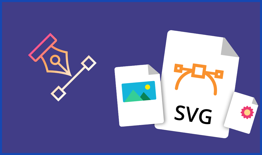
Vector graphics use mathematical equations to define shapes. This allows scaling without quality loss. Raster images, by contrast, pixelate when enlarged. For logos on the web, the choice is straightforward.
SVG files handle icons, logos, and illustrations better than any alternative. They render crisply at all resolutions and carry remarkably small file sizes. Cloudinary reports that optimized SVG files can weigh 80% less than unoptimized versions. That reduction improves page load times and overall site performance.
PNG files still have their place for complex imagery or photographs, but a well-designed logo should be simple enough to exist as a vector.
Color Tells a Story Without Words

People form opinions about products within 90 seconds, according to research cited by ofspace. Up to 90% of that judgment rests on color alone. These numbers explain why color selection deserves serious attention.
Ignyte Brands reports that color can increase brand recognition by 80%. Blue dominates Fortune 500 logos because it communicates stability and trust. Red suggests energy and urgency. Green signals growth or environmental awareness. These associations are not universal, but they hold across Western markets.
The Web Content Accessibility Guidelines require a contrast ratio of at least 4.5:1 for text and images of text. Logotypes receive an exemption from this rule. Still, a logo that disappears against certain backgrounds creates practical problems. Testing your design against light and dark surfaces prevents surprises after launch.
Placement Follows User Behavior
Users scan websites in predictable patterns. Eye-tracking research shows a strong preference for the F-shaped reading pattern, starting at the top left and moving right, then dropping down. Placing your logo in the top left corner aligns with this behavior.
Nielsen Norman Group research, as reported by Uxcel, found that traditional top-left placement produces an 89% improvement in brand recall compared to center alignment. Center placement can work for certain designs, but recognition takes a measurable hit.
This preference is not arbitrary. Users expect to find the logo in the top left because most websites put it there. That expectation creates a mental shortcut. When you place your logo elsewhere, you interrupt the shortcut and force users to search.
Motion Adds Personality
Animated logos have gained traction because they perform well on platforms that support motion. A logo that subtly shifts or transforms on hover creates a sense of energy without overwhelming the viewer.
Static logos still work perfectly well. Animation is not a requirement. But for brands targeting younger audiences or operating in creative industries, motion provides an opportunity to communicate personality that static marks cannot match.
The key constraint remains file size. Animated logos need to load quickly and play smoothly. Heavy animations that stall page rendering defeat their purpose.
Consistency Protects Your Investment
The Nike swoosh, Apple silhouette, and McDonald’s arches share something beyond good design. They appear identically across every platform, product, and piece of marketing. That consistency builds recognition over time.
A logo used inconsistently loses its cumulative value. Different colors, stretched proportions, or altered typography fragment the brand identity. Adchitects emphasizes that consistent branding, from color scheme to logo presentation, makes customers perceive a company as professional and trustworthy.
Creating brand guidelines that specify acceptable logo usage prevents drift. These guidelines should cover minimum sizes, spacing requirements, approved color variations, and prohibited modifications.
Five Dimensions of Effectiveness
Research published in the Linguistics and Culture Review identifies 5 dimensions that define an effective logo: simple, memorable, timeless, versatile, and appropriate. Each dimension addresses a different aspect of performance.
Simple logos register quickly. Memorable logos persist in the mind after brief exposure. Timeless logos resist the pull of passing trends. Versatile logos adapt to any context without losing coherence. Appropriate logos fit the brand they represent without explanation.
A logo can score well on 4 dimensions and fail completely on the fifth. A brilliantly simple mark that seems inappropriate for its industry will confuse customers. A memorable design that lacks versatility will create headaches for every future application.
Greatness requires all 5 working together.