Table of Contents
- Key Takeaways
- Core Design Principles From F1
- Design Evolution: Learning From F1’s Timeline
- Practical Design Ideas You Can Use
- The Power of Typography
- Common Design Mistakes to Avoid
- Conclusion
- Frequently Asked Questions
- How do I develop a signature visual style?
- Can I refresh my brand without losing recognition?
- Why does consistency matter so much in branding?
- What’s the difference between good design and great design?
- How do I design something that works on different screen sizes?
- How important is color choice really?
- What role does white space play?
- Should I use trendy design styles?
Key Takeaways
-
F1 uses bold color palettes, geometric shapes, and minimalist approaches to create instantly recognizable brand identities—principles you can use for your own brand or business
-
Learn from iconic liveries like Ferrari’s scarlet red and Gulf’s blue-and-orange to understand how limited color schemes create powerful, lasting recognition
-
Sponsor placement and negative space matter; F1 designers know how to create visual impact without clutter
-
Digital-first design thinking—flat designs, bold fonts, and adaptive graphics—keeps branding sharp across all platforms from billboards to mobile screens
-
Consistency across all touchpoints (products, merchandise, digital media) builds loyalty and trust
-
Modern F1 design trends lean toward minimalism, sustainability messaging, and interactive experiences
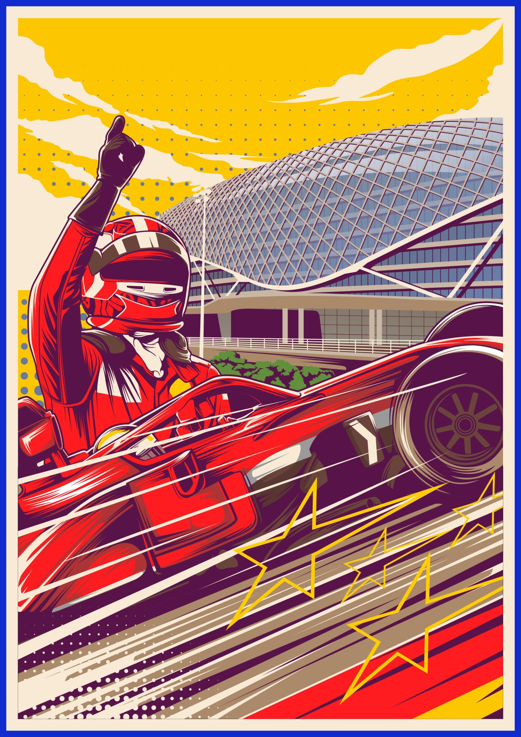
F1 graphic design is the visual language of Formula 1 teams—from the iconic car liveries and logos to race posters, merchandise, and digital campaigns. But here’s the thing: F1 designers have cracked the code on something that applies to any brand or business.
Think about it. When you see a Ferrari, you instantly recognize it by the shade of red alone. You spot a McLaren from miles away by its orange. The same principle works for any business trying to stand out. F1 teams don’t just paint pretty cars; they craft visual stories that fans recognize instantly on television, at the track, or on their phones. This level of visual clarity and impact is what every business—from startups to established companies—should aspire to achieve.
Whether you’re building a personal brand, launching a product, or growing a small business, understanding what makes F1 design so effective can transform how you think about your own visual identity.
Core Design Principles From F1
1. Bold Color Psychology
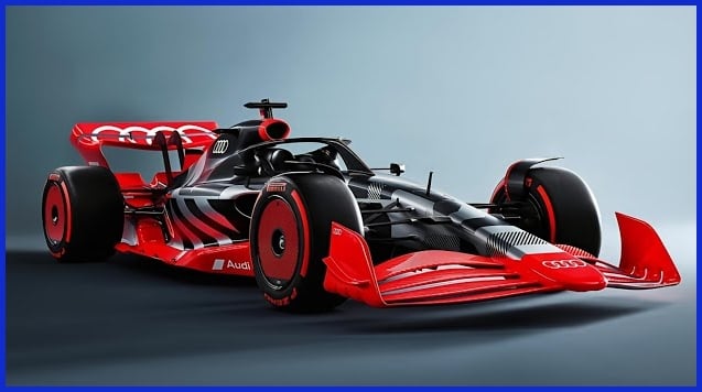
F1 teams understand that color is communication. Ferrari’s iconic red isn’t just tradition—it’s instant brand recognition. McLaren’s fluorescent orange cuts through visual noise on screen and at the track. Mercedes’ silver conveys precision and modernity, while Red Bull’s deep blue feels dynamic and aggressive.
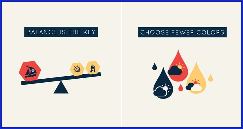
Here’s what you can learn: one signature color, used consistently, creates remarkable brand recognition. F1 proves that limiting your palette often strengthens your brand rather than weakening it. When people think of your business or product, they should be able to picture your color with their eyes closed.
Instead of trying to use every color in the rainbow, pick one or two signature colors that represent your brand’s personality and stick with them everywhere—your website, social media, packaging, even emails.
2. Geometric Shapes and Dynamic Lines

F1 car liveries use sharp angular lines, smooth curves, and geometric patterns to suggest speed and movement, even when the car is stationary. Look closely at a modern F1 livery, and you’ll notice how every line and shape serves a purpose—combining aesthetics with function.
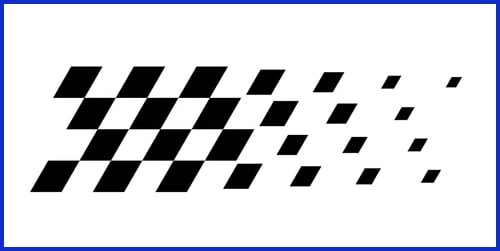
You can use this principle too. If you’re creating a logo, website design, or any visual material, think about what shapes and lines communicate about your brand. Sharp, angular lines suggest innovation and energy. Flowing, curved lines feel more elegant and approachable. Geometric patterns can make your design feel modern and structured.
The key is intentionality: every visual element should say something about who you are.
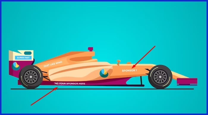
3. Strategic Sponsor Placement and Negative Space
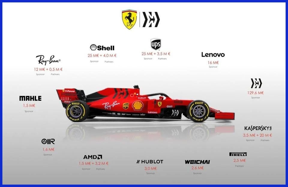
One of the hardest challenges in F1 design is integrating sponsor logos without making the car look cluttered. The best F1 liveries place logos thoughtfully, ensuring each element has breathing room and the overall design reads as unified rather than fragmented.
This teaches an essential lesson: white space is not wasted space. A logo floating in negative space often has more impact than one crammed between other elements. This applies whether you’re designing a website, social media post, or print material.
Don’t feel pressured to fill every inch of your design. Sometimes what you leave blank is just as important as what you fill in. Breathing room makes your design feel premium and intentional.
4. Iconic Livery Patterns
Some F1 liveries have become legendary because of their unique patterns and visual signatures. The Marlboro McLaren’s red-and-white horizontal stripes, Renault’s blue-and-yellow blocking, Jordan’s bright yellow “Buzzin’ Hornets,” and Gulf’s distinctive blue-and-orange swirl are instantly identifiable.
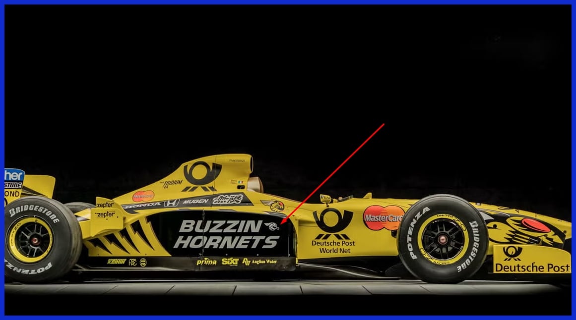
Here’s your takeaway: create a distinctive pattern or visual motif unique to your brand. This could be a specific stripe treatment, a geometric pattern, or a color blocking technique that appears consistently on your materials. This signature element becomes your visual fingerprint—something people recognize immediately.
Design Evolution: Learning From F1’s Timeline
F1 design has evolved dramatically over the decades, and each era teaches us something important:
|
Era |
Design Style |
What We Learn |
|---|---|---|
|
1950s-1970s |
Simple badges, heritage-focused, national colors |
Heritage matters; simplicity creates clarity |
|
1980s-1990s |
Bold, geometric, sponsor-heavy, bright colors |
Boldness demands attention; multiple elements need balance |
|
2000s |
Sleeker designs, 3D effects, metallic finishes |
Technology changes how we view design; adapt without losing identity |
|
2010s-2020s |
Minimalist, flat design, clean lines, mobile-friendly |
Less is more; your design needs to work everywhere |
Notice the trend? The designs went from ornate and sponsor-heavy to clean and minimalist. Why? Because F1 teams realized that a single bold color and crisp lines perform better on television, in photographs, and on mobile screens than complex, cluttered designs.
The lesson for you: don’t be afraid to refresh your visual identity. Strip away unnecessary elements, but keep what makes you recognizable. Evolution, not revolution.
The Unmistakable F1 Aesthetic: What Makes It Work
F1’s visual identity succeeds because it combines several key elements working together:
Speed and Movement: Angular lines, dynamic curves, and asymmetrical compositions suggest velocity and energy, even in a still image.
Vibrant, Purposeful Colors: Every color serves a function—differentiation, emotional resonance, or communication of brand values. There are no random color choices.
Clean, Legible Typography: Fonts are bold and readable, often custom-designed to match the brand’s personality. If people can’t read it quickly, it fails.
Consistent Application: The same visual language appears on cars, uniforms, team gear, and digital assets. This consistency builds recognition and trust.
Strategic Simplicity: Despite the fast-paced environment where designs must be read in seconds, F1 avoids clutter by prioritizing clarity over complexity.
Practical Design Ideas You Can Use
1. Develop a Complete Visual System
F1 teams don’t rely on a single logo. They develop comprehensive visual systems that include color palettes, typography choices, icons, and pattern libraries—all working together.
For your brand, create a simple design system that includes:
-
Your primary and secondary color palettes
-
The fonts you’ll use consistently
-
Any graphic elements or icons unique to your brand
-
Rules for spacing and composition
This gives you flexibility while maintaining consistency.
2. Design for Every Screen Size
Your design needs to work everywhere—from a massive billboard to a phone screen. Use design tools to enhance images so they remain sharp and visually appealing across all platforms and sizes. This means testing how your logo, colors, and fonts look at different sizes. A design that looks great on a poster might be illegible on a business card.
Keep it simple: use bold, clean shapes; ensure colors have high contrast; and test your typography at small sizes.
3. Use Color Blocking for Impact
Instead of subtle gradients or complex layering, consider bold color blocking—distinct sections of solid color that create visual drama. This approach is especially effective in digital design where simplicity often outperforms complexity.
A classic example is the Gulf oil brand’s blue-and-orange swirl. Simple, bold, unforgettable.
4. Balance Heritage with Innovation
F1 teams regularly refresh their liveries without abandoning their identity. A new design might simplify the color scheme, modernize the typography, or introduce new graphic elements—but fans still recognize the team.
Think about your own brand this way: evolution, not revolution. Small thoughtful changes can modernize your image without losing what made people loyal to you in the first place.
The Power of Typography
F1 teams use custom fonts and bold typeface choices to strengthen their brand identity. Think about how different teams have signature font treatments on their numbers and team names. These typographic choices make the brand feel complete and intentional.
For your design: invest in distinctive typography. A custom or modified font creates uniqueness that generic, off-the-shelf fonts cannot achieve. Your typography should reflect your brand’s personality—whether you’re bold and aggressive or elegant and refined.
Digital-First Design Thinking
Modern F1 design embraces digital-first principles, and you should too:
-
Flat designs: No unnecessary 3D effects that distract or clutter
-
High contrast: Bold colors and clear distinctions so designs pop on screens
-
Simplified shapes: Clean geometry that renders beautifully at any resolution
-
Responsive thinking: Your design should adapt from large displays to mobile phones
-
Animation potential: Think about how your design might move and change
Whether you’re designing a website, social media content, or app interface, these principles make your work look modern and professional.
Interactive and Immersive Design Trends
F1 is experimenting with augmented reality overlays, interactive leaderboards, and 3D visualizations. Even if you’re not ready for cutting-edge AR technology, thinking about interactive and engaging design keeps your brand future-ready.
Consider: How can your brand create engaging experiences beyond static images? This might be animated social media content, interactive website elements, or a design that invites participation.
Common Design Mistakes to Avoid
-
Visual Clutter: Too many elements fighting for attention dilute your message. Selective, strategic choices look more premium.
-
Poor Color Contrast: A color that looks great on your monitor might be unreadable on someone else’s screen or in different lighting. Always test.
-
Inconsistent Application: Using your logo differently across different platforms creates confusion. Establish clear guidelines and stick to them.
-
Ignoring White Space: Cramming every pixel with content weakens impact. Breathing room strengthens design.
-
Overcomplicating Typography: Custom fonts should enhance your brand, not sacrifice readability. If people can’t read it in a second, it fails.
-
One-Size-Fits-All Design: A design that works at poster size might fail at favicon size. Always test at multiple scales.
How to Think About Your Own Brand
Here’s the simple framework F1 teams use that you can apply to any brand:
-
Pick Your Identity: What’s one or two colors that represent you? What shapes or patterns are uniquely yours?
-
Keep It Consistent: Use the same colors, fonts, and patterns everywhere—website, social media, business cards, anything people see.
-
Make It Simple: Clear, bold choices beat complex, cluttered ones.
-
Test Everything: How does your design look small? On screens? In print? In different lighting?
-
Evolve Thoughtfully: Your brand doesn’t need a complete overhaul. Small improvements that maintain your core identity are stronger than radical changes.
Real-World Inspiration From F1
Think about these iconic liveries and what made them unforgettable:
-
Ferrari Red: So signature that people recognize the team by color alone
-
Gulf’s Blue-and-Orange Swirl: A pattern so distinctive it became iconic across motorsports
-
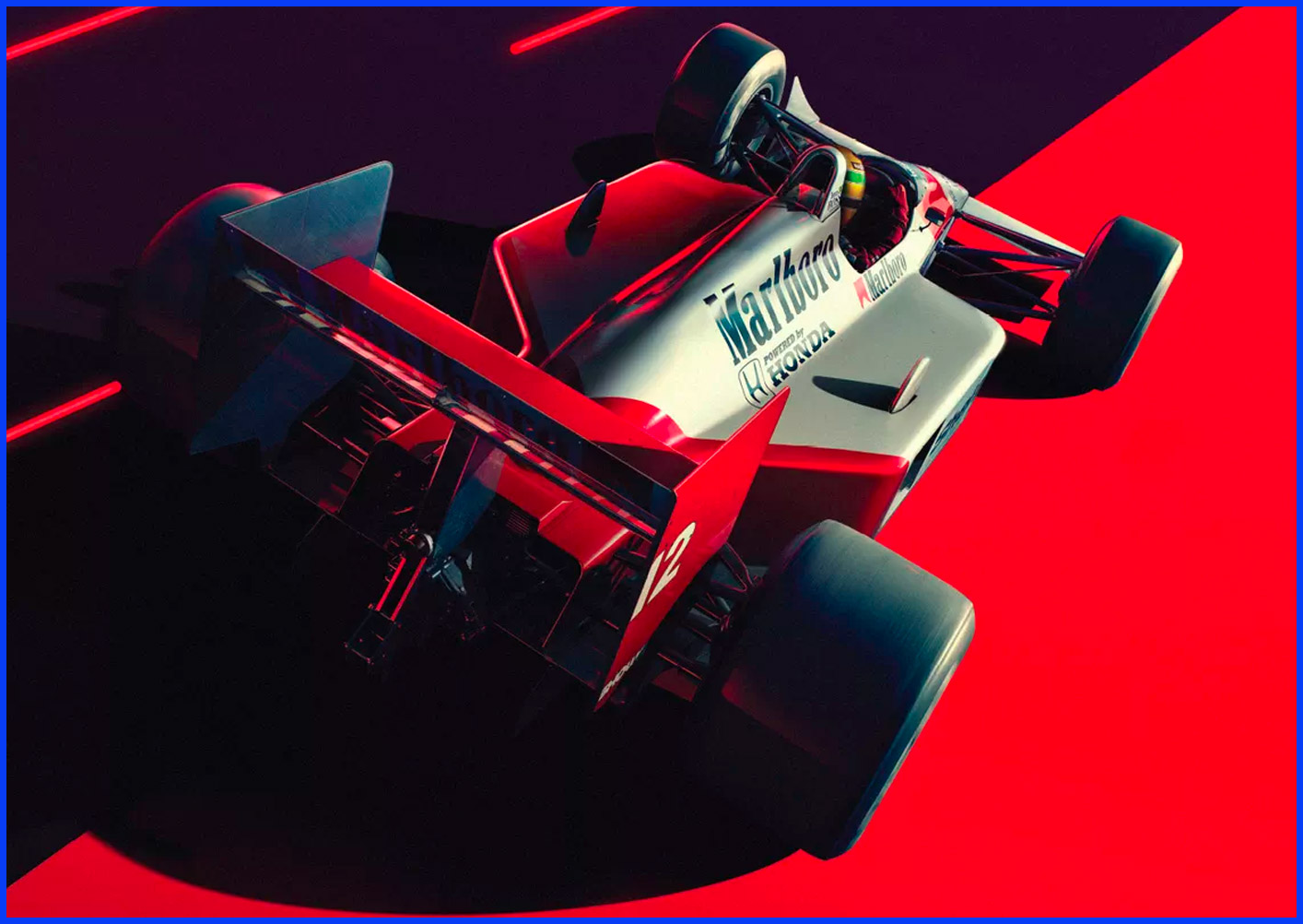
Marlboro McLaren’s Red-White Stripes: Simple, bold, instantly identifiable
-
Lotus Black-and-Gold: Elegant, distinctive, memorable
These designs lasted for decades because they were bold, simple, and consistent. That’s what makes them timeless.
Conclusion
F1 graphic design succeeds because it’s about more than making things look fast. It’s about strategic visual communication, consistency, clarity, and understanding how people recognize and remember brands. These principles work whether you’re designing a race car or a small business identity.
The takeaway is simple: be bold with color, keep it consistent, respect white space, choose your elements deliberately, and always test how your design works in the real world. These principles aren’t just for big brands or sports teams. They work for anyone who wants to create a visual identity that people remember and recognize instantly.
Your brand deserves F1-level strategic thinking. Start with one signature color. Add a distinctive element. Keep it consistent everywhere. That’s how you build a brand people recognize from a mile away—just like Ferrari. Once you’ve identified your design direction inspired by F1’s principles, bringing those ideas to life is the next step, and Graphically can help you with that.
Frequently Asked Questions
How do I develop a signature visual style?
Start with a limited color palette (ideally 2-3 primary colors), choose distinctive typography, and create a unique graphic element or pattern. Repeat these elements consistently across all applications until they become synonymous with your brand.
Can I refresh my brand without losing recognition?
Absolutely. The key is maintaining your core identity elements (colors, typography, iconic shapes) while modernizing how they’re applied. F1 teams do this regularly—updating liveries while keeping the brand instantly recognizable.
Why does consistency matter so much in branding?
Consistency is what builds recognition and loyalty. When people see the same visual language across your website, social media, products, and materials, it reinforces your brand identity. Mixed or inconsistent branding creates confusion.
What’s the difference between good design and great design?
Good design looks nice. Great design communicates quickly, works across multiple contexts and sizes, builds recognition, and remains effective for years. It solves problems while looking beautiful.
How do I design something that works on different screen sizes?
Think digital-first: use bold, simple shapes; ensure high contrast between colors; test typography at small sizes; and avoid fine details that disappear when scaled down. Your design should be readable from a billboard to a phone screen.
How important is color choice really?
Extremely important. Color is often the first thing people recognize about your brand. Ferrari is recognized by red alone. Your color choice should reflect your brand’s personality and be used consistently everywhere.
What role does white space play?
White space (empty space) is as important as the elements you include. It makes designs feel premium, prevents clutter, and helps key elements stand out. Don’t feel pressured to fill every inch.
Should I use trendy design styles?
Be careful with trends. They fade quickly. Instead, focus on timeless design principles—clarity, consistency, bold choices—that will remain effective for years. You can incorporate current trends subtly, but your core design should endure.