Typography is one of the most important elements of graphic design. A designer must know about the different principles of typography to create an excellent design. Typography is not only the kind of font you use but also involves many other aspects.
You need to know about the different typefaces, font usage, color usage, and many other elements that would make your design the best. It is your responsibility, as a designer, to know extensively about typography.
In this module, you will learn about the different typography rules that need to be followed to create a successful design.
Table of Contents
Know the Basics
The first thing that you need to focus on is the basics of the art. If you are new to this work, then you might think that knowing about typography is very simple. However, what most people do not know is that there are many tiny aspects to good typography work.

(Source : Google Images)
Learn the different typefaces, typography vocabulary, measurements, specifications, and other aspects of the art. Without theoretical knowledge, you would not be able to practically make use of them. Spend time learning the different techniques involved in typography.
Understand Typeface Selection
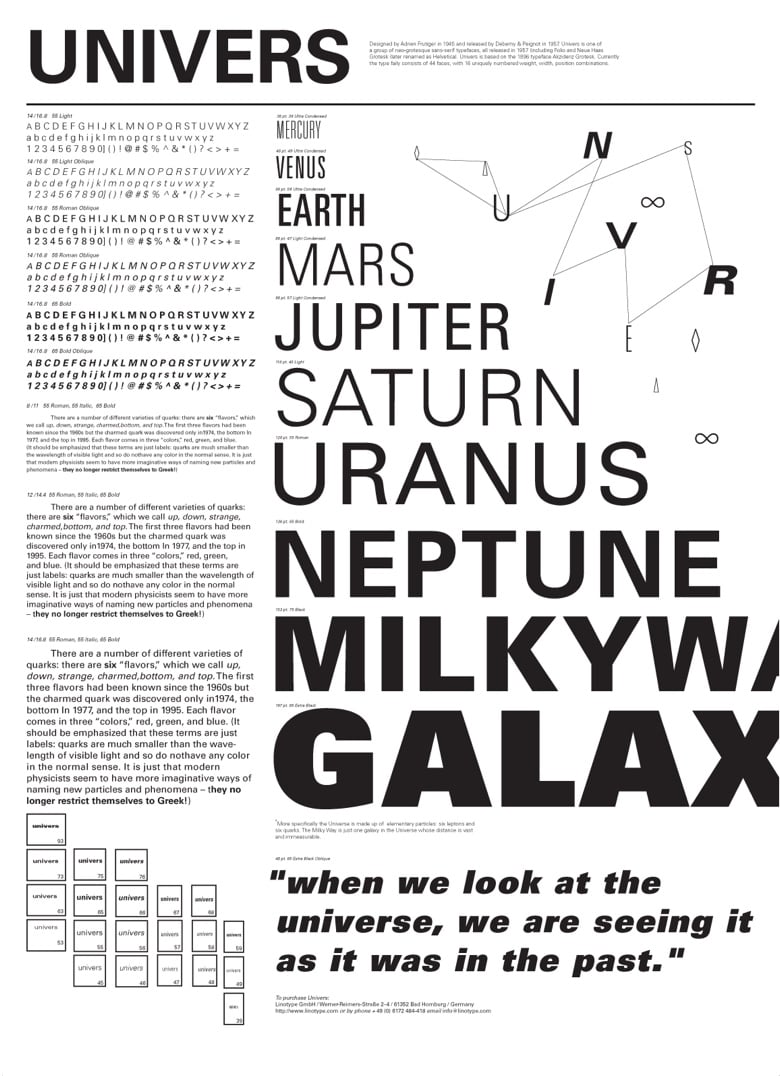
One of the hardest processes of typography is selecting a typeface. There are hundreds of typefaces available in the font catalog. An amateur designer will simply pick a typeface that speaks to them and includes them in the design. However, the effect may not always be fruitful.
(Source : Google Images)
You need to select a typeface that matches the kind of message your design is trying to give to the audience. If you are designing something for a management organization, you would not be using colorful fonts, rather you would opt for something professional. Also, avoid ligature fonts since they can be confusing for the audience.
Understand Kerning
Kerning is the process used to tune the spaces between the characters present in a design. This is done so that there is a unified and streamlined pairing in the design. Most people do not pay attention to kerning, but experienced designers know how different the design can be when the kerning job is done excellently.
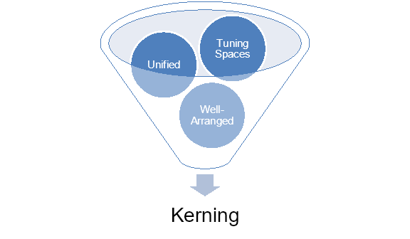
The main aim of kerning is to ensure that the space between every character is even so that the text is well-arranged. You might use different designer software to create your design, but even the software cannot complete the kerning job. As a designer, you need to have the proper knowledge to manually do the kerning job.
Limit Font Usage
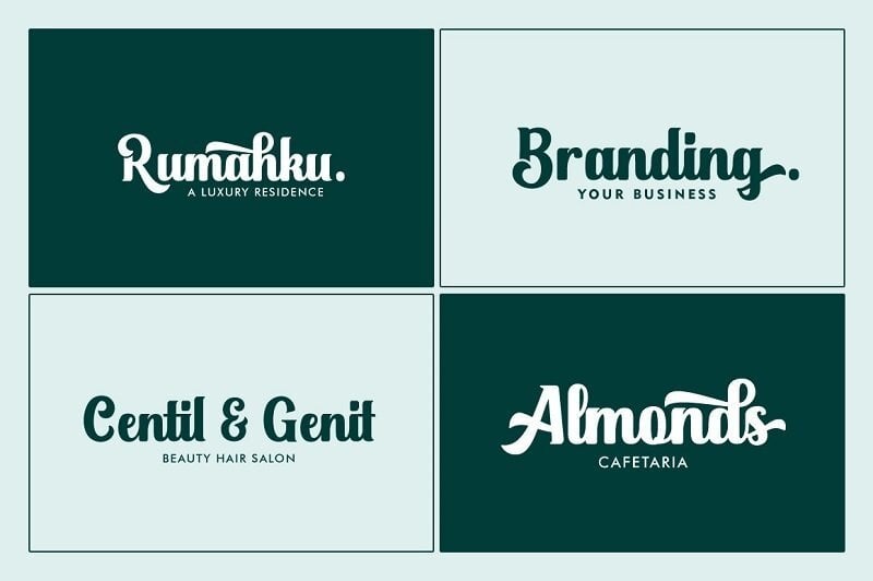
Most new designers make the mistake of using a variety of fonts. However, this wide variety of styles and fonts can spoil the design and make it seem very amateurish. It is right that you do need to include more than one font to create variety in a design. Try to limit this usage to two or a maximum of three typefaces.
(Source : Google Images)
You can use fonts that belong to different typeface families so that the audience can distinguish between different elements of the design. Moreover, using similar type fonts may create confusion for you, which will again be bad for the design.
Secure the Alignment
Alignment is another very important part of typography. Most amateur designers opt for Justified or Center Alignment, which can be hard for the user to read. People who are knowledgeable about MS-Word know about the four types of alignment options, namely, Center, Right, Left, and Justified.

(Source : Google Images)
For designs, it is better to use Left or Right alignment as it gives a good texture to the design. Moreover, it is also good for the eyes as users could read with one-sided alignment better. However, make sure that you keep an eye out for any ragged lines when you use these two alignments.
Use Grids
Using grids for your design would make it more practical and would also provide visual harmony. Both amateurs and experienced designers need to consider grids when creating a design. This would ensure that all the elements in the design are related to each other correctly.

Once you have had a sense of how to position different elements, you can avoid using grids. But you can always check before completing the design if all the elements are in the correct place using a grid. This would make your design much more appealing and make you confident about the work.
Use Font Pairing Smartly
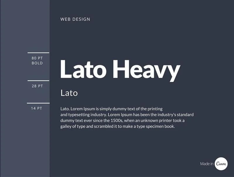
If your design requires pairing up different text elements together, then make sure that you pair up the right font types. Not all fonts would go well with each other. Here you need to be more technical than visual to see which fonts would go with one another. As already stated, you should never use more than two or three fonts in a design.
(Source : Google Images)
Suppose you need a heading and a text below that make sure that the fonts you use for the heading and the text are different yet similar. Since you would mostly be using different typeface families, you need to be very cautious about this pairing up of fonts.
Font Measurement
Learning to measure typography is extremely important for a design, especially if you are designing websites. When designing a website, you will most definitely be using different fonts to emphasize different elements. You need to remember that not all the fonts will take up the same amount of space ratio on the page.
The height, size, and width of each font type would be different. If this is not measured correctly, then the web page would not look good. That is why you have to see that the measurement of all the font sizes is the same so that there is evenness in the design.
Use the Font Palette Properly
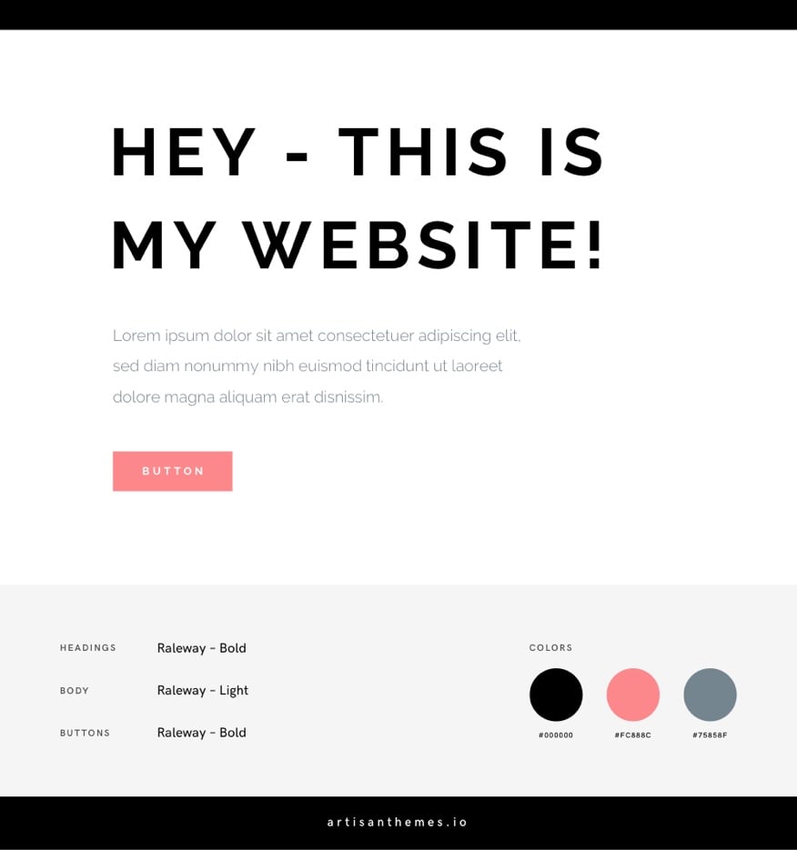
Color is a very strong and powerful tool that can convert any design from bad to good and vice versa. Suppose you take a professional and strong font, but choose the wrong color which does not go with the design, then you will have spoilt the design. That is why you need to use the font palette very carefully.
(Source : Google Images)
When you study typography, you will find that each color has a different depiction. There are professional colors and unprofessional colors. Make sure that you choose the right kind of color that matches the type and message of your design. Moreover, the font color should not distract the audience from the main message.
Do Not Stretch Fonts
Stretching fonts is one mistake that even experienced designers commit some time. Each font has a measurement that changes once you stretch the font. If you want to use a bigger or smaller size of the font, then you can change the font size. However, stretching it destroys the value, efficiency, and detailing of the font.

You can also use fonts that are tall or wide, just like the way you want. In the font family, you can find various good fonts that would meet your measurement requirements. However, taking a font and stretching it destroys the whole essence of the font as well as the design.
Use White Space Wisely
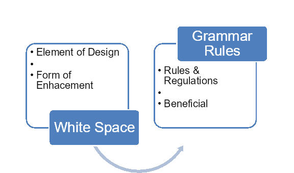
A very important component of a design is the white space. White space is an area where there are no elements in the design. However, you should not forget white space in itself is an element of the design and an essential one at that. Using the white space wisely would change your design for the better.
Do not fill the white space unnecessarily or even keep it completely blank. You need to design your elements around the white space in such a way that it enhances the look and feel of the design. The white space will help in highlighting the important parts of your design.
Follow Grammar Rules
Even in a design, you need to be very attentive to the grammar of the text that you are using. Grammar can be a tricky thing, and this is where most designers go wrong. You have to know where to put the punctuations, dashes, apostrophes, and hyphens. Even the spaces should be at the correct parts in the text.
Choose the Right Tools
Using the right tools is very important if you want to make a good design. In design, there is no right and wrong when it comes to the tools or software. You need to see which tool you are comfortable working with. You can take recommendations from experts, but in the end, you have to see if the tool suits you.
You can choose some of the popular ones that are provided by Adobe. However, you can go for other tools as well if you see that you are comfortable using them. Every designer has a different style and comfort-zone for working, and this needs to be established in the tool they use.
Our team is equipped with all of the industry standard tools to get your job done, just look at what our graphic design testimonials say.
To Sum Up
The rules stated above are a guide for you when you create your design. These are not the only rules that you need to follow. The field of typography is quite extensive, and you need to have an in-depth knowledge of the same before you can build a good design.
The best thing to do in such a scenario is to practice your skills. There is no end to learning about typography, and you need to follow the trial and error method to see which rules you are following. Make rough designs to see if they adhere to all the typography rules that have been stated here.


