Do you think the only thing that matters is the content you deliver? Yes, the message conveyed in the text is essential, but its design and layout are even more significant. Are you wondering how that makes sense?
Read on to know the importance of font sizes and styles in everything you write.
You must be thinking that you are not here to draw but to write. According to you, what is the first thing that a person will note in your snippet? Is the message conveyed? No. it is the design of the text. This is where typography comes into the picture.
Be it your website or a simple document, the right font style and size make a notable difference. Typography is the art of presenting your content professionally and powerfully. It is so because the textual section is as important as the visual, sometimes even more!
So, what is typography? How can you determine the right design for your text? To get a hold of this, you must first know what are font sizes and styles all about. This article will take you on a font ride—from its meaning and types to its uses and importance.
Put on your belt and sit tight!
Table of Contents
What is Font Size? – An Overview
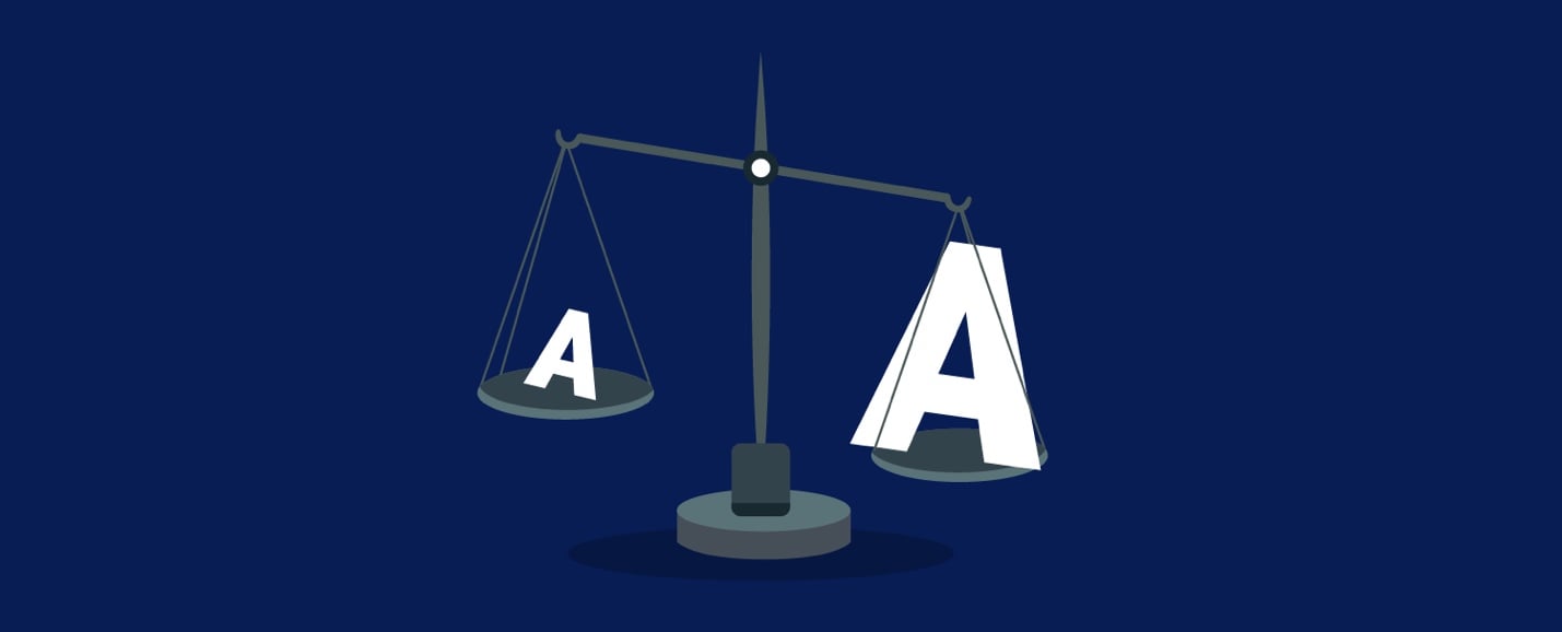
Font size is how small or big the characters are displayed on your screen. It is usually measured in terms of pt (points), where 72 points are equal to an inch. It may be as small as 1pt or as large as 1000pt (way too big to fit on a page).
The right font size helps to build the interest of the viewer. If it is too difficult to read, your audience may just skip through. On the other hand, if the text is too big, the entire page will look congested and unattractive. Therefore, it is imperative to choose the right size for your text.
This is important to know if you want to learn to design quotes, and other types of text that can perform well on social media such as Instagram for your brand.
What is the Ideal Font Size?
The font size of your text should neither be too large nor too small. The ideal size would be what lies somewhere in the middle. It should be comfortable to read and understand without straining the eyes.
The ideal size depends on the purpose of your text. Setting a big size for the heading helps grab the attention of the readers. However, it cannot be used throughout the page. For your viewers to focus on the textual body, it must be a small size.

The ideal font size for a heading is 16 points, while for the body text, it is 12 points. However, you can also set your main title to 18 points or 14 points. Similarly, 10 points are also suitable for the text in your content body.
What is Font Style? – An Overview
To place it in simple words, font style is a unique way of styling a character or letter. It may be the bold, italic, or oblique version of the same font family. To understand the style profoundly, let us first get to the font families and their types.
The right fonts can actually be key tools of user experience in and of themselves.
Every font style that you use belongs to a family. It differs based on width, stroke weight, slant, etc. Its first part may be the family name such as Helvetica, Times, Arial, etc. Simultaneously, the generic family will be the second part, such as sans-serif, monospace, serif, etc. While there are thousands of font families, the generic families are a total of five.

Sans-serif
This type of font does not end with an extended line or stroke. Sans-serif is simple, presenting minimal design, which is why it is the most widely used typeface.
Serif
Quite the opposite to the former, Serif font has an extra stroke or line at the end of a character stroke. Though readable, Serif fonts are not preferable for professional use.
Fantasy
These fonts are primarily used for decorative purposes. The Fantasy font family contains characters that are playfully-designed.
Monospace
The fixed-width font, Monospace, is a typeface whose characters occupy the same horizontal space. It means whether you type ‘a’ or ‘I,’ it will occupy the same amount of space on a page. It is chiefly used in typewriters, scripts, etc.
Cursive
A type of writing, the cursive font family contains characters connected or have joining strokes. The connection may be partial or complete, with the previous and the next letter of the word.
Types of Font Styles
Each generic family has a certain number of font styles. However, monospace has only one. Let us take a brief overview of the types of font styles.

Sans Serif Styles
Grotesque, Humanistic, Geometric, Squared. Some of the famous brands that use these styles are LinkedIn, Calvin Klein, etc.
Serif Styles
Slab, Glyphic, Transitional, Neoclassical & Didone, Old Style, Clarendon. Serif styles are majorly used by Abercrombie & Fitch, Zara, and Tiffany & Co., to name a few.
Cursive Styles
Formal, Calligraphic, Casual, Blackletter & Lombardic. Some famous brands in their logos apply cursive or script fonts. These are Coca Cola, Cadillac, Instagram, and many more.
Fantasy Styles
Graffiti, Grunge, Psychedelic. Decorative or Fantasy styles are appealing and fancy. They are seen in logos of Fanta, Lego, etc.
What is the Ideal Font Style?
The ultimate or ideal font size is the one that is easy to read. It must leave enough space between each character, have a consistent structure, and showcase a sophisticated look. One of the most commonly used font styles is Helvetica.
It has a high readability factor, exhibits uniformity and comfort. Helvetica belongs to the sans-serif font family, which is one of the most popularly used. As a result, this font style is used by multiple companies such as Panasonic, Toyota, Skype, and more.
That said, you must know that the ideal font style for your document depends on several aspects. Multiple factors affect the use and popularity of a particular font, as discussed in the next section.
Factors Affecting the Font Design
Culture

You live in a society where culture impacts most of your choices, if not all. If a font is connected with the ‘bad guys,’ you will automatically set that image in your mind. For example, Blackletter was used in Hitler posters or prison tattoos. This impression did not originate with the font but was created over time.
Another example can be how the train station sign differs in New York from the one in Germany. It is directly connected to the location, neighborhood, and the people of that area.
Forget about different countries; a modern town’s culture would be different from an ancient one. You will be able to see it through the letterforms in the board signs.
Trend
Every style lasts only for a while, and so is the case with font styles. Do you remember when WordArt was the trend of the time? That passed too. Similarly, 2019 was the year of hand-drawn fonts. From YouTubers to bloggers, creators preferred the natural fonts over others.
Apart from that, Vintage fonts were one of the most-liked ones all over the internet. The wave made sans serif appear on the web more than usual. Another one was the bold fonts. Content creators always want to grab their audiences’ attention, and bold fonts certainly take up considerable space.
Several fonts from last year have continued to stay in the spotlight in 2020 as well. Retro, san-serifs (outlined, combination, and rounded), and hand-drawn are some of the font styles of the year. Some of the most popular among these are Crimson, Roboto, Times New Roman, and Helvetica.
Technology
Apart from trends, the font design is highly influenced by technology. With digitalization on the rise, developers play with font styles in a way that traditional printers never did. One such example is the usage of alphabet characters as icons instead of the traditional image icon. You can find ‘A’ as the app store icon, ‘in’ as the linked icon, and many more.

(Source : Google Images)
Getting to the big players of the market, you must have surely noticed the font used in Google’s logo. It is a sans serif font that replaced the Catull BQ serif font around 5 years ago. The brand logo signifies how simple and minimalistic designs can make a difference.

(Source : Google Images)
Another technology giant—Intel, uses Neo Sans in its logo. Facebook, on the other hand, uses Kalvika, which is a combination of humanist and geometric styles, symbolizing social technology.
So how are you going to choose the right font for your web page or document? Is it going to be influenced by the local culture, current trend, or the latest technology? Here are a few things to consider while choosing the right font for your text.
How to Pick the Right Font Type for You?
Purpose of the Text
What is the purpose of your text? Is it to inform someone about a specific topic or to invite someone to an event? Your write-up must portray the message that you want to convey to your readers. If you intend to give some news in a short line, you must use the bold font.
Alternatively, if you want your readers to study a particular subject’s details, the font must be small. Furthermore, different typefaces have varying moods. It may be modern or traditional, formal or informal, light or dramatic.
For example, Times New Roman is a traditional type, while Verdana is a modern one. Helvetica, on the other hand, is capable of delivering varying moods according to other typefaces.
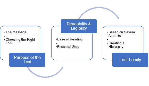
Readability and Legibility
You do not want the person reading your text to put extra effort into reading the message you want to deliver. If you do so, you will drive them to another page or document. Readability refers to the ease of reading a given excerpt. It has even more importance in the long textual content.
Some fonts may be attractive to the eyes, but they are too fancy, making it difficult to read. A few examples of which will be Brush Script, Lucida Calligraphy, Vivaldi, etc.
Font Family
As discussed above, there are several font families. Choosing a specific type of family is based on weight, such as light, regular, heavy, etc. Apart from bold, fonts of the same family may differ according to italic and oblique use.
The varying types may help you create a hierarchy in the text, such as heading, subheading, text body, and sundries.
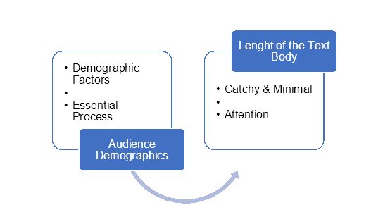
Audience Demographics
The main objective of your content is for the audience who’s going to read it. Therefore, it is essential to determine your readers’ demographic factors like age, gender, profession, and preference. You can choose the right font style only after you are sure who the text is for!
For example, if you want to design a concert poster, the font should be fancy, popping, and fashionable. You may go for a cursive style or fantasy style font.
Length of the Text Body
If you want to write headlines or short texts, the fonts used should be catchy, which grabs the attention. On the other hand, if your content is lengthy such as articles, blogs, etc., the font style must be minimal.
Apart from that, text like keywords and notable points can be italicized or bold to stand out.
Parts of a Font—The Anatomy
For understanding how to differentiate and identify the various font styles, you must first know the parts of a font. Here is a list of a few of them.
- Aperture: The space at the end of an open character such as ‘A’ and ‘n.’
- Arm: A horizontal line which is not connected from one or both ends, such as in ‘E’ and ‘F.’
- Ascender: It is a vertical line that extends above the character’s x-height, such as in ‘h’ and ‘k.’ It is usually found in lowercase letters.
- Baseline: The line where all the letters of a word sit.
- Bowl: A curved section of a character that encloses its counter or space.
- Counter: The space in a letter that is completely or partially enclosed.
- Eye: The eye-like shape in alphabets, such as the upper area of ‘e.’
- Loop: The counter that comes below the baseline, such as in ‘g.’
- Serif: The extra line or stroke at the end of a character like in ‘Times New Roman.’
- Shoulder: A curved line that usually begins from a stem, such as in ‘h.’
- Stem: The prime vertical straight line is not an extension such as in ‘F’ and ‘l.’
- Tail: A stroke that descends from the body of the character such as in ‘R’ and ‘K.’
- x-height: The length or height of a lowercase character’s main body, such as ‘a’ and ‘c.’
Once you know the parts of a character or a typeface, you can identify the different fonts. Some factors that you can notice are positions of the:
- e-bar
- vertical serif
- slab serif
- sans serif
- wedge serif
Helvetica
Why Helvetica out of thousands of fonts? The simple answer would be because it is simple, sophisticated, and easy to read. A part of the sans-serif family, Helvetica is so popular that the font has a typography-based movie named after it.

(Source : Google Images)
The font was released in 1957 by Akzidenz Grotesk. From the immense marketing that it received in the ‘70s to getting situated with Apple, Helvetica has always been famous.
Once connected to Apple, Helvetica was raised to extremely high levels by designers and creators. Here, you can relate to the font being loved by all due to the cultural influence. It’s tight spacing, clean curves, and clear representation are some of the features that add to its popularity.
To further understand how a particular font becomes legible, let us compare it with another font.
Comic Sans vs Helvetica
Mood
Comic Sans is known to deliver a playful, child-like mood. It is usually not used for serious work, but more like kids’ books, kindergartens, etc. On the other hand, Helvetica delivers a strong yet neutral vibe. It can be used for varying purposes and still fit perfectly.

(Source : Google Images)
Stroke
Both Comic Sans and Helvetica have an unmodulated stroke. It means that the thickness of the character remains stable throughout its body. The stroke may be modulated in some fonts, presenting thin lines in some parts and thick in others.
Weight
Though both the fonts have an even distribution of weight, they do not manage it similarly. If you notice Comic Sans, all its characters are thick throughout, i.e., completely unmodulated. However, some of Helvetica’s letters may be modulated to balance the weight.
The evenness or balance in weight plays a key role in making the text’s readability and legibility. Thus, Helvetica proves to be easier to read than Comic Sans.
Space Between the Characters
Kerning refers to the space between two characters. Although none of these fonts belong to the monospace family, still Helvetica has a better kerning table. In Comic Sans, the distance between two letters is uneven, making it look untidy or unpresentable.
This brings us to the final discussion of the hour—why are font sizes and font styles important? Having read about the various types, features, styles, factors to consider, etc., let’s get to the most significant section.
9 Reasons Why Font Sizes and Font Styles are Important
Grabs Attention
Font sizes and styles add value to the text that would be merely an excerpt otherwise. The varying designs give life to your content. Using precise font design can help you reach your target audience. It will not only attract the intended readers but will also make them continue reading.

For your text to approach the right community of readers, it must pass the readability and legibility test. The letters in your content should be of the right size and style, such that they are presentable. Moreover, your snippet should be comfortable to read and easy to understand.
Reading Comfort
Talking about comfort, all your readers will not be viewing your text in the same way. Some might read it on a mobile phone, while others on a tab or personal computer. The screen size makes a lot of difference in its clarity.
Due to a shortage of space, your text may look crumbled or misfitting if not styled correctly. The right size and type of font will ensure that your write-up is as attractive on the phone as on a big screen. It can profoundly affect the reading comfort of your audience, making them stay or leave.
SEO
Search engine optimization has gained considerable importance in recent years. It refers to your text being well-framed and optimized to be founded by the search engine bots. Search engines prefer the content that is user-friendly as well as mobile-optimized.

The font design makes your content readable for the users, increasing its visibility on the internet. If your text is the right size, your webpage will appear as attractive on a mobile as you want. On the other hand, incorrect use of fonts may make your content unreachable by search engines.
Represents the Brand Image
Does your brand sell kids’ cute clothes or men’s sophisticated wear? Is your website about writing or retailing? Even before you advertise, the font design used on your web page represents the company image.
If you do not pay attention to the text size, color, style, etc., your page may set your brand’s wrong image. Whether your company is for entertainment or retail, make sure to match your brand character’s font style.
SERP Ranking
When a query is entered, the search engine robots scan the entire internet to find the relevant pages. The web pages or articles are then ranked based on relevancy, user-friendliness, originality, social response, etc.

The higher the SERP rank, the more chances your page has to receive clicks. This means if your content is well-organized, liked by the audience, and user-friendly, it will further gain more fame. The right font design will optimize your content and thus help gain better recognition.
Marketing
If you are creating content, it will be for others to read for varying purposes. Obviously, duh! The right font design will help your page stand out from others. Moreover, the users will remember a bright and attractive text more than a dull one.
You must be thinking that images play a higher role in marketing, but that is only partially true. The text design has an equally important job in promoting your brand story. If you use an appropriate font pattern, creating a rhythm, your content will be more presentable to the audience.
Conveys a Message

(Source : Google Images)
The font design acts as a mode of communication for your readers. If the text is a gaming website, a playful, funky font design will convey a message full of excitement. On the other hand, if your website is about history, the artistic fonts will deliver a soft yet deep story.
For example, newspapers usually have a simple font design as they intend to deliver serious information. Simultaneously, a fashion magazine may use italics, obliques, bold, etc. in their fonts to make it more attractive and cheerful.
Provides Structure to the Text
Using different fonts lets you create harmony by following a pattern. You can form an information hierarchy by categorizing information under various headings and subheadings. It provides a definitive structure to the content, which would otherwise be one straight, lengthy text.
The harmonic font design will add an artistic touch to your page. Additionally, the hierarchical structure will help your text gain further clarity, adding user comfort and readability.
Showcases Professionalism
There are millions of webpages on the internet and even more newspapers and magazines in the market. Your content needs to be worthy enough for a user to stay and read in a plethora of options. Using the right font design adds to the professional essence of your page or website.

A well-organized, structured text will create a sense of trust among your readers. It will not only help publicize your content but also make space in the heart of your audience. They will have a feeling of confidence and security in your brand.
Wrap Up
The font that you use adds life to your stories. It is not just a type of style but an emotion. The correct use of font sizes and font styles can take your content from zero to a hundred in seconds. However, overdoing the fonts can lead to the complete opposite situation.
Some tips to avoid a negative response from readers include staying away from messy fonts. Further, make sure that you do not make your text look congested or multicolored. Also, try not to use too many fonts in the same text. It can significantly decrease the readability factor.
Font sizes and font style impact your content way more than you realize. This is why you must pick the suitable font design, which is no rocket science. All you need to know is your text purpose, target audience, and some fonts’ basic know-how. It is as simple as that.
So, find the right font and make your text gain the popularity it deserves!


