Table of Contents
- Key Takeaways
- Why Your Logo Matters
- 20 Best Philippines Logo Designs
- 1. Jollibee
- 2. San Miguel
- 3. Ayala
- 4. Cebu Pacific
- 5. Globe Telecom
- 6. Metrobank
- 7. BDO Banco de Oro
- 8. Goldilocks Bakeshop
- 9. Purefoods Tender Juicy
- 10. Max’s Restaurant
- 11. Bench Fashion
- 12. LBC Express
- 13. National Book Store
- 14. PLDT
- 15. SM Supermalls
- 16. ABS-CBN
- 17. Petron
- 18. Smart Communications
- 19. Magnolia Ice Cream
- 20. Philippine Airlines
- Common Design Pitfalls
- Creating Your Own Logo
- Conclusion
- Frequently Asked Questions
- What makes a logo effective for Filipino brands?
- How do Filipino designers express cultural identity in logos?
- Are there common mistakes in designing Philippine logos?
- Why is a logo important for small businesses in the Philippines?
- What trends are shaping logo design in the Philippines today?
- Can I create my own logo without design experience?
- How do I choose the right designer for my Philippines logo?
Key Takeaways
-
A great logo is the backbone of your brand and establishes trust and loyalty with your target audience.
-
Simplicity, clarity, and cultural relevance are essential for making memorable logos that pop in a crowded marketplace.
-
By taking inspiration from Filipino culture, indigenous art, and symbolism, you can craft authentic and powerful brand imagery.
-
With a focus on branding and storytelling, your logo becomes recognizable and emotionally connects with customers everywhere.
-
Steer clear of typical mistakes like overcomplicated designs, trend chasing, and cultural insensitivity through attention to research and timeless principles.
-
Be innovative, sustainable, and ethical to keep your brand relevant and respected in an ever changing digital world.
These 20 best Philippines logo design selections demonstrate how local brands utilize vibrant colors, indigenous imagery and minimalistic strokes to differentiate themselves.
These logos are a perfect mix of tradition and innovation, making them instantly recognizable and memorable. Boutiques, tech companies and design studios all contribute their flair.
To discover how top local brands leverage design to build trust and stand apart, read on for real-world samples and stories.
Why Your Logo Matters
Your logo serves as the visage of your company. It’s what people look at first and frequently, the thing they recall most. By investing in your logo, you’re not just choosing a nice design; you’re defining what your brand stands for.
A professionally designed logo can inspire confidence, attract loyal consumers, and distinguish your company from the competition, particularly in a crowded marketplace like the Philippines.
Why your logo matters: Simple, flexible logos work best; they’re easy to recognize, look good anywhere, and can even be hand-sketched. Your logo itself can help. A culturally symbolic or geometric logo can flaunt your values and even tie your brand to a broader heritage.
In a digital world, your logo is everywhere, so it has to work at any size and in any color.
First Impression
A strong logo catches your attention immediately. It incorporates crisp outlines, defined forms, and a color scheme that reflects your brand’s character. Your brain loves simple logos because they’re easy to process, so they stick.
Consider the brands you trust: the majority have logos you could sketch from memory. Most importantly, they’re not cluttered; they use just what’s needed to get the message across. This attention to clarity makes your business appear professional, reliable, and service-oriented.
When you leverage designs that resonate with your audience, perhaps an emblem, regional landmark, or a subtle letter play, consumers feel like your brand ‘understands’ them. To illustrate, a tech startup could go for sharp, modern shapes, whereas a food brand might embrace warmth and friendly curves.
Brand Recall
-
Stick to simple, bold shapes for easy recognition.
-
Limit your logo to one or two strong colors for a memorable appearance.
-
Add a logo that speaks your brand’s narrative.
-
Use this logo consistently on your websites, social media, and ads.
-
Look for timeless styles that don’t follow fleeting trends.
-
Talk about how your logo connects to your brand’s story or mission.
If you can add a special twist, a hidden symbol, or a reference to local culture, people will feel connected to your brand identity. Reinforcing it with consistent use across every touchpoint, such as your website and packaging, ensures that your logo serves as a functional representation of everything your brand represents.
Market Position
|
Brand |
Color Scheme |
Symbol/Icon |
Style |
Unique Feature |
|---|---|---|---|---|
|
Competitor A |
Blue/Gray |
Abstract Globe |
Minimalist |
Subtle drop shadow |
|
Competitor B |
Red/White |
Food Utensil |
Playful |
Hand-drawn elements |
|
Competitor C |
Green/Black |
Leaf Motif |
Modern |
Negative space design |
|
Your Brand |
Custom |
Custom |
Custom |
Choose your own edge |
Looking at competitor logos lets you identify gaps. Maybe everyone has the same colors—go for a new palette. If most rely on generic icons, discover a symbol that is distinctive yet still appropriate for the industry.
As markets evolve, adjust your logo to keep up. For example, if digital trends drive flatter shapes or monochrome looks, refresh yours so it remains modern and authentic to your brand.
20 Best Philippines Logo Designs
Filipino designers have a gift for blending tradition, innovation and practicality in logo design. Top Philippine logos demonstrate a sharp sense of detail, effective color choices and an innate talent for communicating brand narratives that resonate across the globe.
These logos play in multiple sectors, defining brand personality and assisting businesses to get noticed. Below is a table comparing top Filipino logos, followed by deeper dives into what makes each category special.
1. Jollibee

Design Elements: Red and white, Cheerful bee mascot, Chef’s hat.
Description: Red and yellow cheerful bee mascot in a chef’s hat perfectly captures Filipino joy and hard work. The mascot symbolizes happiness (“jolly”) combined with bee productivity. Simple, flexible design scales beautifully across all media. An iconic cultural ambassador of Philippine pride, triggering powerful nostalgia for overseas Filipinos worldwide.
2. San Miguel

Design Elements: Red and gold escudo, Heraldic crest, Heritage symbolism, Royal grant legacy.
Description: Heraldic red and gold escudo traces to a 1890 royal Spanish grant, representing centuries of commercial prestige. Rather than abandoning historical roots, San Miguel retained crest as primary logo, transforming royal authority into market leadership. Ornate complexity communicates premium positioning impossible for competitors to replicate or authenticate.
3. Ayala
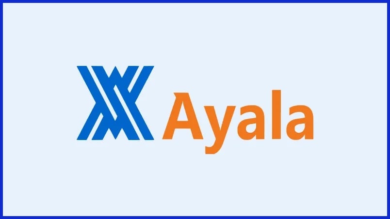
Design Elements: Interlocking A’s, Blue color, Geometric forms.
Description: Minimalist interlocking “A”s designed by artist Fernando Zobel create sophisticated geometric design using negative space brilliantly. Clean blue mark with white lines suggests movement, growth, and dynamic progress—perfect for diversified conglomerate. Demonstrates timeless design: virtually unchanged for 55 years, proving minimalism ages gracefully.
4. Cebu Pacific

Design Elements: Philippine eagle, Blue and yellow, Geometric abstraction, Dynamic motion.
Description: Philippine eagle, national bird, abstracted into clean geometric forms represents freedom, pride, and forward momentum. Blue and yellow reflect Philippine flag while suggesting sky and aviation context. Modern execution ensures logo works at all sizes without losing recognition, communicating proudly Filipino airline with global standards.
5. Globe Telecom

Design Elements: Blue sphere, Interior service icons, Flat design, Connectivity symbolism.
Description: Simplified blue sphere with interior icons representing diverse services—internet, messaging, voice, multimedia. Geometric perfection communicates precision and technological excellence essential for telecom trust. Flat design maintains contemporary appeal without trend-based aesthetics. Icons educate about service breadth instantly.
6. Metrobank
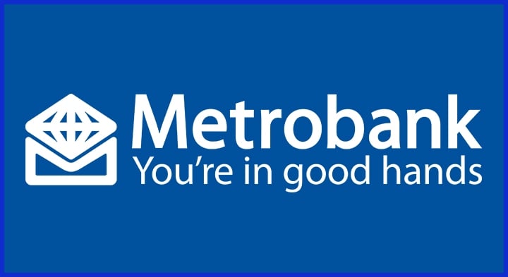
Design Elements: Diamond-shaped globe, Stylized M, Blue monochromatic, Growth and stability.
Description: Diamond-shaped globe with stylized “M” communicates dual concepts: global reach and stability (diamonds represent permanence and value). Exclusive blue monochromatic palette conveys banking professionalism, clarity, and trustworthiness. Geometric precision ensures legibility at any size—from ATM signage to mobile app icons.
7. BDO Banco de Oro
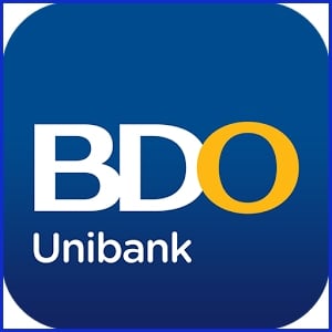
Design Elements: Gold O, Blue background, Uppercase typography, Precious metal symbolism.
Description: Gold “O” against blue background leverages company name as primary design asset—”Banco de Oro” (Bank of Gold) literally visualized. Gold represents wealth, value, permanence; blue adds institutional gravitas. Uppercase sans-serif avoids decorative flourishes, communicating strength, stability, and modern banking excellence.
8. Goldilocks Bakeshop
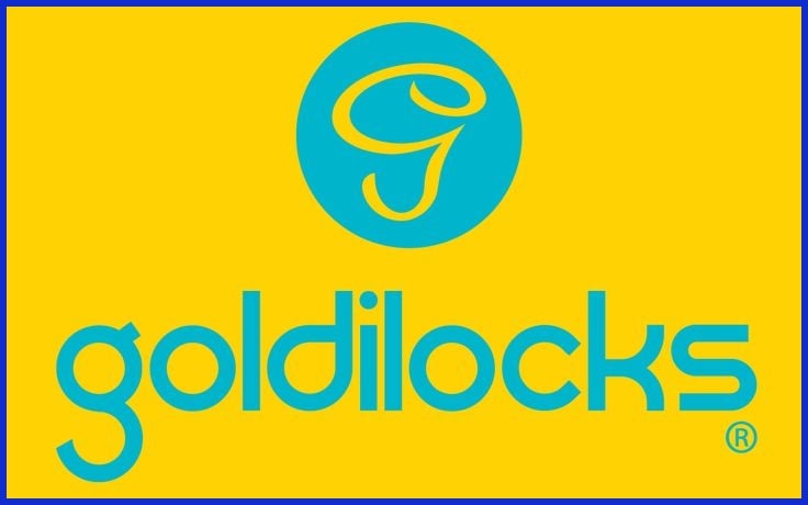
Design Elements: Script handwriting, Yellow and blue, Warm aesthetic, Co-founder designed.
Description: Script handwriting typeface by co-founder Socorro Ramos communicates warmth, approachability, and homemade quality. Yellow evokes happiness and fresh-baked goods; blue adds stability and food safety assurance. Refined typography and accessible aesthetic resonate across Philippines. Successfully communicates “Filipino bakery” through emotional warmth.
9. Purefoods Tender Juicy
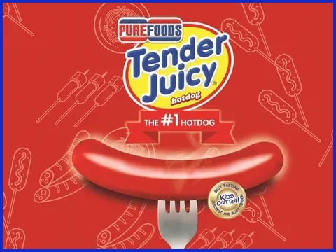
Design Elements: Bold red wordmark, Rounded typography, Accessible positioning, “Kids Can Tell” tagline.
Description: Bold red wordmark commands attention in crowded supermarket shelves. Red is appetite color; rounded typography communicates child-friendly, accessible positioning. Unpretentiously honest design avoids sophistication, speaking directly to families seeking quality protein. Consistency and simplicity created decades of market dominance.
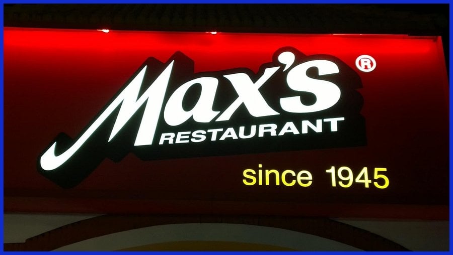
10. Max’s Restaurant
Design Elements: Red text-based logo, Bold wordmark, Simple typography, Family dining.
Description: Red text-based logo (wordmark IS the complete logo) communicates comfort, accessibility, and restaurant confidence. Bold weight suggests market leadership and forever-reliability. Design-as-clarity approach works across all contexts. Evolution shows intelligent restraint—typeface refined but red text remains constant.
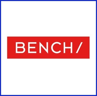
11. Bench Fashion
Design Elements: Bold B icon, Red color, Custom design, Youth-focused positioning.
Description: Interbrand Singapore 2012 redesign: bold “B” icon works as visual anchor for diversified portfolio spanning fashion, cosmetics, housewares. Red communicates youth energy and trendiness. Simplicity allows brand adaptation across categories while maintaining coherence. Custom mark prevents competitor replication.
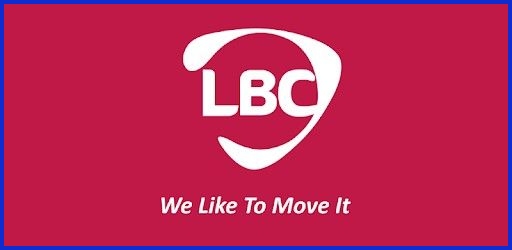
12. LBC Express
Design Elements: Rounded red letters, Friendly typography, “We Like To Move It” positioning, Accessibility focus.
Description: Rounded red letters communicate warmth, friendliness, and trust essential for delivery and remittance services. Red signals Filipino connection (national flag); rounded forms suggest human-scale care versus mechanical logistics. Simplicity creates memorable distinctiveness in crowded logistics category.
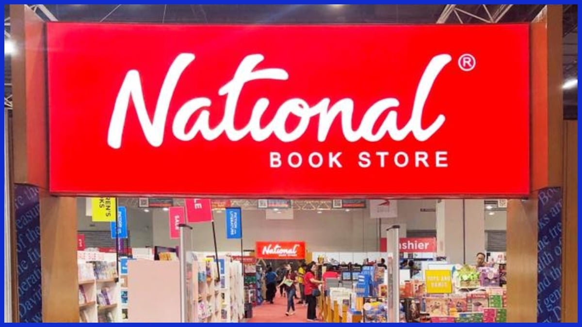
13. National Book Store
Design Elements: Handwriting-style script, Red background, Co-founder designed, Educational positioning.
Description: Handwriting-style script designed by co-founder Socorro Ramos in 1946 communicates personal involvement and educational passion. Red background signals retail importance and visibility. Evolution honored handwritten aesthetic while modernizing execution. Logo represents educational aspiration and lifelong learning accessibility.
14. PLDT
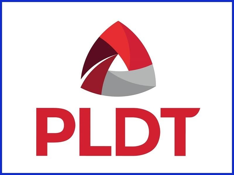
Design Elements: Triangle shape, Red and grey palette, Delta symbolism, Innovation positioning.
Description: 2016 rebranding introduced triangle representing three business pillars: people, innovation, customers. Triangle also represents Greek delta (change symbol) reflecting company’s innovation positioning. Red and grey palette communicates leadership energy with sophisticated balance. Geometric precision signals telecommunications engineering excellence.
15. SM Supermalls
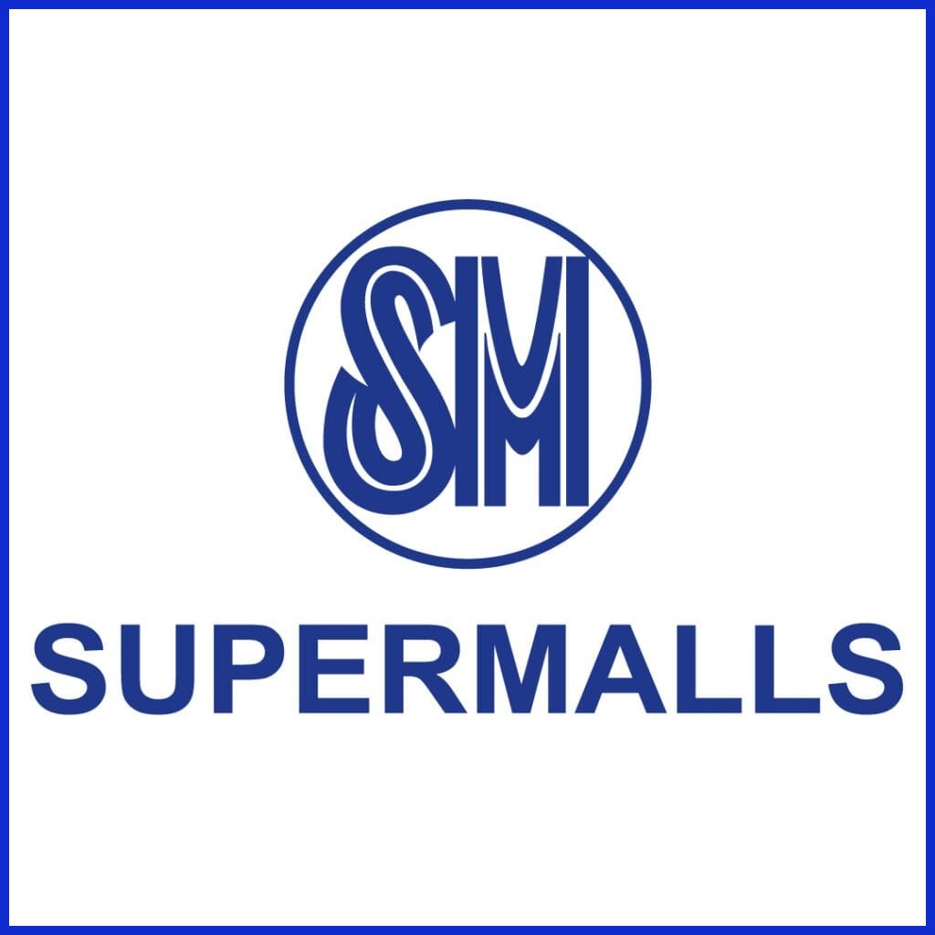
Design Elements: SM in Henry Sans typeface, Electric blue, Custom font, Minimalist execution.
Description: 2022 Pentagram redesign: minimalist “SM” in custom Henry Sans typeface (named after founder Henry Sy). Monochromatic “SM Electric Blue” creates distinctive shade impossible to replicate by competitors. Custom typeface investment represents ultimate brand differentiation. Evolution signals continuous innovation meeting contemporary expectations.
16. ABS-CBN
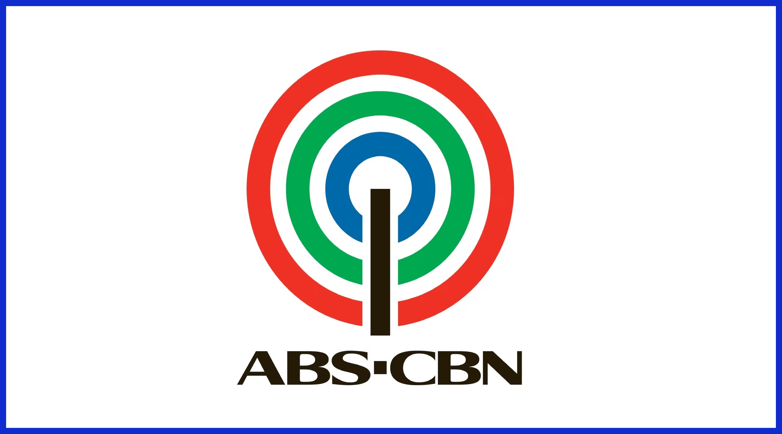
Design Elements: Three concentric rings, Transmitter line, Island geography symbolism, Broadcast legacy.
Description: Three concentric rings represent three major Philippine island groups (Luzon, Visayas, Mindanao), making logo explicitly representative of national broadcast coverage. Vertical transmitter line signifies broadcasting and communication. 1968 design brilliance: single mark communicates national reach, technology, and geographic coverage through symbolic density.
17. Petron

Design Elements: Red and blue palette, Geometric simplicity, Bold execution, Energy symbolism.
Description: Red and blue color palette communicates heat/energy and corporate reliability essential for oil industry leadership. Bold geometric simplicity signals forward-looking contemporary positioning. Powerful visual contrast creates instant recognition among competitor brands. Unapologetically corporate design avoids approachability—appropriate for technical excellence positioning.
18. Smart Communications
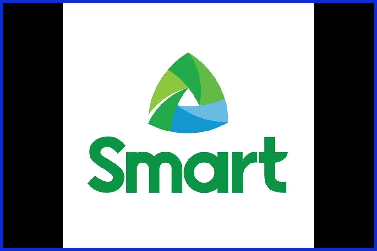
Design Elements: Green and blue rounded triangle, Innovation positioning, Contemporary design, Approachability.
Description: Green and blue rounded triangle signals innovation and approachability distinct from parent PLDT’s sharper triangle. Green associates with growth, environmental consciousness, and freshness important for contemporary telecom brands. Rounded edges prevent harshness. Highly adaptable across digital platforms from app icons to large advertising.
19. Magnolia Ice Cream
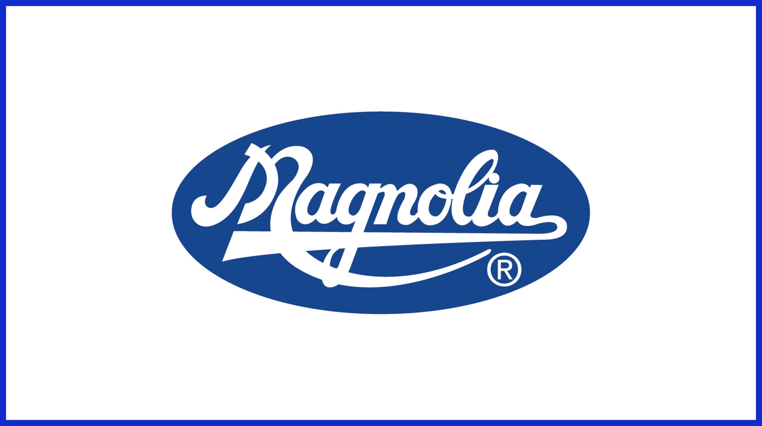
Design Elements: Modern dairy mark, Clean design, Heritage association, Family tradition symbolism.
Description: Modern dairy brand mark representing SMC’s iconic ice cream portfolio. Clean, contemporary execution maintains brand recognition across decades. Design balances heritage association with modern freshness appeal. Logo communicates quality, accessibility, and Filipino family traditions surrounding ice cream consumption and celebrations.
20. Philippine Airlines
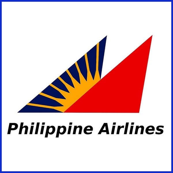
Design Elements: Stylized logo , National carrier positioning, Modern execution, Aviation symbolism.
Description: PAL’s 1986 Sunriser logo features overlapping blue and red triangles representing sail and wings, with eight yellow sun rays symbolizing Filipino warmth and optimism. Designed by Landor Associates, the blue triangle suggests stability while red conveys passion. The iconic combination directly honors Philippine flag colors, reinforcing PAL’s role as Asia’s oldest airline and national carrier.
Common Design Pitfalls
Logo design isn’t just about picking shapes and colors; it’s a crucial aspect of branding that molds consumer perception. Each decision impacts brand identity, and identifying typical traps can save time, cash, and frustration.
Overly Complex
Busy logos with tons of lines, tiny icons or flamboyant fonts might seem trendy initially. They’re prone to losing their appeal. When a design is too cluttered, it usually ends up baffling users.
For example, if a logo is too detailed, it will not look crisp when scaled down for social media or business card use. The specifics become a haze and the point disappears. Just as the simple logos from iconic tech companies or international sporting events lodge in the minds of viewers because they’re easy to identify and recall.
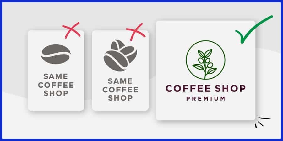
Nothing beats a clean, that helps customers identify your business with just a glance. Consider the Nike swoosh or Apple’s apple. Both are easy and both work on billboards, shirts, or phone screens. It is important to clutter less or include one or two specifics that demonstrate what makes the brand unique.
At Graphically.io, we keep our design options simple and sharp. That way, brands can throw their logo on everything with no reduction in effectiveness.
Trend Chasing
Cutesy designs may appear fresh at the moment, but they tend to wear out quickly. Leaping onto the newest design fad, such as neon gradients or geometrics, will date a logo in a year. Timelessness matters more than being trendy.
It should endure style shifts and not require a facelift every season. A distinct, authentic logo sets your business apart. It keeps your brand consistent and reliable, so customers always have a sense of what to anticipate.
When companies pursue trends, they run the risk of changing their appearance too frequently, leaving the audience bewildered. Being consistent with your logo cultivates loyalty and recognition over time. Fun fact: many top brands haven’t changed their logos in decades, and that’s no accident.
Cultural Missteps
When you design for many, you design for culture from the beginning. Using images or colors with specific meanings in different locations can backfire quickly. A gesture or animal that signifies good luck in one country might be offensive or unfortunate in another.
If a logo overlooks these nuances, it could alienate entire segments of consumers. The aftershocks of a cultural faux pas can spread virally. Consider the international companies forced to redesign logos following criticism.
To prevent this, it’s useful to collaborate with local designers or consult with people who are familiar with the culture. Research or even a quick poll can save trouble down the line. At Graphically.io, we always look for cultural fit because we recognize that one size never fits all.
Creating Your Own Logo
A good logo is not just eyecandy; it communicates your narrative, expresses your identity, and makes your brand immediately recognizable. Making one can seem large, but it’s really all about little things that accumulate. Here’s a clear way to break it down:
-
Begin by writing down what makes your business unique. Consider the vibe you want people to experience when they see your logo. Get your team, if you have one, and start throwing ideas around. Doodle logos, play with your company name, and experiment with sticky notes. Throw out any idea, good or weird, because even weird ideas can ignite a new idea.
-
Geek out on logos you love. Pay attention if they employ simple shapes or bold colors. Most of the world’s best brands have moved to cleaner, simpler logos. More than 70% of new rebrands did. Easy doesn’t mean boring. It means be noticeable and be memorable. Consider a circle for unity or a triangle for strength. Shapes are strong. The colors count as well. Blue can establish trust, while red captures attention. Choose colors that complement your narrative.
-
Experiment with online tools. Many allow you to launch for under $20. Others have AI that can generate a logo in seconds. Designhill’s logo maker is an AI-enabled tool that helps you design your own logo. Make it your own by combining icons and words, or stick to text only if that’s your style. It’s all about balance. A logo with text and an icon can work great, but sometimes less is more.
-
If you want something special or need assistance, consult a professional. Collaborating with a designer, such as the professionals at Graphically.io, will save you time and introduce fresh inspiration. A great design partner listens, questions, and helps you translate thoughts into a fitting logo. They know how shapes, colors, and patterns play together, and they are not going to let you accept “just okay.
-
Once you have a couple choices, get other people to see them. Get feedback from your audience. Do they receive the signal? Are they able to recall the logo after just a glance? Use their feedback to debug and polish. Sometimes, the best logo is the one that sticks in someone’s mind, not the flashiest one.
Your logo isn’t just art. It’s your brand’s first handshake. Design your own logo or collaborate with pros for that professional shine. Either way, the right logo will make your business stand out and stick.
Conclusion
Awesome design ideas. Check out those brands from all over the Philippines. Each logo tells a story you can see a mile away. A clever logo reflects your brand and remains memorable. Experience how these top Filipino designs mix local flavor and contemporary flair. They prove that craft, love, and an uncompromising attention to detail are always rewarding.
Need a logo that hustles as hard as you do! Choose the right design, looks sharp, and works anywhere. Graphically.io makes brands pop with no hassle and no overhead. Take the opportunity to receive a logo you’ll be proud to flaunt. Get in touch, and let’s create something timeless.
Frequently Asked Questions
What makes a logo effective for Filipino brands?
The best Philippines logo designs are those that are simple, memorable, and resonate with local culture, incorporating relevant imagery and colors that enhance brand identity and appeal to the audience.
How do Filipino designers express cultural identity in logos?
Filipino designers incorporate indigenous patterns, national colors, and cultural icons into their branding solutions. These elements symbolize the nation’s values and heritage in an exclusive manner.
Are there common mistakes in designing Philippine logos?
Yes. Other common mistakes in branding include going overboard with design, using too many colors, and conveying an unclear brand message! A good logo must be obvious and memorable.
Why is a logo important for small businesses in the Philippines?
A professional logo design establishes immediate awareness and confidence, distinguishing a business from competitors and enhancing brand identity.
What trends are shaping logo design in the Philippines today?
Minimalism, bold fonts, and national elements are trendy in branding, emphasizing mobile-friendly and flexible logos.
Can I create my own logo without design experience?
Yes, you can use online logo design services and templates. For a professional look, hire a graphic design company that understands Filipino branding.
How do I choose the right designer for my Philippines logo?
Seek out a design agency familiar with Filipino logos. Take a look through their portfolio for style, quality, and cultural relevance. Always read client feedback before hiring!