Table of Contents
Key Takeaways
- True brand recognition survives censorship: When a logo’s silhouette or typography is strong enough, altering or hiding it actually increases audience recall and engagement.
- Design constraints breed viral marketing: Strict advertising regulations (like FIFA’s “clean stadium” rules) can be flipped into brilliant ambush marketing opportunities using minimal visual cues.
- Consistency enables flexibility: You can only subvert your visual identity if you have spent years building rigid consistency with your typography, color palette, and negative space.
- Subversion humanizes corporate brands: Playfully breaking design rules shows brand confidence and self-awareness, turning standard marketing campaigns into cultural moments.
In the world of graphic design, brand guidelines are usually treated like sacred texts. Don’t stretch the font. Don’t alter the colors. Never, under any circumstances, obscure the logo. But what happens when a brand is so culturally iconic that breaking these rules becomes its greatest marketing asset?
Welcome to the world of brand logo subversion—a fearless approach to visual identity where companies intentionally censor, slice, rearrange, or replace their logos to tap into viral trends and overcome marketing restrictions. Instead of weakening the brand, these calculated design rebellions prove just how deeply ingrained their visuals are in the public consciousness. When done right, altering your logo a tad bit is the ultimate graphic design flex.
What is Brand Logo Subversion in Graphic Design?
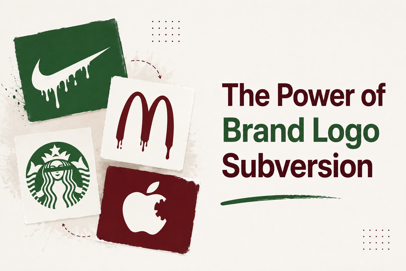
Brand logo subversion is the strategic alteration, concealment, or deconstruction of a company’s established visual identity to communicate a message, capitalize on a trend, or bypass advertising restrictions.
Unlike a permanent brand redesign, subversion is a temporary, tactical campaign. It relies entirely on visual closure—the psychological phenomenon where the human brain automatically fills in missing information to complete a familiar pattern. When a consumer sees a partially hidden shape or a scrambled brand font, their brain works to solve the visual puzzle. This active cognitive engagement creates a deeper, more memorable brand impression than a standard, static logo ever could. By leaning into visual trends or design restrictions, brands transform passive viewers into active participants.
5 Iconic Examples of Brands Capitalizing on Visual Restrictions and Trends
1. Levi’s at the 2026 World Cup (Silhouette Recognition)
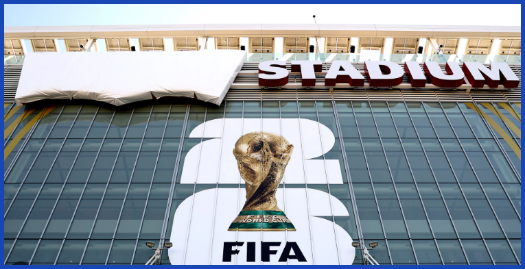
When the 2026 FIFA World Cup arrives, the “clean stadium” rules must come into force, which means that all non-official sponsor branding must be covered at Levi’s Stadium in Santa Clara. Huge white tarps were laid over the exterior Levi’s banners.
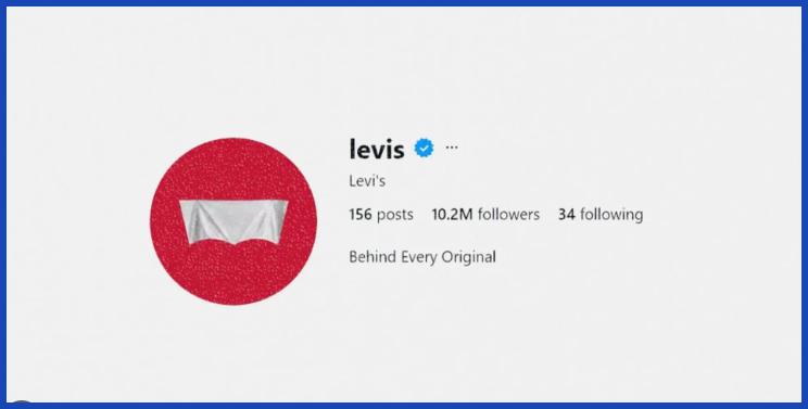
Rather than resist the censure, Levi’s became an ambush marketing virtuoso. Their 1967 “batwing” logo silhouette design, which was based on the arcuate stitching on their back pockets, proved to be so well known that it cut through the canvas. Levi’s have refreshed their digital avatars with a graphic of their logo behind a white sheet and created short video campaigns to greet fans to the “[redacted] stadium”. They embraced the limitation and showed how geometry can be more powerful than the written word.
2. KFC’s “FCK” Bucket (Typography Manipulation)
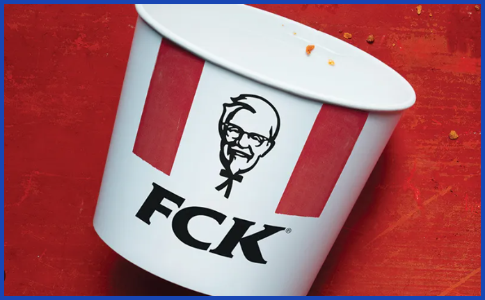
An incident that occurred within the brand’s supply chain in 2018 plunged hundreds of KFC restaurants across the UK into a crisis, as they were left without chicken. They replied with a wonderful self-aware typographic piece of work.
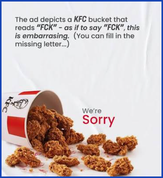
KFC published full-page newspaper ads featuring an empty fried chicken bucket. The brand switched its iconic bold letters to spell out “FCK” instead of the regular three letters. The original font, colors and bucket packaging were preserved, making the logo instantly recognizable for consumers and the brand’s sincere, human apology an appreciated message. It is one of the most awarded print campaigns in graphic design history.
3. McDonald’s “Follow the Arches” (Minimalist Cropping)
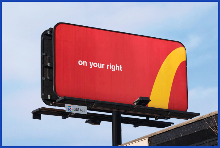
To solve the visual clutter of traditional directional billboards, McDonald’s Canada decided to deconstruct their world-famous Golden Arches.
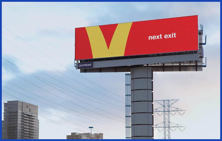
Minimalist versions of the yellow “M” were cut out from the flat red backdrop for the “Follow the Arches” campaign. A left curve was changed to an arrow pointing left (“On your left”) and a central dip was converted to an arrow pointing to an upcoming highway exit (“Next exit”). The campaign proved that McDonald’s is such a powerful brand that showing just 20% of the logo is enough to create a sense of brand recognition and provide directionality that helps the brand.
4. Lacoste’s “Save Our Species” (Logo Replacement)
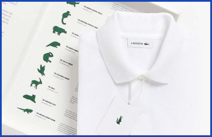
Lacoste’s green embroidered crocodile was one of the most inviolable fashion symbols for 85 years. All this came to an end in 2005 when the brand became a partner of the International Union for Conservation of Nature (IUCN).
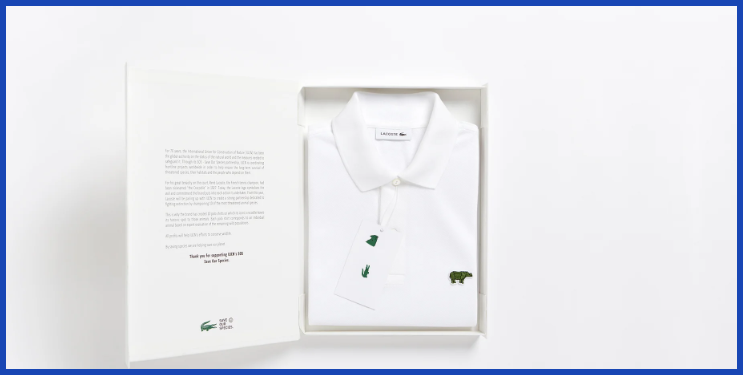
In a clever visual twist, Lacoste stripped the crocodile from their iconic polo shirts and substituted green embroidered images of 10 threatened species. To tie the design directly to data, they produced an exact number of shirts corresponding to the remaining wild population of each animal—such as 350 Sumatran tigers and just 30 Vaquita porpoises. Their core brand asset was replaced and it immediately drew people’s attention and was then out of stock in a matter of hours.
5. Burger King’s “The Moldy Whopper” (Anti-Aesthetic Trend)
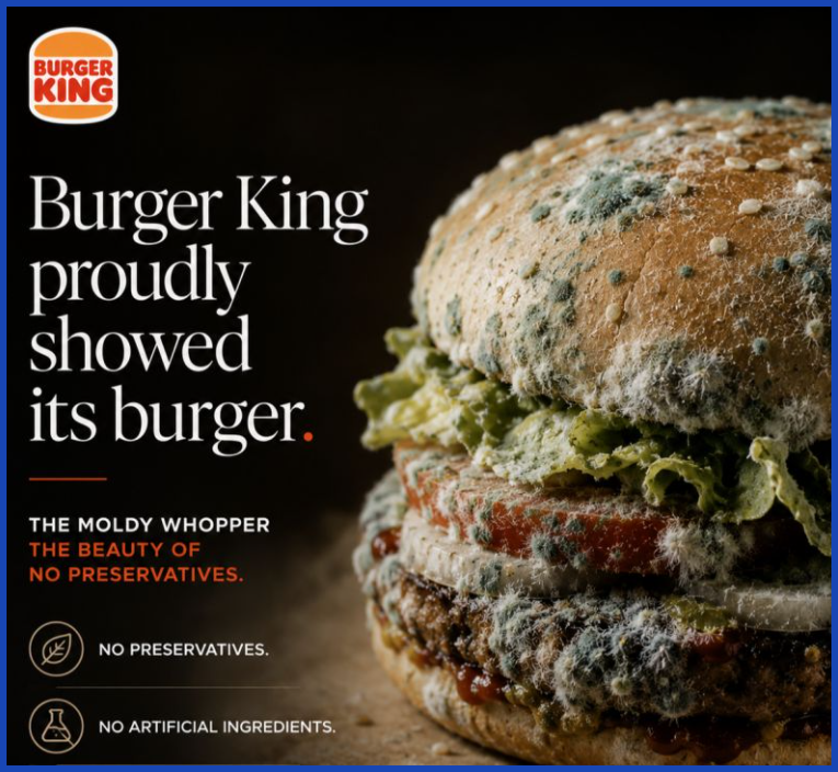
In an industry dominated by artificially perfected food photography, Burger King decided to capitalize on the growing consumer trend toward clean, transparent labeling.
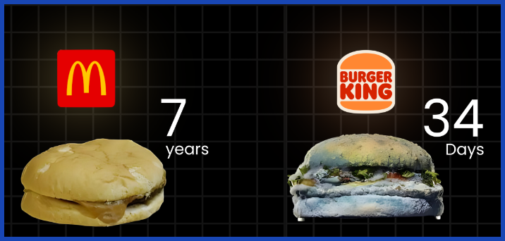
Burger King has unveiled a 34-day time-lapse video of the Whopper’s slow decomposition and thick green mold to herald the elimination of artificial preservatives from its flagship burger. The original idea was to completely reverse the visual aesthetic of the fast food industry and use a shocking “anti-aesthetic” to convey their message about fresh ingredients, which was a much more effective way of communicating than a traditional packaging redesign would have been.
How to Build a Visual Identity Strong Enough to Subvert
You can’t break rules you haven’t learned. If a new company has no brand recognition and shades its logo with a tarp, no one will know who they are. Graphic designers need to concentrate on three areas to create an identity that can stand up to creative marketing campaigns:
- Master the Silhouette: Convert your logo to solid black and place it on a white background. If it isn’t instantly recognizable by its shape alone, it relies too heavily on color and typography to do the heavy lifting.
- Own a Proprietary Palette: Brands like McDonald’s, Tiffany & Co., and Coca-Cola can be identified by color alone. Ensure your primary brand colors are applied so consistently that they trigger recognition even when your logo is absent.
- Protect Your Typography: Custom or highly distinct typography creates visual muscle memory for your audience. When your font is unmistakable, you can manipulate the text (like KFC did) without losing your brand identity.
Conclusion
The most memorable branding campaigns happen when companies stop treating their visual assets like fragile museum pieces and start using them as dynamic tools for storytelling. Whether it’s Levi’s leveraging a silhouette through a stadium tarp or McDonald’s slicing their arches into traffic arrows, brand logo subversion proves that true visual authority lies in simplicity, consistency, and confidence.
Building an iconic visual identity that can withstand this level of creative experimentation takes strategic foresight and elite graphic execution. At Graphically.io, we help forward-thinking brands design scalable, high-impact visual identities that capture attention—whether your logo is displayed in full, cropped in half, or making a viral splash across the web.
FAQs
What makes a logo iconic enough to survive subversion?
An iconic logo relies on simple geometry, distinct silhouettes, and strong negative space rather than complex details. When a design is visually simple and reinforced through years of consistent application, consumers can easily identify it even when parts of it are hidden, cropped, or altered.
Is altering a brand logo risky for small businesses?
Yes. Brand logo subversion is a tactic best reserved for established brands with high visual recognition. For small or growing businesses, altering the logo can cause brand confusion. Emerging brands should focus on building visual consistency first before attempting deconstructive marketing campaigns.
Why do brands use anti-aesthetic design trends?
Anti-aesthetic design—like Burger King’s Moldy Whopper—works because it breaks the visual monotony of traditional advertising. In a digital landscape saturated with hyper-polished, AI-generated imagery, raw and imperfect visuals stand out, feel more authentic, and generate significantly higher engagement.
How does silhouette branding improve digital marketing?
Silhouette branding ensures your visual identity remains legible at any scale, from a massive stadium banner down to a tiny 16×16 pixel favicon or mobile profile icon. This adaptability is critical for modern digital campaigns across social media platforms.