Table of Contents
Key Takeaways
- Five ready-to-use color combination schemes, each with exact hex codes you can paste into your site today
- Clear guidance on where every color goes: backgrounds, headlines, and CTA buttons
- Real brand examples so you can see these palettes already working in the wild
- The 60-30-10 rule, so your new colors stay balanced instead of chaotic
- Free, simple ways to test contrast and accessibility before you push anything live
Nobody abandons your website because the copywriting is bad. Nine times out of ten, they leave because the site looks like it hasn’t been touched since 2019.
Color is doing more work than you realize. A visitor’s brain forms an opinion about your site before they read a single headline, and that first impression comes almost entirely from color.
The good news: you don’t need a design degree to fix this. You need the right color combination schemes and a clear plan for where each shade goes. Below are five pairings trending hard into 2026, complete with hex codes you can drop straight into your CSS this afternoon.
5 Color Combination Schemes You Can Steal Right Now
Each pairing follows the same formula: one dominant color, one confident accent, applied with intention. Grab the hex codes, drop them into your design system, and your site looks different by tonight.
1. Canary Yellow & Black Chocolate
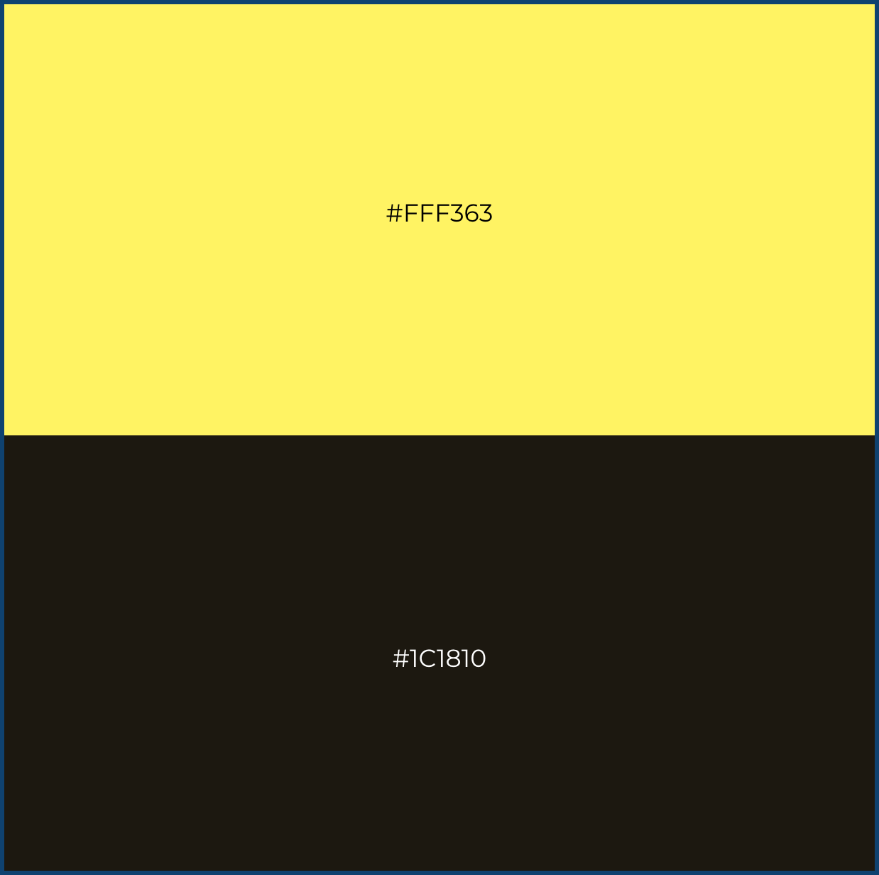
| Where it goes | Color | Hex Code |
| Background/nav bar | Black Chocolate | #1C1810 |
| Headlines & icons | Canary Yellow | #FFF363 |
| “Buy Now” button | Yellow bg, chocolate text |
Best for: food brands, creative studios, youth-focused products.
National Geographic has run yellow-on-black for decades, and it’s nearly impossible to scroll past. That’s high contrast doing the heavy lifting for you.
2. Dark Sea Green & Abstract White
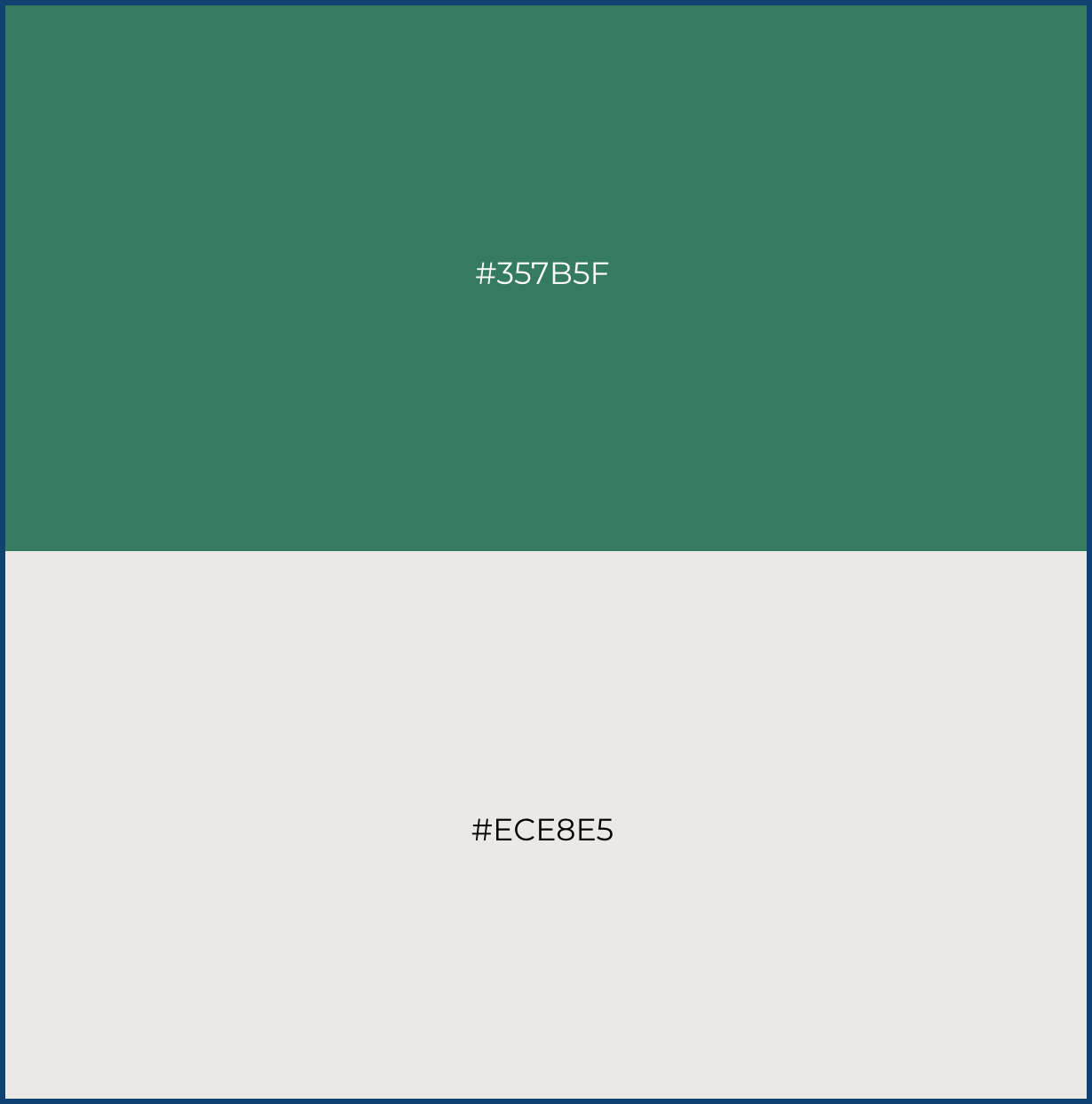
| Where it goes | Color | Hex Code |
| Background | Abstract White | #ECE8E5 |
| Headers & dividers | Dark Sea Green | #357B5F |
| CTA button | Green bg, white text |
Best for: wellness, sustainability, organic and plant-based brands.
Whole Foods has leaned on a dark, grounded green for years because it instantly reads as natural and trustworthy, no tagline required.
3. Deep Teal & Pearl
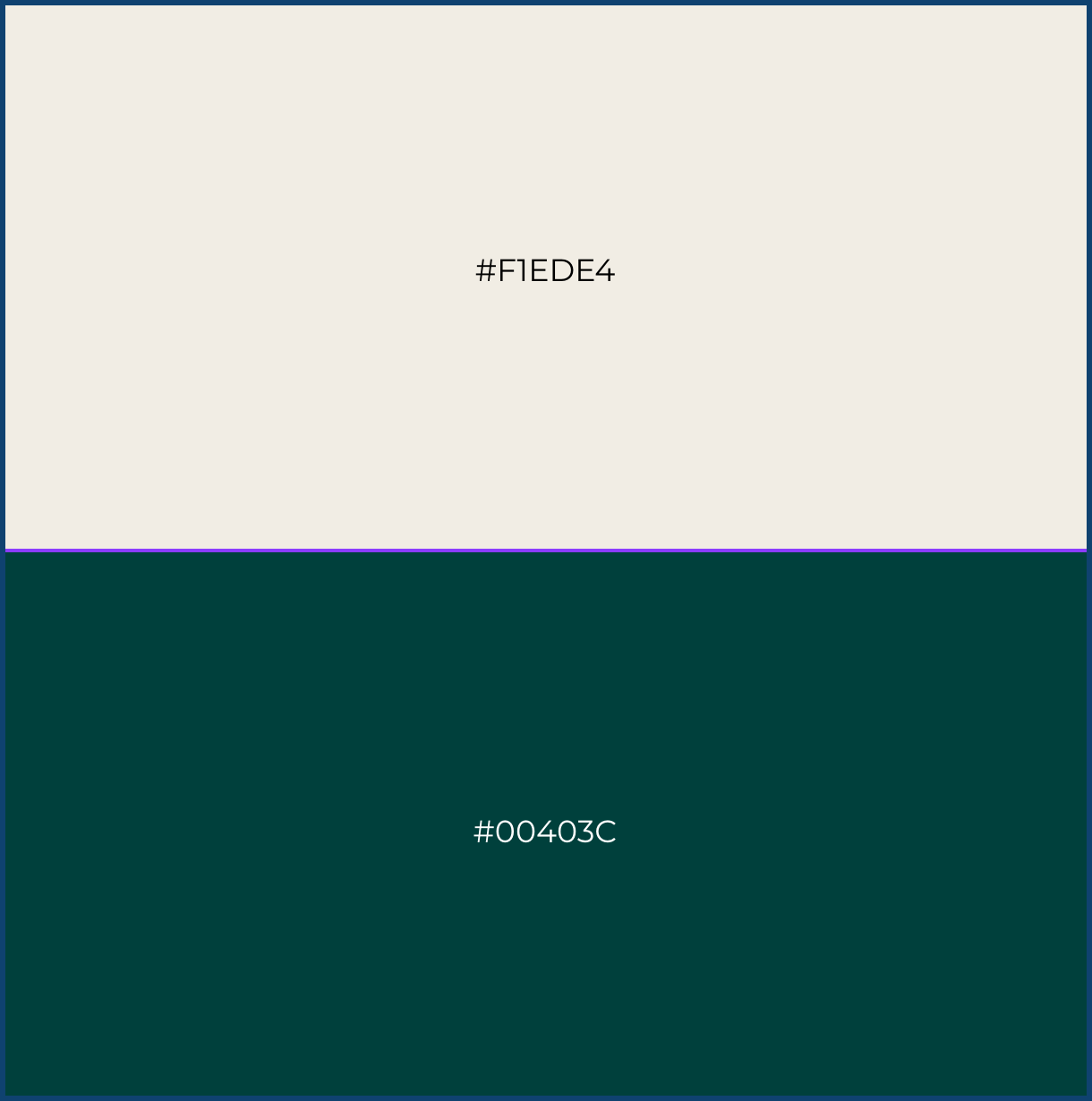
| Where it goes | Color | Hex Code |
| Background | Neutral Pearl White | #F1EDE4 |
| Headlines & footer | Deep Teal (Aquamarine Green) | #00403C |
| CTA button | Teal bg, pearl text |
Best for: boutique hotels, jewelry, financial planning, premium services.
It’s the same emerald-plus-warm-neutral formula high-end hospitality brands build around. Moody, confident, and expensive-looking without a single neon accent.
4. Blacklist Purple & Transparent Pink
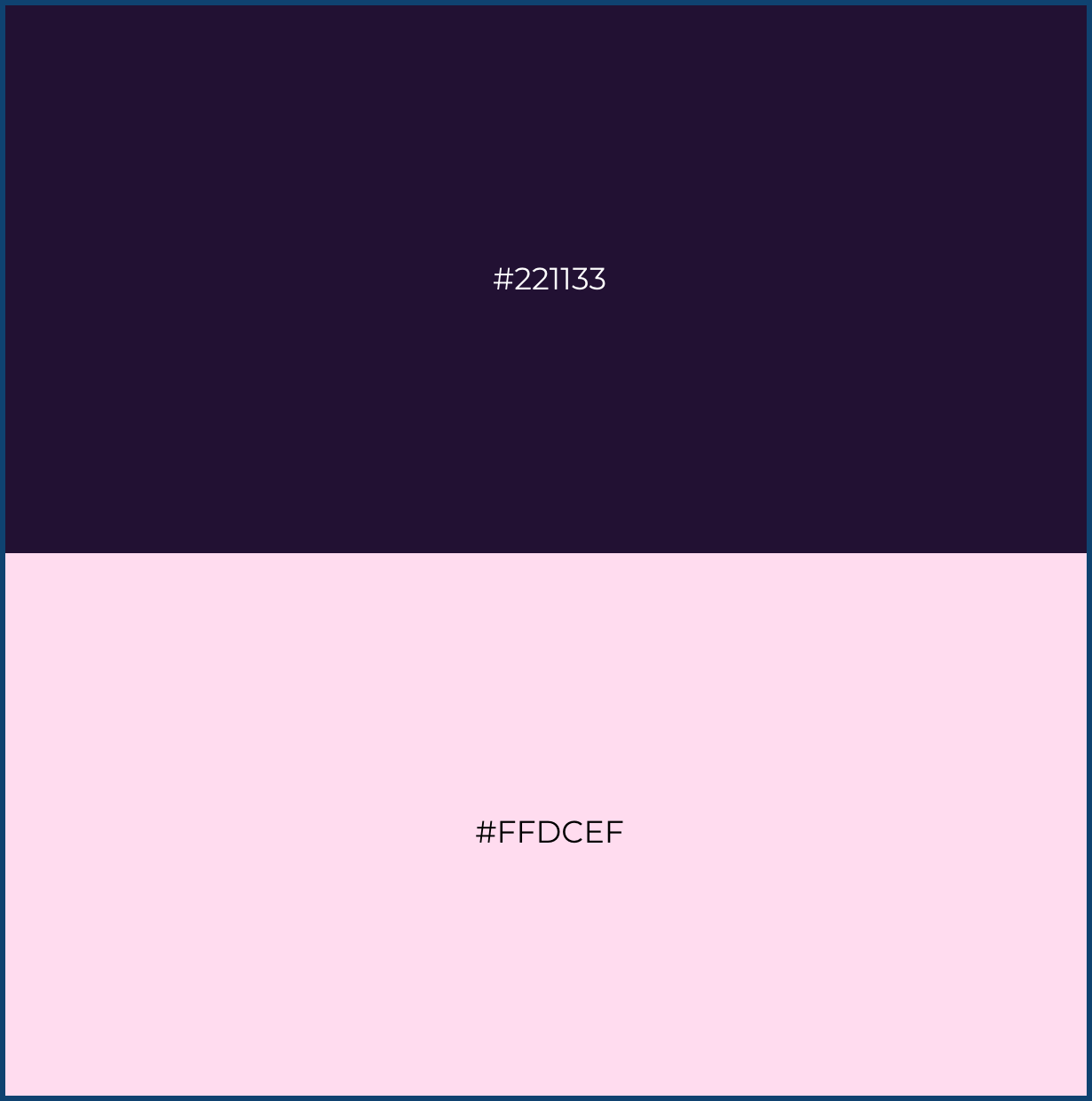
| Where it goes | Color | Hex Code |
| Background | Blacklist purple | #FFF363 |
| Headlines & accents | Transparent pink | #FFDCEF |
| CTA button | Can use vice versa |
Best for: fashion, beauty, entertainment, dating, and social apps.
Neon accents on a near-black canvas are one of the biggest color stories of 2026, showing up everywhere from SaaS launch pages to fashion sites. One loud color, one dark stage.
5. French Rose & Midnight Green
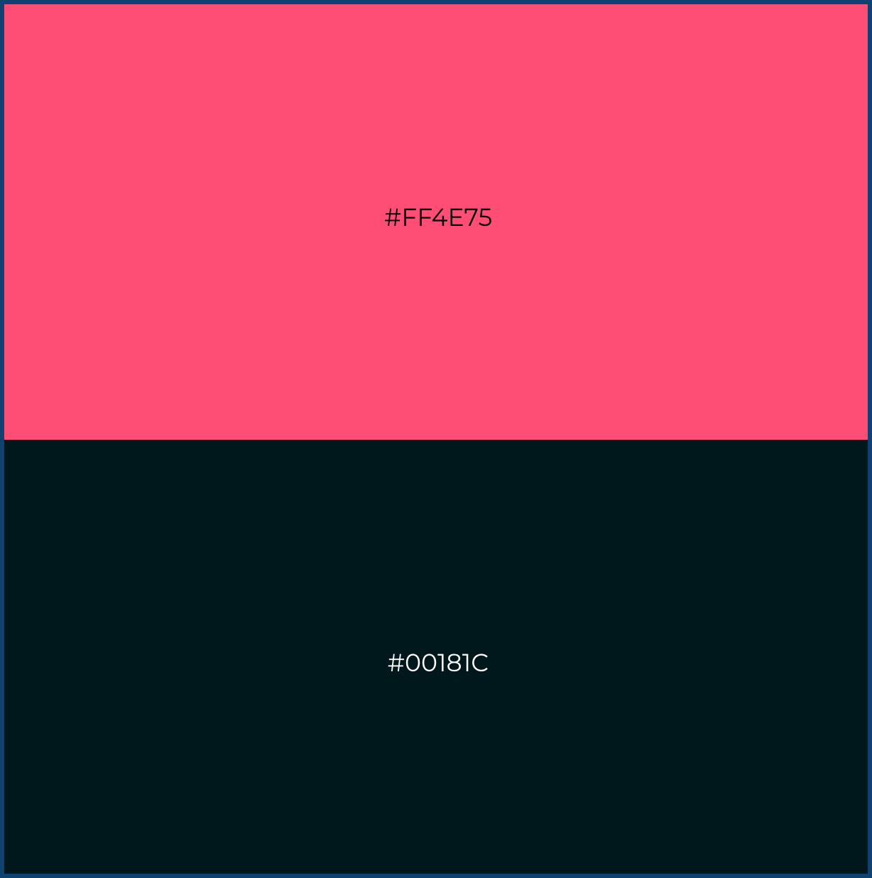
| Where it goes | Color | Hex Code |
| Background | French Rose | #FF4E75 |
| Headlines & links | Midnight Green | #00181C |
| CTA button |
Best for: It works beautifully for modern, dark-mode landing pages that need to feel sleek but still retain a strong, punchy focal point.
This pairing is a conversion driver. Using the bright pink for “Buy Now,” “Subscribe,” or “Learn More” buttons against the dark background ensures the user’s eye goes exactly where you want it to.
Why These Color Combination Schemes Actually Work
Picking pretty colors isn’t the same as picking colors that convert. There’s real logic behind why these five pairings feel so intentional.
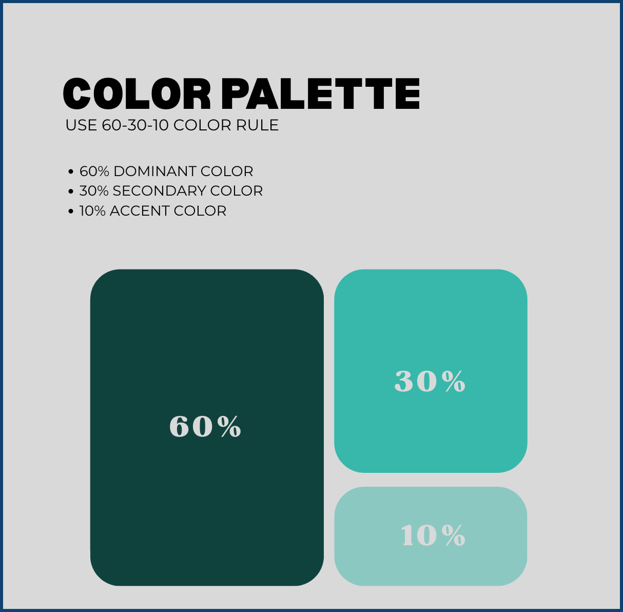
The 60-30-10 rule. Designers typically split a page into roughly 60% dominant color (your background), 30% secondary color (headers and sections), and 10% accent (your CTA button, links, small highlights). Every combo above already follows that ratio, which is exactly why none of them feel like a rainbow exploded on your homepage.
Color carries meaning before words do:
- Yellow reads as energy and optimism, great for grabbing attention fast
- Green signals growth, health, and trust, which is why it shows up in both wellness brands and finance apps
- Deep teal and navy feel stable, premium, and a little moody
- Coral and pink feel playful and modern, especially against a dark background
- Blue is, hands down, the color most associated with trust and reliability
None of this means overthinking your palette. It means the five combos above aren’t random. They pair colors that already carry the right emotional weight for the brands using them, and usability research backs this up: high-contrast color pairings, applied with intention, genuinely improve how easily people read and engage with a page.
How to Use These Colors Without Overdoing It

Having the right hex codes is only half the job. Before you redesign your website, test how the new palette works across your key pages and user interactions. Here’s how to actually apply them without turning your site into a mess.
- Pick one accent color for every CTA, sitewide. If “Buy Now” is coral pink on one page and blue on another, you’re training visitors to ignore both.
- Check your contrast ratio. Body text needs at least a 4.5:1 contrast ratio against its background to stay easily readable. Free tools like WebAIM’s Contrast Checker will tell you in seconds whether a pairing passes.
- Don’t skip dark mode. If your site offers one, make sure your accent color still pops against a dark background. Most combos above already work in both directions.
- Limit yourself to two or three colors, max. Every combo here is built on two core colors plus white or black. That restraint is exactly what makes them feel clean instead of cluttered.
Test Before You Commit to the Full Redesign
Don’t rebuild your entire site in one weekend because you liked a color combo in a blog post. Yes, even this one.
- Start with one page. Try the new combination on your homepage hero or a single landing page first, then live with it for a few days before rolling it out everywhere.
- Get eyes that aren’t yours. Show it to a few actual customers or coworkers outside your team. Designers go color-blind to their own choices fast.
- Mock it up before you code it. A quick prototype can show you how a full palette looks across a real layout before anyone touches CSS, so you’re not guessing how it’ll feel on your pricing page.
- Revisit it in a year. Trends shift. What feels bold in 2026 might feel dated by 2028, so bookmark this list and check back.
Conclusion
A full website overhaul can take months. Swapping in one of these five color combination schemes can take an afternoon, and it’s often the fastest way to make a site feel current again.
Pick the pairing that matches your brand’s personality, plug in the hex codes, and keep your CTA color consistent across every page. That’s genuinely most of the work.
And if you’d rather hand off the execution, that’s exactly what Graphically is for. Instead of gambling on a freelancer or paying agency overhead, you get a dedicated designer for one flat monthly rate who can turn any of these five combinations into real banners, landing pages, and a fully redesigned site, with unlimited revisions until it’s exactly right.
FAQs
How many colors should my website actually use?
Two core colors plus a neutral (white, black, or gray) is plenty. That’s exactly how each combo above is built, and it keeps a site feeling cohesive instead of busy.
Will these color combinations work for dark mode?
Most of them, yes, especially Electric Dusk and Blue Chip Trust, which are already built around a dark or neutral base.
What if none of these five feel right for my brand?
Use them as a formula, not a rulebook. Pick one dominant neutral, one confident accent, and apply the same 60-30-10 split. The logic holds even if you swap in your own brand colors.
How do I know if my color combination is accessible?
Run your text and background colors through a free contrast checker, like the one from WebAIM. Aim for at least a 4.5:1 ratio for body text.
Do I need a designer to make this change myself?
Not for a simple color swap. Most CMS platforms let you update background, text, and button colors right in the theme settings, no code required. For a full redesign, that’s where a dedicated design service can save you the headache.