Table of Contents
 Key Takeaways
- The rule of thirds in graphic design divides your canvas into a 3×3 grid to help you place critical elements exactly where the eye naturally looks.
- Limiting your typography to just three fonts (heading, subheading, and body) instantly removes visual clutter.
- Applying the 60-30-10 color ratio ensures your visuals feel balanced rather than overwhelming.
- Strategic white space in at least three distinct areas gives your layout room to breathe and look professional.
Have you ever spent hours tweaking a visual, only to step back and feel like it still looks chaotic? It is an incredibly common struggle. You add more elements, bump up the font sizes, and throw in extra colors hoping to fix the problem. Instead, the graphic just feels more crowded and amateur.
The good news is that you do not need an expensive art degree to solve this issue. You just need a proven framework. That is where the rule of thirds in graphic design comes in to save the day.
In this guide, we will use the highly practical 1783399083403.pdf document as our ultimate design audit checklist. We will troubleshoot exactly why your layouts feel suffocating and show you how a few simple “rules of three” can transform them from messy to masterful in minutes.
What is the Rule of Thirds in Graphic Design? (And Why It Works)
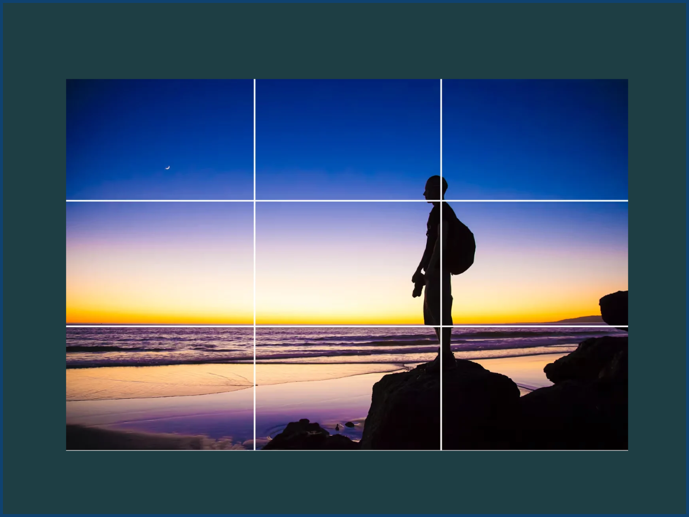
To understand why your graphics feel overwhelming, we first have to look at how human eyes digest information. When presented with a blank canvas, amateur designers tend to shove all the important text and imagery dead center. This creates a static, heavy look that stops the viewer’s eye from moving naturally.
The rule of thirds in graphic design fixes this by breaking your layout into a 3×3 grid. Imagine drawing two equally spaced vertical lines and two equally spaced horizontal lines over your image.
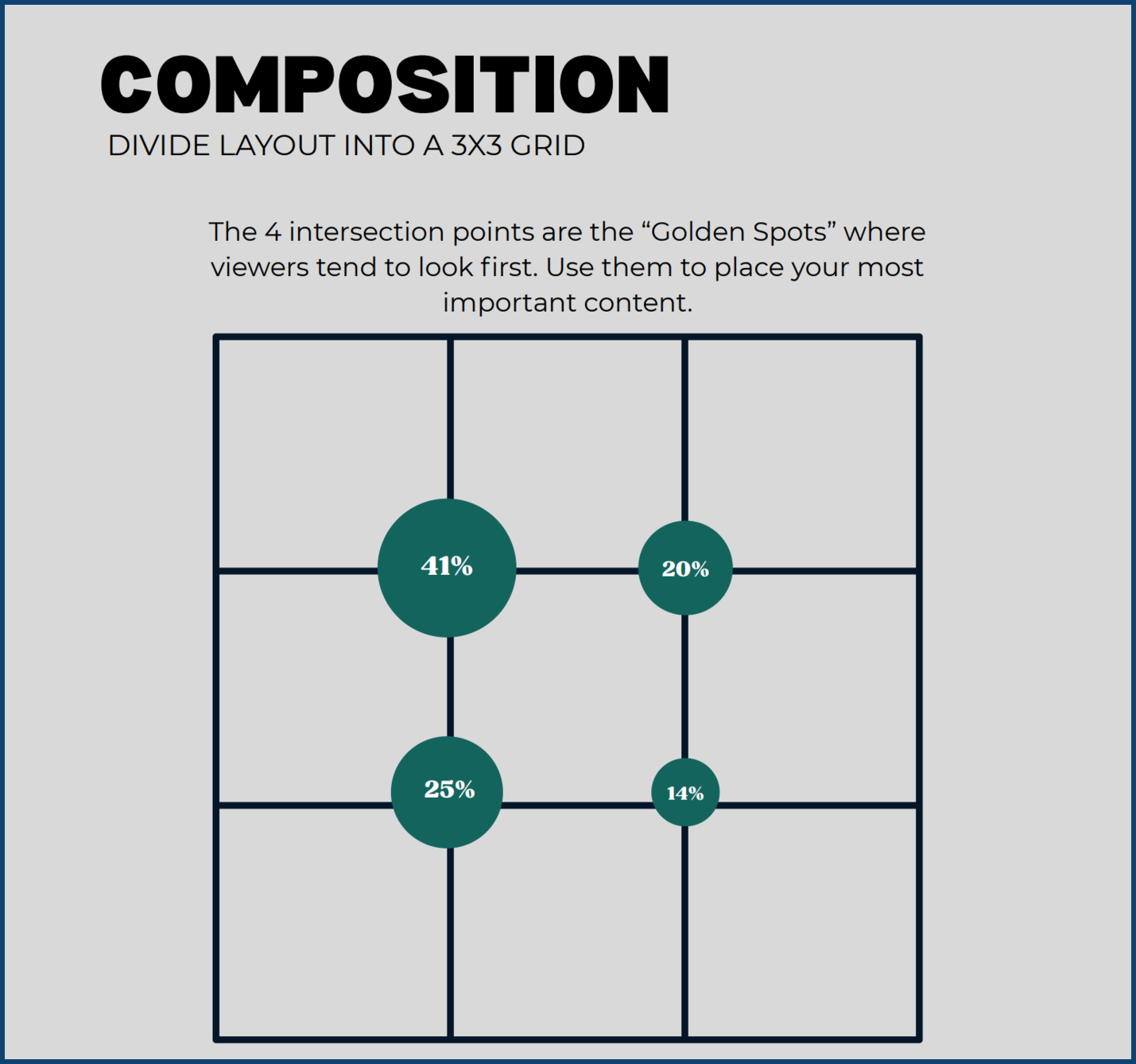
Where these lines cross, they create four intersection points. These specific points are known as the “Golden Spots”. This is exactly where viewers tend to look first when they see your graphic. When you stop centering everything and start placing your most important content on these Golden Spots, you create a dynamic, balanced tension. The design immediately feels more professional and engaging.
Real-World Examples: Seeing the Rule in Action
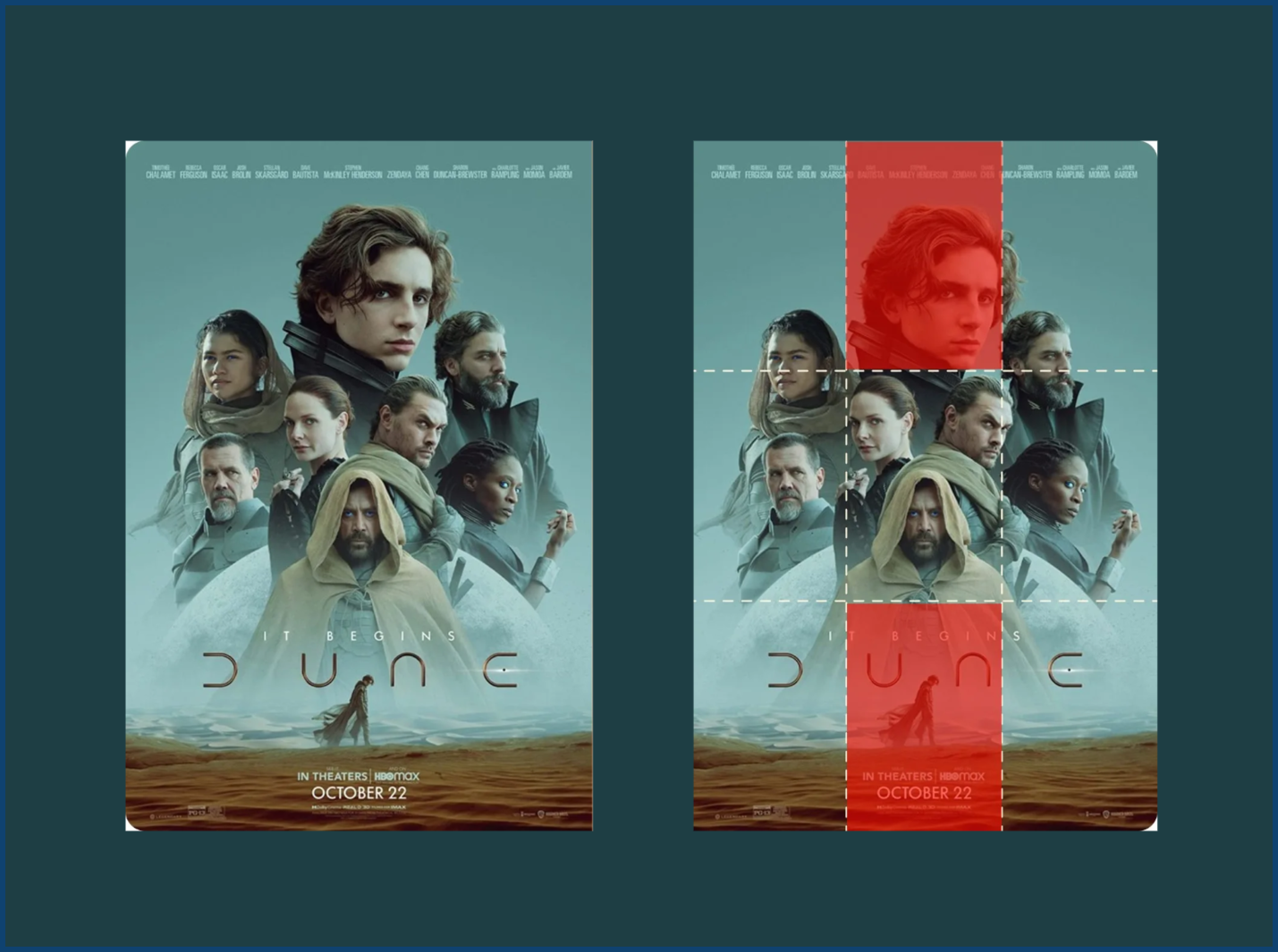
Let’s step away from the theory and look at how this plays out in the real world. Think about your favorite blockbuster movie poster. The main character’s face is rarely planted right in the middle. Instead, their eyes usually align perfectly with the top horizontal line of that invisible grid, often sitting right on a top intersection point.
You can also see this on high-converting website layouts. A great landing page will often feature a bold headline resting on the left intersection points, while a striking product image takes up the right vertical third. This invisible structure guides your eye exactly where it needs to go, holding your attention longer—which is a massive bonus for keeping visitors on the page and boosting your SEO performance.
Here at Graphically, our professional designers rely on this exact framework every single day. Graphically understands that balanced layouts communicate trust and authority. When you use these grid principles, your audience spends less time figuring out where to look and more time absorbing your actual message.
Taming the Chaos: The “Rule of Threes” Design Audit
If your current project feels like a jumbled mess, it is time to run a quick audit. Using our reference document as a guide, let’s troubleshoot your graphic using the powerful “Rule of Threes”.
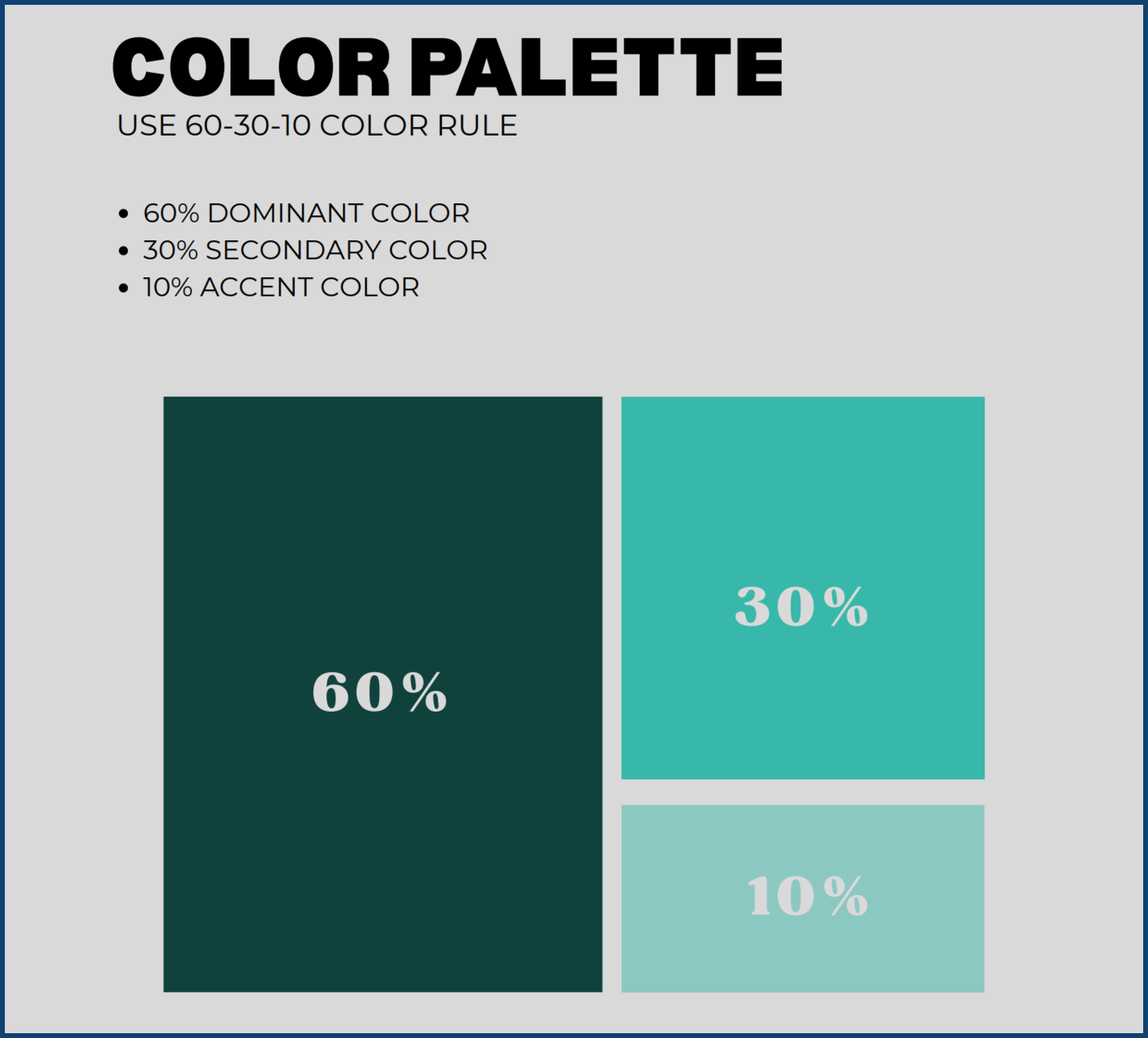
- Too many colors? Color chaos is the fastest way to make a design look cheap. Reset your palette by applying the 60-30-10 color rule. Your layout should be 60% dominant color, 30% secondary color, and 10% accent color. This ratio guarantees harmony.
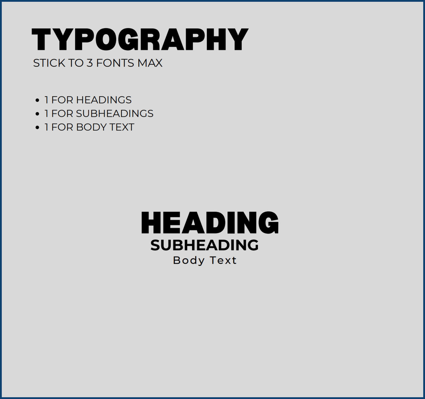
- Too many fonts? If your graphic looks like a ransom note, you are trying to say too much with your typography. Stick to a maximum of three fonts. Use exactly 1 for headings, 1 for subheadings, and 1 for your body text.
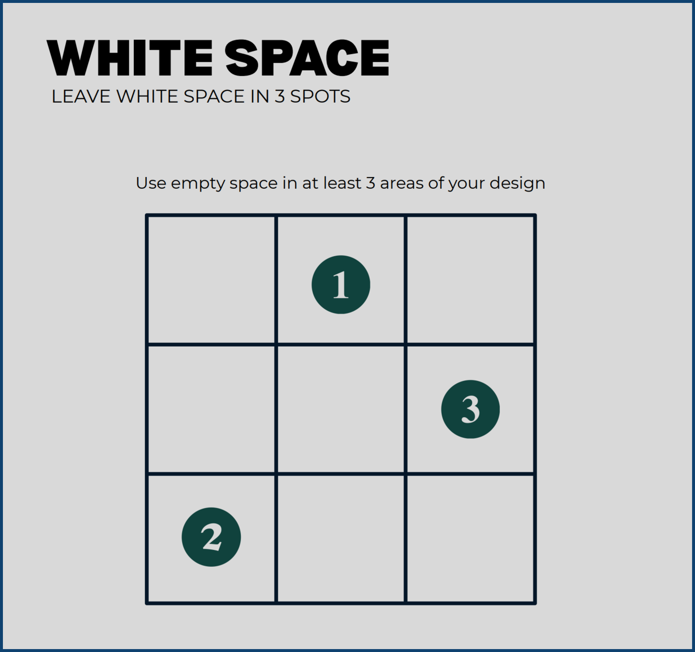
- Feels suffocating? Your design is probably starving for white space. You need to leave white space in at least three areas of your design. Empty space is not wasted space; it is the cushion that makes your main elements pop.
- Ignoring the Golden Spots? Stop guessing where to put your text. Research shows exactly how human attention is divided among the grid’s intersection points: the top-left spot grabs 41% of attention, the bottom-left takes 25%, the top-right gets 20%, and the bottom-right gets 14%. Put your absolute most crucial element in that top-left 41% zone.
Simple Tips to Instantly Upgrade Your Next Project
Now that you know the rules, how do you apply them effortlessly? Start by treating your canvas like a map rather than a bucket. Before you drag a single photo or text box onto your screen, visualize that 3×3 grid.
If you are creating a social media graphic for an upcoming sale, do not just center the word “SALE.” Instead, place an engaging photo of your product aligned with the right vertical third. Then, put your bold heading on the top-left intersection point where 41% of the viewer’s attention naturally goes. Drop your secondary text and call-to-action button down to the bottom-left point.
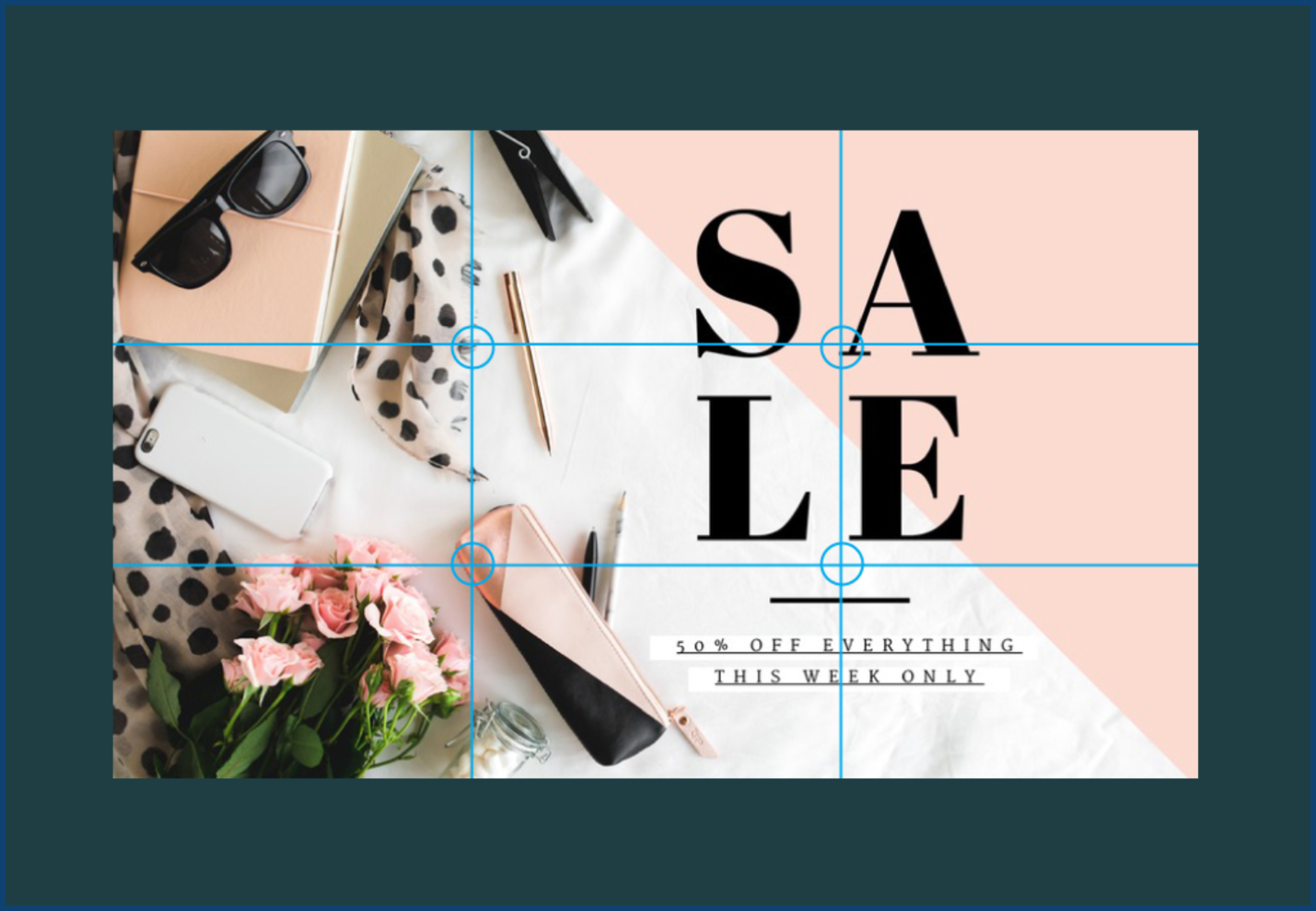
Instantly, you have created a visual journey. The viewer’s eye starts top-left, drops down to read the details, and sweeps across to the attractive product image. Always remember to check your fonts and colors before finalizing. Are you using just three fonts? Does your accent color make up only 10% of the image, drawing attention right to the “Buy Now” button? If yes, you are ready to publish.
Conclusion
Creating stunning, professional visuals doesn’t have to be a frustrating guessing game. By applying the rule of thirds in graphic design, mastering the 60-30-10 color ratio, and respecting white space, you can instantly elevate your work from cluttered to captivating. Structured designs simply perform better. They communicate clearly, build trust with your audience, and make your brand look incredibly polished.
If you want to ensure your visuals always hit the mark without having to overthink the grids and ratios yourself, Graphically is here to help. Our team of experts lives and breathes these design rules, ensuring every project we deliver is perfectly balanced, highly engaging, and ready to make your brand stand out.
FAQs
What is the rule of thirds in graphic design?
It is a composition guide that divides your layout into a 3×3 grid using two vertical and two horizontal lines. Placing your main subjects on the intersecting lines—the “Golden Spots”—creates a more balanced, visually interesting design than simply centering everything.
Why do my graphics always look so crowded?
Crowded graphics usually suffer from a lack of white space and too many competing elements. To fix this, leave empty space in at least three distinct areas of your layout, and strictly limit yourself to a maximum of three fonts.
How do I balance colors in my designs?
If your colors feel chaotic, use the 60-30-10 rule. Choose one dominant color for 60% of the design, a secondary color for 30%, and a bold accent color for the remaining 10%.