Table of Contents
Key Takeaways
- A brand style guide isn’t a 50-page manual. It’s a cheat sheet for how your brand looks and sounds.
- Know your audience and your “why” before you pick a single color.
- Keep the big three simple: a scalable logo, a small color palette, and fonts that read well on phones.
- Set clear rules for your images and your voice.
- Pack everything into a one-page cheat sheet your whole team can follow.
Picture this: your website looks sleek and futuristic, but your social media looks like a chaotic 2012 meme page. Your buyers won’t know which one is the real you. That confusion costs you trust.
The fix is a brand style guide. And no, it’s not a giant corporate manual that nobody reads. It’s a cheat sheet for your brand’s look and feel, like a dress code that keeps everything on-brand. No design degree needed.
It’s also worth your time. Research from Marq (formerly Lucidpress) linked consistent brand presentation to revenue increases of up to 33%. The same research found that 85% of companies have brand guidelines, but only about 30% enforce them.
So let’s keep it light. Here are the brand style guide essentials you actually need, with zero jargon.
Brand Style Guide Essentials: What You Actually Need
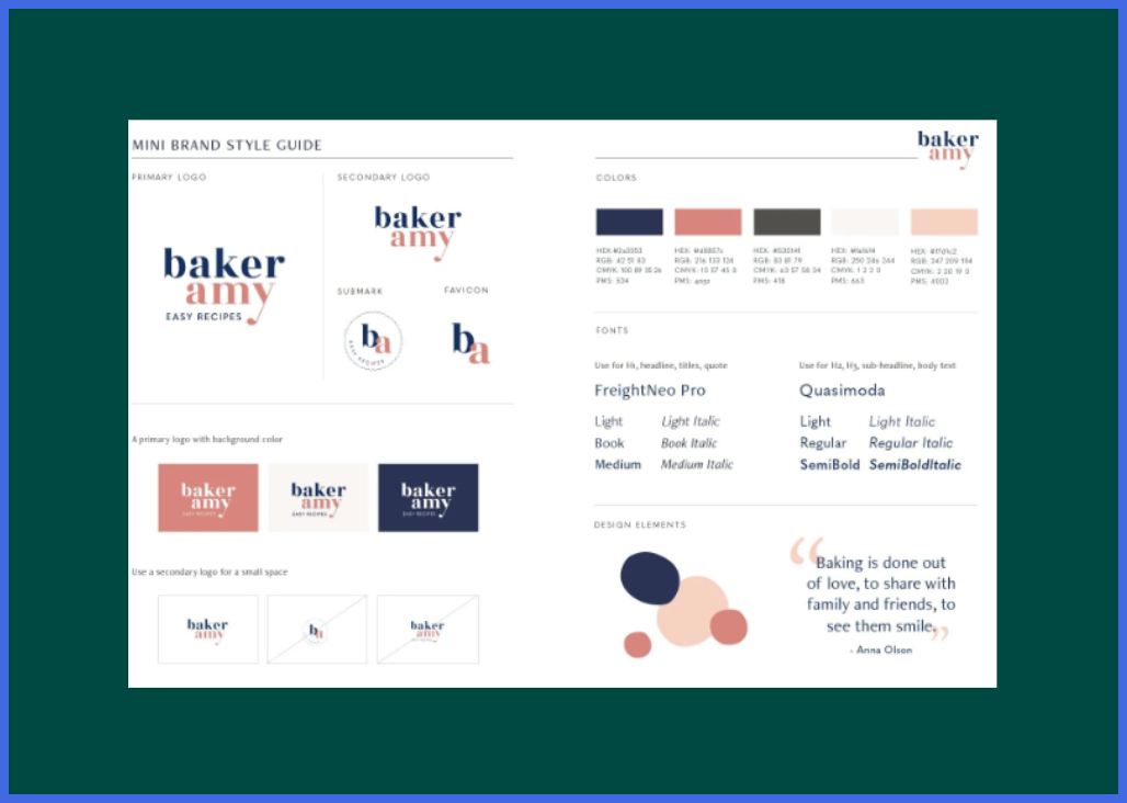
Think of your style guide as a time-saver, not a creative prison. When your rules are written down, you can move fast. You can also hand off design work without worrying that your brand will get messy.
Here’s why that matters. When people see the same colors, fonts, and tone everywhere, they start to recognize you. Recognition builds trust, and trust turns browsers into buyers.
A simple style guide covers five things:
- Logo: how it looks and where it can go
- Colors: your core palette and how to use it
- Typography: the fonts for headlines and body text
- Imagery: the look of your photos and illustrations
- Voice: how your brand talks
Notice what’s missing? Fifty pages of rules. You don’t need them yet.
First, Do a Vibe Check
You can’t pick colors until you know who you are. So answer three quick questions before you design anything:
- Who is your target market? Name the people you want to help.
- What problem do you solve? Say it in one sentence.
- What does your brand name mean? Nike, for example, is named after the Greek goddess of victory. Its famous Swoosh was inspired by her wing. The meaning shapes the look.
Write your answers in two or three sentences. That little paragraph becomes your compass for every design choice that follows.
That’s your main character energy. Once you know it, dressing the part gets way easier.
The Holy Trinity: Logo, Colors, and Typography
Now for the visual stuff. The rule here is simple: keep it simple. Every element should earn its spot.
Logo
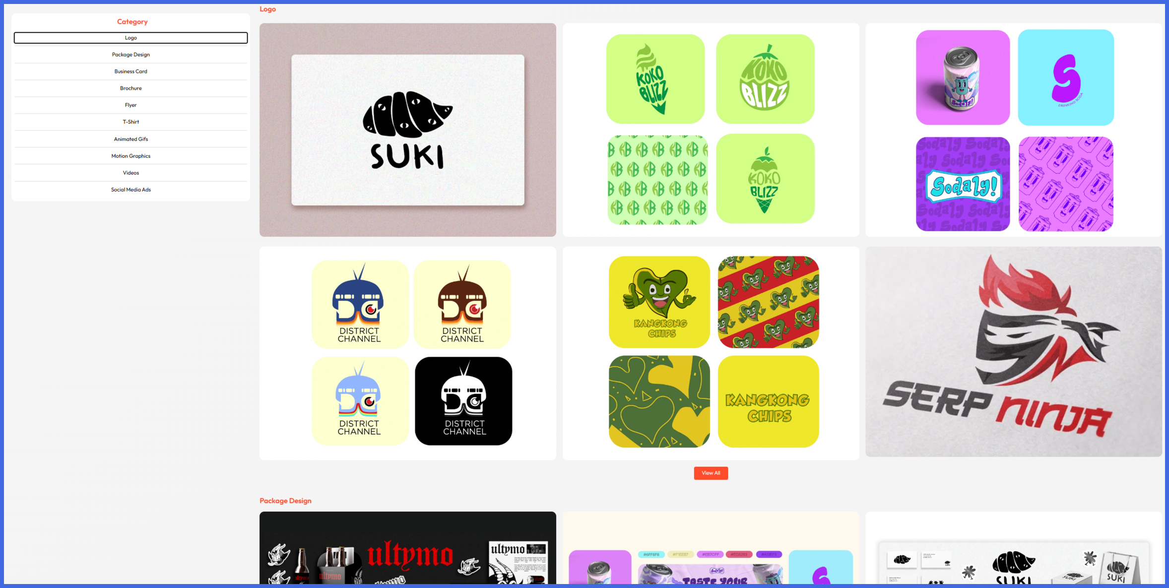
Avoid the indistinguishable. A good logo stands out in your market and still works at any size.
Nike’s Swoosh is proof. It’s a single curve, created in 1971, and the designer was paid just $35. Simple wins.
Google shows why scale matters. In 2015, it swapped its serif logo for a cleaner sans-serif one. It also added a four-color “G” for tiny screens. The goal was a mark that stays clear on every device.
Try this quick test. Shrink your logo to app-icon size. Can you still tell what it is? If not, simplify it.
Colors
Here’s color theory in 30 seconds. Warm colors like red, orange, and yellow feel energetic. Cool colors like blue and green feel calm. Neutrals like black, white, and gray keep things balanced.
Pairing changes the whole vibe. Yellow feels bright, energetic, and optimistic. Black feels classic and sophisticated, which is why it works well for premium products. Put them together and you get “bold, but serious.”
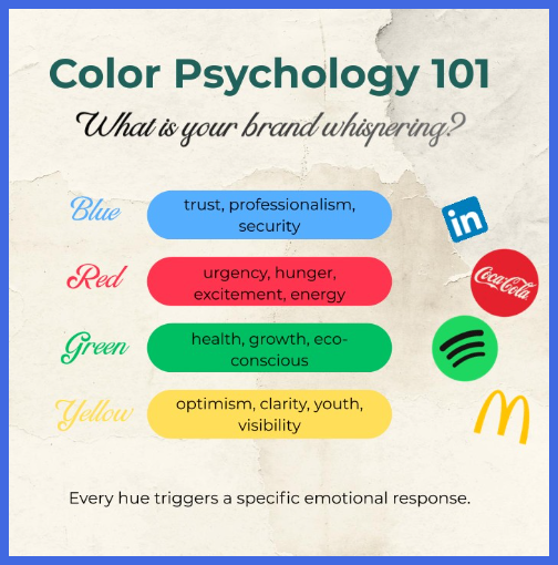
Caterpillar is the classic example. Yellow and black are its official colors, and yellow is easy to spot from far away, even on dusty job sites.
To keep your palette easy to use:
- Pick one main color, one partner color, and one neutral.
- Save the exact hex codes in your guide.
- Check contrast. Pale yellow text on a white background is tough to read.
- Remember that color meanings shift across cultures, so test with your audience.
Typography
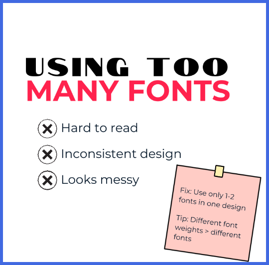
Choose fonts that are actually legible. Check them on a tiny mobile screen. If you squint to read them, drop them right away.
Stick with two fonts: one for headlines and one for body text. Free libraries like Google Fonts make it easy to find readable options.
Write down your sizes, too. Future you (and your designers) will say thanks.
Set the Rules for How You Look and Sound
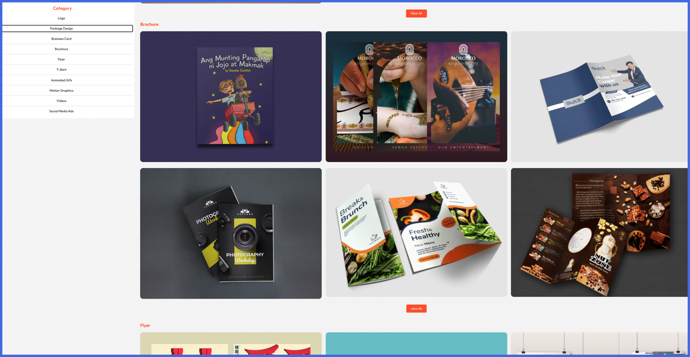
A brand is more than a logo. People also notice how your images look and how your words feel.
Imagery
Decide what your visuals look like. Minimal illustrations? Raw photo shoots? A signature two-tone photo filter? Pick one style and use it everywhere, from your website to your social posts and ads.
Each choice sends a message. Raw photos feel real and personal. Clean illustrations feel friendly. A two-tone filter feels bold and modern.
Spotify did this well. Its 2015 refresh made duotone images a signature look, and it built a Colorizer tool to apply the effect to uploaded images. Every image ended up feeling like Spotify.
Write your rule down, like “Every photo gets our yellow-and-black filter.”
Voice
Are you funny, serious, sarcastic, or educational? Your voice decides how people feel about your company. A playful brand cracks jokes. A serious one stays calm and clear.
Mailchimp’s public content style guide is a great model. Its voice stays the same, but its tone adapts to the moment. Think about how a celebration message sounds different from an error message.
Choose three voice words. Then add one “say this, not that” example, so everyone can copy it.
Put It on One Page
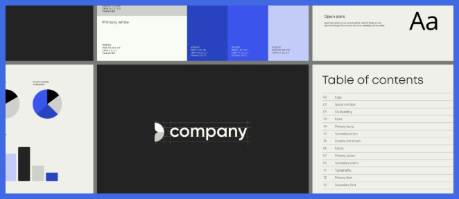
Now squeeze every decision into one simple one-page cheat sheet. Your cheat sheet should show:
- Your logo, in main and small versions
- Your color palette, with hex codes
- Your two fonts
- A sample of your image style
- Your three voice words
A one-page cheat sheet isn’t a full brand book, but it’s a perfect start. It ends the endless guessing game. It also gives everyone a single source of truth for your brand’s look and feel. And because it’s one page, people actually use it.
Pass Your Guide to Graphically
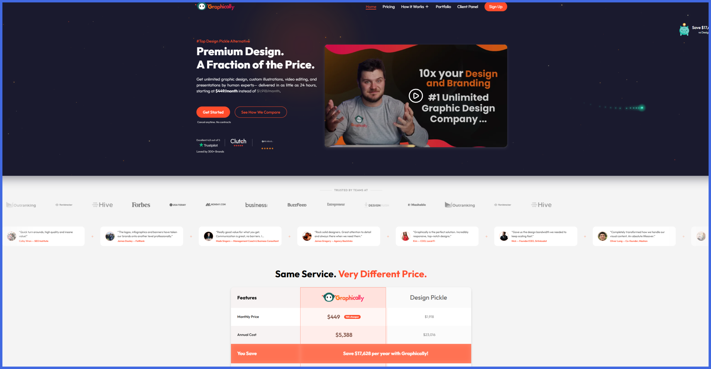
Here’s what most founders skip. You shouldn’t spend six hours a day pushing pixels around.
Once your guide is ready, hand it to Graphically. You get an unlimited design team that follows your exact brand rules. They turn your guidelines into scroll-stopping social graphics, presentations, campaign materials, and more.
Most requests come back within 24 hours. Your team also learns your fonts, tone, and standards, so you never have to re-explain. And with unlimited revisions, you can tweak things until they feel just right. Your brand stays visually flawless while you focus on growth.
Conclusion
Nailing your brand style guide essentials doesn’t have to be a big project. Do the vibe check, lock in your logo, colors, and fonts, set rules for imagery and voice, and put it all on one page. Start small, then update it as you grow.
You already know your audience, your look, and your voice. Now put them to work. Let Graphically handle the pixels, so every post, ad, and page looks like you. Consistency builds trust, and trust builds sales.
FAQs
What should a brand style guide include?
At a minimum: logo rules, a color palette, fonts, image style, brand voice, and a one-page summary cheat sheet. You can add more rules later as your team grows.
How long should a brand style guide be?
Start with one page. You can grow it into a full guide as your business grows.
How many colors and fonts do I need?
Keep it small: one main color, one partner color, one neutral, and two fonts. Fewer choices make it easier to stay consistent.
Do I need a designer to build a style guide?
You can build the basics yourself. A designer helps most when it’s time to produce graphics at scale and keep every one on-brand.
How often should I update my style guide?
Review it once a year, or whenever your brand changes.