Table of Contents
- Key Takeaways
- The Seasonal Design Trap
- 10 Killer Halloween Fonts on Canva
- 1. Shlop
- 2. Tallow Sans Pen
- 3. Beast
- 4. Art Nuvo
- 5. Jeepers
- 6. ITC Bottleneck
- 7. Max Somsin
- 8. Sweet Dreams
- 9. Scary Stories
- 10. Pirata One
- The 3 Rules of Novelty Typography
- Never Use It for Body Copy
- Pair With a Clean Sans-Serif
- Use Color Strategically
- Make the Layout Look Expensive
- Where to Use These Fonts
- Upgrade Your Aesthetic With Graphically
- Conclusion
Key Takeaways
- Canva makes it easy to find a holloween font, but using it well takes design discipline.
- Spooky fonts work best in short headlines, not paragraphs or long product descriptions.
- Pair one dramatic Halloween font with a clean, simple sans-serif font for readability.
- Move beyond basic orange and black with deep purples, acid greens, muted oranges, and modern noir tones.
- Fonts such as Shlop, Pirata One, Jeepers, Scary Stories, and Beast each create a different mood.
- If you want Halloween marketing that feels polished rather than cheap, Graphically can turn your seasonal ideas into professional, conversion-focused designs.
Halloween is one of the best times to have fun with your marketing. You can play with mystery, humor, nostalgia, and a little drama.
But there is a problem.
Many brands grab the first jagged, dripping, or scratchy font they see in Canva, drop it onto a template, and call it a Halloween campaign. The result? A design that looks more like a neighborhood party flyer than a polished brand promotion.
A holloween font should add atmosphere—not take over your entire design. The right font can make an Instagram post feel cinematic, an event flyer feel exciting, or a limited-time offer feel irresistible. The wrong font can make even a great brand look rushed.
Canva’s own design guidance recommends using clear hierarchy, readable body text, and no more than about three fonts in one design. canva+1 That matters even more with Halloween fonts because they are naturally loud.
So, let’s fix that. Below are 10 Canva fonts worth trying, plus the simple rules that make them look premium.
The Seasonal Design Trap
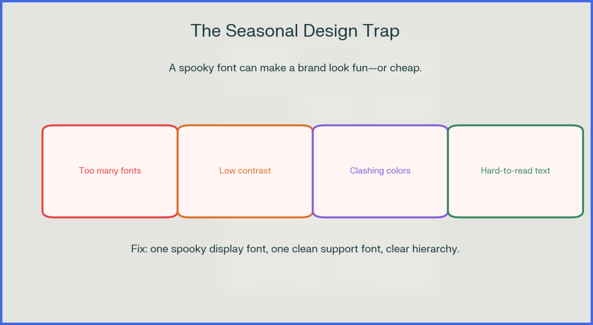
You want your brand to join the Halloween conversation. That is smart. Seasonal campaigns can make your content feel timely, human, and fun.
The trap is treating Halloween design like a costume you throw on at the last minute.
You have probably seen it before:
- A dripping blood-red headline
- Three different “spooky” fonts
- Neon orange text on a busy black background
- Tiny body copy nobody can read
- A cluttered layout with bats, pumpkins, cobwebs, and ghosts everywhere
The biggest culprit is usually the font.
Novelty fonts are designed to create a strong reaction. They are intentionally unusual, dramatic, or strange. That is their job. But when you use them everywhere—headlines, subheadings, buttons, and paragraphs—they stop feeling stylish and start feeling chaotic.
Think of a Halloween font like glitter eyeshadow. A little can look striking. Covering your whole face in it? Not so much.
Your goal is not to make everything look scary. Your goal is to make your Halloween campaign look intentional.
10 Killer Halloween Fonts on Canva
Here are 10 fonts you can search for directly in Canva. Each one creates a different Halloween mood, so choose based on your campaign—not just because it looks creepy.
1. Shlop
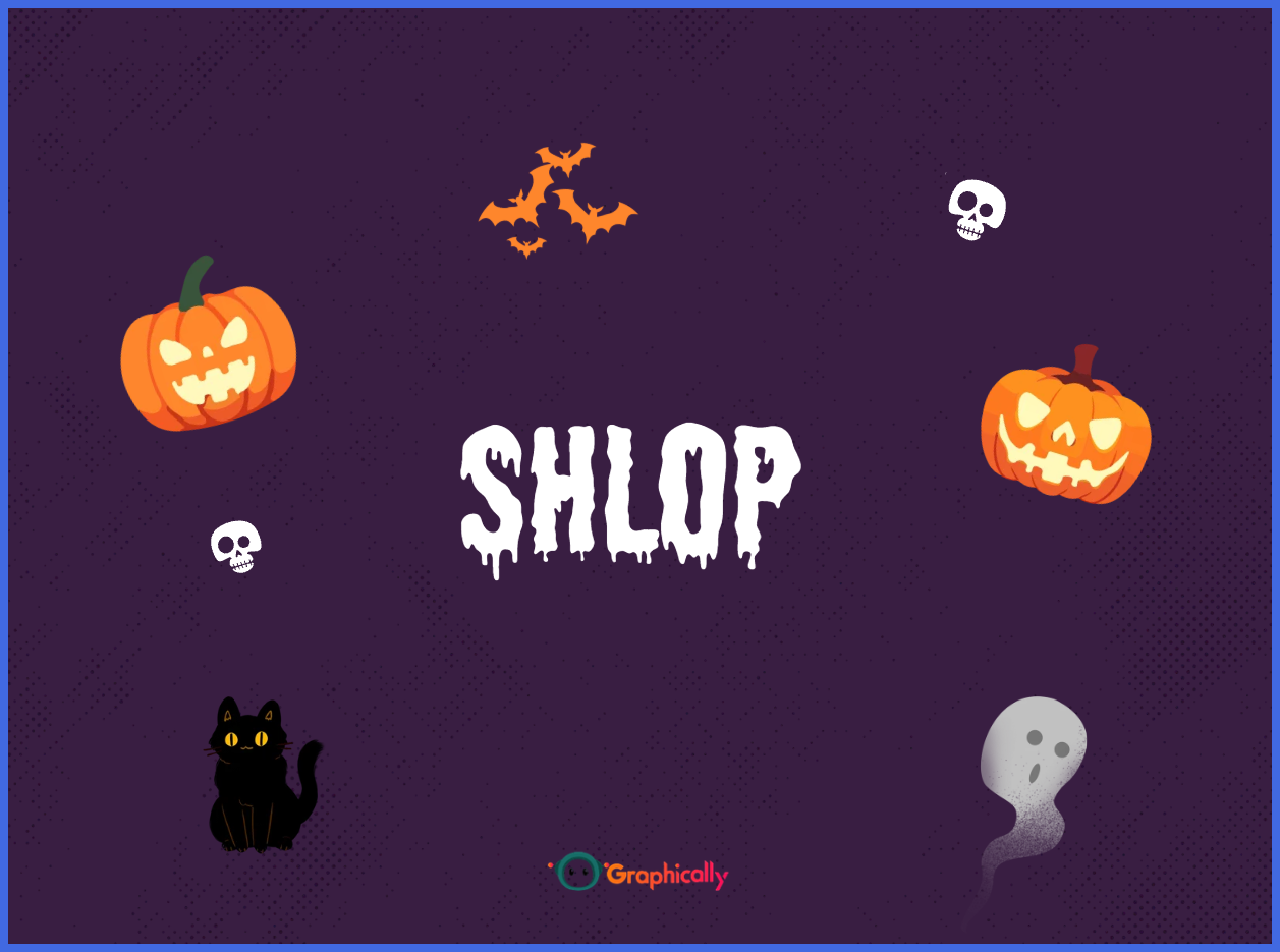
Shlop is thick, gooey, and dripping. It instantly says slime, melting monsters, haunted potions, or horror-movie posters.
Use it for:
- Horror-themed product launches
- Halloween party posters
- “Something wicked is coming” teasers
Avoid using it for long sentences. Those drippy letterforms need space.
2. Tallow Sans Pen
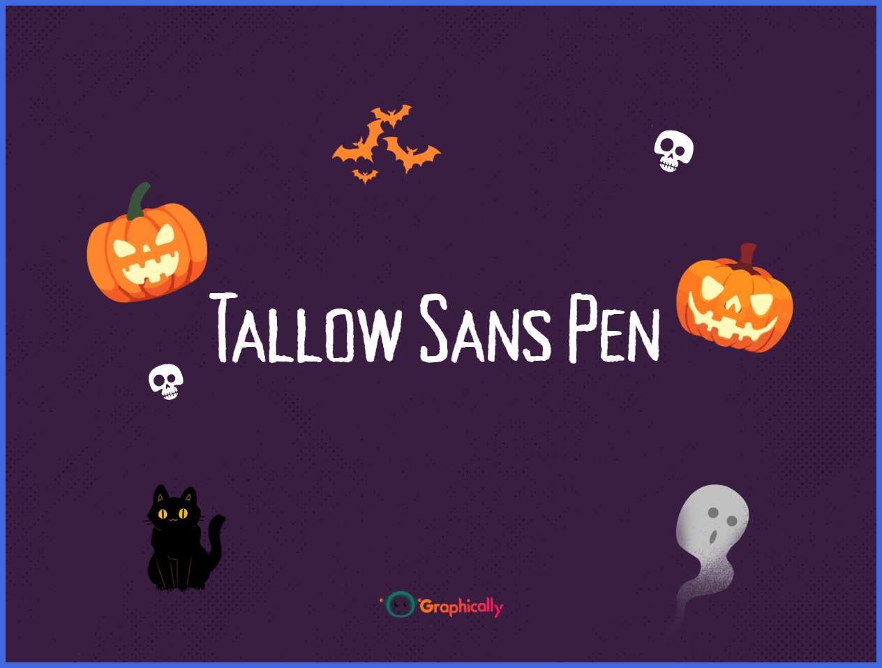
Tallow Sans Pen has a hand-drawn, slightly eerie feel. It is less aggressive than Shlop, making it great for boutique brands, candle shops, cafés, and creative businesses.
Use it for:
- Autumn product collections
- Halloween workshop invitations
- Cozy-but-spooky social posts
3. Beast
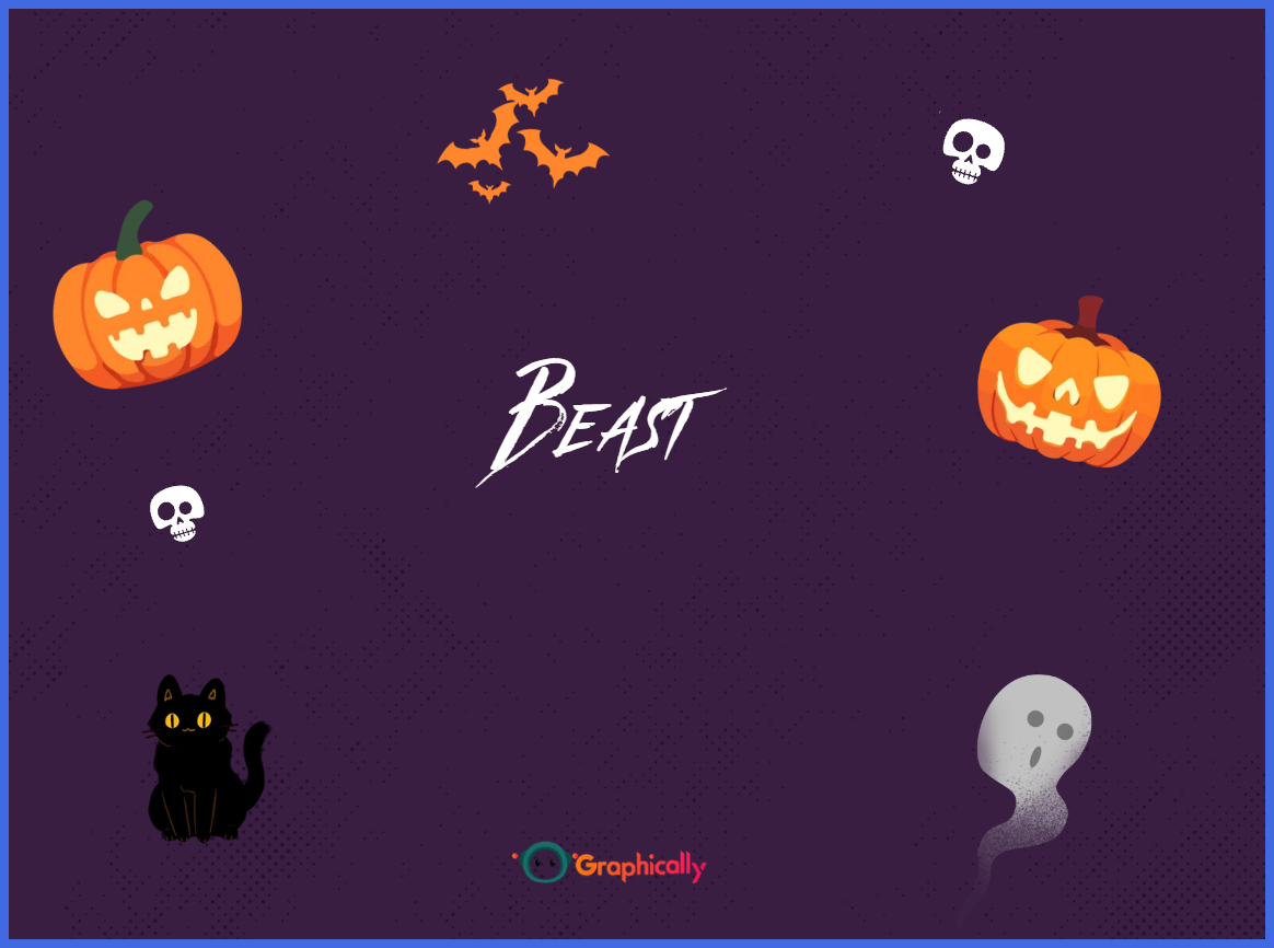
Beast is bold, jagged, and feral. It has a monster-movie energy that works well when you want your design to feel intense.
Use it for:
- Haunted house promotions
- Gaming or entertainment brands
- Bold “limited time” offers
Keep the surrounding layout simple. Beast already brings plenty of personality.
4. Art Nuvo
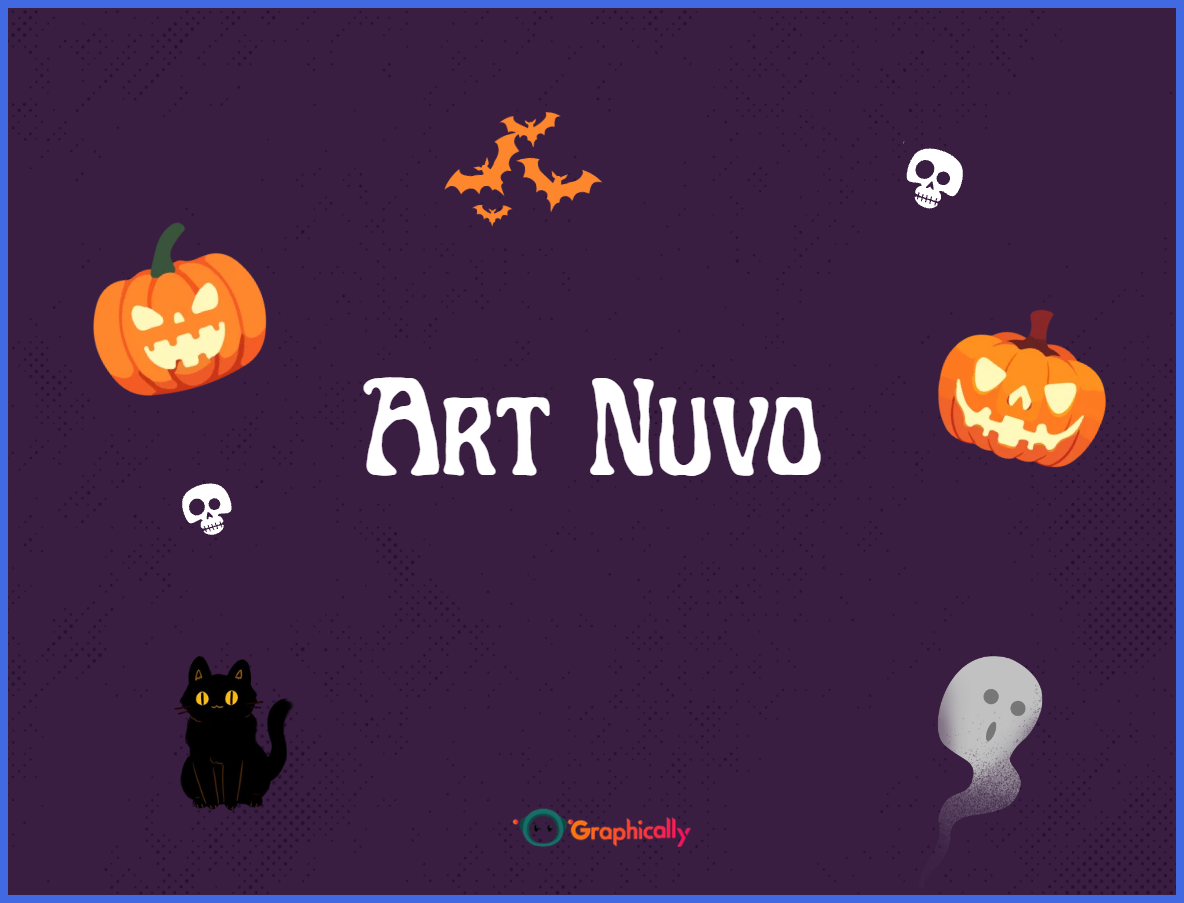
Art Nuvo leans more ornate and vintage than outright terrifying. It has an old-world, mysterious character that suits elegant Halloween campaigns.
Use it for:
- Masquerade events
- Luxury Halloween collections
- Vintage-inspired packaging or social graphics
This is a strong choice if you want “haunted elegance” instead of “cheap horror.”
5. Jeepers
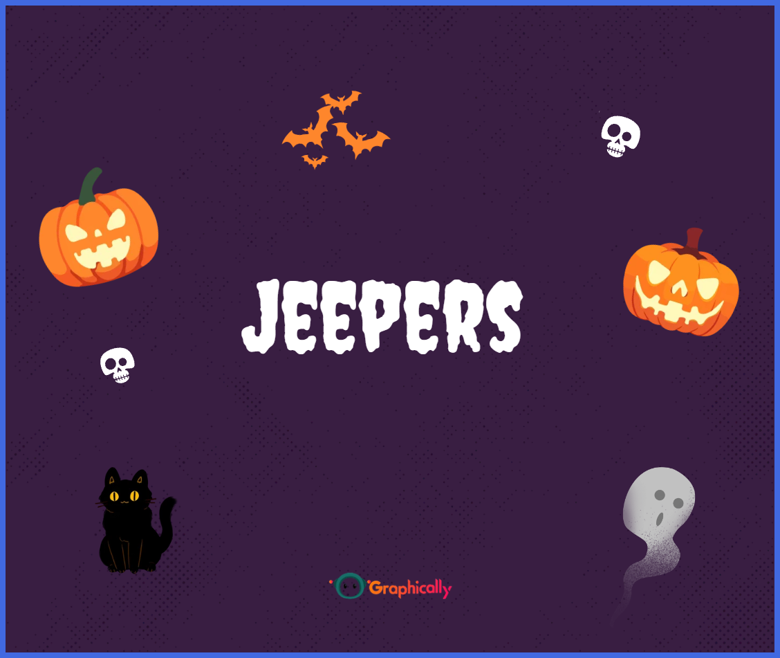
Jeepers is a classic playful Halloween font. It feels fun, slightly mischievous, and easy to recognize.
Use it for:
- Family-friendly events
- Halloween sales
- Social media giveaways
- Costume-party invitations
If your brand is friendly and approachable, Jeepers is usually safer than a full horror font.
6. ITC Bottleneck
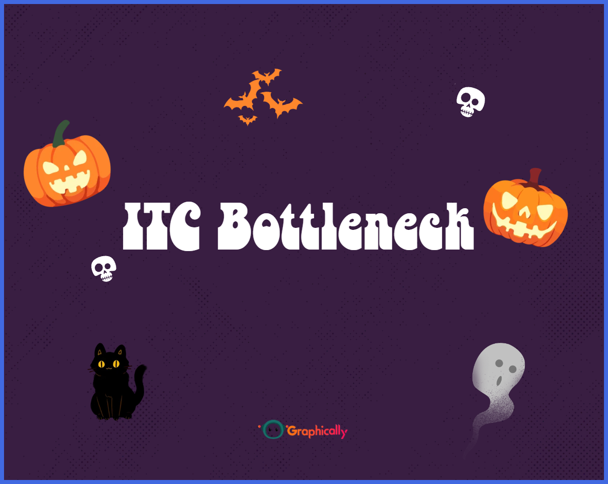
ITC Bottleneck has dramatic, gothic energy. It feels theatrical, dark, and old-fashioned—in a good way.
Use it for:
- Vampire-themed campaigns
- Gothic fashion or beauty content
- “Midnight” sales and evening events
Pair it with lots of clean space so the dramatic letterforms can stand out.
7. Max Somsin
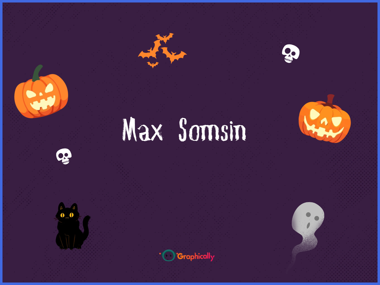
Max Somsin is bold and rough, with a poster-like feel. It works when you need your headline to be impossible to ignore.
Use it for:
- Event announcements
- YouTube thumbnails
- Flash-sale graphics
- Halloween countdown posts
Because it is heavy and textured, keep the rest of the design minimal.
8. Sweet Dreams
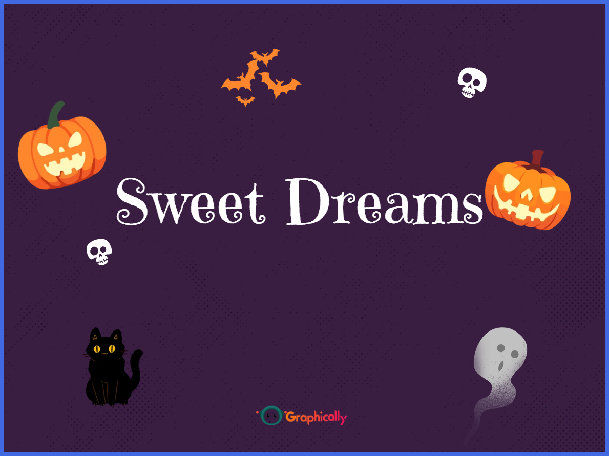
Sweet Dreams has a creepy-cute, storybook quality. It is ideal for brands that want Halloween to feel whimsical rather than frightening.
Use it for:
- Kids’ events
- Bakery and dessert promotions
- Pet-friendly Halloween posts
- “Trick or treat” campaigns
This font proves that Halloween does not have to be bloody to be memorable.
9. Scary Stories
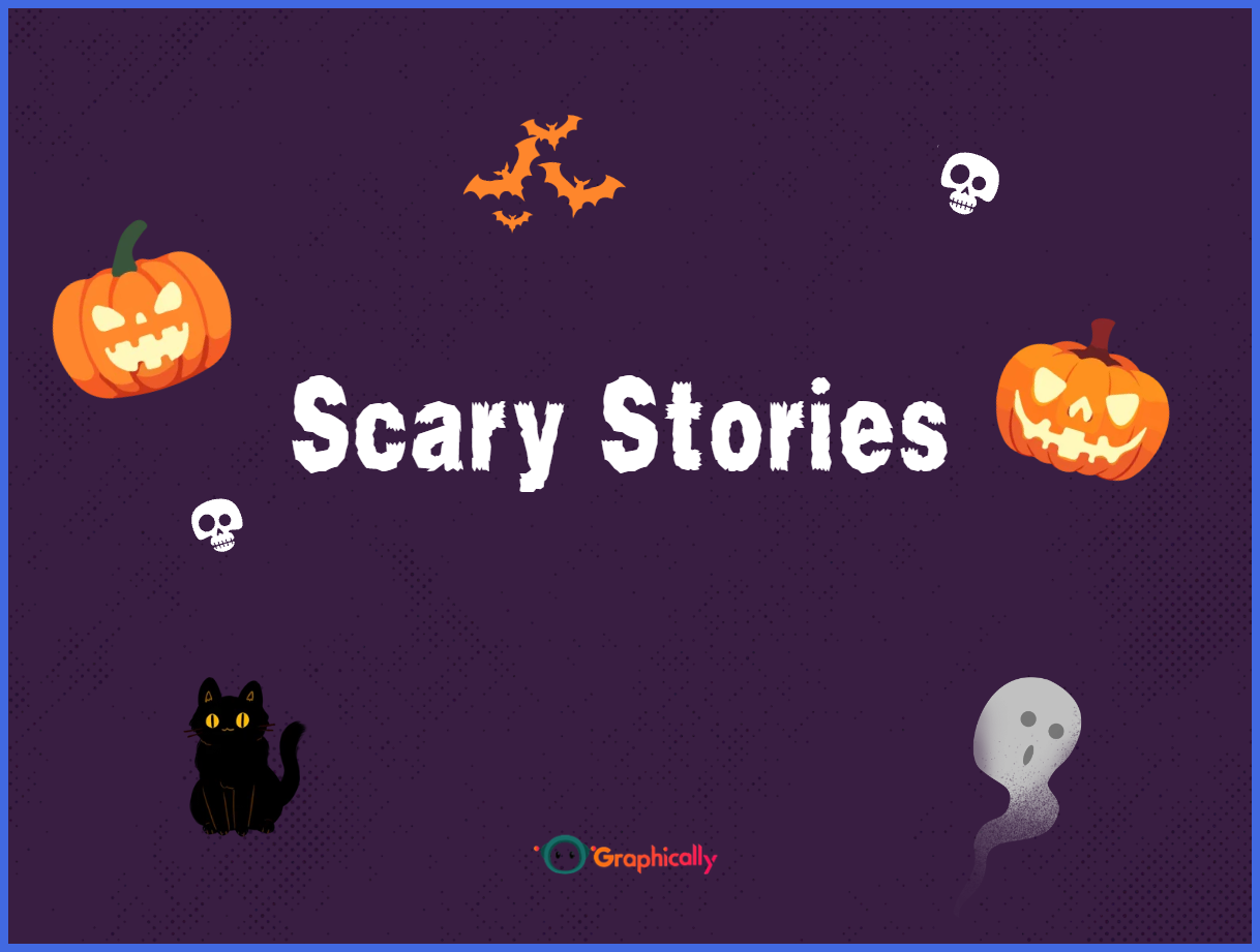
Scary Stories has rough, irregular lettering with an unsettling storybook feel. It is perfect for ghost stories, mysterious promotions, and atmospheric content.
Use it for:
- Horror book promotions
- Mystery-themed campaigns
- “True scary story” social posts
- Haunted attraction marketing
10. Pirata One
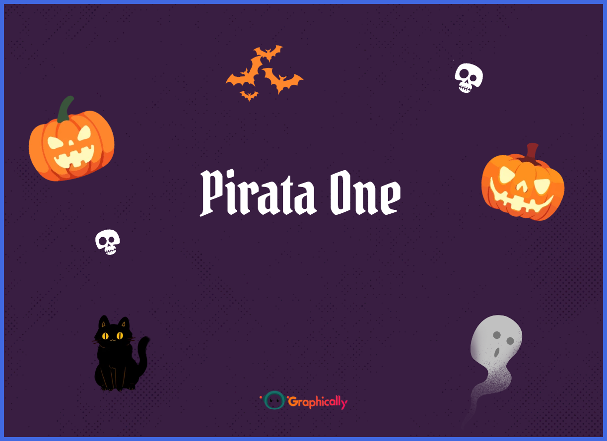
Pirata One is a sharp Gothic font with medieval character. It brings dark, adventurous energy to a design.
Use it for:
- Pirate- or castle-themed events
- Gothic branding
- Halloween night markets
- Dramatic product launches
Pirata One works especially well when you want a design that feels like the cover of a dark fantasy novel.
The 3 Rules of Novelty Typography
Finding a cool font is easy. Making it look expensive is where most people struggle.
These three rules will instantly improve your Halloween designs.
Never Use It for Body Copy
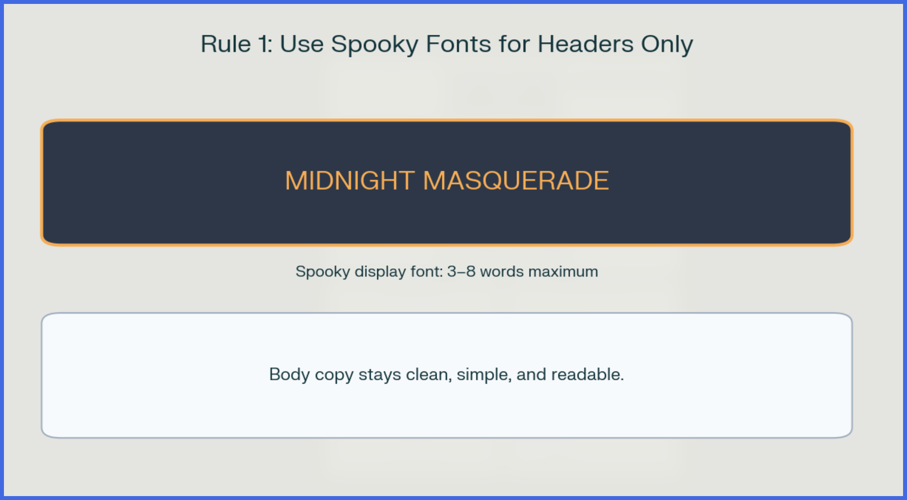
Spooky fonts are for headlines only.
If you write an entire paragraph in Sweet Dreams, Max Somsin, or Shlop, people will struggle to read it. And if people have to work too hard to understand your message, they will simply scroll past.
A better structure looks like this:
- Spooky font: “Midnight Masquerade”
- Clean font: “Friday, October 31 – 7 PM – The Grand Hall”
- Clean font: “Tickets are limited. Reserve yours today.”
Canva recommends using larger, more dominant type for your most important message, followed by smaller supporting text. canva+1 Halloween fonts should be the “largest and loudest” part of that hierarchy—but only for a few words.
Pair With a Clean Sans-Serif
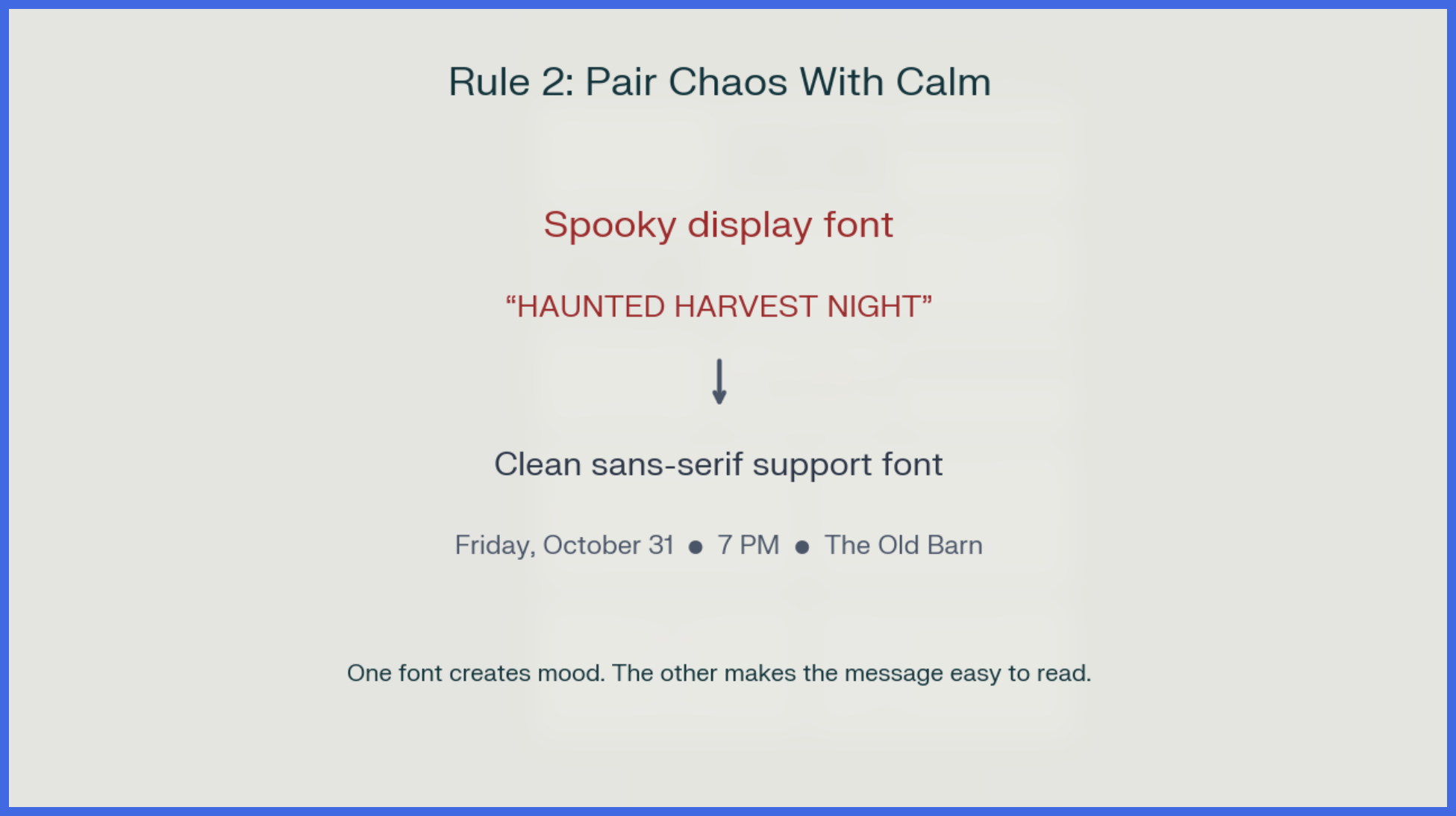
A dramatic Halloween font needs a calm partner.
Use a simple sans-serif font for:
- Dates and times
- Prices
- Product details
- Event locations
- Calls to action
- Body copy
Good clean options in Canva include fonts such as Inter, Montserrat, Poppins, Open Sans, or League Spartan. The spooky font creates the mood; the clean font makes the message usable.
Canva’s font-pairing guidance emphasizes contrast between typefaces while keeping the design readable and balanced. canva+1 In practice, that means: one expressive font, one practical font.
For example:
- Pirata One: “The Haunted Harvest”
- Montserrat: “Live music, seasonal cocktails, and costume contests”
- Montserrat Bold: “Get tickets before October 25”
That combination feels designed. It does not feel like a template someone rushed through.
Use Color Strategically
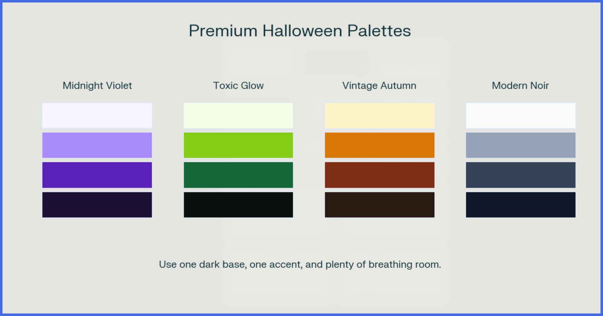
Orange and black are classic for a reason. But if every Halloween design uses the same bright orange on pure black, it can start to feel generic.
Try these more premium directions:
- Midnight violet: Deep purple, lavender, and near-black for a magical, luxurious feel
- Toxic glow: Black, forest green, and acid green for a modern horror look
- Vintage autumn: Muted orange, burnt sienna, cream, and deep brown for a warm, elevated seasonal feel
- Modern noir: Charcoal, slate gray, silver, and white for a sleek, high-end campaign
Color contrast matters as much as color choice. Your text should be easy to read on both desktop and mobile. If the background is busy, add a simple dark overlay behind the text or place the headline in a clear, open area.
Make the Layout Look Expensive
Typography is only part of the equation. Spacing, hierarchy, and restraint are what make a design look professional.
Start with a clear reading order:
- Headline: The main Halloween message
- Supporting line: What the offer or event is about
- Details: Date, time, location, discount, or product name
- Call to action: What you want the viewer to do next
Then give everything room to breathe.
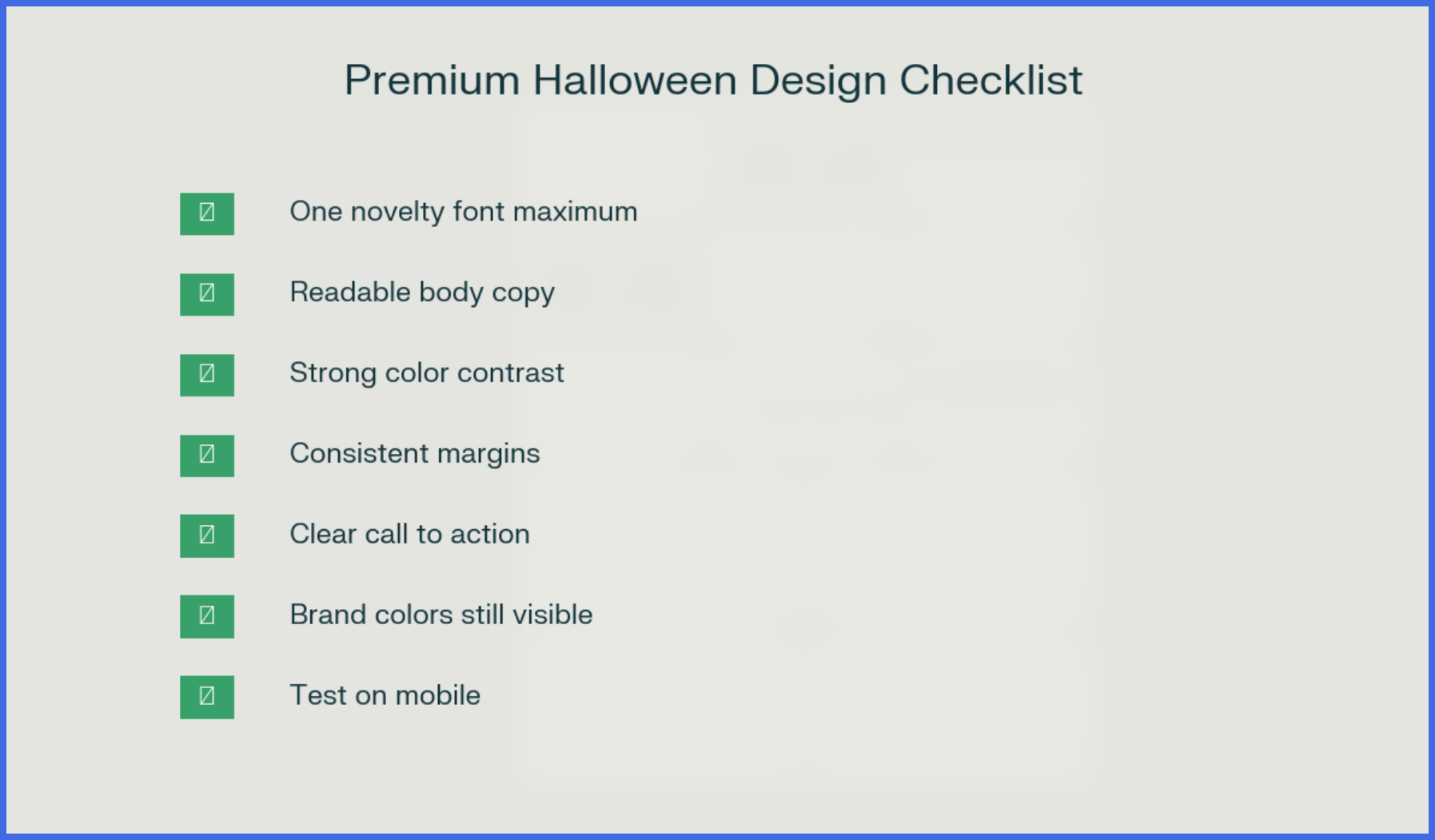
- Leave margins around the edges.
- Avoid stacking text directly on top of detailed illustrations.
- Use consistent alignment.
- Keep your call to action obvious.
- Limit yourself to one novelty font.
- Test the design at small mobile size.
Whitespace is not wasted space. It makes your headline feel more important and your brand feel more confident.
Where to Use These Fonts
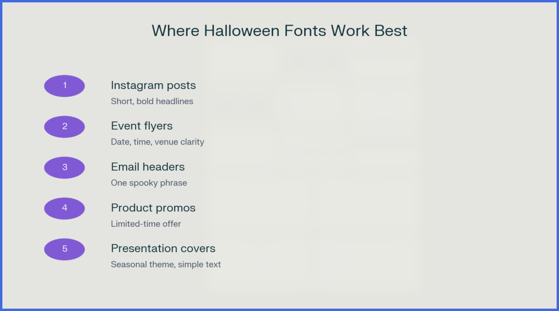
You do not need to redesign your entire brand for Halloween. Use seasonal typography where it creates the most impact.
Strong places to use a holloween font include:
- Instagram and Facebook post headlines
- Event flyers and ticket promotions
- Email subject-line graphics or header banners
- Limited-time offer announcements
- Website hero banners
- Presentation covers
- Product launch teasers
- In-store signage
For example, a skincare brand could use Art Nuvo for a “Midnight Repair Ritual” Halloween campaign. A café could use Sweet Dreams for a pumpkin-spice promotion. A fitness studio could use Beast for a “Beat the Monster” Halloween workout challenge.
Same season. Completely different moods. That is what makes a campaign feel tailored rather than generic.
Upgrade Your Aesthetic With Graphically
Knowing which font to use is only about 10 percent of the battle.
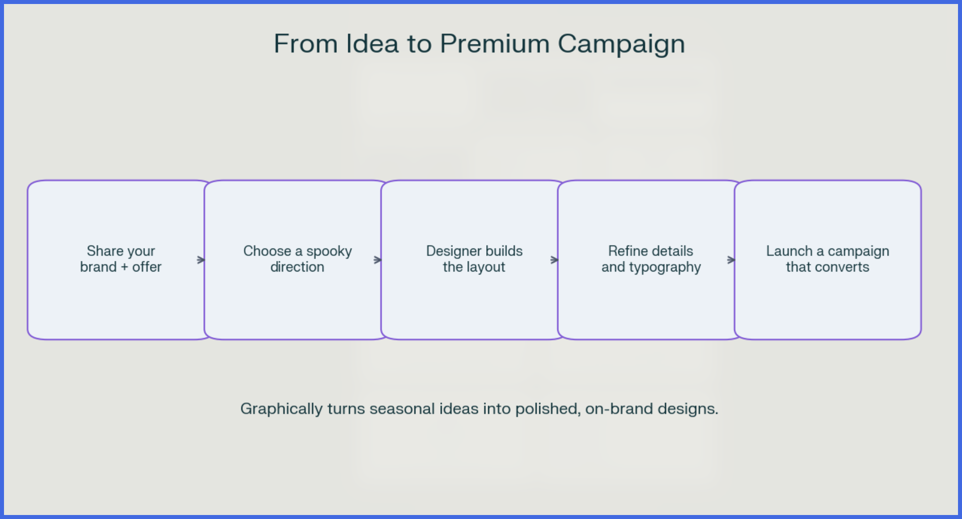
The real work is execution: choosing the right layout, balancing the typography, adjusting spacing, creating contrast, keeping your brand consistent, and making sure the final design actually drives action.
That is where Graphically comes in.
Instead of spending three hours fighting with a Canva template, you can hand your seasonal concept to Graphically’s design team. They understand how to use novelty typography without letting it overwhelm your brand.
With Graphically, you can get:
- Custom Halloween social media designs
- Polished event flyers and email headers
- On-brand seasonal campaign visuals
- Professional font pairings and layout execution
- Designs built to look premium and convert—not just look spooky
You bring the idea. Graphically brings the design discipline.
Conclusion
A holloween font can make your seasonal marketing unforgettable—but only if you use it with intention.
Choose one font that matches your brand’s mood. Keep it in the headline. Pair it with a clean sans-serif. Use smarter colors, give your text room to breathe, and make your call to action impossible to miss.
Halloween is the perfect time to be bold. Just make sure your design looks boldly professional, not boldly cheap.
When you want seasonal visuals that stand out from the generic pumpkin-and-slime clutter, partner with Graphically. Their team can turn a simple Halloween idea into a polished, high-impact campaign that still feels unmistakably like your brand.
FAQs
What is the best Halloween font in Canva?
There is no single “best” font. Jeepers works well for playful, family-friendly designs, while Pirata One suits Gothic themes and Shlop fits full horror aesthetics. Choose based on your campaign’s mood.
Can I use Halloween fonts for body text?
No. Use them for short headlines, titles, or a single phrase. Body copy should use a clean, highly readable font.
How many fonts should I use in one Halloween design?
Keep it simple: one spooky display font and one clean support font. Canva generally recommends avoiding too many fonts and maintaining a clear hierarchy. canva+1
Deep purple, muted orange, forest green, acid green, charcoal, cream, and metallic accents often look more elevated than bright orange on pure black.
Can Graphically design my Halloween campaign?
Yes. Graphically can create custom, on-brand Halloween designs for social media, email, ads, events, and promotional campaigns—so you do not have to wrestle with Canva templates alone.