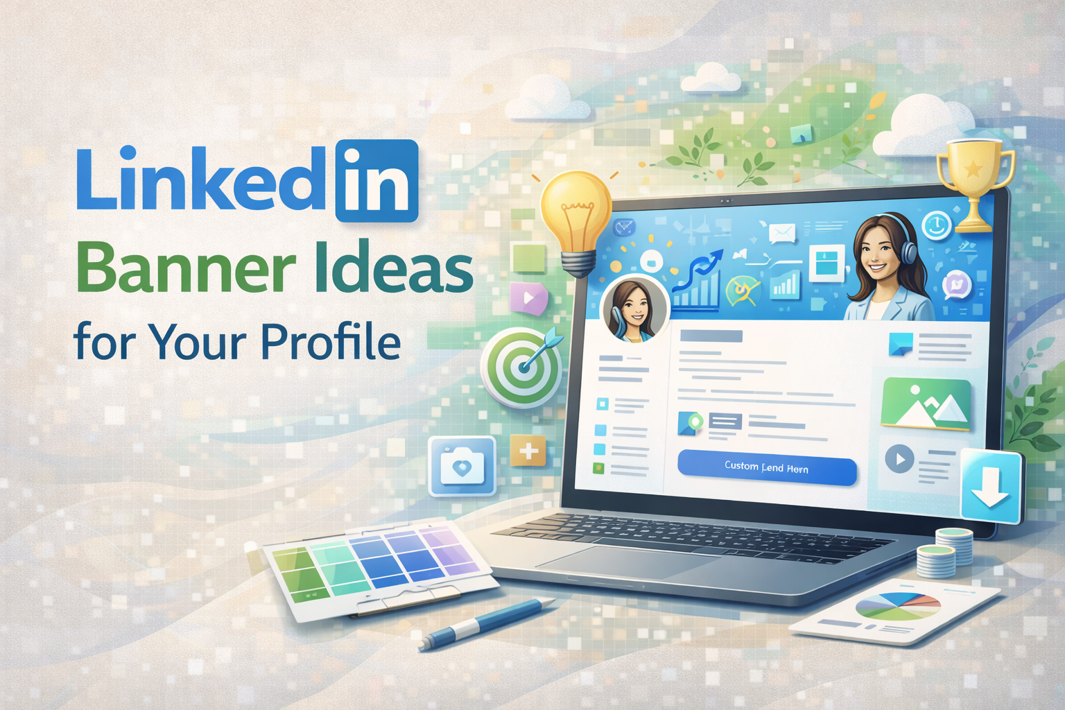
Table of Contents
- Key Takeaways
- Why Your Banner Matters
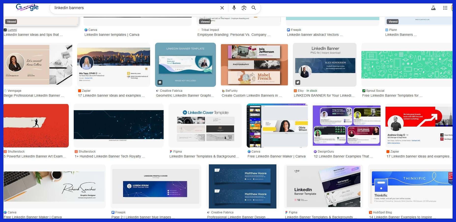
- 10 LinkedIn Banner Background Ideas
- Banner Psychology and Strategy
- Technical Best Practices
- Sourcing Your Banner Image
- Conclusion
- Frequently Asked Questions
- What size should my LinkedIn banner background be?
- Can I use personal photos as my LinkedIn banner background?
- What are some safe color choices for LinkedIn banners?
- Where can I find free LinkedIn banner backgrounds?
- How often should I update my LinkedIn banner?
- What message should my LinkedIn banner communicate?
- How do I avoid common design mistakes with LinkedIn banners?
Key Takeaways
-
A professional LinkedIn banner immediately grabs attention and establishes a powerful first impression, making you memorable to recruiters and clients globally.
-
By tailoring your banner to your professional brand, industry, and career goals, you craft a compelling and consistent profile that communicates your distinct value.
-
Be creative. Cityscapes, action shots, abstract designs, and product showcases visually share your skills, culture, and personality.
-
Employ color theory, legible fonts, and harmonious compositions to lead eyes and inspire feelings, rendering your banner compelling and beautiful.
-
Be sure to adhere to LinkedIn’s size, resolution, and file format recommendations for a crisp, professional display on all devices.
-
Say NO to clutter and pixelated images. Say yes to high-quality stock imagery or custom designs that really showcase your story and values.
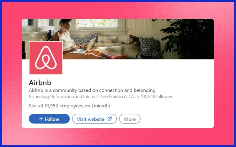
LinkedIn banner background ideas not only make profiles pop but also showcase a brand’s personality with ease. For small business owners and agencies, banners featuring clean lines, bright colors, or team photos do the trick.
Icons, company logos, or a soft color block add a powerful tone. Choosing an appropriate banner makes your business page shine and attracts the perfect demographic.
Below, get ideas to use for your next banner!
Why Your Banner Matters
A LinkedIn banner isn’t just a background image. It’s the very first thing people notice after your name and photo. It’s the only spot where you can demonstrate your values without speaking. A crisp, clean banner catches the eye quickly. It matters because people choose within seconds if they want to find out more about you.
If your banner is pixelated or off-brand, that first impression is gone and they may never give you a second shot. Consider your banner your virtual handshake, a straightforward but strong opening.
Your banner should demonstrate who you are and what you do. When you pair it with your brand or your business style, you aid in memorability. For instance, a tech consultant might opt for a sleek, modern design with cool blues and minimalistic icons, whereas a creative agency owner could prefer vibrant hues and whimsical forms.
A digital marketing agency might use a picture of a bustling workspace or city skyline, implying momentum. These touches associate your face with your area and make your profile memorable.
A compelling banner can increase your profile’s attractiveness. With over 14 million jobs and 97% of recruiters on LinkedIn, it’s hard to rise above the crowd. Because your banner is important, a professional banner takes you above the fray.
If you’re a small business owner, having your logo or a tagline creates confidence. For freelancers, a picture of your workspace or a mock project demonstrates that you’re serious. Even a simple pattern in your brand colors can make people pause while scrolling!
Graphically.io helps you craft banners that suit your brand and keep your page looking sharp — even if design isn’t your forte. Care about your banner. Words aren’t always necessary. A sustainability consultant might use pictures of green landscapes or clean energy.
A diversity-conscious tech founder could display a diverse team at work. If you switch up your banner for holidays or seasons, it demonstrates you’re engaged and aware, such as pride colors in June or a year-end snapshot in December.
These little touches keep your profile fresh and demonstrate that you care about what’s current. Your banner can prompt viewers to take action. You might add a short call to action: “Let’s connect,” “View my portfolio,” or “Open to projects.
Just stick to a simple design and easy-to-read text at 1584 x 396 pixels. Updating frequently keeps your profile fresh, which is crucial in a world that moves quickly. If you need help, Graphically.io’s fast turnarounds and quality control make this simple.
10 LinkedIn Banner Background Ideas
The appropriate LinkedIn banner background establishes the atmosphere for your profile. It’s a virtual handshake that can narrate your tale, demonstrate your principles, and assist you in differentiating yourself. A great banner employs simple signals such as color, arrangement, and visuals to be memorable.
So here are 10 LinkedIn banner background ideas to help you find the right fit for your professional persona!
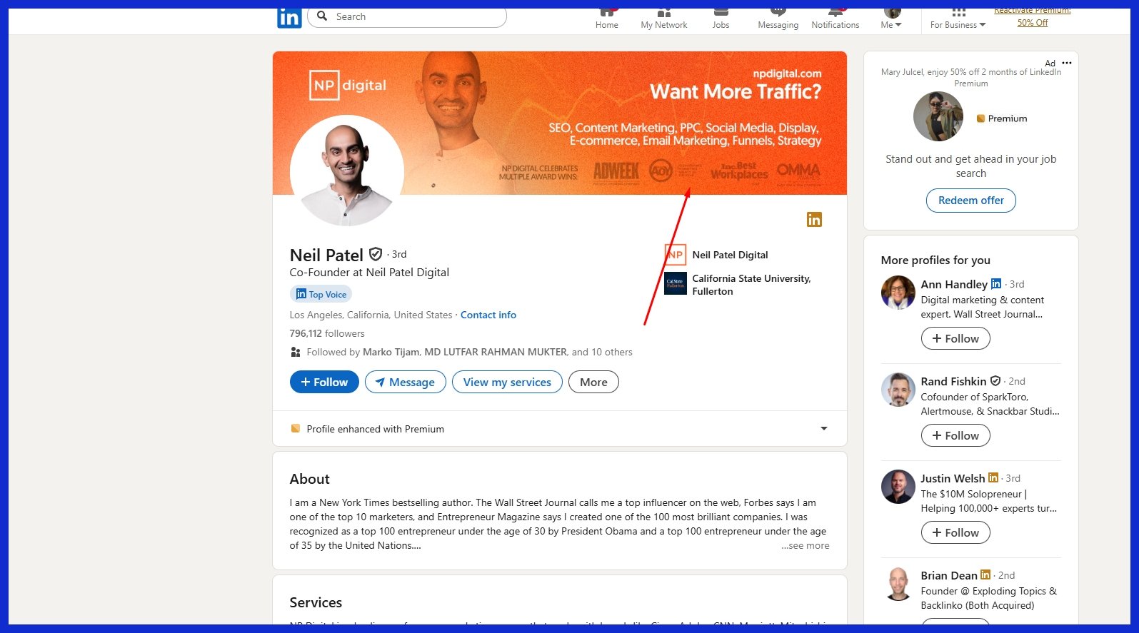
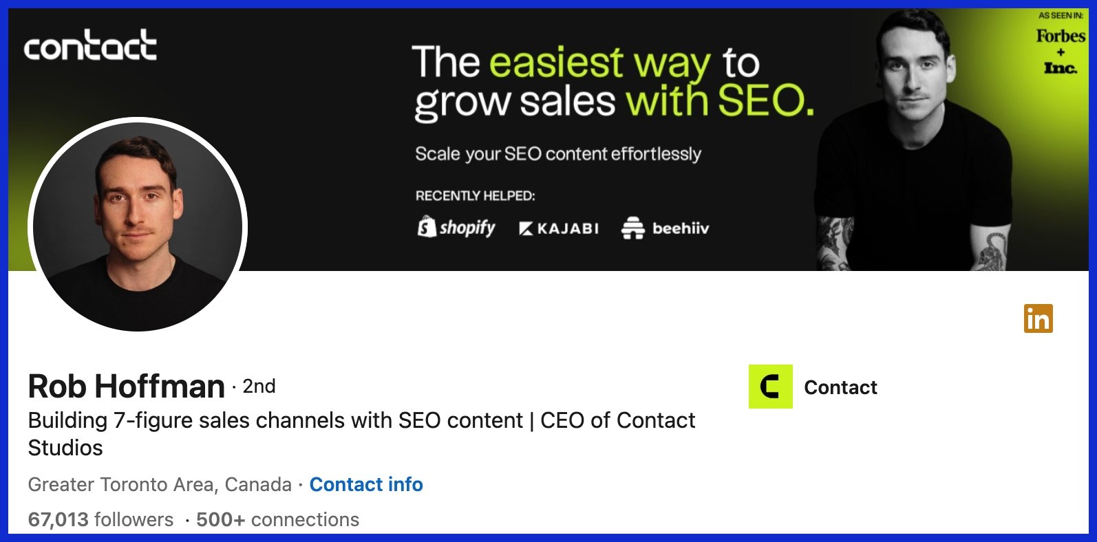
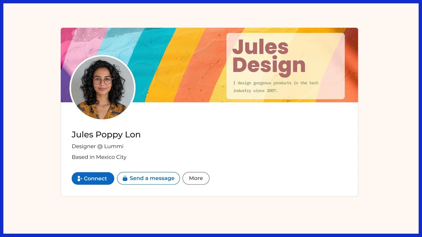
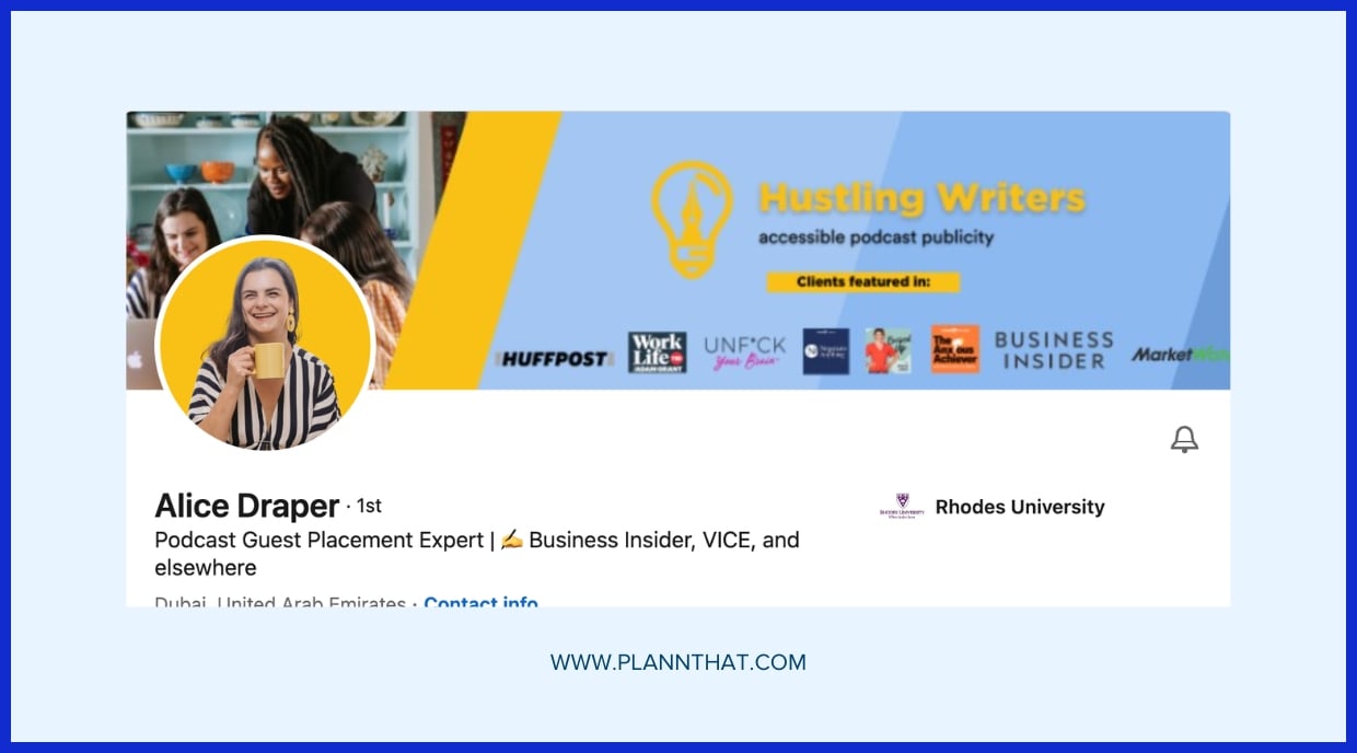
1. The Brand Statement
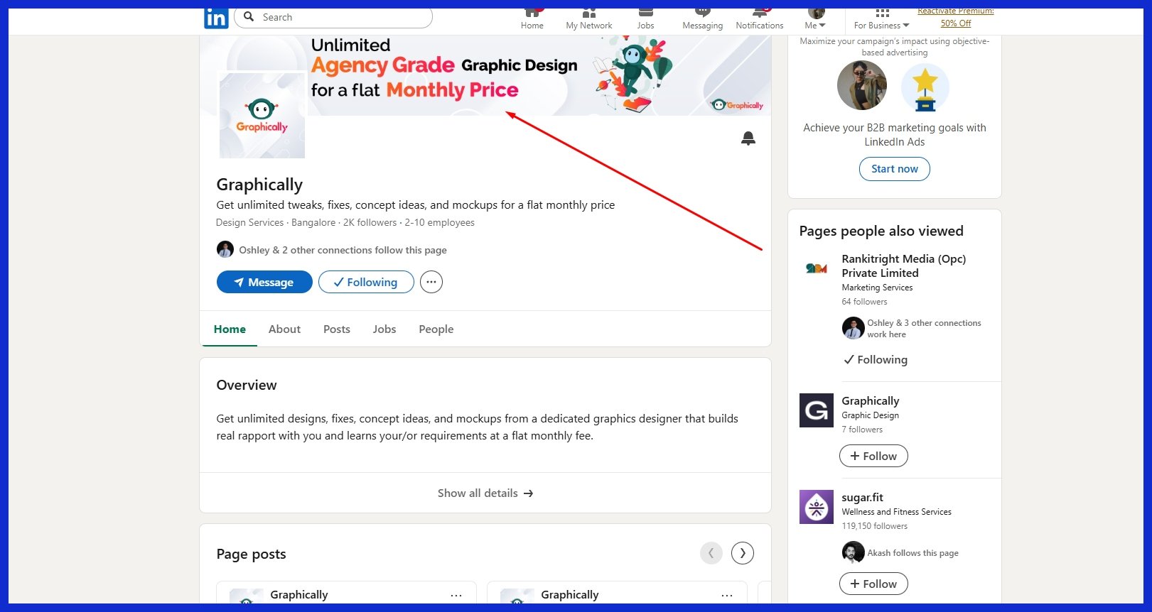
Transparent banners — similar to those used in different LinkedIn banner ideas — can convey a lot without excessive text. Display your mission or motto prominently, incorporate your brand colors throughout, and maintain a minimalist layout. A well-designed logo and a sharp tagline help your audience understand exactly what you do.
2. The Professional Landscape
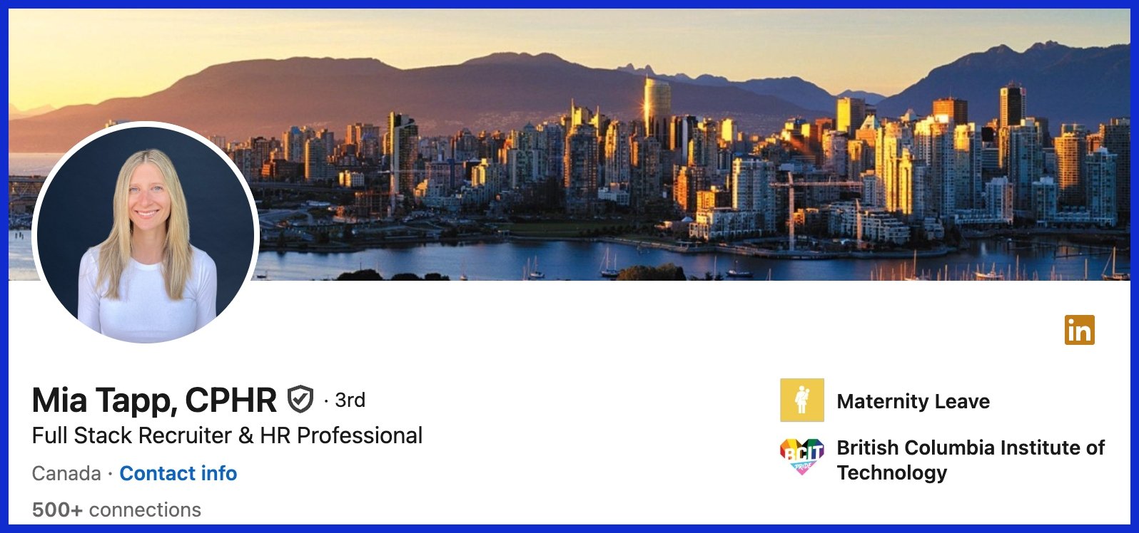
Whether it’s a city skyline, a well-lit office, or a close up of your tools at work, these communicate to people what industry you’re in. Select graphics that are sincere and placid, perhaps with a pastel blue or dusty green.
Overlays help to keep the focus on your face. Take advantage of sharp, high quality photos sized to LinkedIn’s specific dimensions so nothing looks bent or skewed.
3. The Action Shot
Show yourself in action, lecturing, programming, drawing, or at a client conference. An action shot adds warmth and dynamism, demonstrating that you’re passionate about your work.
Limit the composition to one or two obvious features. Too much stuff will clutter it.
4. The Creator’s Space
A desk with a laptop, brushes, or camera gear can demonstrate what you do on a daily basis. Don’t fill it up—remember to reserve some area for your image to shine.
Cool geometric backgrounds, like half circles or vibrant lines, add a little pizazz without being a distraction.
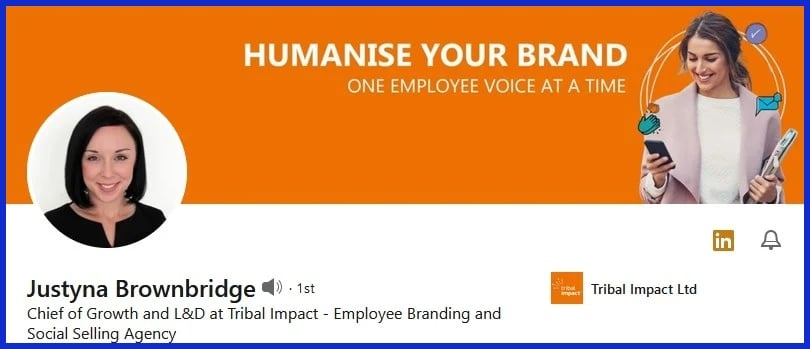
5. The Collaborative Spirit
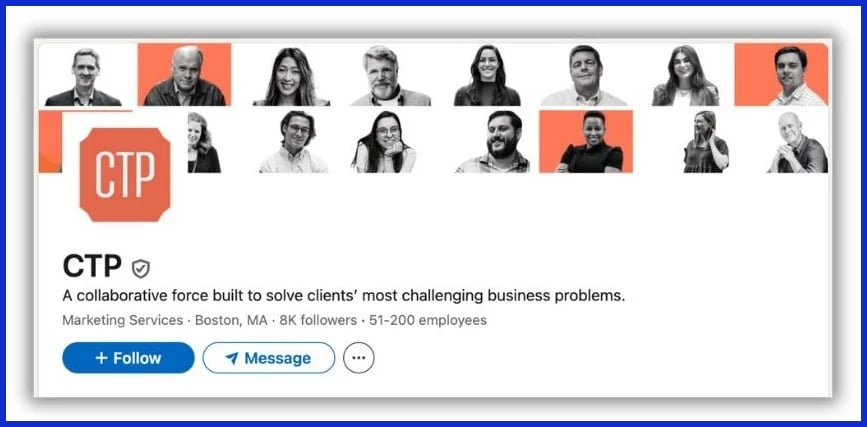
Team pics, huddles, or even a handshake can demonstrate you’re a people person. Include a brief quote on teamwork, maybe one from social media.
Choose pictures that are light and welcoming so anyone can identify.
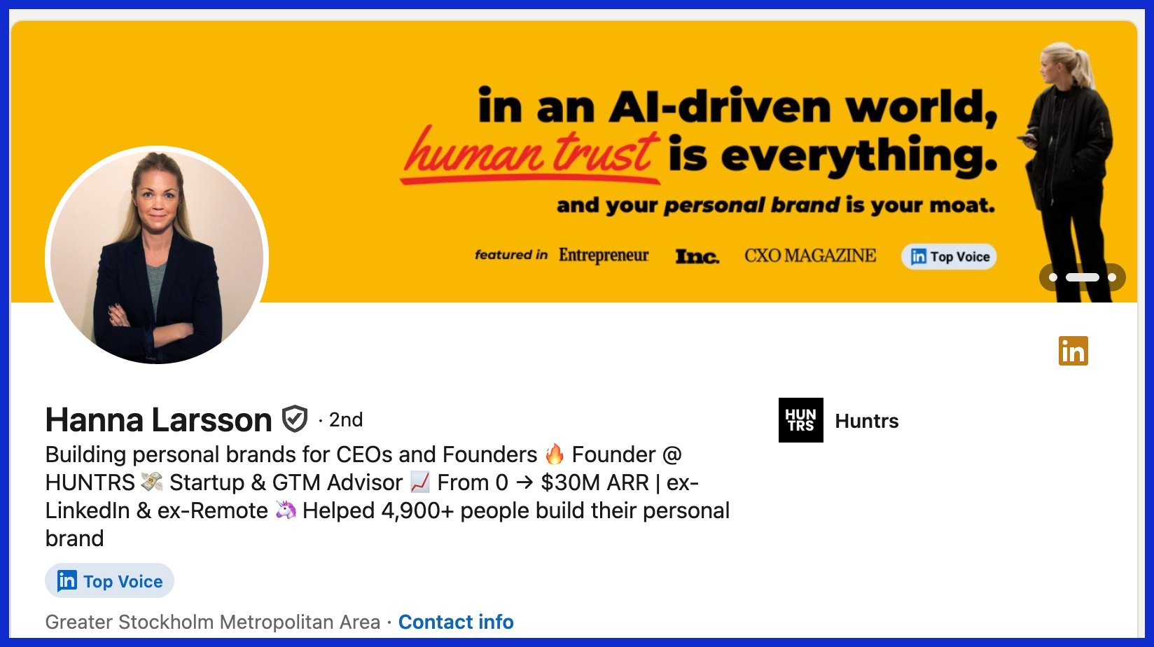
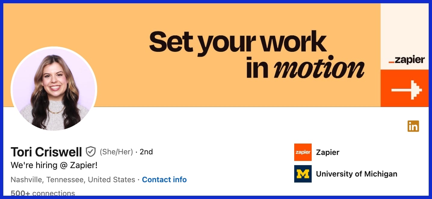
6. The Value Proposition
Utilize bold icons or brief statements to highlight your key skills. Graphics such as checkmarks or graphs can be very effective.
Make it concise so a harried viewer grasps the point quickly. Customize the color and design to match your brand for a cohesive touch.
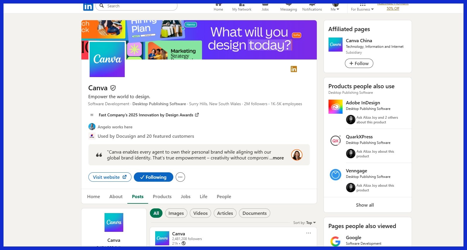
7. The Brand Identity
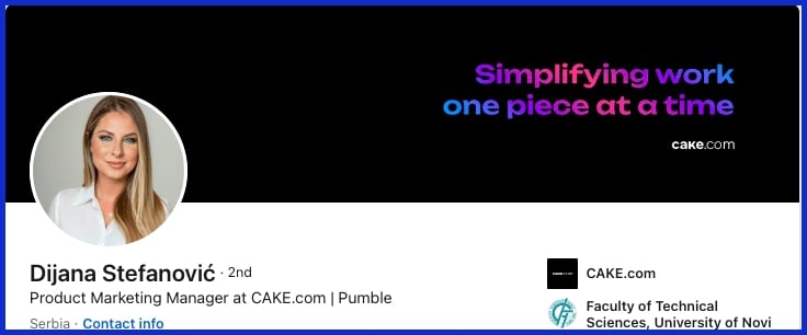
A logo, your primary hue and a repeating pattern give your brand that ‘pop’. Go with a soothing palette if you want to appear amiable, or choose aggressive hues for extra punch.
For some reason, a clean, polished look always wins.
8. The Human Element
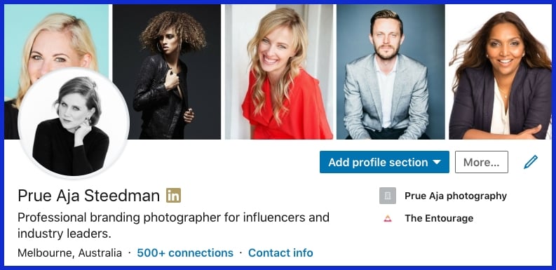
Pictures of humans—grinning, grinding, and gabbing—bring humanity to a profile. Show some variety to reach even more people.
Let the background image represent your profession, but leave your mug unobstructed.
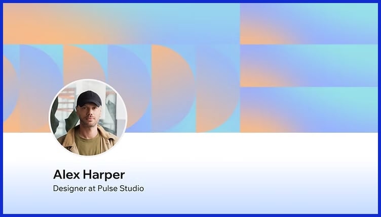
9. The Abstract Concept
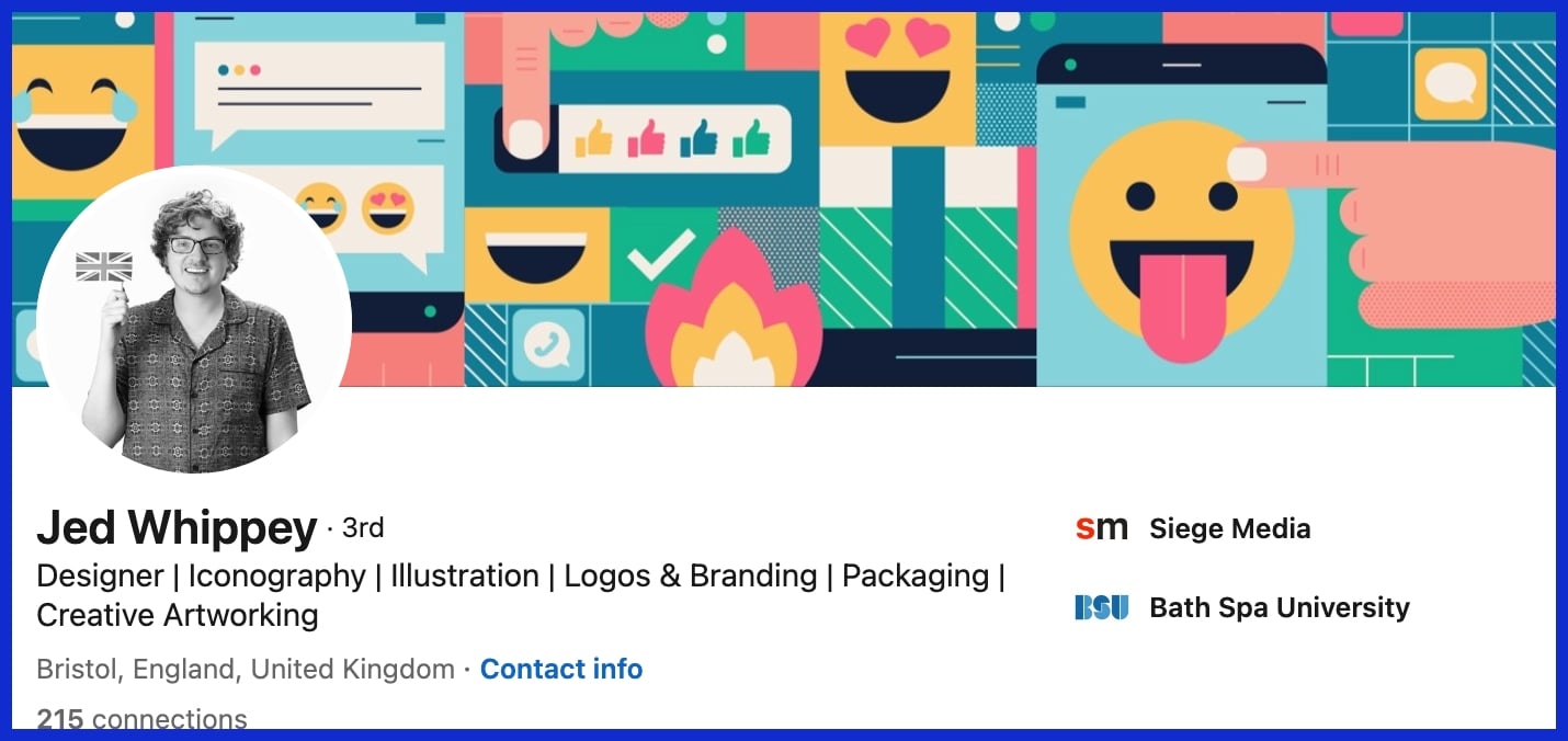
Shapes, waves, or color blocks can demonstrate creativity. Avoid cluttered backgrounds.
Simple patterns are both eye-catching and contemporary. Coordinate your colors with your style and keep it readable!
10. The Product Showcase
If you’re selling something, sell it. Employ crisp images, perhaps in a slick collage.
Copy something here in a few short lines about what you do. Just be sure the aesthetic aligns with your overall branding. For more unique product layouts, unbounded design services like Graphically.io help keep things on point.
Banner Psychology and Strategy
On LinkedIn, your banner and profile photo talk before you do. We can determine trust and skill in 100 milliseconds. A recruiter may give it just three seconds before moving on. Images, when selected carefully, establish credibility and display your aesthetic. They tell your story quicker than words, displaying your accessibility and polish.
By learning how colors, layout, and images influence perception, you can design a banner that works for you and your brand rather than against it.
Color Theory
That’s what color does. It establishes the mood. A tranquil blue palette can signal dependability, while green suggests growth or innovative thinking. Select colors that correspond with your brand. For instance, a tech consultant could apply tones of gray and blue for a crisp, contemporary feel.
Using contrasting colors, such as white text on a dark background, allows names and titles to pop out. Too many colors are distracting, so limit yourself to three or less. This maintains design clarity and prevents ambiguity. It’s not merely aesthetic; it’s about making it simple for audiences to concentrate on value.
Typography Choices
Fonts influence how your message reads. Simple, readable fonts, such as Arial or Lato, keep things professional. BANNER PSYCHOLOGY AND STRATEGY! Don’t use fancy or script fonts either. They are difficult to read and appear incongruous on a business profile.
Stick with one or two fonts, and use them consistently across the banner. For instance, have one typeface for your name and one for your title or tagline. Nice and clean and easy on the eyes. If you need a hand selecting, the folks at Graphically.io assist in selecting and pairing fonts that suit your brand.
Visual Storytelling
Your banner shouldn’t display your position; it should display your path. Photos of speaking engagements, awards or key projects make your achievements tangible. For small business owners, a snapshot of your office or team can demonstrate culture and values.
Utilize images that indicate your narrative, for instance, a climbing chart for growth or a globe for worldwide reach. It’s about banner psychology and strategy. You want someone to peek at your banner and catch your professional scent in seconds.
Match images to your objective, be it career advancement, thought leadership or trust building. The banner psychology and strategy is that with the right artwork, even a passing glance can tell a compelling story. If you need assistance interlacing your tale, firms such as Graphically.io focus on banners that demonstrate both expertise and character.
Technical Best Practices
LinkedIn banners are the first thing folks notice when they drop by your profile or company page. A crisp, professional banner photo is more than decor; it’s a visual handshake that enhances your professional image. Nailing the technical best practices keeps your LinkedIn profile pop worldwide, regardless of who’s checking it out or what device they’re using.
Correct Dimensions
Professional Tip: Stick to LinkedIn’s banner size recommendations for optimal results. Personal profiles measure 1584 x 396 pixels and company pages measure 1128 x 191 pixels. These sizes keep your design looking sleek on desktop and mobile.
If you have company pages as well, store separate banners for each—one for your personal brand and one for your business. This makes your brand look professional and consistent regardless of where people encounter you.
File Format
JPEG and PNG are the banner favorites for LinkedIn, as they maintain a crispness of detail while remaining broadly compatible. Company banners can use GIFs, but keep below 3MB. For personal profiles, it is 4MB, but it is best to keep it well below so your image loads fast.
Use good quality JPEGs for photos or PNGs for graphics with text and logos. Steer clear of TIFF or BMP as they do not work well with LinkedIn and can cause odd color shifts or failed loading. Whenever you update your branding or have a seasonal campaign, swap your banner. New images keep your profile feeling alive and current.
Mobile View
Mobile users account for a massive portion of LinkedIn traffic, so be sure to always preview your banner on a phone. On mobile, LinkedIn crops banners tighter and profile photos occupy more space.
Keep important content — your name, logo, or core message — in the center 60% and do not put anything important in the lower left 200 x 200 pixels. Use a 70% empty and 30% content ratio so your message isn’t lost on small screens.
Sourcing Your Banner Image
Your LinkedIn banner photo is the first thing people see when they land on your profile, so it needs to immediately reflect both who you are and what you do. The perfect picture accents your profile and provides a quick sense of your brand identity. To hit the ground running, seek out HD images that fit LinkedIn’s suggested size of 1584 pixels wide by 396 pixels tall. This ensures your banner loads well on any device and helps keep it crisp, regardless of who is looking.
Even most small business owners and digital shops go to stock sites for their banner images. I know that many of you like using platforms such as Unsplash, Pexels, and Pixabay to source free, high-quality photos. While these sites feature a broad eclectic mix of themes ranging from urban city scenes to tranquil nature shots, selecting a soothing color scheme might establish a nice mood. The right layout can create visual interest and enhance your overall vibe.
An edgy photo montage or geometric pattern may really make your banner stand out. A geometric pattern, for instance, can give a techie feel, while a photo collage can narrate a more complex story about your team or company culture. Incorporating different LinkedIn banner ideas can help capture your audience’s attention effectively.
Custom graphics are a great option if you want a personal touch. Something custom-made with design tools such as Canva or Figma is another choice. If you need that professional look without the time sink of software training, a designer is a smart option. Working with a designer can elevate your profile picture and ensure your banner aligns with your brand colors.
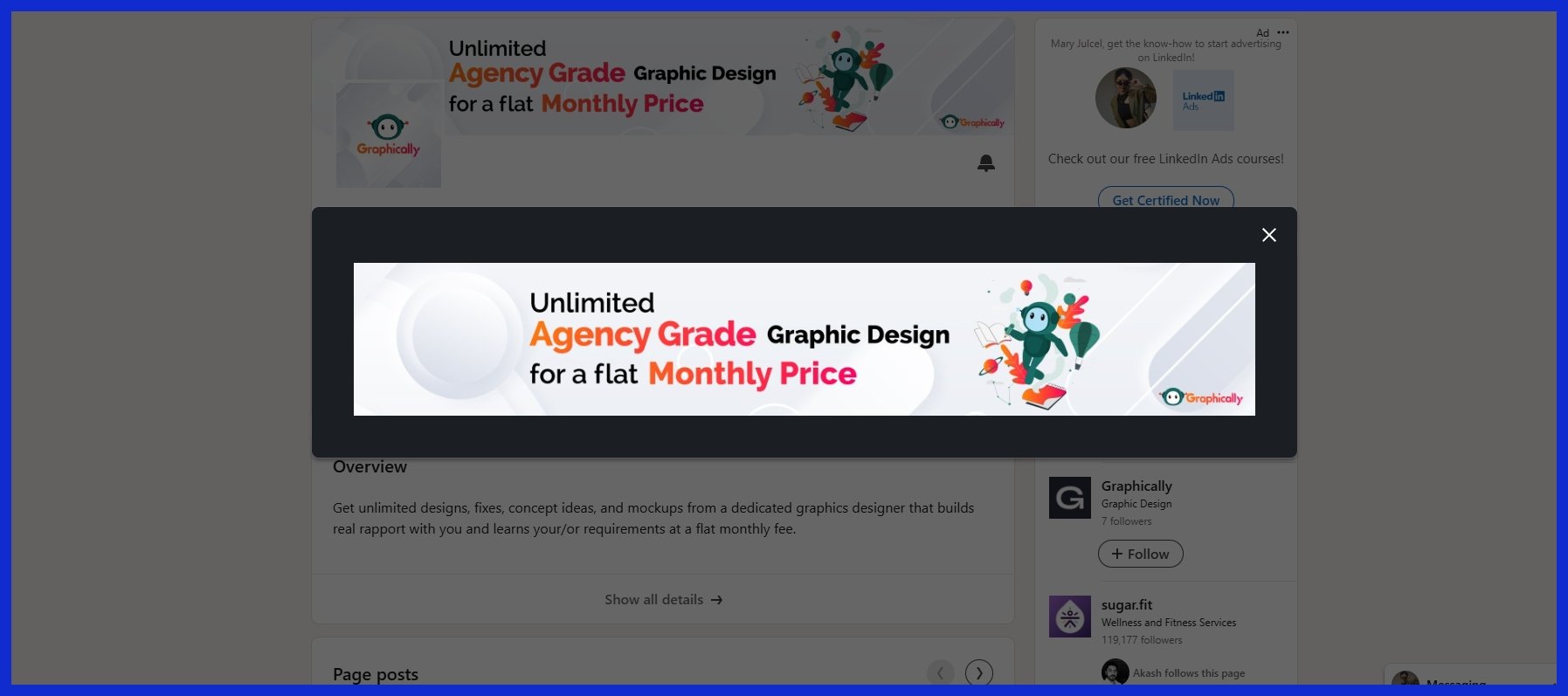
Creative agencies such as Graphically.io provide unlimited graphic design services, so you can order as many banner versions as you desire. This comes in handy if you enjoy changing your banner frequently to suit new occasions or spotlight special initiatives. A designer can help add touches such as your favorite social media quote, which makes your banner not only more memorable but establishes your personal brand.
Conclusion
Something to stand out on LinkedIn, a sharp banner does more than space-fill. A bold color block or clean skyline can communicate your style immediately. Nothing builds trust like a plain old desk shot. An active tech environment shows you’re serious. Banners talk before words do. Whether you’re an artist or an entrepreneur, a sharp banner puts you ahead. Even a minor patch or a fresh photo can ignite major transformation. Clever choices are better than cool stunts any day. To represent your brand at its best, select a style that aligns with what you do and who you are. Want a banner that sticks? Give Graphically a shot. We like to keep it quick, easy, and direct — no fuss, all impact.
Frequently Asked Questions
Using different LinkedIn banner ideas (recommended size: 1584 x 396 px) ensures your profile photo and banner template appear crisp across devices.
If you have nice professional photos of yourself, like a great profile picture, go ahead. Just be sure the picture complements your personal brand and is not distracting.
Neutral colors like blue, gray, and white create a professional image for your linkedin banner photo. They’re slick and visually appealing, enhancing your profile’s vibe.
Free banner templates are available at Unsplash, Pexels, and Canva, which can enhance your linkedin banner photo; just ensure the image license allows commercial use.
Change your linkedin banner photo at least annually or when your brand colors, job, or focus shifts to keep your profile fresh and engaging.
Your linkedin banner photo should reflect your professional image and emphasize your skill set, incorporating visuals that resonate with your audience and field of work.
Use high-quality images for your linkedin banner photo, minimize text, and avoid clutter to enhance visual interest.