Are you looking to hike up sales on your website? Well, let us tell you that you are not alone. Countless websites and e-commerce owners are putting in constant efforts to boost their sales figures. Even aggressive promotion and marketing tactics falter to improve sales, but why?
Imagine you see this excellent discount banner on social media and immediately jump to the website. However, the website is prolonged and challenging to navigate. Would you prefer to hop or even go through such a website? The odds for this website are not very favorable.
Have you ever wondered how improving your website design can contribute to customer experience? In this article, we’ll briefly discuss some awesome design tips that can help you boost your sales. Let’s get started!
Table of Contents
Keeping It Simple
Your website should be clutter-free and minimalist. Even if you have plenty of content or product, you must learn to organize these elements properly. To optimize your web design, consider the streamlining process.

(Source : Google Images)
It would be best if you deleted all the unnecessary information. Ensure that your website design has appropriate space between and on the sides of each type of content. On the other hand, there should be no distracting videos, links, or images.
The elements on your web page should harmonize with each other. You could also try to break down the information into bite-size, which is more digestible.
Don’t Forget the Images.
Most internet users find images interesting. The images can contribute to the overall aesthetics and vibe of the website. We recommend using high-quality images at all times. Since the user views your website as a professional service, using low-quality images can disappoint them.

(Source : Google images)
Images will also help break the monotony between the background and black text. However, whichever image you use on your website should have a specific purpose. The images should match the text and content of your web page.
Remember to use powerful and bright imageries that can support your website. Many people skip the text and look at the images. Therefore, you must use appropriate and high-quality images.
Reviews and Testimonies
When you are shopping online, don’t you want to check the comments of its previous buyers? The reviews and testimonies can be a helpful tool to boost your web traffic and sales. More than half of online shoppers prefer going through the customer reviews before purchasing anything. You can embed Google reviews on your website as a social proof.

(Source : Google Images)
Including the testimonies of your previous customers can be an excellent web design upgrade. You can place the testimonies on the bottom of the home-page or make it product-centric.
Contact Information
The placement and positioning of your contact information are very critical for customer experience strategy. The more accessible you are, the more customers will find it easy to shop from your website. Many times customers get frantic when they have queries or complaints.
You should not be adding to their burden by making it difficult to spot your contact details. It is also a good idea to add a ‘contact us’ page or splurge the details at the end of the web page.

(Source : Google Images)
You can even design a contact form, add your phone number, email id, operations hours, etc. If you are willing to go more advanced, adding a widget for a direct message can also impress the customers.
Speedy Checkout
Just like the rest of the website is simple, the checkout process should also be effortless. Most people abandon their carts because they don’t want to go through a tedious check out process. For speedy checkout, you can add an option like “check out as a guest.”

(Source : Google Images)
It is also possible that your users do not like to share much information during their first purchase. The checkout page should ask for only the necessary details. Name, shipping address, and payment details are the essential elements of the checkout page.
Go Mobile-Friendly
In today’s world, a website needs to be mobile-friendly to enhance customer experience. The majority of your visitors are going to be tablet or mobile phone users. One of the biggest designing mistakes for your website would be not being mobile-optimized.
Design a responsive layout that makes it easy for your mobile users to go through the contents. The responsive layout will allow your website to adapt to all screens and operating systems.

(Source : Google Images)
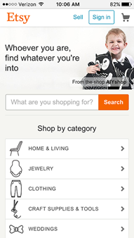
In a mobile-friendly site, the users don’t have to keep zooming to read the text or check the details. The icons in mobile websites are generally more prominent, and the paragraphs are much shorter. If you want to increase your sales, make sure your website is optimized to reach a broad audience.
Itsy is one of the best websites that have perfected the mobile-friendly feature. The icons on the website are larger, the navigation menu is simpler, and the layout is quite simple. Etsy is the best example of a mobile-optimized website.

Improve Website Speed
The website speed plays a critical role in determining the traffic on your website. We all have come across websites by hand and lag, and we ultimately end up closing them. If your website takes forever to load, there’s a good chance that people might never return.
There are several ways of turning this situation around. The first thing to do is to take a quick speed test for your website. It would be best if you determined the factors that are causing the lag in your website.
For the best experience, your website should load in less than two seconds. You can even hire a reputable web hosting provider who can optimize your website speed.
Highlight Your CTA
Another critical tip for boosting your sales is to make the CTA more visible and attractive. Call to action or CTA can move your audience towards the purchasing process. Your CTA should be powerful enough to encourage your audience to take up some action (in this case, buying).

(Source : Google Images)
CTAs are meant to stand out and attract attention. The CTA will also help you to divert the audience to perform a specific action. There are many ways in which you can score full marks for your CTA.
The call to action should be easy to spot. It should also break through the monotony and look different from the rest of the page. This designing tip will not only be beneficial to you but also for your buyers.
For example, this Hotjar CTA is one of the best on the internet. It’s using the right words, the right image. The message is simple yet strong.

Closing Thoughts
Now that you’ve eight powerful designing tips in your mind make sure the other parts of your website are on point. With great content and design, nothing can stop you from achieving skyrocketing sales. It’s important, when outsourcing your design, to ensure that the person or company you hire understands these design tips, and many more.
While designing your website, don’t forget to consider the most important thing – the users. After optimizing and redesigning the website, you’ll be able to witness consistent growth.


