Table of Contents
Key Takeaways
- The hard truth about digital marketing is that bad contrast is costing you customers.
- Visual strain is a silent conversion killer; if your audience has to work hard to read your text, they will simply scroll past it.
- You can easily check your graphic’s readability using a 10-second method called the grey scale test.
- The greyscale test involves downloading your image, re-uploading it, and dragging the saturation down to -100 to check its true light-to-dark contrast.
- If your design is still easy to read in black and white, your contrast works in any color.
- You can save time and guarantee high-converting graphics by using an unlimited design service like Graphically.io.
Let’s try a quick mental exercise. First, read these three lines in your head:
Imagine the first line is bright white text placed on a pitch-black background. Reading this feels effortless.

Now, imagine the second line is medium-grey text on that same black background. To read this one? A little more work.

Finally, imagine the third line is dark-grey text on a black background. And this… you’re straining already.

That microscopic moment of strain you just felt? Multiply it by everyone who scrolls past content like that without reading a word.
You might spend hours perfecting your copywriting, tweaking your layout, and aligning your elements. But if your audience has to squint to read your message, they won’t stick around. Bad contrast is costing you customers. Stop making your audience work so hard, and let’s fix your colors.
The Silent Conversion Killer: Why Beautiful Colors Fail
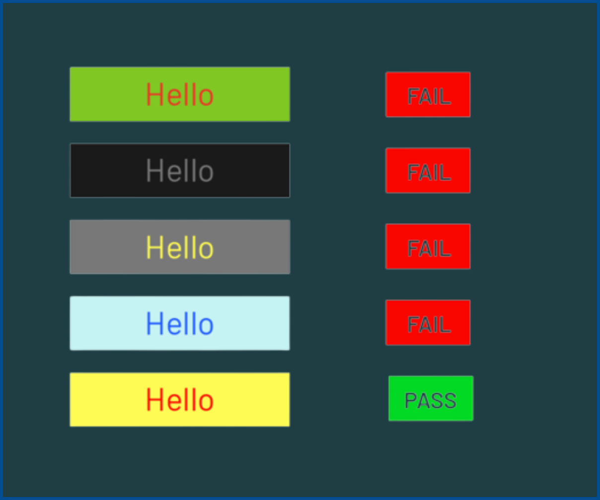
Why does poor contrast destroy your conversion rates? It all comes down to a psychological concept called “cognitive load.” This is simply the amount of mental effort required to process information.
In the digital world, you have less than three seconds to grab someone’s attention. If a potential buyer has to strain to decipher light peach text on a pale pink background, their brain decides it’s too much effort. They won’t try to figure it out. They will just keep scrolling.
Low-contrast design isn’t just an innocent aesthetic mistake. It is an active roadblock in your customer’s buying journey.
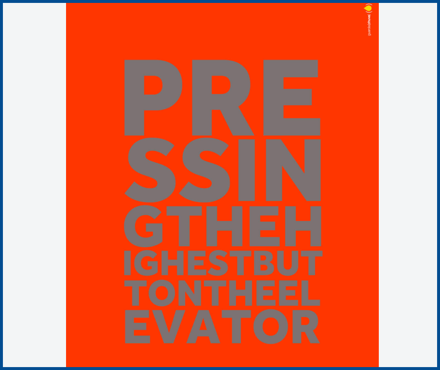
Let’s look at a real-world example of how this happens:
- Imagine a trendy e-commerce coffee brand launching a new ad campaign.
- They create an Instagram ad featuring soft brown text on a dark beige background.
- On a massive, high-definition monitor in a dark office, the graphic looks incredibly warm and beautiful.
- But in the real world? A tired commuter is scrolling on her phone while waiting for the train. The glare of the morning sun hits her screen.
- That beautiful brown-on-beige graphic completely washes out into a muddy, illegible square.
She scrolls right past it. That is a lost sale, simply because the brand failed to prioritize visual contrast.
The 10-Second Grey Scale Test
So, how do you prevent this from happening to your business? You need to stop guessing if your brand’s hex codes match or if your graphics are legible.
Instead, you can use the exact test our designers use to catch it first. It is a dead-simple, visual audit that guarantees text readability before you ever hit publish.
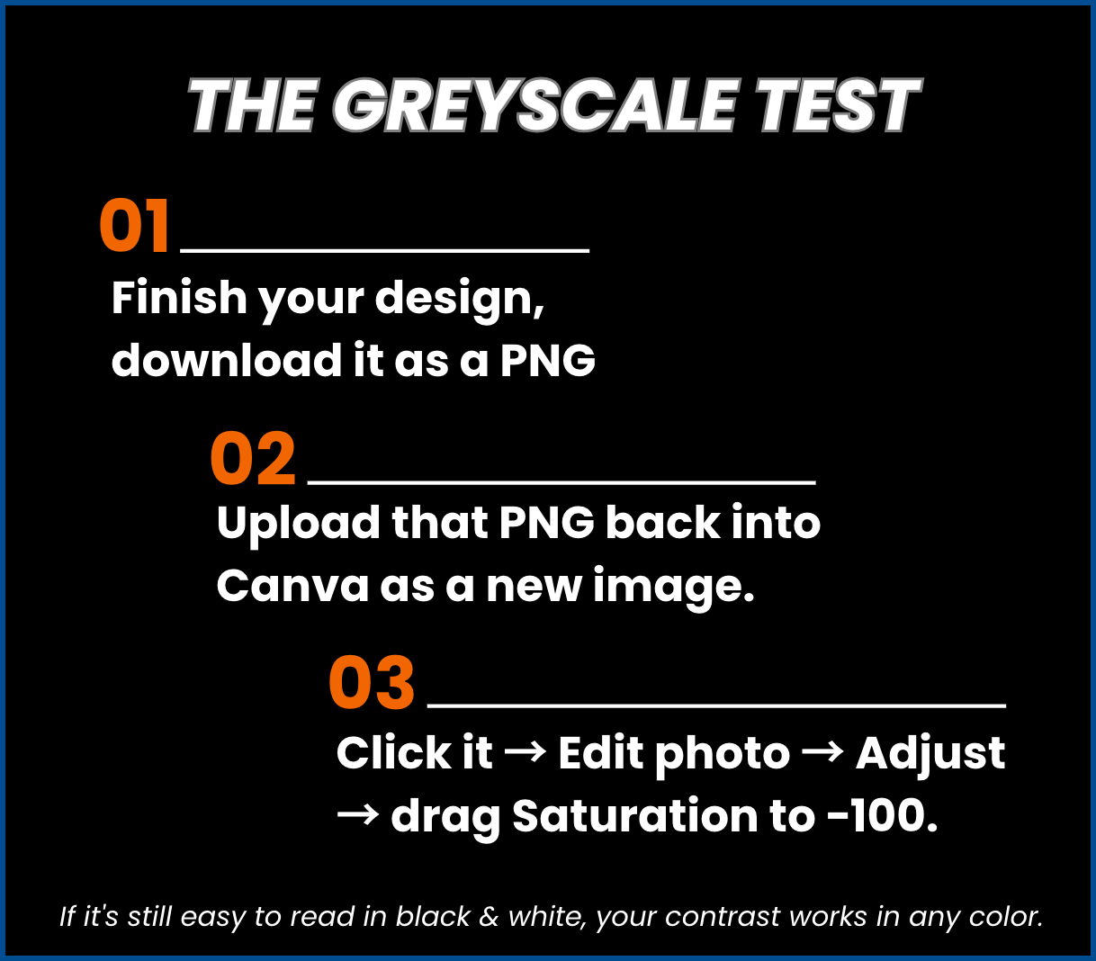
It is called the grey scale test. Here is how you can run this test on your own content in just three easy steps:
- Step 01: Finish your design, download it as a PNG.
- Step 02: Upload that PNG back into Canva as a new image.
- Step 03: Click it -> Edit photo -> Adjust -> drag Saturation to -100.
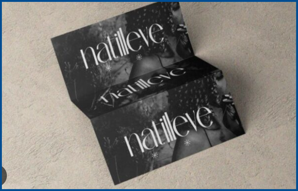
Look at your newly desaturated, completely black-and-white image. Is the text still popping off the background effortlessly?
If it’s still easy to read in black & white, your contrast works in any color.
If the text disappears into the background or becomes muddy and hard to read, your graphic has failed the test. You are actively losing customers because of visual strain, and you need to adjust your colors immediately.
How to Guarantee High-Contrast Designs Without the Hassle
While the grayscale test is a fantastic 10-second audit, let’s be totally honest. As a business owner or a busy marketer, you shouldn’t have to manually QA every single Instagram post, ad creative, and blog header you publish.
Your time is far too valuable to spend re-uploading PNGs and dragging saturation sliders all day long.
If you are tired of constantly second-guessing your color palettes, there is a much easier way. You can hand your visual marketing over to Graphically.
As the ultimate safety net for your brand, Graphically provides an unlimited design team that builds high-contrast, conversion-optimized assets by default.
You never have to worry about the grayscale test again. When you hire Graphically, their vetted professional designers bake readability and accessibility into every single graphic they create for you. You just pass off your branding guidelines, and they deliver striking, scroll-stopping graphics that pass the test every single time.
The Science of Contrast: Understanding Hue vs. Value
To truly understand why the grayscale test is so brutally effective, we need to talk a little bit about color theory. Don’t worry, we’ll keep it very simple!
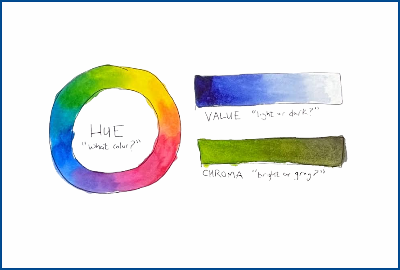
There are two main concepts you need to know when designing marketing assets: Hue and Value.
Hue is the actual color itself. Red, blue, green, yellow, and purple are all hues.
Value refers to how light or dark that specific color is. Think of navy blue (a very dark value) versus baby blue (a very light value).
Here is the golden rule of graphic readability: High contrast relies on a drastic difference in value, not just a difference in hue.
You might think that putting bright green text on a bright red background is highly contrasting because they are opposite colors. But if those two specific colors have the exact same level of lightness (the exact same value), they will vibrate against each other. The text will become an eye-straining nightmare to read.
When you apply the grayscale test, you are completely stripping away the hue. You are removing the red, the green, and the blue. All that is left behind is the true light-to-dark value.
This test strips away your subjective feelings about pretty colors. It proves definitively whether or not your design actually has enough dark-to-light value difference to be legible to the human eye.
4 Ways to Fix Bad Contrast Today
Aesthetic branding is incredibly important for standing out in a crowded market. However, your aesthetic should never come at the expense of readability. If your audience cannot read your message, your business cannot make money.
But what if your brand guidelines strictly dictate that you must use light, pastel colors? How do you pass the grayscale test without destroying your carefully crafted brand identity?
Here are four quick tips to boost your contrast while staying completely on-brand:
- Use heavier, bolder fonts: Thicker text naturally takes up more space and stands out more against backgrounds. Simply changing a “Thin” font to a “Bold” font can instantly save a failing graphic.
- Add a subtle dark overlay: If you are placing text over a busy, full-color photograph, add a slightly transparent black or dark grey rectangle behind the text. This helps the letters pop without hiding the photo.
- Darken your text color slightly: If your brand color is a medium blue, drop the brightness down by 20% just for your text elements. Your audience won’t notice the slight color shift, but they will read the text much easier.
- Embrace negative space: Give your text plenty of room to breathe. Cluttered graphics make poor contrast even harder to read.
Conclusion
In the fast-paced world of digital marketing, every single detail counts. Bad color contrast might seem like a minor graphic design flaw, but it is a major roadblock in your customer’s buying journey.
By utilizing the 10-second grey scale test, you can instantly identify visual strain and fix it before it costs you a sale. Stop making your customers squint. Make reading your content the absolute easiest part of their day.
And if you are ready to completely remove the guesswork from your visual branding, let the experts handle it. Head over to Graphically.io to get a dedicated, unlimited design team that ensures your marketing assets aren’t just beautiful—they are built to convert.
FAQs
What is a grey scale test?
A greyscale test is a quick design audit where you remove all the color (saturation) from an image, turning it black and white. This reveals the true light-to-dark contrast of your design. If the text is hard to read in black and white, it lacks the necessary contrast to be easily readable in color.
Why is contrast so important for digital marketing?
High contrast reduces visual strain and cognitive load. In marketing, you only have seconds to capture attention. If an ad or graphic is hard to read due to poor contrast, users will simply scroll past it, leading to lower engagement and lost sales.
How do I do the grayscale test in Canva?
Finish your design and download it to your computer as a PNG file. Upload that PNG back into Canva as a brand new image. Click the image, select “Edit photo,” click “Adjust,” and drag the Saturation slider all the way down to -100.
Can I still use my brand’s light or pastel colors?
Yes! You just have to use them strategically. If your background is a light pastel, your text must be a significantly darker color (like charcoal, navy, or deep forest green). Never place light pastel text on a light pastel background.