
Table of Contents
Key Takeaways
- A grid system is the invisible structure behind every professional-looking design, not a set of rules that kills creativity.
- There are five foundational grids: Axial, Column, Hierarchical, Modular, and Radial, and each one solves a different layout problem.
- Structure doesn’t make design boring. It removes guesswork so bolder creative choices actually work.
- Real posters, from ballet programs to gallery exhibitions, use these five systems every day.
- If aligning everything by hand feels tedious, a design team that works in these grids natively, like Graphically, can apply them for you.
Look at any design that feels expensive and put-together- a magazine spread, a gallery poster, a slick Instagram carousel- and there’s a structure holding it up that you’re not even supposed to notice. That structure is a grid system.
Most non-designers assume good layout comes down to “a good eye.” It usually comes down to a grid. Every piece of text and every image sits against an invisible set of lines, and that’s what makes a composition feel balanced instead of scattered.
Here’s the part that surprises people: a grid doesn’t make a design boring or corporate. It does the opposite. Once you know exactly how a canvas is divided, you can bend or break that structure on purpose instead of by accident, which is usually where the most striking layouts come from.
Randomly dragging and dropping text onto a blank canvas is exactly what makes a graphic look amateur. Build on a grid instead, and even a simple design starts to look premium. Here are the five grid systems in graphic design worth knowing, and where you’ll actually spot them in the real world.
1. The Axial Grid
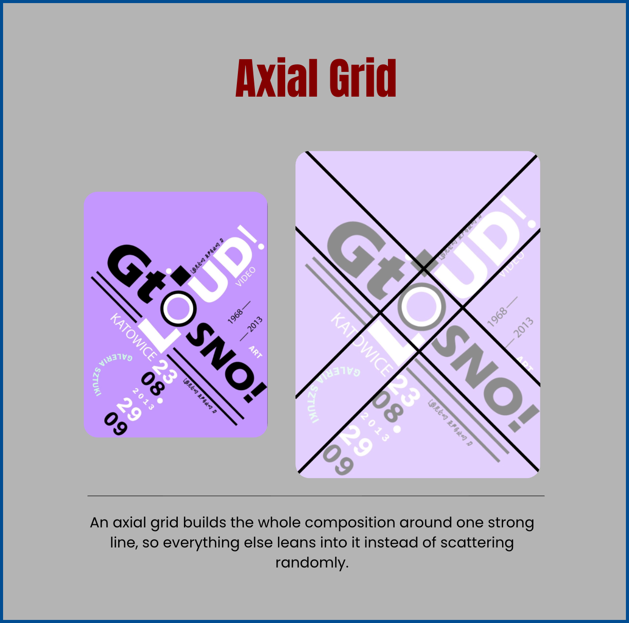
An axial grid builds the whole composition around one strong line. Everything else leans into that line instead of scattering randomly across the page.
You can see this clearly in poster design that uses one bold diagonal, or a full X, as the spine of the layout. A Polish art-gallery poster for an exhibition in Katowice does exactly this: two crossing lines cut straight through the title type, and every other element falls into place around that intersection. Because the eye only has one line to follow, the layout still reads fast, even with dense or overlapping type.
This system works especially well for:
- Bold, typography-driven posters
- Minimalist event or concert flyers
- Any layout that needs one clear line of movement across the page
2. The Column Grid
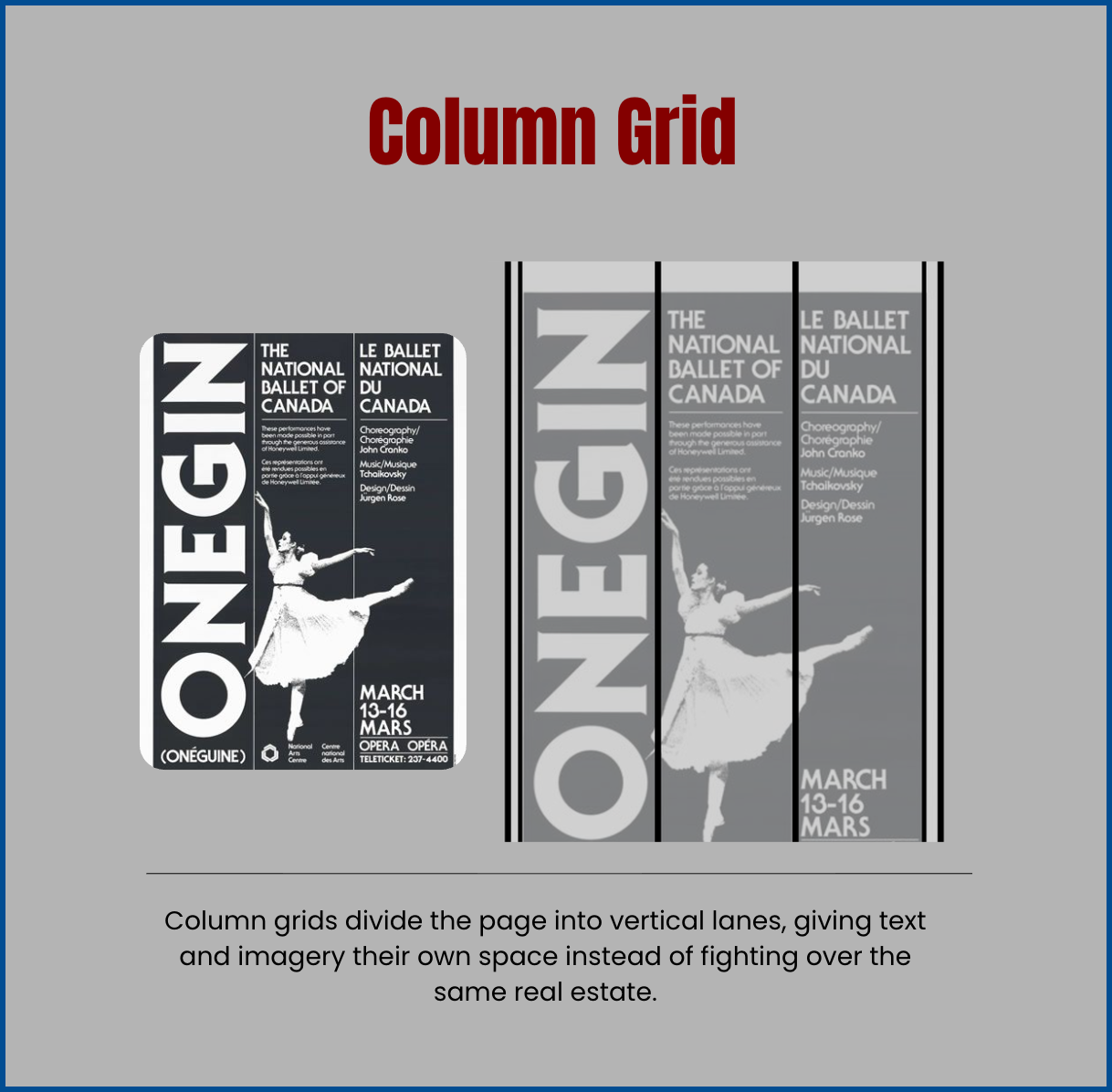
A column grid divides the page into vertical lanes. Text and imagery each get their own dedicated space, instead of fighting over the same real estate.
A great real-world example is theater and ballet posters, which often run two languages at once. A poster for the National Ballet of Canada’s production of “Onegin” splits the page into columns: one for the bold title, one for the English program details, one for the French. Each column does its own job without crowding the others.
Column grids are the backbone of:
- Magazine and newspaper layouts
- Bilingual or multi-language posters
- Websites (it’s the same logic behind a standard 12-column web grid)
3. The Hierarchical Grid
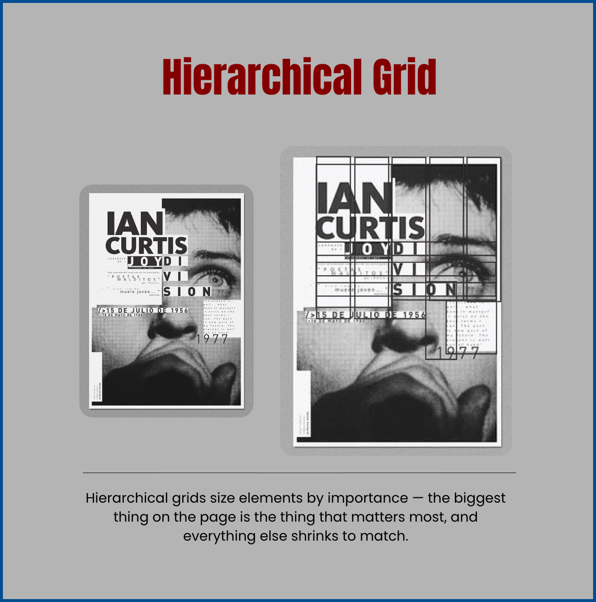
A hierarchical grid sizes elements based purely on importance. The biggest thing on the page is the thing that matters most, and everything else shrinks to match.
A tribute poster for Joy Division’s Ian Curtis is a clean example of this in action. His face fills most of the page, his name runs in the largest type on the layout, and everything else, the date, a lyric, the fine print, shrinks in proportion to how much it actually matters. You understand exactly who and what the poster is about in under a second.
This grid earns its keep anytime a viewer needs to get the point instantly: album art, tribute pieces, or any design where one name or image has to dominate the page.
4. The Modular Grid
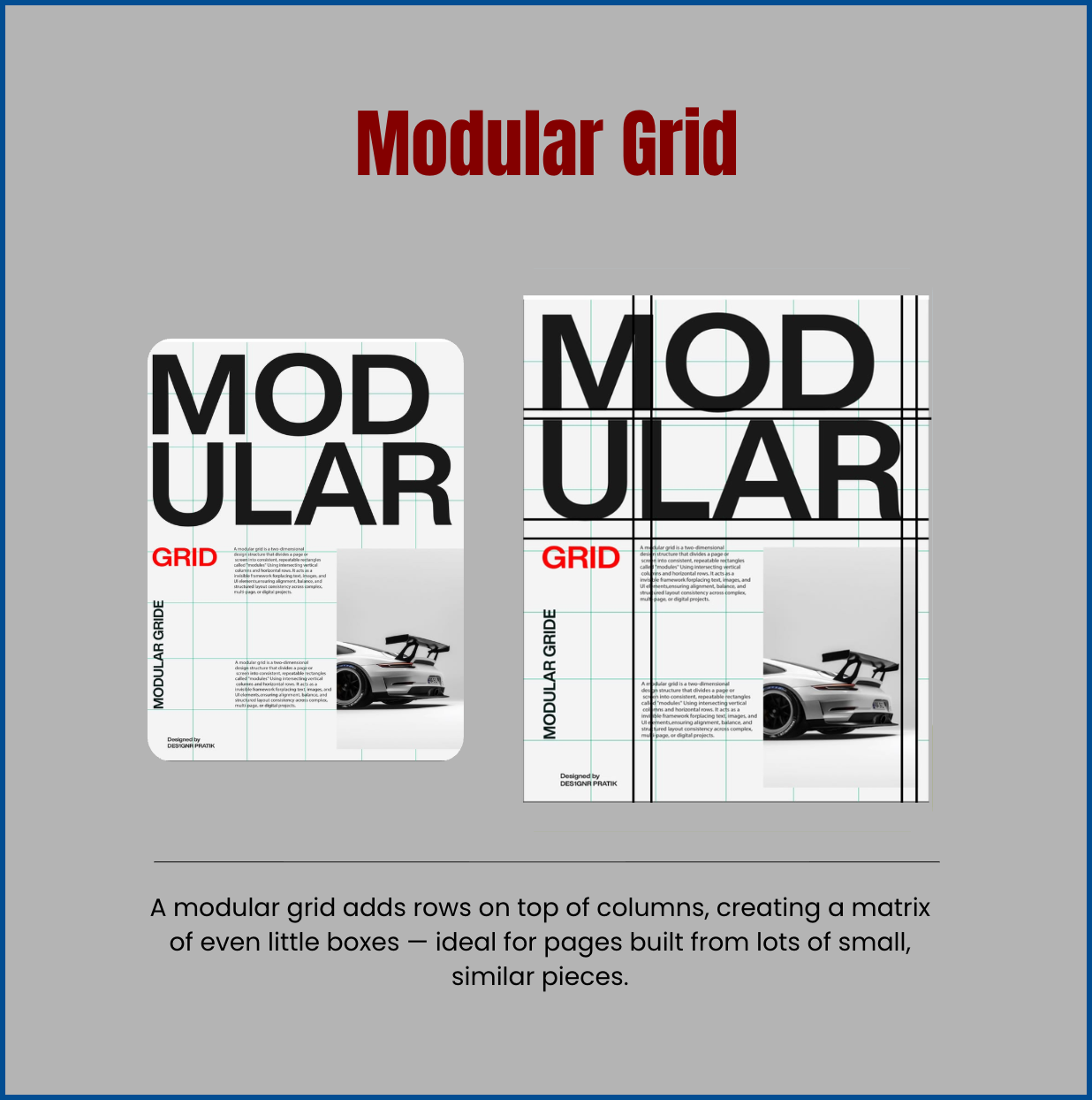
A modular grid adds horizontal rows on top of vertical columns, creating a matrix of even, repeating boxes. That makes it the ideal system for pages built from lots of small, similar pieces.
A modular automotive poster (designed by Designr Pratik) shows this well: the bold headline, the body copy block, and the product photo are all snapped to the same underlying matrix of squares, so nothing feels off-balance even though the page is packed with information. Because every box in the matrix is the same size, you can add or swap out a product without redesigning the whole page.
Where modular grids shine:
- Product catalogs
- Portfolio or photography grids
- Instagram feed layouts
- Pricing tables and other repeating content blocks
5. The Radial Grid
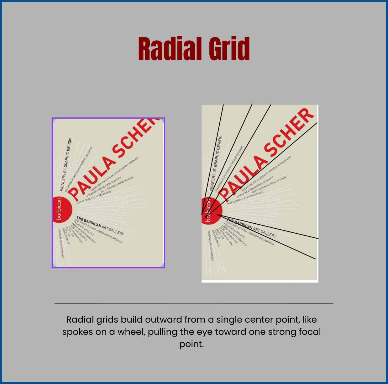
A radial grid builds outward from a single center point, like spokes on a wheel, pulling the viewer’s eye directly toward one strong focal point.
Picture a tribute poster built around legendary designer Paula Scher, a real Pentagram partner famous for her bold, expressive typography. Lines radiate outward from one anchor point near the logo, so no matter where your eye lands first, it eventually gets pulled back to that center.
Reach for a radial grid when you want:
- One unmistakable focal point, like a logo, face, or product
- A sense of energy or movement
- The eye to travel outward and then snap right back to center
Conclusion
None of these five grids is “better” than the others. The right one depends entirely on what the page needs to say first, and whether that’s one focal point, a clear hierarchy, or a wall of repeating content.
Whether you need the organized lanes of a column grid or the intense focus of a radial one, executing any of these five systems takes real precision: measuring margins, aligning baselines, calculating exactly where a focal point should land. Do it by eye, and it’s easy to end up slightly, noticeably off.
This is where Graphically comes in. Instead of fighting with rulers and alignment tools inside your design software, hand the brief to Graphically’s unlimited design team. They work in these five grid systems natively, so every graphic that comes back is aligned exactly the way it should be, without you dragging a single guide yourself.
FAQs
Do I need expensive software to use a grid system?
No. Every major design tool, including Figma, Canva, and Adobe Illustrator, has built-in grid and guide features for free. The system matters far more than the software.
Modular grids are the easiest starting point for Instagram or LinkedIn carousels, since they keep spacing consistent across multiple slides.
Does using a grid make my designs look stiff or corporate?
No, usually the opposite. A strong axial or radial grid can look more energetic than a design with no structure at all, because every element clearly has a reason for being exactly where it is.
Can I combine more than one grid system in a single design?
Yes, and professional designers do it constantly. A poster might use a column grid for the text block and a radial grid for the central image, for example.
What’s the fastest way to start seeing grids in designs I like?
Pull up a poster or ad and try to trace the invisible lines behind it: where things line up, where they’re centered, where the margins repeat. Spot the pattern once, and you’ll start noticing it everywhere.