Table of Contents
Key Takeaways
- Flat, ultra-polished vector design is now the default look for almost every brand, which means it no longer helps anyone stand out.
- Texture in graphic design borrows visual cues from real, physical materials (paper, ink, film) to make digital work feel tactile and intentional.
- Four textures are leading the way in 2026: Halftone (nostalgia), Risograph (rebellion), Ink Spoiled (authenticity), and Liquid Grain (futurism).
- Each texture sends a different psychological signal, so the right pick depends on what your brand is actually trying to say.
- Less is more. One or two signature textures, used consistently, read as premium. All four mixed together just reads as noise.
Open ten random websites right now and count how many look basically the same: a soft gradient, a rounded sans-serif font, a friendly icon set, a color palette that could belong to any startup on earth. It’s clean. It’s also completely forgettable.
That sameness even has a nickname in design circles — “blandification.” It’s a big reason texture in graphic design has become such a hot topic in 2026. Texture adds friction, history, and warmth to a visual, qualities a perfectly smooth vector graphic simply can’t fake.
This guide covers what texture actually does for a brand, why “messy” now reads as premium instead of careless, and how four specific textures — Halftone, Risograph, Ink Spoiled, and Liquid Grain — can say exactly what you want your brand to say.
What Is Texture in Graphic Design, Exactly?
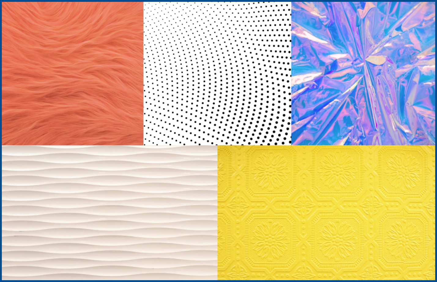
Texture is anything in a design that hints at how it would feel if you could touch it. In print, that feeling can be real: embossed foil, raised ink, rough uncoated paper. On a screen, texture is almost always an illusion — a visual trick that makes a flat pixel grid feel like paper, film, or fabric.
Designers generally build it in two ways:
- Literal texture — a scanned or photographed material (paper grain, canvas, cracked concrete) layered into a design as an image or overlay.
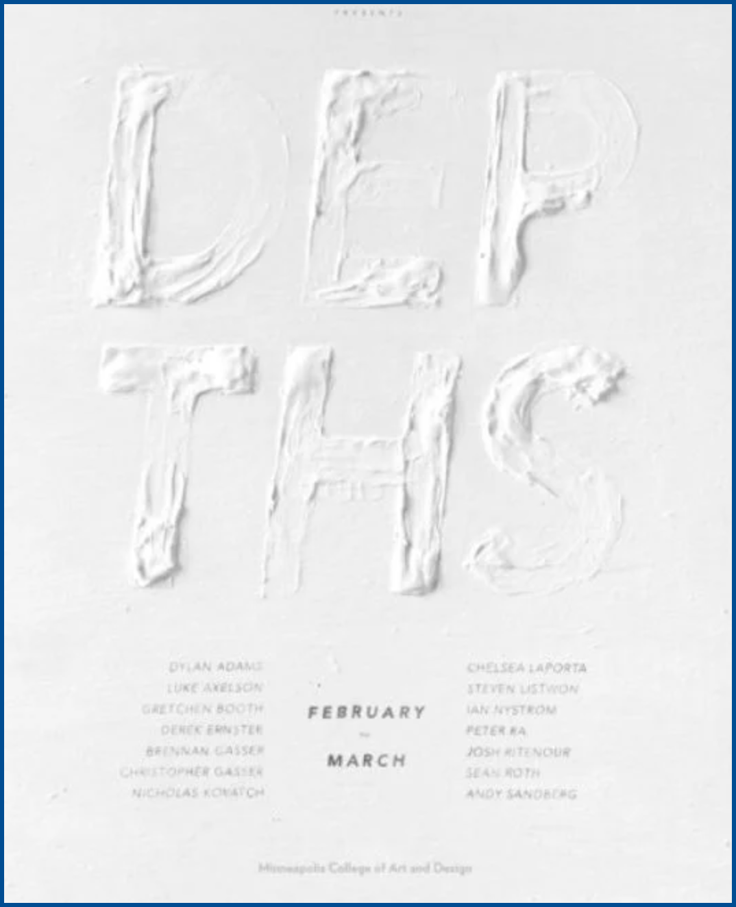
- Simulated texture — a digital effect built to mimic a physical process, like halftone dots recreating old newspaper printing, or a noise filter mimicking film grain.
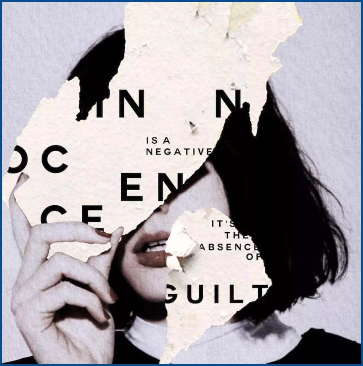
Texture tends to fall into a few recognizable families:
- Print textures — halftone dots, riso misregistration, paper grain
- Material textures — fabric, stone, metal, wood
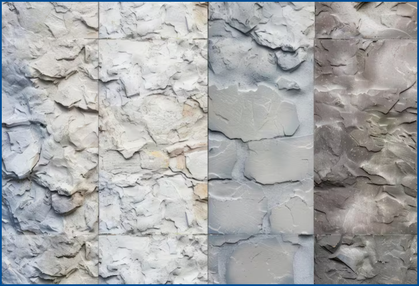
- Process textures — ink bleeds, brush strokes, scratches
- Digital-analog hybrids — film grain, VHS static, glitch
Here’s why this matters right now: AI tools can generate a “clean” logo in seconds, and thousands of brands already have. Texture still looks slow and deliberate to produce, which is exactly why it reads as more human, and more premium.
Why Flat, “Perfect” Design Stopped Feeling Premium
Flat design wasn’t always the problem. When Apple dropped its skeuomorphic icons for something flatter in iOS 7, and Google followed with Material Design, it felt genuinely fresh — clean, fast, easy to scale.
Then everyone copied it.
By the late 2010s, most tech brands were using some version of the same flat illustration style: bendy-limbed characters, tiny heads, candy-bright colors. Design circles started calling it “Corporate Memphis,” and it spread from Facebook to Slack, Dropbox, and Lyft. It was supposed to feel friendly. Instead, it became shorthand for “generic” — a look so widely recycled that audiences stopped registering it as a brand choice at all.
That’s the trap flat design fell into. It’s fast, cheap, and infinitely scalable, which is exactly why it stopped feeling special.
Compare that to Liquid Death. Instead of the soft, sterile look most bottled water brands lean on, it went gothic — bold type, skull imagery, a heavy-metal edge with nothing “clean” about it. That deliberate roughness is a huge part of why it gets noticed on a shelf full of near-identical bottles.
Texture works on the same principle. It takes a little more effort to pull off well, and that effort is exactly what reads as premium.
4 Texture Styles Smart Brands Are Using Right Now
Not all texture sends the same message. Each of these four styles taps into a different psychological trigger, so picking the right one matters as much as using texture at all.
1. Halftone
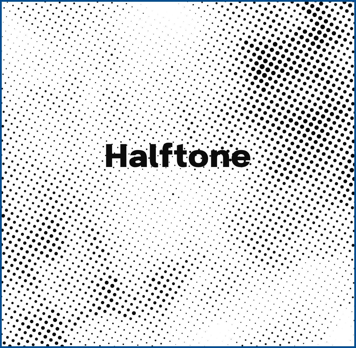
Halftone is the pattern of tiny dots old newspapers and comic books used to print tone and color before digital printing existed. It reads as retro, but in 2026, plenty of brands use it for a sharper, more technical look instead — tight, high-contrast dots that feel engineered rather than vintage. Nothing is a good example, with a whole identity built around exposed, dot-matrix detailing. Best for: posters, packaging, apparel graphics — anywhere you want a “printed” feel on a digital screen.
2. Risograph
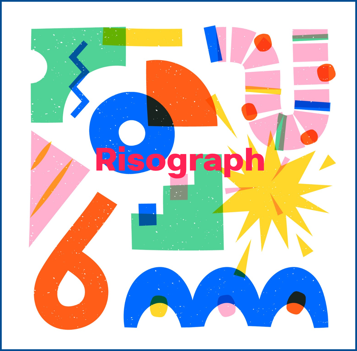
Riso printing uses soy-based ink drums with imprecise registration, so colors shift and overlap slightly instead of lining up perfectly. It grew out of zine culture and independent presses looking for an alternative to slick, corporate offset printing. Studios like RISOTTO in Glasgow have built entire practices around that look. Brands borrow it today to feel indie, handmade, and a little anti-corporate. Best for: event branding, music and culture campaigns, and any brand that wants to feel like a small studio, even if it isn’t one.
3. Ink Spoiled
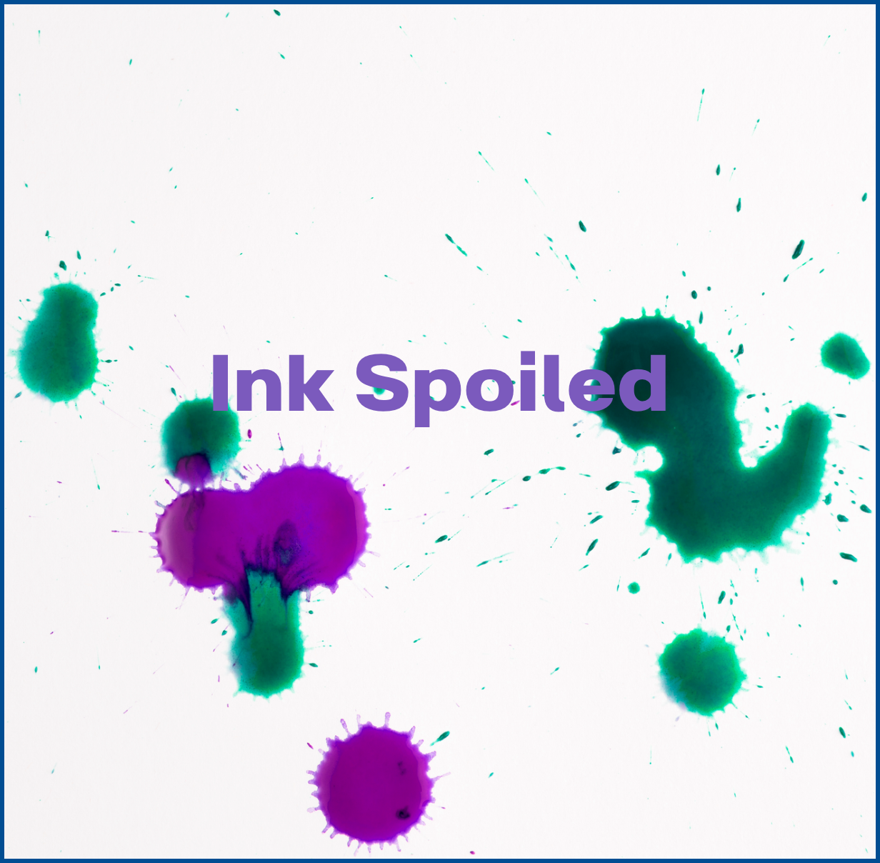
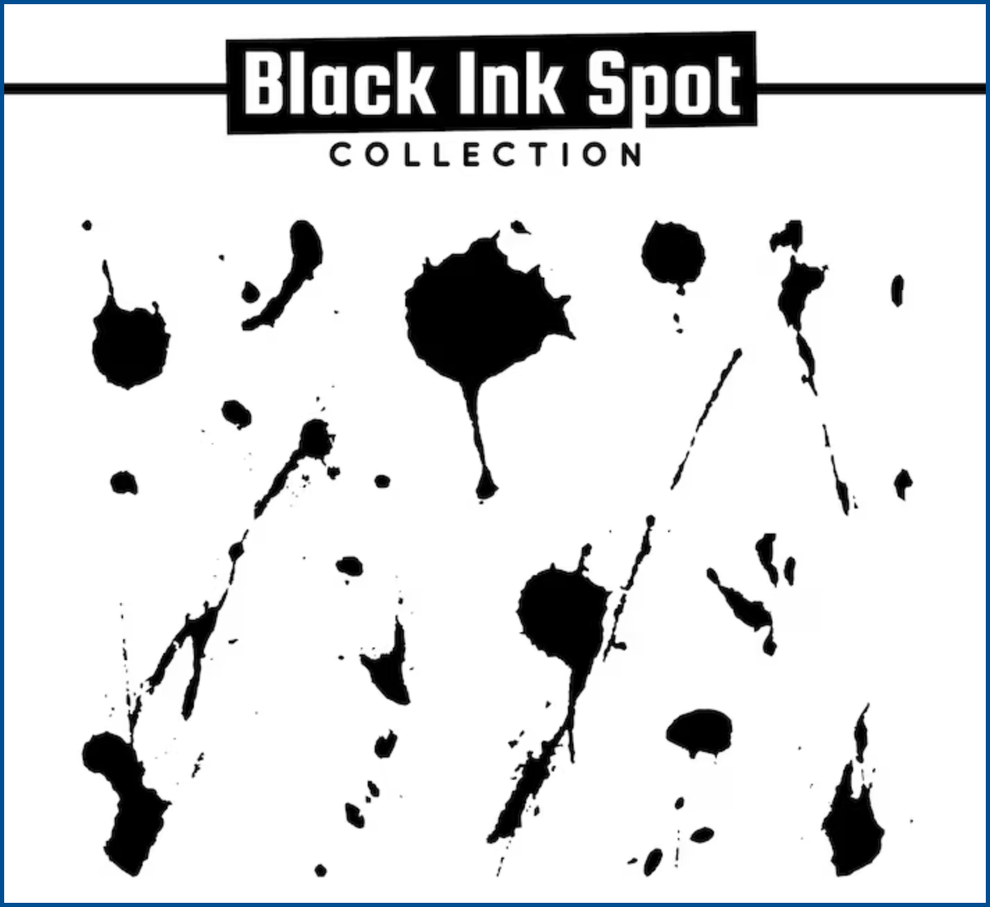
Picture a stamp that bled slightly into the paper, or ink that pooled unevenly instead of sitting in a perfect line. This is “imperfect on purpose,” the opposite of a razor-clean vector. Real ink never applies evenly, so a design that shows it reads as handmade instead of templated. Best for: craft and artisanal products, food and drink packaging, and any brand trying to prove a human actually made it.
4. Liquid Grain
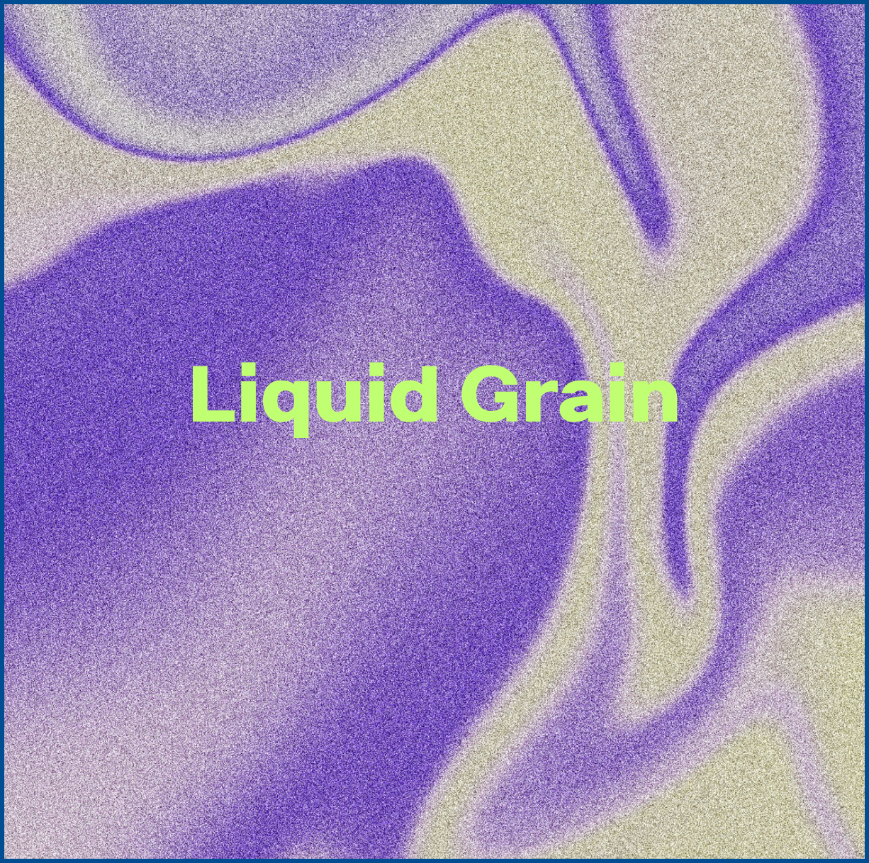
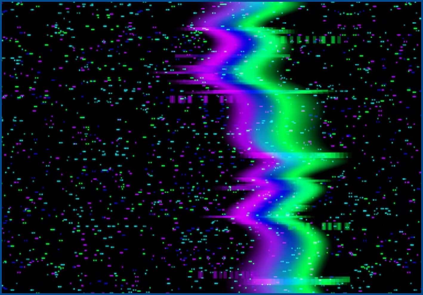
This is the soft, glowing noise you see in film photography and cinematic branding: grain layered with blur and gradient light. It’s less about the past and more about mood — depth, atmosphere, the sense that something is unfolding rather than sitting flat on a page. Film studios like A24, along with album art and forward-leaning tech brands, lean on it for exactly that feeling. Best for: product teasers, video thumbnails, album art, and website hero sections.
How to Actually Use Texture Without Wrecking Your Brand
Texture is easy to overdo. A few ground rules keep it working for you instead of against you.
- Keep it behind the message, not on top of it. Texture belongs on backgrounds and edges, not layered directly over body text or a logo where it fights legibility.
- Pick one or two signature textures, not all four. A brand mixing halftone, riso, grain, and ink texture in one layout looks chaotic, not premium. Consistency is what makes texture feel intentional.
- Match the texture to what you’re actually selling. A fintech app probably shouldn’t reach for gothic ink bleeds. A record label probably shouldn’t play it flat and corporate.
- Test it small. Texture that looks great on a full-bleed poster can turn into visual mud on a favicon or app icon, so check it at the smallest size it’ll actually be used.
- Watch your file weights. Grain and texture overlays bloat file sizes fast — compress and export smart, especially for anything going on a website.
Used with restraint, texture becomes a signature. Used everywhere at once, it just becomes noise.
Conclusion
Flat, safe, perfectly polished design isn’t wrong — it’s just no longer rare, and rare is what gets remembered. Texture in graphic design gives a brand something a template can’t fake: the sense that a real hand, real ink, or real film was somewhere in the process.
Halftone, Risograph, Ink Spoiled, and Liquid Grain each say something different about a brand, so the goal isn’t to use all four. It’s to pick the one or two that actually match the story you’re telling.
If figuring out which texture fits your brand — and applying it consistently across your logo, packaging, and social content — sounds like more than your team has time for, that’s the kind of execution Graphically’s designers handle every day. A dedicated designer who actually learns your brand can turn “messy is premium” from a nice idea into a visual identity that holds up everywhere it needs to show up.
FAQs
Is texture in graphic design just a passing trend?
Specific styles like riso or grain will rise and fall, but texture itself isn’t new — it’s a reaction to how flat and AI-generated most design has become. Expect the exact look to evolve, not disappear.
Does adding texture slow down my website?
It can, if you’re not careful. Large image overlays are heavy. Use compressed formats like WebP, keep textures subtle, and avoid stacking high-resolution overlays on one page.
Can I combine more than one texture in my branding?
You can, but it’s risky. Most strong brands lean on one primary texture and use a second sparingly, rather than mixing all four styles into one design.
Is texture only useful for digital design?
No. Texture actually started in print, and print is still where it looks most natural: packaging, business cards, posters, and stationery all benefit from a tactile finish.
How much texture is too much?
If it starts making your logo or text harder to read, it’s too much. Texture should support your message, not compete with it.