Table of Contents
Key Takeaways
- It Isn’t Just Empty Space: Negative space is an active, vital design element that gives your content room to breathe and helps highlight the most important parts of your message.
- Reduces Cognitive Load: A modern, minimal aesthetic prevents visual clutter, making it significantly easier for your audience’s brains to process and remember your content.
- Creates Iconic Branding: The world’s most memorable logos rely on the clever use of empty space to create striking, timeless, and clever imagery.
- Guides the User’s Eye: Strategic spacing acts as an invisible roadmap, guiding your audience exactly where you want them to look, whether that is a “Buy Now” button or a crucial piece of information.
Imagine walking into a room packed wall-to-wall with furniture, stacked to the ceiling with boxes, and covered in loudly patterned wallpaper. You would likely feel instantly overwhelmed, unsure of where to look or where to step. Now, imagine walking into a sleek, modern art gallery with smooth floors, plain walls, and a single, stunning sculpture sitting directly in the center. Your eyes are immediately drawn exactly where they are supposed to go.
This contrast perfectly illustrates one of the most misunderstood concepts in the creative world. When putting together a graphic, a website, or a piece of marketing material, the natural human instinct is to fill up every single blank corner. We feel like empty space is wasted space. But in reality, nothing could be further from the truth.
So, why is negative space a secret weapon in design?
Negative space, also known as “white space,” is the space of a layout that is blank. It is the space that exists between graphics, columns, text and margins. Rather than being an empty void, it is the invisible glue that holds a composition together. It makes a good use when it is used right, it makes chaotic, amateur visuals into modern, futuristic, and simple masterpieces. In this guide, we will be discussing precisely how the strategic use of “nothing” can bring your brand to the level of something truly memorable.
The Psychology of Clarity and Focus
To understand why negative space is a secret weapon in design, we first have to understand how the human brain processes visual information. We are constantly bombarded by thousands of advertisements, notifications, and images every single day. Because of this, our attention spans are shorter, and our tolerance for visual clutter is at an all-time low.
When a design is crammed with text, heavy graphics, and multiple competing colors, it causes what psychologists call a high “cognitive load.” The brain has to work incredibly hard just to figure out what it is looking at, which usually leads to frustration. The user will simply click away or ignore the graphic entirely.
Negative space acts as a visual reset button. By embracing a minimal aesthetic, you give the viewer’s eyes a place to rest. This breathing room allows the brain to easily separate different pieces of information and understand the hierarchy of the page. It tells the viewer, “Relax, you don’t have to figure this out; just look right here.”

Think about the user interface of the most successful tech platforms. They don’t bombard you with fifty buttons at once. They use vast amounts of padding and margins to make the experience feel effortless and frictionless. This simplicity conveys confidence. A brand that uses a lot of negative space is silently communicating that their core message is strong enough to stand on its own without needing flashy distractions to prop it up.
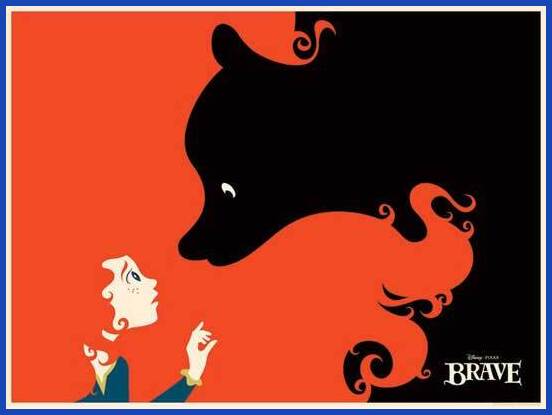
Iconic Branding and Industrial Minimalism

Nowhere is the power of empty space more evident than in logo design. If you look at the most recognizable brands on the planet, they don’t use highly detailed, complex illustrations. They rely on the brilliant manipulation of positive and negative shapes to create something memorable.
Let’s look at a few examples of how this works in practice:
The Apple Logo
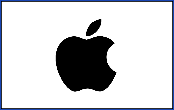
The Apple logo is one of the most iconic pieces of corporate branding in human history. But what makes it so brilliant isn’t just the shape of the apple itself—it’s the bite taken out of it. That chunk of negative space provides scale (so it isn’t confused with a cherry), adds a layer of clever visual interest, and turns a generic fruit silhouette into an unmistakable, globally recognized symbol.
The Steam Logo

For a masterclass in industrial minimalism, look no further than the logo for the gaming platform, Steam. At first glance, it is a sleek, modern combination of shapes. But the negative space within the design actually forms the connecting rods and cranks of a steam engine. By letting the background cut into the primary shapes, the designers created a mechanical, futuristic icon that perfectly captures the essence of the brand without having to draw a literal, detailed train engine.
The FedEx Logo

Perhaps the most famous use of this technique is the FedEx logo. Look closely at the empty space between the capital “E” and the lowercase “x”. The negative space perfectly forms a forward-pointing arrow. Once you see it, you can never unsee it.
These designs prove why negative space is a secret weapon in design. It allows for “aha!” moments. When a viewer discovers the hidden shape or the clever minimalism in your branding, they feel a sense of inclusion and cleverness, which instantly builds a stronger psychological connection with your brand.
Directing the User’s Journey
Beyond psychology and clever branding, negative space is a highly practical tool for improving user experience (UX) and driving conversions. Whether you are designing a landing page, an email campaign, or a social media graphic, your ultimate goal is usually to get the viewer to take a specific action.
The Spotlight Effect
If you want something to stand out, you shouldn’t necessarily make it bigger, bolder, or brighter. Instead, put more space around it. If you have a critical “Subscribe Now” or “Add to Cart” button, surrounding it with generous negative space isolates it from the rest of the content. It acts like a spotlight on a dark stage, making it virtually impossible for the user to miss.
Improving Readability

No one wants to read a giant, unbroken wall of text. It looks intimidating and exhausting. By utilizing macro-spacing (the space between major layout elements) and micro-spacing (the space between lines of text and individual letters), you make your content vastly more readable. Breaking up paragraphs and adding margins ensures that a 1500-word article feels like a breezy, engaging read rather than a dense textbook.
Establishing Relationships
Negative space also helps visually group related items through the psychological principle of proximity. Elements that are placed close together (with very little negative space between them) are perceived as related, while elements with large amounts of space between them are seen as separate. This allows you to organize information logically without needing to draw heavy lines or boxes around everything, maintaining that clean, modern aesthetic.
Conclusion
So, why is negative space a secret weapon in design? Because it is the foundation of clarity, elegance, and focus. It transforms chaotic visual noise into a streamlined message. By resisting the urge to fill every blank pixel, you allow your core content to shine, create clever and iconic branding, and effortlessly guide your audience exactly where you want them to go.
However, mastering the art of “nothing” is actually incredibly difficult. Balancing proportions, knowing exactly how much breathing room to leave, and achieving that perfect industrial minimalism requires a highly trained eye and years of experience.
If you want to elevate your brand’s visuals without dealing with the frustration of trial and error, Graphically.io is the ultimate solution. Graphically provides unlimited, flat-rate graphic design services powered by a team of vetted, professional designers. Whether you need a sleek new logo, engaging social media graphics, or a complete website redesign, the experts at Graphically understand the deep mechanics of visual hierarchy. They know exactly how to wield negative space to make your brand look modern, trustworthy, and utterly unforgettable. Stop settling for cluttered, amateur designs, and let Graphically.io help you create visuals that truly speak volumes.
FAQs
1. What is the difference between white space and negative space?
In the world of graphic design, these two terms mean the same thing and are used interchangeably. “White space” comes from the early days of printing on white paper, while “negative space” is a broader term used in art and photography.
2. Does negative space actually have to be white?
Not at all! The term simply refers to the empty space in a design, regardless of what color it is. Your negative space could be pitch black, bright yellow, a subtle gradient, or even an out-of-focus background photograph. As long as it is an area free of core focal elements, it acts as negative space.
3. Can you use too much negative space in a design?
Yes, it is possible to overdo it. If elements are pushed too far apart, the design can feel disconnected, and the viewer might lose the relationship between different pieces of information. Good design is about striking the perfect balance between the active elements (positive space) and the resting areas (negative space).
Cluttered designs are often associated with cheap, “shouty” advertising (think of a clearance sale flyer bursting with neon text and starbursts). Minimalist design, on the other hand, is associated with high-end luxury brands, modern technology, and art galleries. By using generous negative space, a brand subconsciously signals that it is confident, sophisticated, and premium.