Table of Contents
Key Takeaways
- Clarity is key: The Canva AI image generator requires precise and well-structured instructions to provide you with clean, usable branding assets. Don’t use very long sentences that go on and on.
- Less is usually more: If you want an iconic brand look, focus on minimalism. Messy, unusable images result from cluttered prompts.
- Understand the adjective: Words such as “flat vector” or “industrial minimalism” or “modern and futuristic” will have a significant impact on your results.
- Format matters: Always specify your sizing and aspect ratios, like asking for a standard 1536 x 1024 dimension for your website’s featured images to ensure a perfect fit.
Building a brand from scratch can feel completely overwhelming. You have a clear idea in your mind which your brand should be – clean, professional, memorable. However, it will be another task to get that vision out of the mind and onto the screen.
In the past, you had to hire an expensive graphic designer or spend hours scrolling through generic stock photo websites just to find a simple background. Nowadays, Artificial Intelligence has turned the tables in the game. Just type what you want and the computer types it for you in seconds.
But there is a major catch. When you enter the wrong words, you’ll receive odd, garbled and unprofessional output. The magic of achieving great photos does not lie simply in the price of the tool — it’s about being able to “talk” to the tool.
If you’re looking to produce graphics that appear high quality, then you need to use the appropriate words. Let’s look at exactly how to use the canva ai image generator to create visuals that elevate your business, along with the exact phrases you should be typing into the search bar.
5 Exact Canva AI Image Generator Prompts for Clean Branding
When it comes to great branding, simplicity always wins. Think about the Apple logo. It is 100% iconic because it is as clean as it can be. It doesn’t have 3D drop shadows, messy text, or a busy neon background.
Or, consider the Steam logo that gamers around the world see. It is an absolute masterclass in industrial minimalism. It has simple geometric forms and a clean design that conveys the meaning of a thing efficiently without impressing viewers.
If you want the AI to give you results like these, you have to tell it to be minimal. Let’s look at five of these prompts in real-life situations, and see what prompts you should use—not what you should avoid!
Example 1: The Blog Post Featured Image
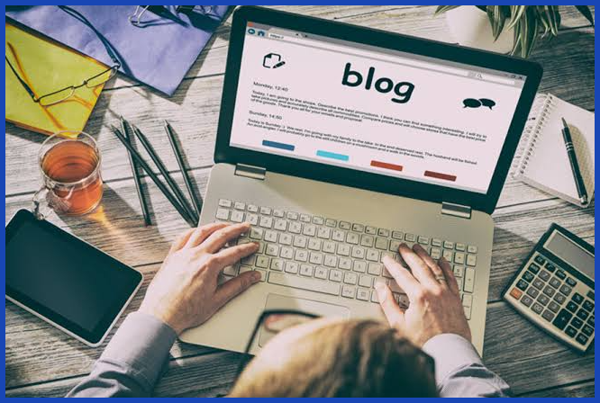
The Bad Prompt: “A picture of a blogger typing on a laptop in a busy coffee shop with lots of plants and people in the background.”
- Why it’s bad: This supplies too much background information for the AI to concern itself with. The picture will be messy and will make it hard for readers to read the article title when you place text over it.
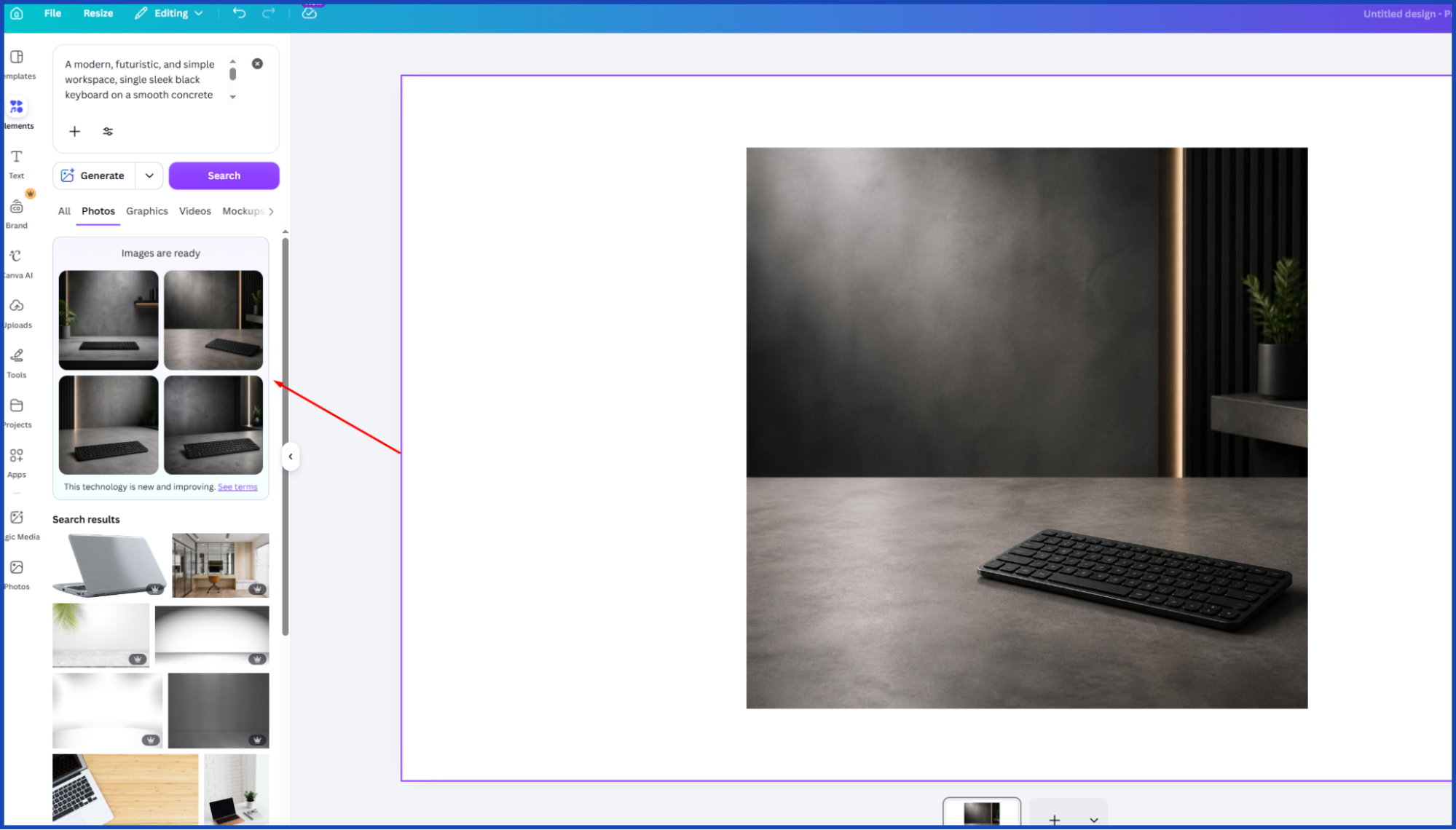
The Good Prompt: “A modern, futuristic, and simple workspace, single sleek black keyboard on a smooth concrete desk, industrial minimalism, soft studio lighting, empty space for text, 1536 x 1024 dimensions.”
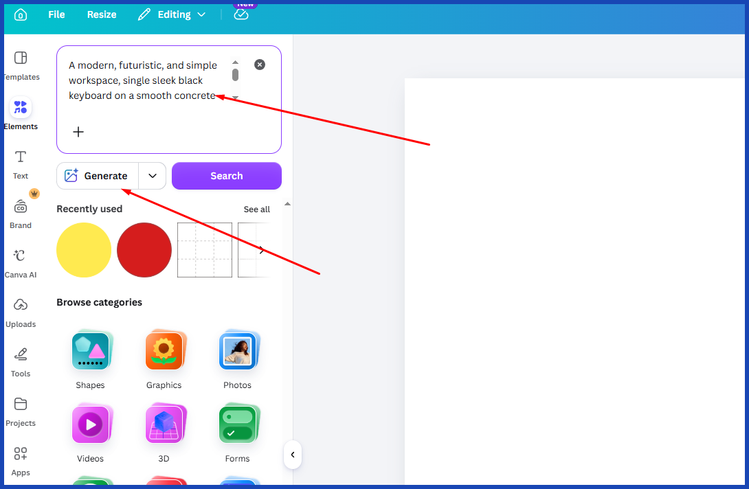
- Why it works: You nailed down the exact vibe (industrial minimalism), asked for specific lighting, and included the perfect aspect ratio (1536 x 1024) so it fits flawlessly into your website’s header.
Example 2: The Gaming or Tech App Icon
The Bad Prompt: “A 3D logo for a gaming app with a controller, a headset, fire in the background, and bold text.”
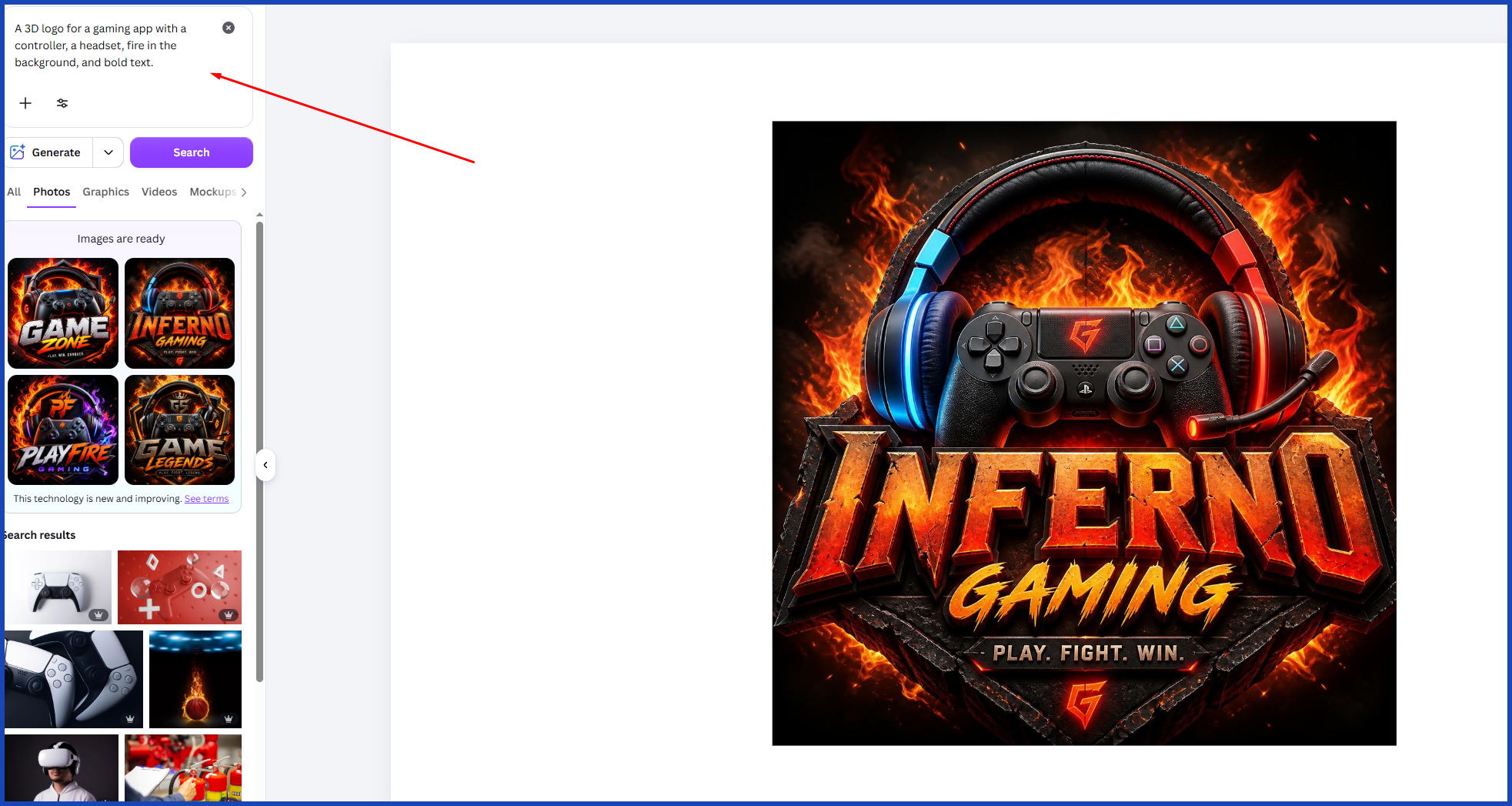
- Why it’s bad: Pushing text and several complex objects into a small app icon just about always produces a confusing and incomprehensible mess.
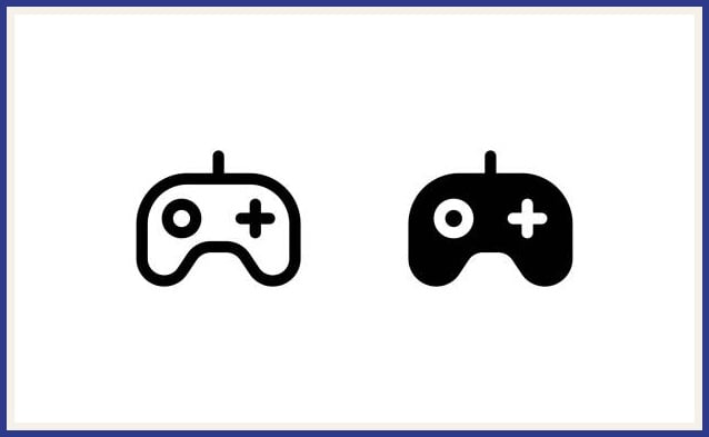
The Good Prompt: “A clean app icon of a stylized minimalist gamepad, industrial minimalism, flat vector graphic, monochromatic dark grey, modern and futuristic, solid white background.”
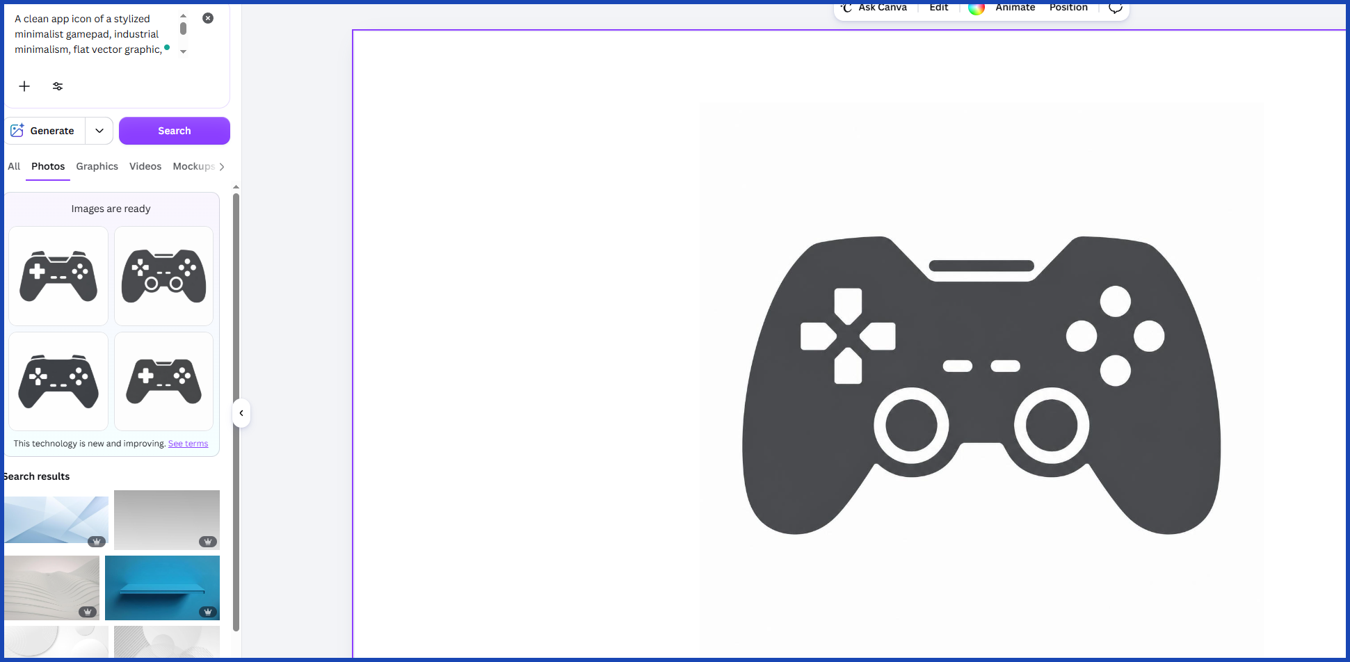
- Why it works: By specifying “flat vector graphic” and a “solid white background,” you guarantee an iconic, high-end design that is incredibly easy to cut out and use across all your digital platforms.
Example 3: The Email Campaign Header
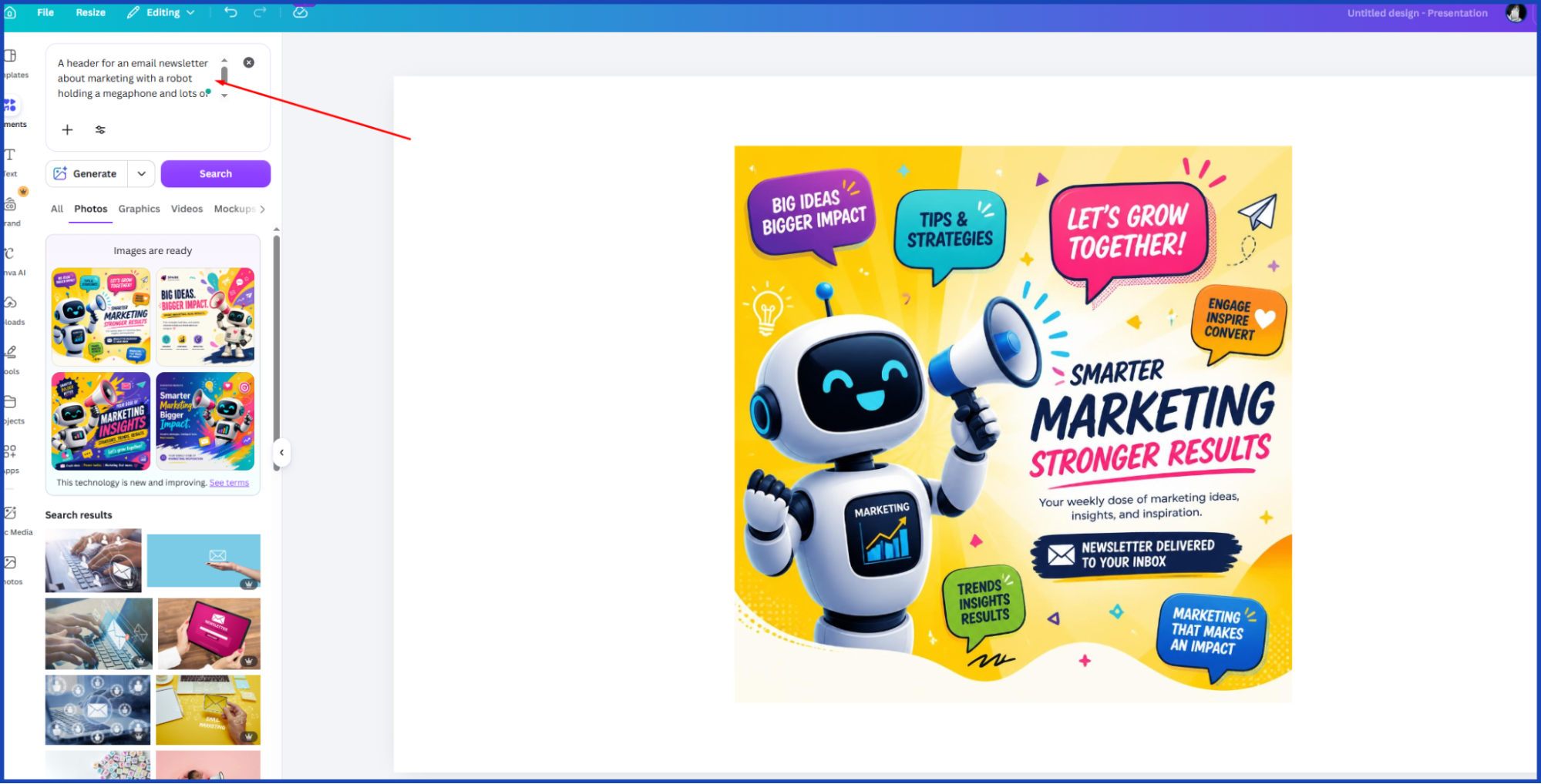
The Bad Prompt: “A header for an email newsletter about marketing with a robot holding a megaphone and lots of bright colors.”
- Why it’s bad: This prompt is going to generate a cartoonish, unprofessional graphic. It will likely make your email subscribers instantly hit the “unsubscribe” button because it looks like spam.
The Good Prompt: “A modern, minimal email header graphic, abstract geometric waves, metallic silver and electric blue, flat vector style, solid white background, leaving plenty of negative space.”
- Why it works: You asked for “negative space” and “abstract geometric waves.” This gives you a polished, professional graphic that frames your email perfectly without overpowering your written message.
Example 4: The Presentation Slide Deck Background
The Bad Prompt: “A business presentation background with two people shaking hands, a chart going up, and a city skyline.”
- Why it’s bad: Using literal human faces and city skylines behind your presentation text makes it incredibly difficult for your audience to read your bullet points. It looks dated and far too busy.
The Good Prompt: “A subtle presentation background, modern futuristic lines, minimal dark mode aesthetic, deep navy blue with glowing cyan accents, uncluttered, simple.”
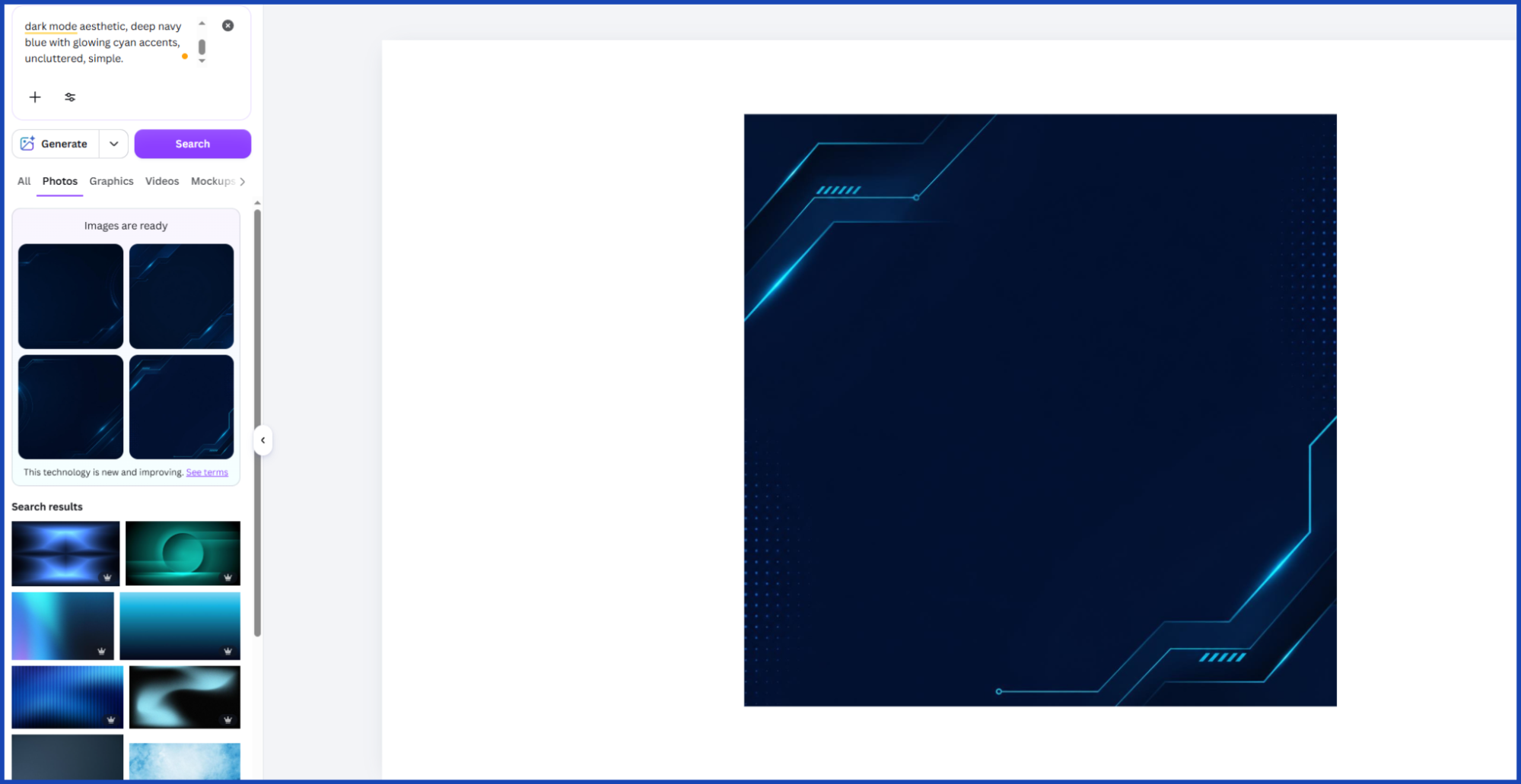
- Why it works: You told the Canva AI image generator to prioritize an “uncluttered” and “subtle” aesthetic. The dark mode color palette will make your white text pop beautifully on the big screen.
Example 5: The Social Media Quote Graphic
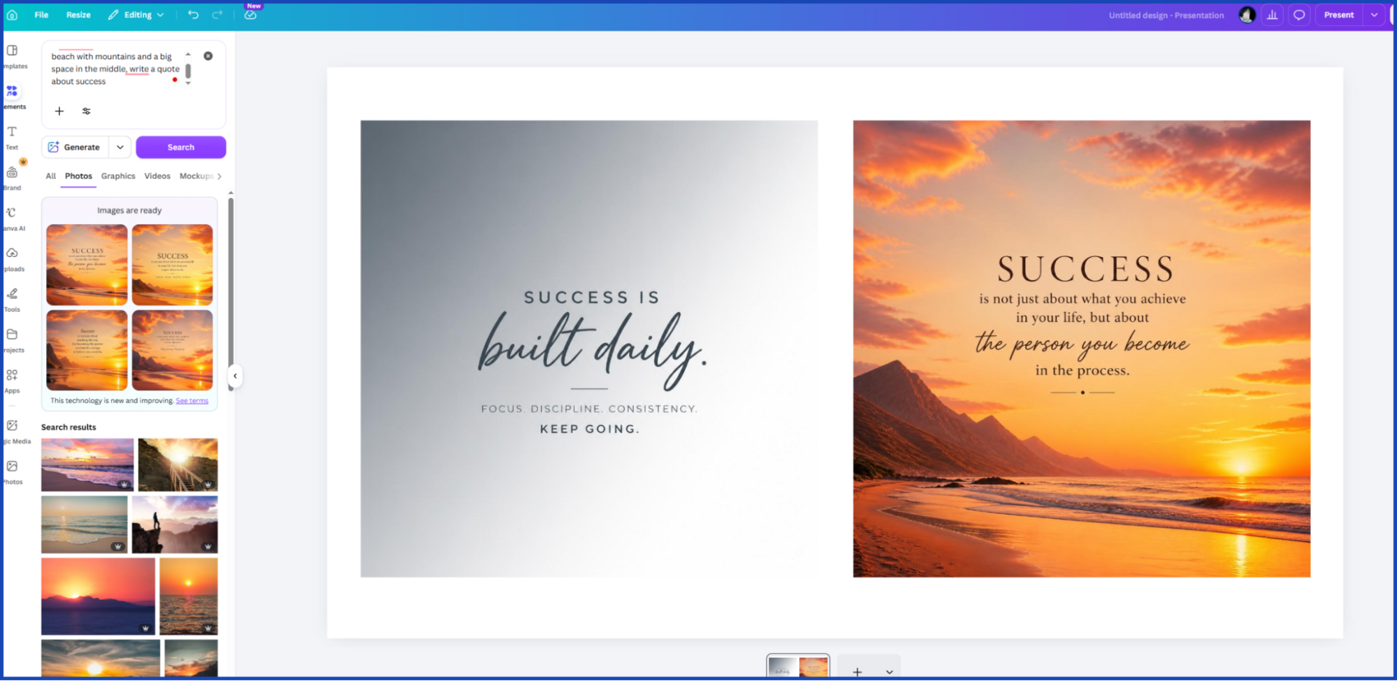
The Bad Prompt: “A beautiful bright sunset over a beach with mountains and a big space in the middle to write a quote about success.”
- Why it’s bad: AI often struggles to seamlessly blend highly detailed realistic landscapes with blank spaces. The lighting usually looks unnatural, and the image feels like a cheap tourist postcard.
The Good Prompt: “A minimal abstract background for social media, smooth soft gradient blending slate grey into pure white, modern and simple, no distracting elements, flat vector style.”
- Why it works: You are asking for a background that exists solely to elevate your words. The smooth gradient creates a premium, high-end feel that makes your audience want to stop scrolling and actually read your text.
How to Write Good Prompts for the Canva AI Image Generator
Talking to an AI is much the same as giving directions to an intern. If you’re not specific, they’ll infer what you really mean and they screw that up. Make sure that you are clear, direct, and specific, or they will give you exactly what you asked for.
When using the AI image generator on Canva, it’s crucial to adhere to a fundamental formula for optimal output. Consider it as the recipe for an ideal picture.
The essence of your prompt recipe should be as follows: Subject + Style + Color Palette + Background.
Let’s break that formula down so it is incredibly easy to use on your next project.
- The Subject: What is the main focus of the image? Be precise. Don’t just say “a coffee cup.” Say “a matte black ceramic coffee cup.”
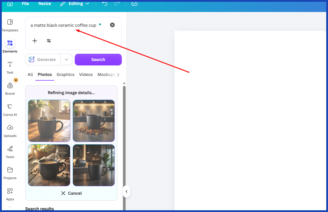
- The Style: How should it look? Is it a photograph, a 3D render, a flat vector graphic, or a watercolor painting? If you are building a modern brand, words like “minimalist,” “flat vector,” and “clean lines” are your absolute best friends.
- The Color Palette: Don’t leave colors up to chance. If your brand colors are navy blue and silver, tell the AI to only use those colors.
- The Background: Tell the AI what to put behind your subject. If you are making a logo or an icon, always ask for a “white background” or a “solid color background.” This makes it much easier to remove the background later.
When you put it all together, you get a clean, professional instruction that the AI can easily understand and execute.
Top Tips for Keeping Your Brand Look Consistent
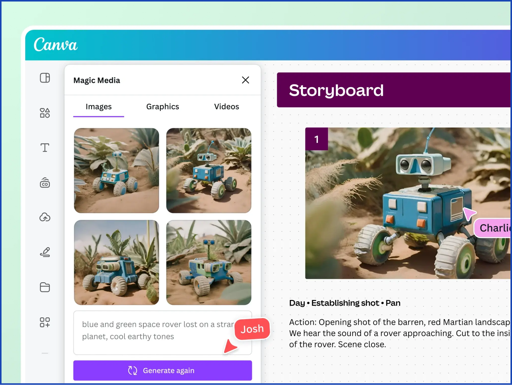
Creating one great image is fun, but building a real brand means creating dozens of images that all look like they belong together. You want your website, your social media accounts, and your emails to feel like a unified experience.
Here are a few simple tips to make sure your AI-generated art looks like a cohesive, professional brand.
- Save your favorite keywords. If you discover a style word that suits your brand to perfection, jot it down, such as “futuristic,” “industrial minimalism,” or “flat vector. From then on, use the same exact wording for all of each of your prompts. This will teach the AI to provide you with the same look each time.
- Standardize your sizes. Keep the sizes of images the same throughout platforms. If that’s the case, do not change your blog post header dimensions to anything else. It helps you to create a look which is professionally designed by maintaining consistency in sizing so that there is no awkward cropping.
- Remember the “Squint Test.” For each new logo or graphic, take a step back from your computer screen and squint your eyes. Still able to tell what is the shape? If it results in a muddled mess, it’s too complicated. The most successful brands in the world are those that are simple, which is a characteristic that they reveal when they pass the squint test.
Conclusion
It is one of the most intelligent ways to save your time and money when your business is growing; you can create your visual identity using AI. By mastering the canva ai image generator, you can instantly create graphics that look like they were made by a high-end design agency.
The key is really the prompt! Don’t give vague and untidy directions. Rather, provide simple and succinct guidelines that clearly instruct the AI on what you are trying to achieve. Keep to your own brand colors, expect straight lines, and always be afraid of keeping it wonderfully simple.
Of course, generating the raw images is just the first step. Yet, even with the work done by AI tools, it still needs a human touch to create a fully-fledged professional website or marketing campaign. That is exactly where Graphically comes in. When you’re ready to leverage your newly created brand assets and make them look polished and high-converting, the team at Graphically has all the tools, experience, and talent needed to make your brand completely unforgettable.
FAQs
What is the best style for an AI-generated logo?
For logos, the best styles are “flat vector,” “minimalist,” or “simple silhouette.” These styles make your logo clean, scalable and legible on any screen, including large billboards and small smartphone screens.
Why do my AI images look messy or distorted?
When requesting excessive information all at once, AI models will get confused. If your image is too cluttered, you may need to eliminate half of the adjectives in your prompt. Try to work on a single topic and request a basic solid background.
Can I use AI-generated images for my business?
Yes, Canva’s AI image generator allows you to use the images for commercial purposes, like on your website or social media. But the fact that it’s created with AI means you shouldn’t expect to be able to trademark the original image itself as your legal property.
How do I make the AI use my exact brand colors?
AI can be very good at understanding colors, but it’s not quite accurate. It is best to talk directly to the color names such as “navy blue and burnt orange”. Additionally, there is the option to upload your AI-generated image to Canva’s basic editor and then add your brand’s exact hex codes to the design later.