Table of Contents
Key Takeaways
- A busy YouTube banner gives viewers a reason to look away. They have a reason to stay if it’s a minimal one.
- YouTube’s safe zone (1546 x 423 px) is the only area that is visible on all devices—so keep your name, logo, and key text within the bounds of the safe zone.
- Simple layouts dominate the work of creators such as MKBHD, Kurzgesagt, Matt D’Avella, and Ali Abdaal.
- Stick to one or two brand colors, one clean font, and a single focal point.
- Need to get the job done quickly or don’t feel like designing? We can create a nice banner for you graphically, and in most cases it will be done in 24 hours.
Your channel banner is the first thing that will appear to viewers before they watch any video on your channel.
It’s the top of your channel page, similar to a storefront window. People glance at it for a second, maybe two, and in that glance, they decide whether to stick around or scroll past.
Many creators attempt to cram all that information into that window: their name, a tagline, their upload plan, their social media, a photo or a logo, and perhaps everything combined! The result usually feels loud, and loud doesn’t hold attention. It pushes attention away.
This is why minimal banners on YouTube prevail. In the absence of a visual, there’s less to overlook.
In this guide, we’ll break down why that works, how to design your own minimal banner, and show you real examples from creators who’ve already nailed it.
Why Minimalist Banners Win on YouTube (and How to Design Yours)
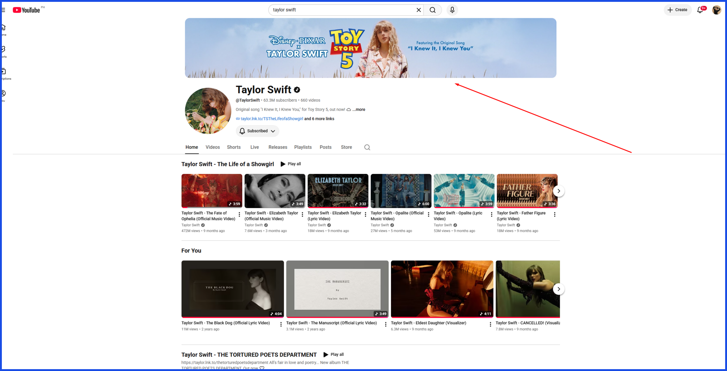
The thing about banners is that nobody reads them. They scan them.
A new visitor spends a second or two on your channel page before deciding what to do next. During the same period, a single clear message is understood in a flash on the banner. A banner with five competing ideas doesn’t get understood at all — it just gets skipped past.
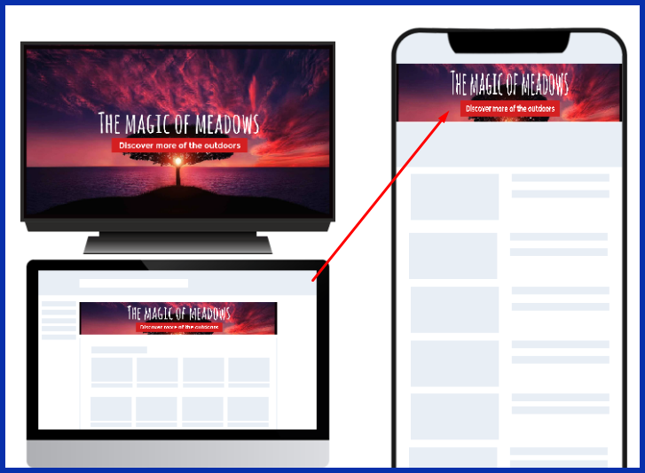
Minimal design also faces the biggest technological challenge for YouTube, namely when your banner is cropped differently on phones, tablets, desktops, and TVs. The fewer elements it has, the less is that something important will be cut off, or appear awkward on a random screen size.
So, how to really design one? Start here.
Beginner tips
- Pick one or two brand colors and stop there. Any more starts to feel busy fast.
- Use a single, easy-to-read font. Save decorative script fonts for something else.
- Make your channel name or logo the one thing people’s eyes land on.
- Leave empty space on purpose. It’s not wasted space — it’s breathing room.
- Preview your banner on mobile before you publish it. Most visitors will see it there first.
Expert tips
- Design on a simple grid so elements line up instead of floating randomly.
- Reserve one small, consistent spot for details that change, like your upload schedule.
- Match your banner’s colors and tone to your thumbnails and profile photo, so your whole channel feels like one brand instead of three.
- Use contrast on purpose. Light text needs a solid dark area behind it, not a busy photo.
- Build in one small recurring visual — an icon, a shape, a mascot — that people start to recognize over time, the way Kurzgesagt’s little bird shows up everywhere.
If that list already sounds like a lot to juggle on top of filming and editing, you’re not wrong — it is. Design is usually the first thing that gets pushed aside once a channel gets busy.
That’s where a service like Graphically comes in handy. Instead of learning design software yourself, you describe what you want, and a dedicated design team builds your banner — and keeps it consistent with the rest of your channel’s branding — typically within 24 hours.
Real-Life Examples: YouTube Banners That Get Minimalism Right
The easiest way to understand minimal design is to look at creators already doing it well.
MKBHD (Marques Brownlee)
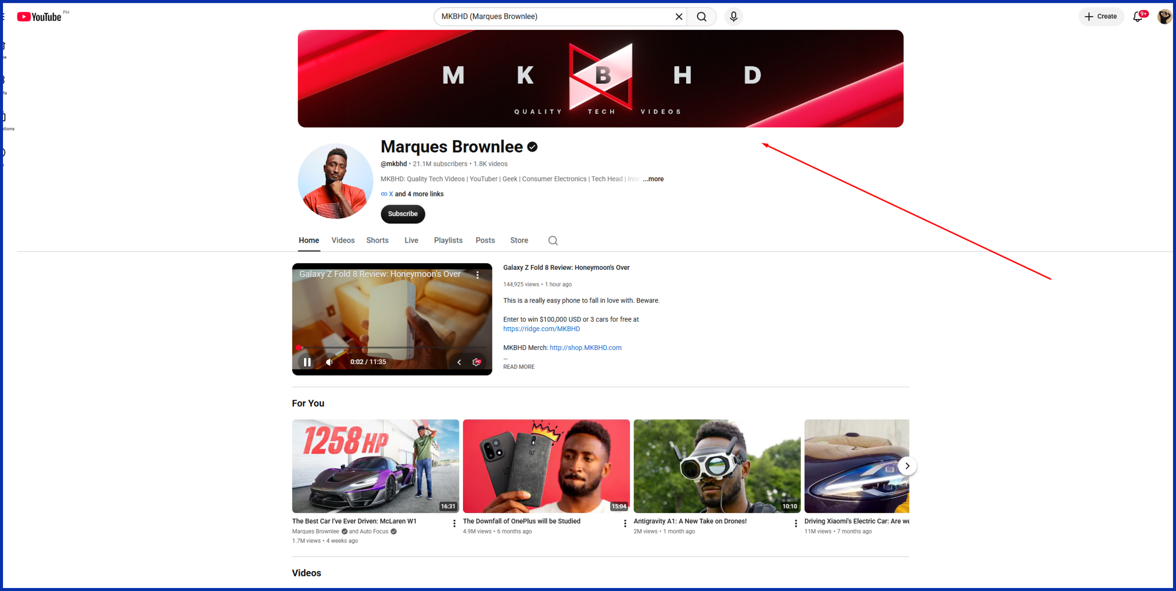
One of YouTube’s most popular tech channels takes down its logo to one colour, adding his name in crisp, clean type. No photo, no tagline, no extra icons competing for space. It’s effective in that his audience already trusts and has been impressed by the channel’s reputation for snarky, no frills movie reviews, so the banner only reaffirms that.
Kurzgesagt – In a Nutshell
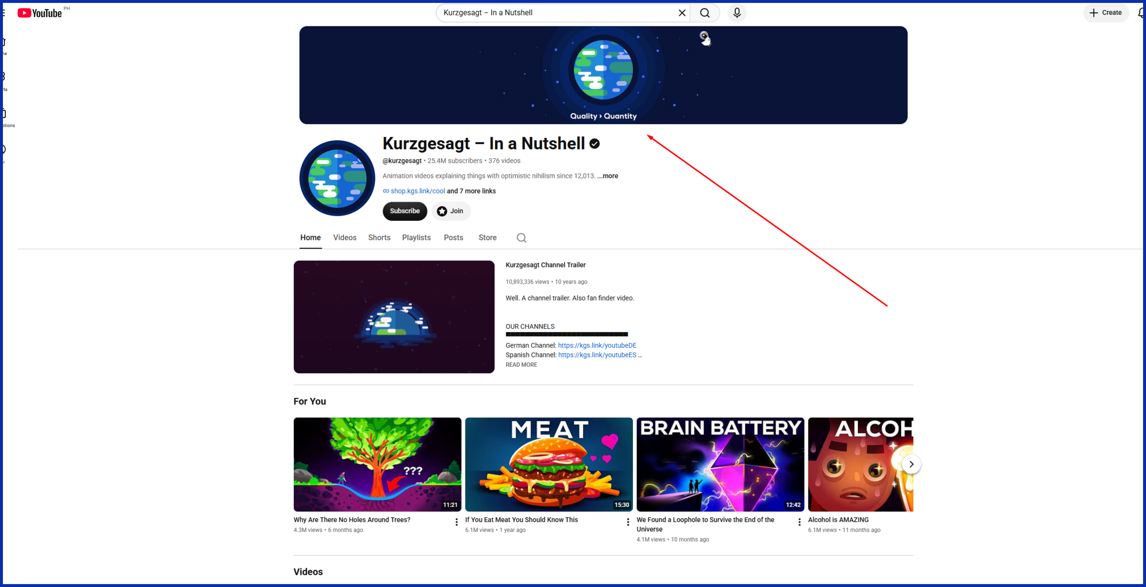
This science channel is based on the same “flat” and “colored” illustration style found in the videos, with the same color palette and character design. It’s simple in design, with no frills or additional language but rich and definitely their. Evidence that less is more doesn’t have to be less interesting.
Matt D’Avella
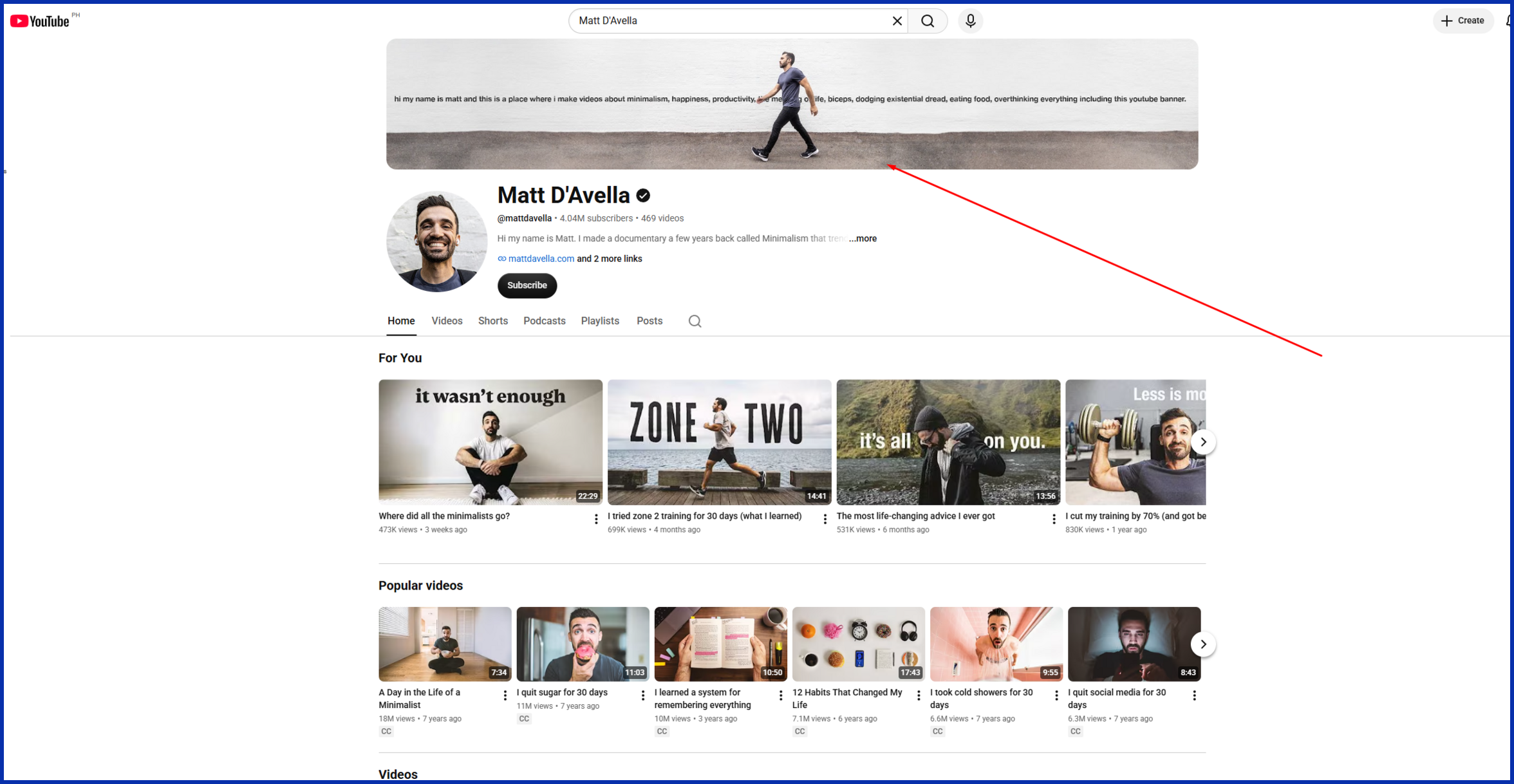
Fittingly, a filmmaker best known for a documentary about minimalism keeps his own channel art just as restrained: his name, a short tagline, and generous white space, set in a clean, geometric font. Nothing to compete with it, so nothing fights for it.
Ali Abdaal

This productivity-focused channel uses a soft, calming palette, a few simple icons representing his content topics, and a short, friendly line introducing who he is. It’s very little, and it tells you what you can expect before watching a single video.
Notice what none of these banners do: they don’t try to say everything at once. Each one picks a single idea and commits to it — that’s really the whole trick.
Common YouTube Banner Mistakes to Avoid
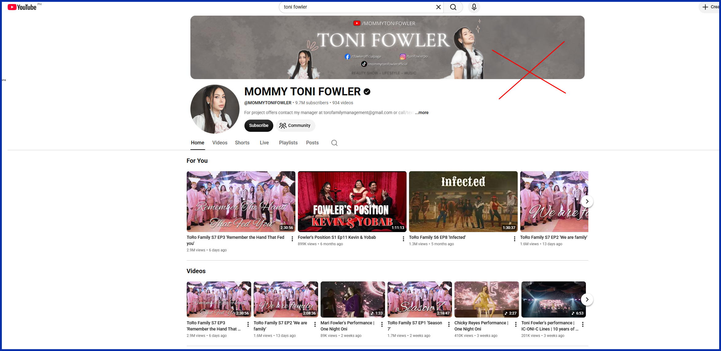
Even with good intentions, it’s easy to fall into habits that quietly work against you.
- Text too small to read on mobile. Most viewers see your channel from a phone, so anything smaller than a bold headline tends to disappear.
- Too many fonts or colors. More than two of either usually reads as chaotic instead of intentional.
- Ignoring the safe zone. Anything placed outside it risks getting cropped out completely on certain devices.
- Low-resolution images. A blurry or pixelated banner makes a channel look unfinished, even when the design idea is solid.
- Never updating it. An old banner — outdated schedule, expired promotion, an old logo — quietly signals that a channel has gone stale.
- Mismatched branding. If your banner, profile photo, and thumbnails all look like they belong to different channels, none of them build recognition.
YouTube Banner Dimensions and Specs You Actually Need
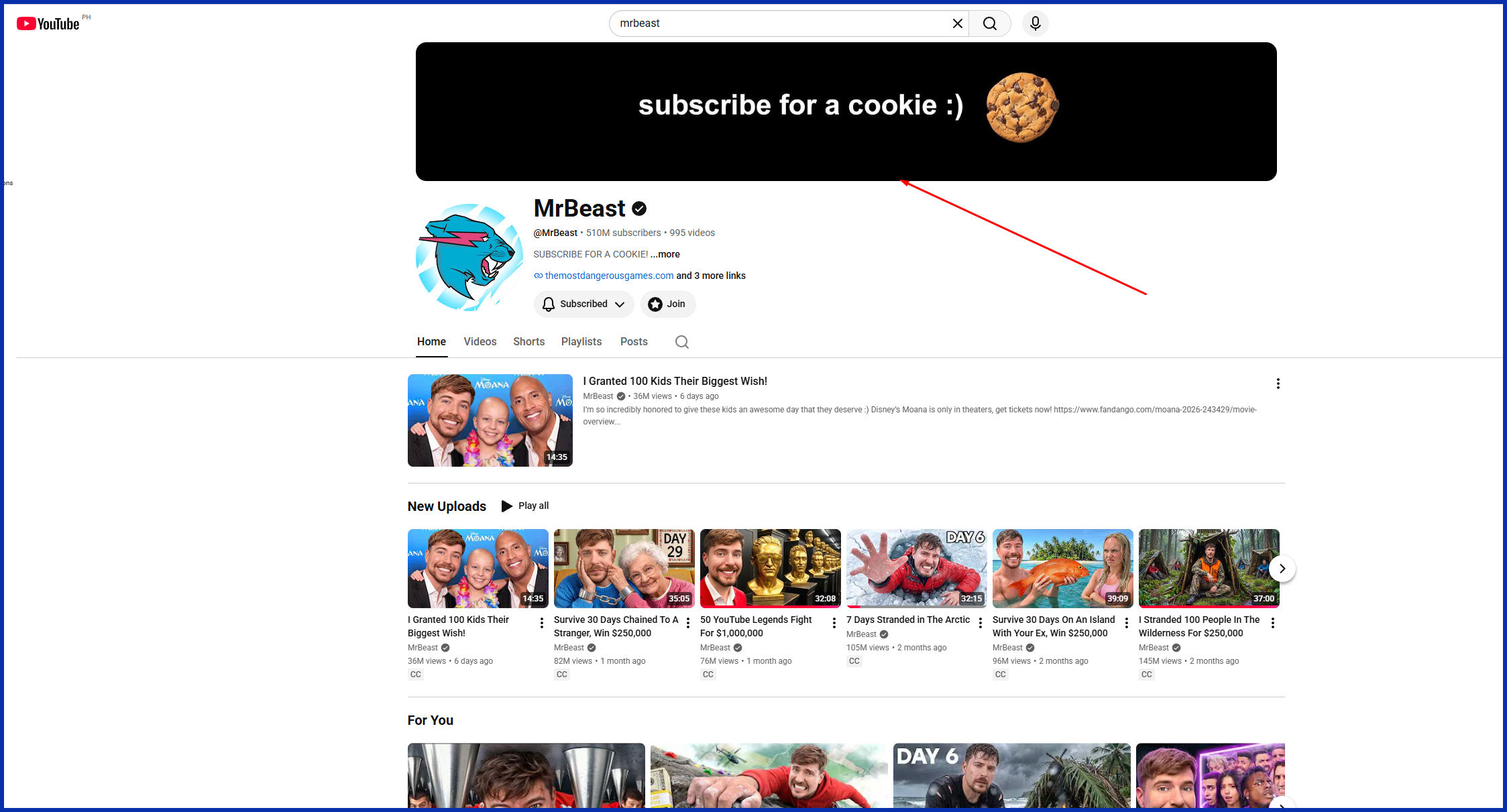
Good design only helps if the file itself is set up right. Here’s what YouTube currently asks for:
- Recommended upload size: 2560 x 1440 pixels (this is what fills a TV screen)
- Minimum size: 2048 x 1152 pixels, at a 16:9 ratio
- Safe zone: 1546 x 423 pixels, centered — the only area guaranteed to show on every device, phones included
- File size limit: 6MB
- Accepted formats: JPG, PNG, GIF, or BMP (no animation)
Here’s why the safe zone matters so much: YouTube shows a different crop of your banner depending on the device. Phones only show that centered strip. Desktop shows a wider slice. TVs show the whole image. So design on the full canvas, but keep your name, logo, and any text inside that centered safe zone. Everything outside it is a bonus for desktop and TV viewers, not something to count on.
Conclusion
A great YouTube banner isn’t about doing less work. It’s about being intentional with the space you have.
Every color, word, and icon should be there because it earns its place — not because it seemed like a good idea the night before you launched your channel. Start with your brand colors, settle on one clear message, and let the design breathe.
And if you’d rather hand the whole thing off, Graphically’s design team can build your banner — and the rest of your channel’s visuals — so you can spend your time making videos instead of fighting with a template.
Whatever route you take, remember the actual goal: someone lands on your channel, glances at your banner, and instantly gets who you are. That’s it. That’s the whole job.
FAQs
pload at 2560 x 1440 pixels, but your logo and text should remain within the centered safe zone of 1546 x 423 pixels to ensure that it renders properly on all platforms.
Not necessarily. Most of the way can be accomplished with a template, and there are services such as Graphically who will create one for you if you’d rather not.
When you rebrand, when you launch a new series or when you see it looking dated. There are some active channels which update their channels every few months.
No. YouTube only supports static JPG, PNG, GIF, or BMP files for channel banners — no motion.
The banner is the top banner across the entire channel page. The icon will be the little circular photo or logo that will appear next to your videos and comments.
Yes — but they must remain within the safe zone, so that they can be seen on mobile as well.