Graphic designs add a powerful visual punch to your messages! It can show a product in a way impossible to miss. It can take a complex message and simplify it. Or, it can do the opposite — adding just the right touch of complexity. But, to unleash your creative potential and leverage its benefits, it is important to follow some best practices to produce the most effective visuals.
Here are some essential best practices to help you unlock the creative potential of graphic design.
Table of Contents
1. Follow Brand Guidelines
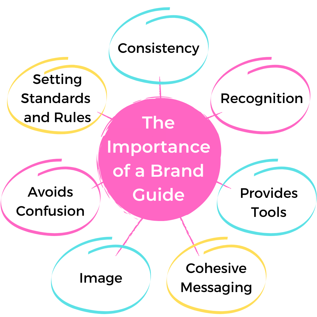
The following brand guidelines is an important practice in graphic design because it helps to maintain consistency and cohesiveness across all branding materials. This is important for several reasons:
-
Establishes brand recognition
By following brand guidelines, the design elements such as typography, colors, images, and logos are consistent across all materials, making it easier for customers to recognize and remember the brand.
-
Enhances brand credibility
Consistency in branding materials helps establish credibility and professionalism, making the brand appear more trustworthy and reliable.
-
Facilitates brand messaging
Brand guidelines provide direction on the messaging and tone of a brand, making it easier for designers to create materials that align with the brand’s overall message and voice.
-
Increases efficiency
Following brand guidelines can make the design process more efficient, as designers don’t have to start from scratch with each new project and can instead build upon established elements.
-
Maintains control
The brand maintains more control over how it is represented visually and can avoid inconsistencies or errors by establishing guidelines. Therefore, it is important to pay attention to all the details in the brand guidelines, such as the logo, colors, typography hierarchy, and imagery, to ensure that the design is consistent with the brand’s overall look and feel.
So, before starting any project, it is advisable to study the brand guidelines thoroughly to ensure that one is on the same page as the client. Plus, consider using project management tools to help organize design tasks.
2. Consider the Audience
Why and how to define your target audience?
When it comes to graphic design, understanding your audience is one of the essential steps. Having a good understanding of your target audience and what they are looking for can make the difference between a successful design and one that falls flat. You need to first think about who your primary audience is and what their preferences are.
For example, designs should be tailored to the age, gender, and interests of the audience. For example, a design for a younger audience might be more colorful, playful, and dynamic, while a design for an older audience might be more professional and subdued. Additionally, the design should reflect the intended message and be appropriate for the intended context.
3. Choose the right Color Palette
How to apply color palatte to your design?
The importance of color in graphic design cannot be overstated. Colors can create a particular mood, evoke an emotion, or highlight a feature. With the right combination of colors, you can make your project stand out and attract attention. And understanding the basics of color theory is key when combining colors for a good graphic design. Read more
Here are some tips for choosing the right color palette:
-
Determine the purpose and audience of the design:
Your chosen colors should be appropriate for the design and the intended audience.
-
Choose colors that are appropriate for the subject matter.
The colors you choose should be relevant to the subject matter of the design.
-
Use color schemes
A color scheme is a combination of colors that work well together. Some common color schemes include complementary, analogous, and monochromatic.
-
Use color meaning and symbolism
Different colors can evoke different emotions and associations in people. Consider the meanings and symbolism of the colors you choose.
-
Consider the context
The colors you choose should also be appropriate for the context in which the design will be viewed.
-
Create a mood
The colors you choose can help to create a certain mood or atmosphere in the design.
-
Limit the number of colors
Using too many colors can be overwhelming and make the design look cluttered. Therefore, it is generally best to limit the number of colors to three or four.
-
Use color tools
Many online tools and resources are available to help you choose a color palette, such as Adobe Color, Canva Color Palette Generator, and Colormind.
4. Develop an Eye for Typography

Typography is arranging text in a readable and aesthetically pleasing composition. Developing an eye for typography is essential for anyone looking to create good graphic design.
There are several tips to keep in mind when improving your typography skills.
- Look for inspiration outside your niche, as this will challenge you to appreciate design based on the core principles of what makes a design good. Pay attention to details such as the line spacing, shape of numbers, and weights of letters in everyday life.
- Different font types are better suited to different purposes, so make sure you choose a typeface that is designed for the purpose you are using it for.
- You should also consider the message the font conveys and ask yourself if it accurately reflects your brand’s values.
- Try to stick with simple and legible fonts over fancy or script fonts if you use them for large amounts of text.
- Try to use only a few different fonts, as too many can be confusing and overwhelming.
5. Optimize readability
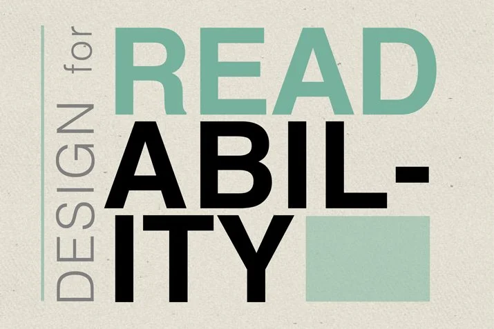
Optimizing readability is one of the most important aspects of graphic design. You should follow a few key best practices to ensure that your designs are easy to read and understand.
- First, use a large font size. This will make it easier for viewers to read the text, regardless of their distance from the design. Additionally, pick fonts that are clear and easy to read.
- Second, use contrasting colors to ensure the text stands out against the background. Ensure the text color is easy to read and avoid using too many colors in one design. This will help keep the design from becoming too overwhelming.
- Third, incorporate white space into the design. White space can help separate elements and keep the design from looking too cluttered.
- Fourth, pay attention to typography. Fonts should be chosen carefully and used consistently throughout the design.
- Finally, make sure to test your design on different devices. Different devices can display designs differently, so it is important to ensure they look good on all devices.
- By following these best practices, you can optimize the readability of your graphic design and create attractive and effective designs.
6. Utilize Grid Layout
Using Grid Layout in graphic design is a great way to create professional-looking designs. It will help to align page elements based on sequenced columns and rows, allowing designers to place text, images, and functions consistently throughout the design. This makes creating and navigating the design easy and keeps the balance from page to page or slide to slide. There are five types of grids commonly used in graphic design:
- manuscript
- column
- baseline
- modular
- hierarchical

When choosing the best grid for a layout design, it is important to consider what design will be created. For example, designs with lots of text need layout grids, while designs with lots of abstract color and shape compositions do better with the rule of thirds or golden mean.
Grid layouts offer many advantages to designing projects. They make creating and navigating a design easy and maintain balance from page to page or slide to slide. Creating a grid layout requires practice, but it can help designers achieve the desired result once mastered.
7. Experiment with Visual Elements
Graphic design is an art form that utilizes visual elements to create appealing images, designs, and layouts. The seven visual elements used in graphic design are
- Line
- Shape
- Color
- Value
- Form
- Texture
- Space

Experimenting with these visual elements is a key part of becoming a great graphic designer, as it allows you to develop creative solutions to design problems. You can use pictures, illustrations, infographics, diagrams, icons, and more to break up text and make your design stand out.
Mastering visual elements with creativity and skill is a key part of becoming a successful graphic designer. In addition, practicing with different elements and techniques will help you gain experience and develop a unique style.
8. Keep it Simple and Clear

Even though you need to be creative and experimental, it is important to keep your design simple and clear. Keeping a design simple and clear is a good practice for several reasons.
- First, it makes the design easy to understand and navigate. When a design is cluttered or has too many elements, it can be overwhelming for the viewer and make it difficult for them to understand the message or find the information they need.
- A simple design is often more visually appealing and professional looking. A clean and uncluttered design can be more aesthetically pleasing and create a sense of sophistication.
- It allows the viewer to focus on the most important elements of the design. When there is less visual noise, the viewer’s attention is drawn to the key message or information, making it more effective.
- Simple designs are often more versatile and can be used in various contexts, such as different devices, platforms, and print or digital formats.
9. Use White Space Strategically

White space is an essential tool for unlocking the creative potential of graphic design. Also known as negative space, white space can be used strategically to create a sense of balance, focus, contrast, and structure. It is important in graphic design for the following reasons:
-
Creates a sense of balance and hierarchy
White space can create a sense of balance and hierarchy in a design. It can be used to separate different elements, such as text and images, and draw attention to the most important parts of the design.
-
Enhances legibility
It can be used to improve the legibility of text by adding space around it, making it easier to read and understand.
-
Creates a clean and uncluttered look
White space can create a clean and uncluttered look, giving the design a professional and polished appearance.
-
Enhances visual appeal
It can create a sense of visual interest and enhance the overall aesthetic of the design.
-
Allows for easy adaptability
White space can help designs look good on different devices, platforms, and print or digital formats by providing flexibility for different sizes and aspect ratios.
10. Stay Up-to-Date with Design Trends
Top graphic design trends that you can expect in 2023
Staying up-to-date with design trends is important in graphic design because it allows designers to stay current and relevant. It also helps to ensure that designs are fresh and engaging for viewers. Here are some ways to stay up-to-date with design trends:
- Follow design blogs and publications to stay informed about the latest design trends and techniques.
- Attend design conferences and events: Attend design conferences and events to learn about new trends and techniques and network with other designers.
- Participate in online design communities to share your work and get feedback from other designers.
- Use design resources such as Canva, DocHipo Adobe Spark, and Venngage to explore step-by-step guides on infographic creation, helping you transform complex information into visually engaging content.
- Experiment with new techniques and tools, such as 3D design, motion graphics, or generative design, to stay up-to-date with the latest trends.
- Keep an Eye on industry leaders to see how they are pushing the boundaries of design and how you can apply those to your work.
Graphic design is invaluable for conveying your message in a way that stands out and catches the eye. So, follow these essential practices to unlock its creative potential, ensure your visuals are effective, and your messages get noticed.
You can also take the help of a creative service company like Graphically.io to unveil the creative potential of graphic design. Graphically.io is an innovative, creative services company connecting customers worldwide with limitless custom graphic and illustration designs at an attractive flat rate. In addition, we offer immediate access to graphical and illustrative design when needed without breaking the bank on a full-time designer available on demand.